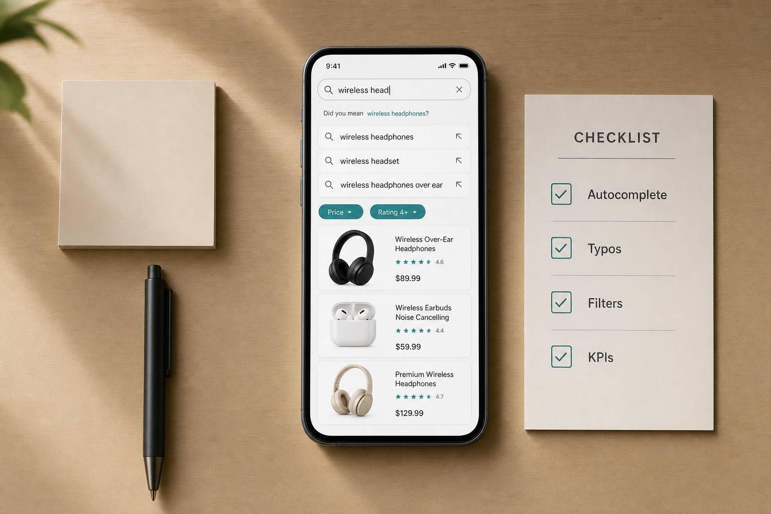
Checklist for Mobile Product Search Optimization
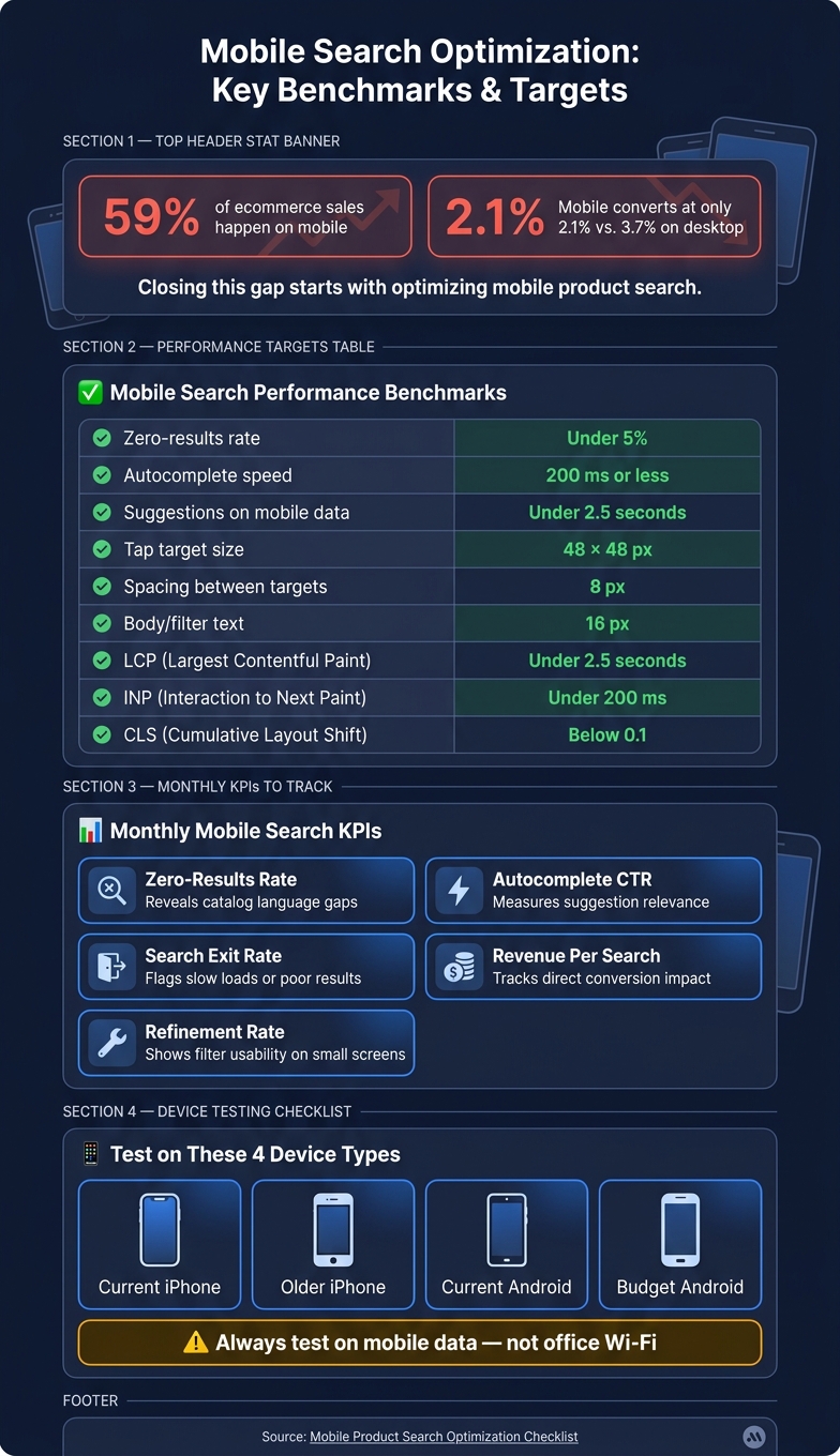
July 27, 2026Mobile brings in most ecommerce sales, but it still converts worse than desktop: 59% of retail ecommerce sales happen on mobile, yet mobile conversion averages just 2.1% vs. 3.7% on desktop.
If I had to sum up the fix in one line, it would be this: make search easy to spot, easy to use, and easy to recover when something goes wrong.
Here’s the short version of what matters most:
- Set clear goals first: cut taps, cut dead ends, and get shoppers to product pages faster.
- Track the right numbers: zero-results rate, search exits, refinement rate, autocomplete CTR, search conversion rate, and time to first product view.
- Fix the entry point: keep search visible, make tap targets at least 48 × 48 px, and stop pop-ups from blocking it.
- Make input easier: support pasted queries, keep autocomplete under 200 ms, and test on iPhone and Android devices over mobile data.
- Improve matching: cover misspellings, synonyms, SKUs, abbreviations, and partial matches.
- Avoid dead ends: replace zero-results pages with fallback products, categories, or suggested searches.
- Clean up results pages: show product info early, keep filters touch-friendly, and use active filter chips.
- Keep state intact: save filters, sort order, and scroll position when shoppers go back from a product page.
- Review search every month: check reports, test ranking and filter changes one at a time, and watch Core Web Vitals.
A few numbers from the article set the standard:
| Check | Target |
|---|---|
| Zero-results rate | Under 5% |
| Autocomplete speed | 200 ms or less |
| Suggestions on mobile data | Under 2.5 seconds |
| Tap target size | 48 × 48 px |
| Spacing between targets | 8 px |
| Body/filter text | 16 px |
| LCP | Under 2.5 seconds |
| INP | Under 200 ms |
| CLS | Below 0.1 |
The core idea is simple: if mobile shoppers can search, filter, and return to results without extra work, they are more likely to keep going instead of leaving. The rest of the article walks through that flow from the search bar to monthly testing.
Mobile Search Optimization: Key Benchmarks & Targets
Mobile search done right: Common pitfalls and best practices
sbb-itb-cef5bf6
Checklist: Audit Mobile Search Entry Points and Input Experience
Mobile sessions are short. That means the search entry point needs to be instant and hard to miss. If your metrics point to friction, start with the search box. More specifically, start with the search bar itself: if shoppers can't spot it or use it fast on mobile, nothing else in the search flow matters.
Check Search Placement, Visibility, and Tap Targets
Put the search bar or icon in the mobile header so it's visible without scrolling. Keep it in the same fixed, visible spot across the homepage, category pages, and product pages. People shouldn't have to hunt for search every time they move around the site.
Search icons and fields should be at least 48 × 48 CSS pixels, with 8 pixels of spacing. That gives shoppers enough room to tap without fumbling, which matters a lot on smaller screens.
Also, watch for blockers. Email overlays, promo pop-ups, and similar elements must not sit on top of search.
Test the Search Flow on Multiple Phones
Use real devices for testing. That's where mobile pain points show up: small screens, slower connections, and people moving fast. It's also where layout bugs and performance issues tend to slip out into the open before they drag down search use.
Run the audit on at least these four device types:
- a current iPhone
- an older iPhone
- a current Android
- a budget Android
Test on mobile data, not office Wi-Fi.
| Audit Check | Pass Standard |
|---|---|
| Keyboard behavior | Does not hide autocomplete suggestions or the "Search" button |
| Orientation shift | No horizontal scrolling or text cutoff in landscape mode |
| Tap targets | All search icons/buttons are at least 48 × 48 px |
| Sticky elements | Search bar stays accessible; not covered by chat widgets or banners |
| 4G/LTE performance | Suggestions load in under 2.5 seconds on mobile data |
Confirm Support for Mobile Input Behavior
Autocomplete should respond in 200 milliseconds or less. Test pasted queries too, since plenty of shoppers copy and paste product names, model numbers, or long searches from other apps.
Voice search can help, but only if it matches the catalog. If it doesn't fit the way people shop on the site, skip it.
The empty state can do useful work here. Use it to show trending searches, recent queries, or popular categories.
Once entry points feel easy to use, move to the next step: improving how search reads and responds to what shoppers type.
Checklist: Improve Autocomplete, Typo Tolerance, and Query Matching
Once the search entry point feels smooth, the next step is making sure the engine can understand how people actually search. That includes misspellings, shortcuts, and product terms that don't match your catalog word for word.
Enable Predictive Suggestions That Reduce Typing
Show suggestions after 2 to 3 characters. That gives shoppers a way to narrow results faster without typing the full query.
Prioritize suggestions by product relevance first, then layer in recent searches, trending queries, and user behavior. That order matters. If the top suggestions don't match shopping intent, autocomplete turns into noise.
For empty states, surface recent searches and trending queries before the shopper types anything. This helps with discovery and gives people a useful starting point instead of a blank box. On small screens, product thumbnails and rich snippets like price and ratings can make the right item easier to spot at a glance.
Build Rules for Synonyms, Misspellings, and Product Language
When suggestions don't land, the issue is often language. Shoppers use one set of terms. Your catalog uses another. That's where product discovery starts to fall apart.
A simple fix is to pull terms from places where customers speak plainly:
- Search logs
- Product reviews
- Support tickets
Use those terms to build synonym rules. Cover singular and plural forms, abbreviations, color names, model formats, and common misspellings for top-searched products.
It's also worth pressure-testing each priority product with three query types:
- The exact title
- One unique title word
- The SKU
If one of these fails, you can usually trace the problem back to content, keyword mapping, or synonym setup.
Prevent Zero-Results Pages with Fallback Logic
When matching fails, don't let search hit a dead end. Recover the session instead.
Swap zero-results pages for partial matches, category fallbacks, and relevant search suggestions. Show popular categories or fallback searches in place of a blank screen. Typo tolerance should also be turned on across all queries to cut down on mobile keyboard mistakes.
| Safeguard | What It Does |
|---|---|
| Typo tolerance | Corrects spelling errors automatically |
| Predictive suggestions | Reduces typing and guides shoppers toward relevant queries |
| Partial-match handling | Returns close results when exact matches fail |
| Category fallbacks | Surfaces relevant sections when no products match |
| Recent/trending searches | Populates empty states and encourages discovery |
Checklist: Optimize Mobile Results Pages, Filters, and Sort Options
Once a search shows results, the page needs to make the next step simple. Getting search to understand the query is only half the work. What happens after that - the results page itself - is where many mobile sessions either lead to a purchase or fall apart.
Show the Most Relevant Products in the First Screen
Keep the first screen centered on the products shoppers came to find. Put the product name, image, price, stock status, and ratings above the fold. If banners, sidebars, or oversized hero images push those details down, move them or remove them.
On mobile, space is tight. Every element has to earn its spot. Product cards, chips, and sort controls should be large enough to tap without mistakes. Use WebP images and fixed image dimensions to keep the page stable and fast.
From there, the goal is simple: make filters and sorting easy to use on a small screen.
Use Filter Drawers, Active Chips, and Touch-Friendly Controls
Filters and sort options should be easy to reach without extra scrolling and simple enough for one-handed use. Place the filter and sort triggers at the top of the results page. When tapped, they should open in a slide-out drawer that overlays the results instead of replacing them.
Active filters should show up as removable chips right above the results list. That gives shoppers a quick view of what’s turned on and lets them remove one filter without opening the drawer again. Filter labels should use a font size of at least 16px so users don’t have to pinch-to-zoom.
It also helps to group filters in a way that matches the product type. For apparel, lead with size and color. For electronics, put brand and specs first. And keep top-level filter groups to 5–7 options max so the screen doesn’t feel crowded.
Preserve Filter State, Sort Selection, and Scroll Position
Mobile shoppers lose patience fast when a page makes them start over. Preserve filter state, sort selection, and scroll position when someone opens a product detail page and then comes back.
Use in-place filtering instead of full page reloads. Add clear Reset and Back controls inside the drawer so people can change course without friction.
That kind of continuity keeps shoppers moving instead of forcing them to repeat the same search steps.
Checklist: Measure, Test, and Refine Mobile Search Every Month
After the search flow goes live, review it every month so you can catch regressions before they start hurting revenue.
Review Search Reports and Behavior Data on a Fixed Schedule
Once your results pages and filters are set up, check your top queries, zero-results terms, low-CTR searches, and high-exit searches each month. Then pair that data with session recordings or tap heatmaps. That combo helps you spot where people drop off and where filters create friction.
Focus on these monthly KPIs:
- Search exit rate can point to slow load times or results that miss the mark.
- Zero-results rate shows gaps in your product wording and missing synonyms.
- Refinement rate shows whether filter controls are easy to use on small screens.
Also track revenue per search and search exit rate. Mobile conversion gaps already show up in those numbers.
Keep mobile Core Web Vitals within target ranges: LCP under 2.5 seconds, INP under 200 milliseconds, and CLS below 0.1.
Run Controlled Tests on Suggestions, Ranking, and Filters
Run single-variable tests on autocomplete, default sort, or ranking changes. In plain English, change one thing at a time. Otherwise, it gets hard to tell what moved the needle.
Each month, recheck two iOS devices and two Android devices. Make sure tap targets are at least 48 × 48 pixels, spacing is at least 8 pixels, and body text is 16 pixels.
Use Reporting and Expert Support to Turn Findings Into ROI
If your team needs help with monthly reporting, mobile search testing, or performance fixes, SEO Werkz can support the work with SEO, web development, and analytics services focused on measurable ROI.
FAQs
How do I know if mobile search is hurting conversions?
Check GA4 and Google Search Console for warning signs like a high mobile bounce rate, low engagement, or mobile conversion rates that trail desktop. Those gaps often point to usability problems or slow page speed.
Look at the Mobile Usability report for blockers such as small fonts or tap targets that are hard to hit. Then use PageSpeed Insights to track Core Web Vitals. Comparing mobile and desktop conversion patterns can help you spot whether friction on mobile search is hurting sales.
What should I fix first in mobile product search?
Start by making sure your site is fully mobile-responsive. That sets the stage for every other mobile SEO fix.
Next, work on Core Web Vitals. Put extra focus on LCP, and keep it under 2.5 seconds. If your main content loads too slowly on mobile, the rest of the page won’t matter much.
Your mobile site also needs to show the same key product content as your desktop version, and that content needs to be indexable. If Google can’t access or read it on mobile, you’re asking the search engine to rank a thinner version of your page.
Then use Google Search Console to spot and fix major mobile usability problems, such as:
- Small tap targets
- Poor navigation
These issues may seem minor, but on a phone, they can make a site feel clunky fast.
How often should I test mobile search performance?
Use a layered schedule for mobile SEO checks.
Review Mobile Usability reports every week. Then, once a month, audit your key pages with PageSpeed Insights. Every quarter, run a full mobile SEO audit.
And if your site goes through a redesign, a hosting switch, or a major content update, do a complete performance check right away.