

CTA Placement Strategies for E-commerce
April 28, 2026Want to boost e-commerce sales? It starts with CTA placement. Where you place your "Add to Cart" or "Buy Now" button can make or break your conversions. Here’s what you need to know:
- Above-the-fold CTAs: Get 73% more visibility and can boost conversions by 161%.
- Mobile-first design: With 73% of e-commerce traffic from phones, position CTAs in the "thumb zone" (bottom-center).
- Sticky CTAs: Keep buttons visible as users scroll - especially on mobile - for up to 37% more checkout starts.
- Tailored placement: Quick purchases? Place CTAs at the top. High-ticket items? Place them mid-page after key details.
Testing is key. Use heatmaps, scroll tracking, and A/B testing to refine placement and ensure your CTAs are visible and easy to tap. Even small tweaks - like moving a button or adjusting its size - can drive major results.
How to design an effective website call to action
sbb-itb-cef5bf6
Primary CTA Placement Zones on Product Pages
E-commerce product pages typically feature three main zones for CTAs, each catering to different buyer behaviors.
Above-the-fold placement is ideal for capturing visitors who are ready to buy immediately. Content in this area gets 84% more attention than what’s below the fold, and CTAs here can perform 304% better than those placed lower on the page. This works well for straightforward products or returning customers who already know what they want.
CTAs within product details and descriptions align with the natural decision-making process: viewing the product, reviewing the price, selecting variations, and then acting. Placing the CTA near the price and variant selectors reduces friction since users don’t need to scroll back up. This approach is especially effective for complex or high-ticket items, as it gives buyers time to absorb details before deciding. In fact, long-form pages with mid-page CTAs can convert 220% better than shorter pages with just a hero CTA.
"Placement determines whether your CTA gets seen at the moment of highest intent." - Heurilens
Bottom-of-page placement appeals to thorough shoppers who want to review all the details before committing. A CTA at the end of the page acts as a final nudge, increasing conversions by 70%. Repeating CTAs at both the top and bottom of the page can further lift conversions by 25%, ensuring no opportunity is missed.
For even better accessibility, sticky CTAs can keep the "Add to Cart" button visible as users scroll. This feature is particularly effective on mobile, where scrolling is more frequent. A sticky bar that appears when the primary CTA leaves the screen has been shown to boost mobile conversions by 17%. For example, in October 2025, a Shopify DTC brand added a sticky bottom CTA to their mobile product pages and saw a 37% increase in checkout starts within two weeks. This approach eliminates the need for users to scroll back up when they’re ready to act.
While these strategies work well for desktop, the next step involves tailoring CTA placements specifically for mobile users, whose browsing habits differ significantly.
CTA Placement for Mobile Devices
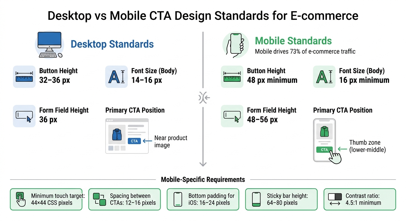
Desktop vs Mobile CTA Design Standards for E-commerce
In 2026, mobile commerce hit a staggering $3.4 trillion globally, yet conversion rates (1.8–2.2%) remain about half of desktop rates, even though mobile drives 73% of visits. The issue isn’t traffic - it’s how users interact with smaller screens. Unlike desktop users, who navigate with precision using a cursor, mobile users rely on their thumbs, which changes how CTAs (Call-to-Actions) should be positioned.
Adjusting for Mobile Scrolling Behavior
Mobile users scroll differently due to limited screen size and thumb-based navigation. The "thumb zone" refers to the area easily reachable during one-handed use, typically in the bottom-middle and lower-right portions of the screen. Since 75% of mobile interactions involve a single thumb, placing CTAs within this zone is crucial to reducing friction.
"The 'thumb zone' - the area easily reachable by the thumb in a natural grip - determines which UI elements get tapped and which get ignored."
- ECOSIRE Research and Development Team
Sticky bottom CTAs solve this challenge by keeping buttons like "Add to Cart" fixed at the bottom of the screen as users scroll through product details, reviews, and images. This method has delivered impressive results across industries: fashion brands report a +22% lift in add-to-cart actions, electronics see +18%, home goods +19%, and beauty products +24%. Overall, conversion rates improve by 11% to 16%, depending on the category.
For long product pages, progressive disclosure - such as expandable "Read more" sections - helps keep content manageable while ensuring the CTA remains visible. Collapsible headers that disappear when scrolling down and reappear when scrolling up further maximize screen space without sacrificing navigation.
These strategies highlight the importance of designing for thumb-friendly interaction on smaller screens.
Making CTAs Accessible on Small Screens
Beyond scrolling behavior, minimizing touch errors is another key priority for mobile design. Touch targets smaller than 48 pixels increase tap errors by 60%. To reduce these errors, ensure buttons meet a minimum size of 44×44 CSS pixels (following Apple’s standard). Larger targets can accommodate users with bigger hands, while sticky bar heights should range between 64 and 80 pixels to balance visibility and content space.
Spacing also matters. Leave 12 to 16 pixels between the primary CTA and secondary actions like "Wishlist" or "Share." Additionally, include 16 to 24 pixels of bottom padding for iOS safe areas, preventing overlap with the home indicator or system gestures.
Visual feedback is essential for creating a seamless experience. Buttons should have four distinct states:
- Default: The button’s standard appearance.
- Pressed: A visual response within 50 milliseconds of being tapped.
- Loading: A spinner icon to indicate processing.
- Success: A confirmation message, such as "Added" with a checkmark, displayed for 800–1,200 milliseconds.
This feedback reduces double-tapping and reassures users during critical interactions.
Here’s a quick comparison of desktop and mobile standards for key UX elements:
| UX Element | Desktop Standard | Mobile Standard |
|---|---|---|
| Button Height | 32–36 px | 48 px minimum |
| Font Size (Body) | 14–16 px | 16 px minimum |
| Form Field Height | 36 px | 48–56 px |
| Primary CTA Position | Near product image | Thumb zone (lower-middle) |
Adding short trust signals - like "Free Returns", "Ships Today", or "In Stock" - directly below the CTA button can ease last-minute hesitation. Ensure the CTA text meets a 4.5:1 contrast ratio for accessibility, and use aria-live regions so screen readers can announce updates like "Added to cart" for visually impaired users.
Testing and Improving CTA Placement
Once you've identified the best zones for your CTAs, the next step is to confirm those choices with real user data. Even well-thought-out placements need validation. With 97% of e-commerce visitors leaving without making a purchase, poorly placed or hard-to-reach CTAs can be a major culprit. Tools like heatmaps, scroll tracking, and A/B testing can help ensure your CTAs are in the right spots.
Using Heatmaps and Scroll Tracking
Heatmaps provide a visual representation of where users focus their attention, click, and scroll on your pages. For example, click heatmaps can show if users are ignoring your "Add to Cart" button and instead clicking on nearby elements like product images. If product images are getting more engagement than your CTA, consider moving the button closer to the gallery or embedding it within the image.
Scroll tracking is another powerful tool. It pinpoints where users stop scrolling and leave your page. If your CTA is below this "cold spot", it’s likely invisible to most visitors. In such cases, moving the button higher on the page or making it sticky can make a big difference. Ideally, your primary CTA should be visible to at least 80% of visitors without requiring them to scroll.
Pay attention to "rage clicks" - those rapid, repeated taps on or near a CTA. These often indicate user frustration due to issues like slow loading, broken links, or confusing design. Similarly, "dead clicks" on non-clickable elements suggest users expect a button or interactive feature in that area. To gather reliable insights, aim to collect data from 1,000–2,000 sessions per page.
"The question isn't whether you're losing sales - it's where and why."
Once you’ve identified problem areas, you can use A/B testing to refine your CTA placements.
A/B Testing Different CTA Positions
A/B testing is essential for determining the most effective CTA adjustments. For accurate results, each test should include at least 1,000 conversions per variant (not just visitors) and maintain a 95% confidence level. Tests should run for 2–4 weeks, allowing for variations in user behavior over a full business cycle.
Focus on testing one variable at a time. For instance, if you’re experimenting with a sticky bottom CTA on mobile, avoid simultaneously changing the button’s color or text. This ensures you can isolate what’s driving the results. In one example, a Shopify brand saw a 37% increase in checkout starts after adding a sticky CTA to their mobile site. Similarly, moving a CTA to the bottom of a long landing page led to a 304% boost in conversions.
Key metrics to track include Click-Through Rate (CTR), scroll depth to CTA, and time to first click. A shorter time to first click indicates a more intuitive placement for users with high purchase intent. It’s also crucial to test across different user segments - mobile versus desktop, new versus returning visitors, and various traffic sources. Regular A/B testing can lead to a 10% to 20% improvement in conversion rates, and optimizing CTA buttons alone can increase e-commerce conversions by up to 35%.
CTA Placement for Different Product Types
Fine-tuning your CTA (Call-to-Action) placement based on your product type can significantly improve conversion rates. A $15 impulse buy doesn’t need the same strategy as a $1,500 subscription service. The key is aligning the CTA with how much time your customer needs to make a decision.
Expensive Products and Subscriptions
When selling high-ticket items or subscriptions, your CTA should appear only after you've demonstrated the product's value. Buyers need time to absorb details about features, ROI, and social proof before committing. Placing the CTA mid-page - right after showcasing a powerful testimonial, demo video, or case study - performs much better than an aggressive above-the-fold placement.
The wording of your CTA matters just as much as its placement. For these products, "soft" CTAs like "Learn More", "See How It Works", or "Get a Demo" are more effective than "hard" CTAs like "Buy Now", especially for cold traffic.
"For high-ticket items, 'Learn More' or 'See How It Works' almost always outperforms 'Shop Now' for cold traffic." - Sumeet Shroff, Prateeksha Web Design
This approach reduces the perceived risk of clicking, making the interaction feel less intimidating.
Repetition also plays a big role. Including multiple CTAs throughout the page ensures users can act when they’re ready, especially on long-form pages. Pair your CTA with trust signals - like star ratings, money-back guarantees, or security badges - to address any lingering doubts. For complex products, long-form pages with mid-page CTAs have shown 220% higher conversion rates compared to shorter pages.
Impulse purchases, however, require a completely different tactic.
Quick Purchases and Limited-Time Offers
For impulse buys or simple products, speed is everything. Above-the-fold CTA placement works best, capturing high-intent visitors before they have a chance to overthink. Since users spend 57% of their viewing time above the fold, placing a "Buy Now" or "Add to Cart" button in the hero section maximizes visibility and engagement.
Action-packed language like "Buy Now" or "Add to Bag" encourages immediate clicks. For limited-time offers, adding urgency triggers - like countdown timers, stock alerts ("Only 3 left"), or fast-shipping deadlines ("Order in the next 2 hours for same-day delivery") - creates a sense of FOMO (fear of missing out).
On mobile devices, a sticky CTA in the thumb zone is a game-changer. A sticky "Add to Cart" button, positioned at the bottom center or right of the screen, keeps the action easily reachable and has been shown to increase checkout starts by 37%. Bright, high-contrast colors like orange or red amplify visibility and create a sense of urgency, especially for flash sales.
| Product Type | Optimal CTA Placement | Recommended Copy | Supporting Elements |
|---|---|---|---|
| Expensive / Complex | Mid-page (after social proof) | "See How It Works", "Get a Demo" | ROI data, testimonials, case studies |
| Quick Purchase / Impulse | Above the fold & sticky on mobile | "Buy Now", "Add to Bag" | Product images, price, simple description |
| Limited-Time Offers | Hero section near countdown | "Claim Discount", "Get Yours Before It's Gone" | Countdown timers, stock levels, urgency copy |
| Subscriptions | Hero & below value list | "Start My Free Trial", "Join Now" | "Cancel anytime", "No credit card required" |
Conclusion
Every decision about where to place a CTA can significantly impact user engagement and conversions. By tapping into attention, psychology, and timing, even small changes in placement can turn a missed opportunity into a successful click.
Visibility is everything. Placing CTAs above the fold and repeating them throughout the page has been shown to improve conversion rates, sometimes by as much as 161%. Strategic positioning ensures your audience doesn't miss the opportunity to take action.
With mobile commerce leading the way, it's crucial to consider the "Thumb Zone" for easy access on smaller screens. Sticky footers that stay visible as users scroll are another smart way to reduce friction and keep CTAs within reach.
Testing is your secret weapon. A/B testing and heatmap analyses can help identify the best placements for your audience. By tweaking one element at a time - whether it's the color, wording, or location - you can gather clear insights to refine your strategy.
FAQs
How do I pick the best CTA spot for my product page?
When deciding where to place your call-to-action (CTA), it's important to think about how visitors naturally browse your site. On desktop layouts, users often follow an F-pattern, meaning they scan horizontally across the top and then down the left side. This makes CTAs most effective when placed above the fold or to the right of the product image.
For landing pages or designs with heavy visuals, the Z-pattern comes into play. Here, users scan in a zigzag motion, making the top-right or bottom-right corners prime spots for your CTA. By aligning your CTA placement with these browsing habits, you can improve both visibility and conversions.
Should I use a sticky CTA on mobile?
A sticky CTA (Call-to-Action) on mobile can make a big difference in user experience. By keeping important actions like "Buy Now" or "Sign Up" constantly visible, users don’t have to scroll or search for them. This convenience often leads to higher engagement and better conversion rates.
What’s the fastest way to test CTA placement changes?
The fastest way to evaluate changes in CTA placement is by using A/B testing. Tools designed for this purpose make it simple to tweak placements and track results accurately. Pay attention to metrics such as clicks, view-to-click rate, and scroll depth. To get reliable results, ensure your test includes a large enough sample size and achieves statistical significance. This will help you pinpoint the placement that leads to the most conversions effectively.