Best CTA Placement Strategies for Email Campaigns
April 10, 2026Want better email conversions? Start with your CTA placement. The position of your call-to-action (CTA) can significantly impact click-through rates, with the right placement boosting conversions by up to 15–20%. Here's what you need to know:
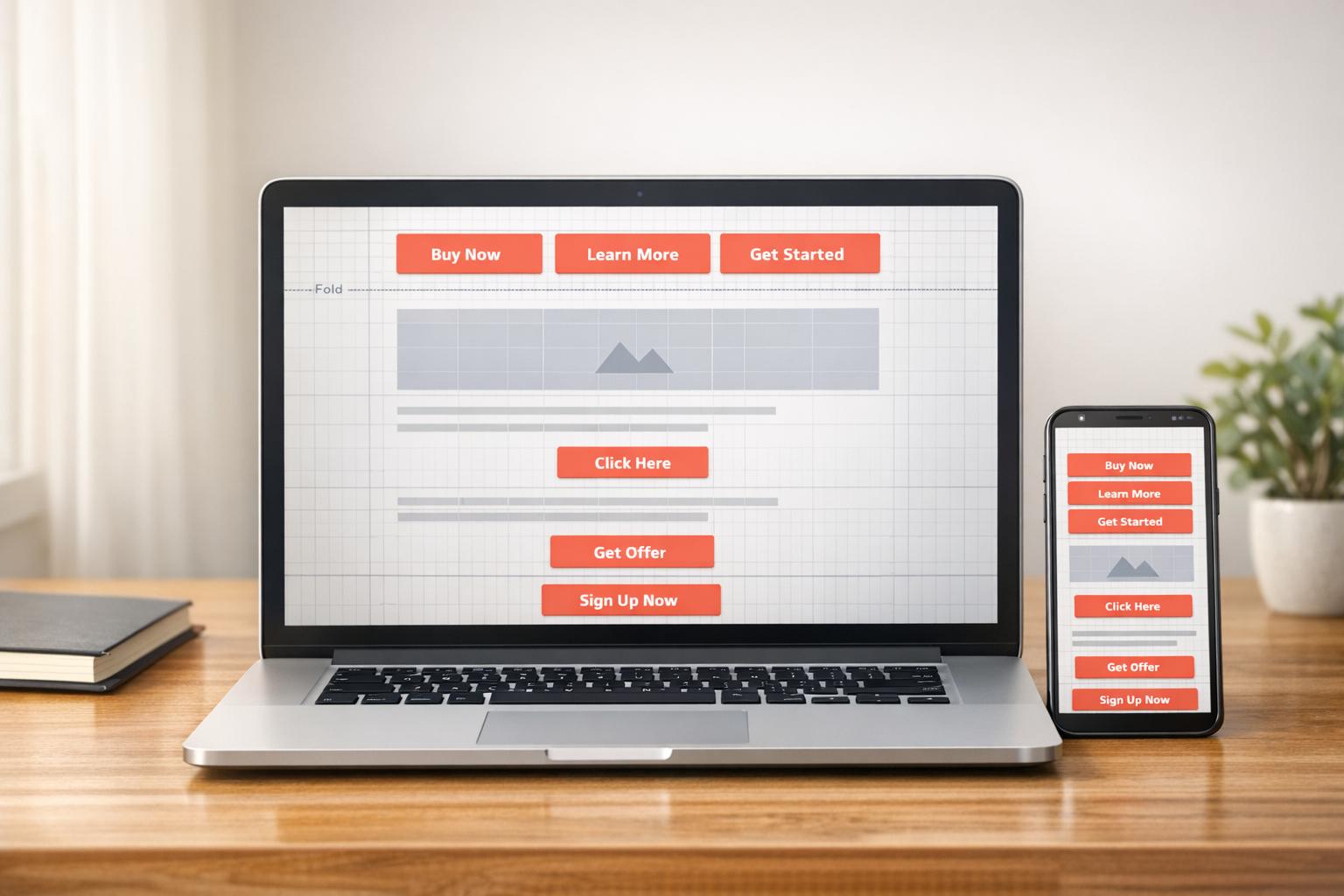
- Above the Fold: Best for urgent actions (e.g., password resets) and time-sensitive offers. Drives quick engagement but may lack context.
- After the First Paragraph: Balances context and visibility. Ideal for promotional emails and newsletters.
- End of Email: Works for long-form content where readers need more details. Risky for short emails due to low visibility.
- Repeated Placement: Targets all reader types by including CTAs at multiple points. Effective but can overwhelm if overused.
Key Takeaway: Match CTA placement to your email type, audience behavior, and device usage. Test different placements, track performance, and refine for better results.
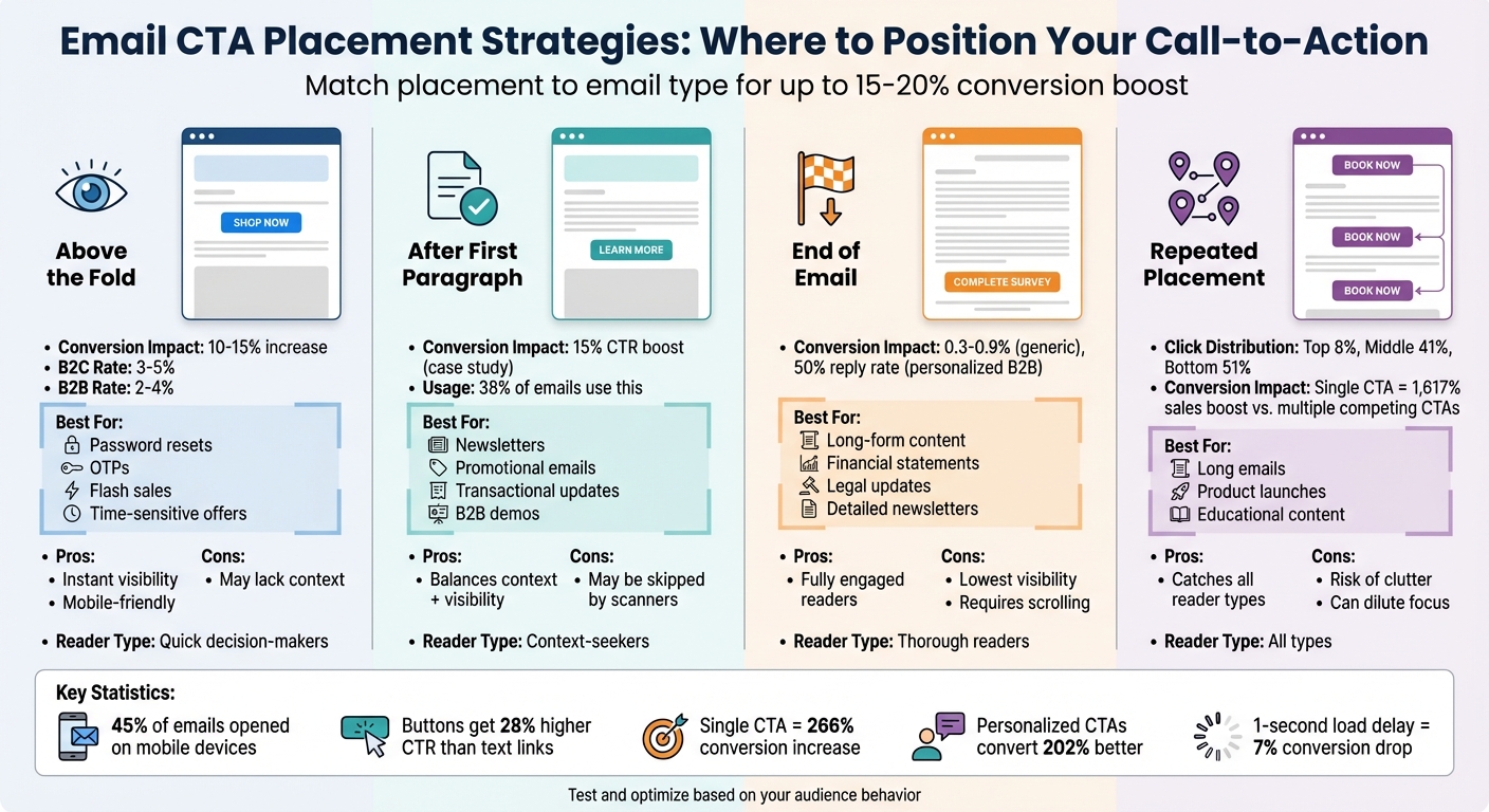
Email CTA Placement Strategy Comparison: Conversion Rates and Best Use Cases
7 Tips for How to Write a Great Call to Action for Email - Copyhackers
sbb-itb-cef5bf6
1. Above the Fold Placement
"Above the fold" refers to the part of an email that’s visible without scrolling. This area is crucial for grabbing the attention of readers who scan quickly and may not scroll further - especially important for mobile users, where nearly half of all email opens occur.
Effectiveness
Positioning your call-to-action (CTA) above the fold can lead to a 10–15% increase in conversion rates. The results vary by audience type: B2C campaigns often achieve conversion rates of 3–5%, while B2B campaigns average around 2–4%. This placement targets immediate attention, ideal for those who decide within seconds whether to engage, as opposed to readers who prefer more detailed information.
Best Email Types
This placement shines in urgent transactional emails like password resets, one-time passwords (OTPs), and payment reminders. It’s also effective for time-sensitive promotions, such as flash sales or limited-time offers. For straightforward actions - think newsletter signups or "Shop Now" buttons - placing the CTA above the fold ensures users can act quickly.
Industry Suitability
| Industry/Type | Avg. Conversion Rate | Best Use Case |
|---|---|---|
| B2C | 3–5% | Flash sales, limited discounts, order tracking |
| B2B | 2–4% | Webinar signups, free trials, whitepapers |
| Transactional | High (Intent-driven) | Password resets, OTPs, payment reminders |
Pros and Cons
The biggest advantage of above-the-fold placement is instant visibility - the CTA grabs attention before readers decide whether to keep scrolling. This is especially effective for mobile users or those who skim rather than read in depth. However, this approach can backfire if the email lacks enough context, making the CTA feel abrupt or pushy. Additionally, overly generic designs could lead to "banner blindness", where users ignore the button entirely.
For longer emails, consider pairing an above-the-fold CTA with a duplicate placed at the end. This strategy caters to both quick-click users and those who prefer to read thoroughly before acting. While this placement is great for encouraging immediate action, it’s just one option among several, each suited to different types of readers and goals.
2. After First Paragraph Placement
Placing your CTA right after the introductory paragraph strikes a balance between catching the reader's eye early and providing enough context to make the offer clear. A short, compelling introduction sets the stage, ensuring your audience understands the value before you prompt them to take action.
Effectiveness
This approach naturally flows from presenting information to encouraging action. As Jerusha Carolin J from Zoho ZeptoMail puts it:
Once the user understands the core message and action.
Positioning the CTA here capitalizes on the reader's heightened interest. For example, a B2B client saw a 15% boost in click-through rates simply by moving their CTA from the middle of the email to right after the introductory paragraph. This highlights how timing and placement can align with engagement patterns. Notably, 38% of emails position their first CTA within the top third of the message.
Best Email Types
This placement works especially well in transactional emails like password resets, shipping updates, and payment reminders (e.g., "Your payment is due on 04/15/2026. [Pay Now]"). It’s equally effective in newsletters that use an introductory paragraph to lead into a "Read More" button or downloadable resource. B2B emails also benefit, particularly when explaining a feature or benefit before inviting users to try a free trial or schedule a demo. While this placement provides clarity and context, it does come with its own set of challenges and advantages.
Industry Suitability
Different industries can leverage this strategy effectively:
- SaaS companies: Ideal for account security alerts or trial milestone emails, where users need a quick explanation before acting.
- Financial services: Works well for monthly statements or billing notices that require context before action.
- Retail and e-commerce: Perfect for transactional receipts or delivery tracking updates.
Pros and Cons
One major advantage is better engagement on mobile devices. The CTA appears early, avoiding excessive scrolling, while still being backed by brief, informative copy. This approach aligns with task-oriented readers who are ready to act once the offer is clear. However, if your opening paragraph fails to establish value or urgency, the CTA might seem out of place and be ignored. To address this, keep the introduction concise and ensure the CTA stands out with ample white space, reducing accidental clicks on smaller screens. By balancing context with early placement, this strategy sets the tone for other CTA placements discussed later.
3. End of Email Placement
Placing your call-to-action (CTA) at the bottom of an email creates a natural conclusion for your message. The logic is simple: readers who make it to the end of the email are already engaged and more likely to take the next step. As Zoho ZeptoMail puts it:
When [users] reach the end, you want them to have an easy next step without having to scroll back up.
This placement is particularly effective for long-form emails - think monthly bank statements, policy updates, or detailed newsletters. Readers often scroll through these types of emails to review important details before deciding to act. Supporting this, a study by Canopy Labs revealed that a bottom-placed CTA outperformed those on the left or right sides of an email. That said, generic end-of-email CTAs typically convert at a modest 0.3% to 0.9%, while inline CTAs can drive click-through rates up to 121% higher.
Effectiveness
A great example of this strategy in action comes from Margaret Sikora, CEO of Woodpecker.co. In January 2025, she sent out 22 personalized cold emails, each ending with a CTA inviting recipients to schedule a 15–20 minute Skype chat. The campaign achieved an impressive 50% reply rate, with all responses being positive. Sikora attributed the success to the quality of her outreach rather than the volume of emails sent:
The 50% reply rate comes from the quality of the outreach, not the quantity of prospects I reached out to.
This placement also caters to "enthusiastic scrollers" - those who might skip over an early CTA but are still engaged enough to act when they reach the end. The results highlight how effective this approach can be across different types of email formats.
Best Email Types
The end-of-email CTA works well for a variety of email types. Financial services often use it in monthly statements, where users need to review transactions before taking action. SaaS companies rely on this placement for service updates or legal notifications. E-commerce brands apply it to shipping updates and order confirmations. It’s also a strong choice for B2B outreach emails, where the content builds a case before asking for a demo or meeting. For longer emails, repeating the CTA - one at the top and another at the bottom (the "sandwich" approach) - ensures all readers have a clear next step.
Pros and Cons
One major advantage of placing the CTA at the end is its convenience for readers who want to verify details before acting. It’s also a great spot for secondary actions, like contacting support or following your brand on social media, which can complement your main goal.
However, this placement isn’t ideal for shorter emails or audiences who expect to act quickly. If the CTA is buried at the bottom, it might go unnoticed. To make it work, ensure the content builds value throughout the email, and format the bottom CTA clearly with ample white space. For emails with multiple CTAs, consider varying the wording slightly - for example, using "View Statement" at the top and "Download Statement PDF" at the bottom.
4. Mid-Content or Repeated Placement
Adding multiple CTAs (calls-to-action) throughout an email can cater to different reader behaviors. Some readers act quickly, others need more details, and some wait until the very end to decide. By placing CTAs at strategic points - like above the fold, mid-content, and at the end - you can align with the natural flow of information and catch readers at their peak interest.
A "three-point" strategy is a popular approach. It includes a CTA above the fold for fast decision-makers, one mid-content for readers who need more context, and a final one for those who finish reading. This method addresses three types of readers: those ready to act immediately, those who engage with the content before deciding, and those who prefer to absorb all the details first. By segmenting the reader's journey, this strategy ensures CTAs are well-integrated into the email's flow.
Effectiveness
Inline CTAs work seamlessly with how readers naturally scan emails, often resulting in better click-through rates. For instance, in a study analyzing an email with three CTAs, the bottom CTA accounted for 51% of clicks, the middle one for 41%, and the top-right CTA for just 8%. This shows that placement matters, and mid-content CTAs can be particularly effective for engaged readers.
That said, balance is key. Overloading an email with too many CTAs can create a cluttered design that overwhelms readers. Interestingly, research has found that emails with a single, focused CTA can boost sales by 1,617% compared to those with multiple competing CTAs. If you’re using repeated CTAs, ensure they all lead to the same goal but are placed strategically to match different decision points in the reader's journey.
Best Email Types
Repeated CTAs work well across various email formats and lengths. For example:
- Newsletters: Mid-content CTAs are effective after highlighting key value propositions.
- E-commerce Announcements: Product launch emails can include CTAs after showcasing different features to capture interest at multiple points.
- Financial Services: Statements often feature CTAs like "View Statement" at the top and "Download PDF" at the bottom for convenience.
Timing is everything. Placing a CTA immediately after your strongest selling point - rather than sticking to a fixed spot - can capture readers when they’re most convinced.
Pros and Cons
| Aspect | Advantage | Drawback |
|---|---|---|
| Audience Coverage | Reaches readers at different decision stages | Risks overwhelming readers with too many options |
| Contextual Timing | Aligns CTAs with relevant information for better engagement | Requires careful planning to avoid clutter |
| Mobile Experience | Reduces scrolling for long emails | Heavier designs can slow load times (even a 1-second delay can lower conversions by 7%) |
| Flexibility | Supports both simple (e.g., "Learn More") and complex (e.g., "Buy Now") actions | Overuse can dilute the email’s focus |
To make repeated CTAs work, vary their format to preserve clarity. Use bold, prominent buttons for your primary action, and styled text links for secondary or repeated actions. On mobile, ensure enough white space between buttons to prevent accidental clicks. Finally, personalized CTAs can convert 202% better than generic ones, so tailor mid-content CTAs to the section they follow.
Pros and Cons
Every CTA placement strategy has its strengths and weaknesses. Knowing these differences helps you align your approach with your campaign objectives and how your audience interacts with your content.
Above the fold placement grabs attention right away, making it perfect for situations where immediate action is key - think password resets or OTPs. However, for more complex offers that need explanation, this placement can feel premature and might not be as effective.
After the first paragraph strikes a balance by providing some context before prompting action. This works well for promotional emails and personal outreach, as it creates a natural flow. The downside? Quick scanners might skip over it, and it may not fully persuade readers when dealing with high-cost items or intricate B2B offers.
End-of-email placement is ideal for readers who’ve taken in your entire message and are ready to act. But it’s risky - especially in transactional emails. As one expert notes, “the reader isn’t browsing. They’re doing something... the CTA should appear immediately after the main message”. This strategy hinges on your ability to keep readers engaged enough to scroll.
The table below breaks down the pros, cons, and best use cases for each placement strategy:
| Strategy | Pros | Cons | Ideal Use Cases |
|---|---|---|---|
| Above the Fold | Instant visibility; appeals to eager readers | May lack context; feels premature for detailed offers | OTPs, password resets, urgent alerts, simple "Shop Now" buttons |
| After First Paragraph | Adds context; follows a logical flow | Can be missed by scanners; less persuasive for high-cost items | Short promotional emails, personal outreach |
| End of Email | Appeals to fully engaged readers; natural conclusion | Lowest visibility; depends on scrolling | Long newsletters, legal updates, complex B2B offers |
| Repeated Placement | Reinforces the message; works for all reader types | Risk of overwhelming readers; may dilute focus | Long emails, detailed product announcements, educational content |
Your CTA placement should match what your audience is looking for. Keep in mind that buttons perform better than plain text links, with a 28% higher click-through rate. Plus, simplifying emails to feature just one CTA can increase conversions by 266%. To optimize performance, use bold, visually distinct buttons for your primary action and styled text links for secondary CTAs. This ensures your message is clear without overwhelming the reader. Balancing these strategies thoughtfully will help you achieve your campaign goals while keeping your audience engaged.
Conclusion
The placement of your call-to-action (CTA) largely depends on the type of email you're sending. For urgent transactional emails, positioning the CTA above the fold tends to work best, while in-depth, long-form content benefits from placing CTAs at the end, where readers have the full context. What works for a retail brand promoting discounts might not translate to a B2B company offering complex services. The only way to uncover what resonates with your audience is through consistent testing.
To get started, ensure your email templates are mobile-friendly - this is critical since nearly 45% of emails are opened on mobile devices. Simplify your message to focus on one primary goal. Begin A/B testing different CTA placements, changing only one variable at a time to collect actionable data. Use UTM parameters to track which placements generate the most clicks and conversions. Don’t stop there - experiment with button colors, wording, and positioning to discover what drives the best results.
"Call to action button copy best practices are great, but they have one fatal shortcoming: they generalize. So, while everything we've told you about here is proven to work, it's not specific to your audience." - Sean Tinney, AWeber
This insight highlights the importance of tailoring your CTAs to your audience's unique preferences and behaviors. If you're looking for expert help, SEO Werkz offers services like mobile-responsive template design, advanced A/B testing frameworks, and in-depth data analysis to refine your strategies and maximize ROI.
Keep testing, measuring, and fine-tuning - your audience's behavior holds the key to discovering the perfect CTA placement.
FAQs
How do I pick the best CTA placement for my email type?
When deciding where to place your call-to-action (CTA) in an email, think about the email's purpose and who you're sending it to.
For transactional emails, it's smart to put the CTA prominently above the fold so recipients can quickly spot it without scrolling. In marketing emails, placing the CTA near the top or in the center tends to get good results.
Make sure your CTA stands out visually, uses clear and action-driven language, and ties directly to your email's goal. It's also a good idea to test different placements and review performance metrics to see what resonates most with your audience.
How many CTAs should one email include without hurting clicks?
When crafting your email campaigns, it's best to focus on one primary call-to-action (CTA). A single, clear action helps guide readers without overwhelming them. While you can include secondary CTAs sparingly, overloading the email with too many options can dilute the message and lower click-through rates.
By keeping the action straightforward and focused, you can improve engagement and drive better results.
What’s the simplest A/B test to find my best CTA placement?
A basic way to test where your call-to-action (CTA) works best in an email is by experimenting with two placements. Try putting the CTA above the fold (visible without scrolling) versus below the content. Then, compare the click-through rates to see which position grabs more attention. This simple test requires minimal effort but can reveal valuable insights about what resonates with your audience.