
Mobile Navigation Patterns: Pros and Cons
February 26, 2026Choosing the right mobile navigation pattern is critical for user experience. Navigation impacts usability, with 30-40% of mobile usability problems tied to poor navigation design. Effective navigation ensures users find what they need quickly, reducing frustration and abandonment rates.
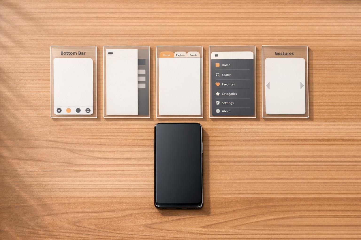
Here’s a quick breakdown of five common mobile navigation patterns:
- Bottom Navigation Bar: Always visible, easy for one-handed use, great for apps with 3-5 main sections (e.g., Instagram, Spotify).
- Hamburger Menu: Saves screen space by hiding options, better for apps with many secondary features (e.g., Gmail, Uber).
- Tab Bar Navigation: Visible and accessible, ideal for apps with limited categories (e.g., WhatsApp, LinkedIn).
- Full-Screen Navigation: Focused and clear, suitable for task-specific apps (e.g., United Airlines).
- Gesture-Based Navigation: Minimal interface, great for immersive apps but harder for discoverability.
Key takeaway: Match your navigation style to your app’s structure and user needs. For apps with frequent switching between sections, visible options like bottom or tab bars work best. For apps with complex hierarchies or occasional actions, hidden menus like the hamburger menu are more suitable. Testing with real users is essential to avoid usability issues.
About UX: Common Mobile Navigation Patterns
sbb-itb-cef5bf6
1. Bottom Navigation Bar
The bottom navigation bar is a staple in mobile app design, offering 3–5 core options that are always visible at the bottom of the screen. Apps like Instagram, Spotify, and Amazon use this layout to provide quick access to essential features without requiring extra taps or scrolling.
Accessibility
One of the biggest strengths of the bottom navigation bar is its ease of use with one hand. Since about 60% of mobile users operate their devices this way, placing navigation options in the "thumb zone" makes interaction much easier. To ensure usability, touch targets should measure at least 44×44px for iOS and 48×48px for Android. If an icon isn't immediately clear, adding a short label (1–2 words) can improve understanding by 30–40%. Additionally, designers should account for devices with rounded corners or home indicators by including CSS padding, such as safe-area-inset-bottom.
Discoverability
Because the bottom navigation bar stays visible as users scroll, it significantly improves discoverability. Users are 1.5 times more likely to interact with navigation options that are always in view. In contrast, hiding these options - like in a hamburger menu - can decrease discoverability by over 20%. As Nick Babich, a Developer and UX Specialist, explains:
"What's out of sight is out of mind. When navigation is hidden, users are less likely to use it."
Screen Space Utilization
While the bottom navigation bar does take up some vertical space, it’s more efficient than alternatives like full-screen menus. Keeping the bar limited to 3–5 items ensures that touch targets remain large and easy to use. This also encourages a streamlined information hierarchy - secondary features, such as "Settings" or "Help", can be tucked away in a separate menu.
Ideal Use Cases
This navigation pattern shines in apps where users frequently switch between major sections. For instance:
- E-commerce apps: Quick access to Home, Search, Cart, and Account.
- Social media platforms: Easy navigation between Feed, Explore, Notifications, and Profile.
- Music apps: Instant access to Player, Library, and Search.
It works best when the convenience of instant access outweighs the slight reduction in content space. For apps with more than five primary sections or complex navigation structures, a hybrid approach may be better. This could involve using a bottom bar for key actions and a secondary menu for less critical features.
Balancing accessibility with screen space is key to creating a navigation experience that feels intuitive and efficient. As we explore other navigation patterns, this design remains a strong contender for improving mobile usability.
2. Hamburger Menu
The hamburger menu - those three horizontal lines that reveal a slide-out drawer - has become a common feature in mobile design. Unlike a bottom navigation bar that stays visible, the hamburger menu keeps things clean by hiding options until needed. Originally created by Norm Cox for early graphical interfaces, it was designed to be "very 'road sign' simple, functionally memorable, and mimic the look of the resulting displayed menu list". While the icon is widely recognized today, its hidden nature presents challenges for usability compared to more visible navigation methods. Let’s dive into how its space-saving benefits stack up against its drawbacks in discoverability and accessibility.
Screen Space Utilization
One of the biggest perks of the hamburger menu is how it frees up screen space. By tucking navigation options behind a single icon, it allows the main content to take center stage - especially valuable on small mobile screens. It also works well for handling complex site structures without cluttering the interface. However, this design comes with a trade-off: users have to make extra taps to access hidden options, which increases interaction time.
Accessibility
For the hamburger menu to work well for everyone, accessibility must be prioritized. Developers should use semantic HTML elements and ARIA attributes, like adding an aria-label to the menu button and updating its aria-expanded state, so screen readers can easily interpret it. The menu should also support keyboard navigation - ensuring users can open, navigate, and close it seamlessly. Focus management within the menu drawer is key, and the Escape key should close the menu. Because users with low vision often zoom in on websites (up to 200–400%), it’s crucial to ensure the menu remains functional and readable even at high zoom levels. Additionally, its typical placement in the top corners can make it harder to use one-handed on larger devices.
Discoverability
One of the hamburger menu's main flaws is that it’s not immediately visible, which hurts discoverability. As Mike Stern, User Experience Evangelist at Apple, points out:
"Hamburger menus are terrible at both of those things, because the menu is not on the screen. It's not visible. Only the button to display the menu is."
Studies show that hiding navigation behind an icon can reduce discoverability by about 20%. While 86% of users accessed visible navigation options, only 57% accessed hidden ones. Tasks also took about 15% longer to complete when navigation was concealed. Without visible cues, users may feel lost within an app, increasing their cognitive load.
Ideal Use Cases
The hamburger menu shines when used for secondary features like Settings, Profile, or Help - areas users visit occasionally rather than frequently. It’s also a smart choice for platforms with more than five top-level categories, as it organizes complex navigation without overwhelming the main interface. On the other hand, if a site has four or fewer main sections, visible tabs or buttons generally offer better usability. Pairing the hamburger icon with a visible "Menu" label can also improve user recognition, striking a balance between space-saving and usability.
3. Tab Bar Navigation
Tab bars keep core features front and center, unlike hamburger menus that hide them behind an extra tap. Positioned at the bottom of the screen, they provide quick access to 3–5 key destinations, all within easy thumb reach. However, they do come with a trade-off: they permanently occupy about 7% to 10% of the screen and aren't ideal for apps with more than five main features. Let’s break down how they affect discoverability, screen space, and accessibility.
Discoverability
One of the biggest strengths of tab bars is their visibility. Since they’re always on display, users can immediately see their options without extra steps. This constant presence improves discoverability and keeps users engaged. It’s no surprise that platforms like LinkedIn, Facebook, and Instagram have moved away from hamburger menus in favor of tab bars as their offerings expanded. Persistent navigation has proven to encourage higher engagement.
Screen Space Utilization
While tab bars do take up a small portion of the screen, they make up for it by offering one-tap access to essential features. For instance, Airbnb’s switch to a tab bar with five sections led to a 40% faster task completion rate compared to its previous hamburger menu design. That said, keeping the tab bar limited to three to five items is crucial. Overloading it can shrink touch targets, making them harder to use (ideal sizes are at least 44×44px on iOS or 48×48px on Android) and creating a cluttered interface .
Accessibility
Tab bars shine when it comes to accessibility. Positioned in the "thumb zone", they make one-handed navigation much easier - an important factor given that 60% of mobile users browse with just one hand. Icons, labels, and active states provide consistent visual cues, helping users stay oriented as they navigate. Pairing icons with short text labels can further boost understanding by up to 40%.
Ideal Use Cases
Tab bars work best for apps with three to five primary sections that are equally important. Think of apps like social media platforms, music players, or shopping services where users frequently move between features. Take Instagram, for example - it uses a bottom tab bar to organize its five main sections (Home, Search, Reels, Shop, Profile), ensuring a smooth and accessible experience. For apps with more than five main categories, consider using the fifth tab as a "More" menu or placing less-used features under a profile or settings icon.
4. Full-Screen Navigation
Full-screen navigation takes over the entire homepage (or a dedicated hub) with menu options, keeping other content hidden until users make a selection. This method prioritizes clarity and focus over immediate content visibility. By removing persistent navigation bars, it allows content to be displayed in full-screen mode once a user makes a choice. However, this design comes with its own set of trade-offs.
Discoverability
When users first open an app with full-screen navigation, the design ensures high discoverability. The screen is clean, with only clear and organized menu options visible. This simplicity makes it easy for users to understand their choices. However, after navigating to a specific section, the menu disappears, requiring users to return to the hub to switch sections. This extra step increases interaction costs compared to persistent navigation. A notable example is United Airlines’ mobile site, which adopted this approach in November 2015. Their homepage functions as a hub for tasks like check-ins and flight status, helping users focus on one goal at a time.
Screen Space Utilization
Initially, full-screen navigation dedicates the entire screen to the menu, which may seem like a heavy use of prime screen real estate. But it balances this by creating a fully immersive experience on subsequent content pages, as there are no persistent navigation bars taking up space. Nick Babich, a Developer and UX Researcher, highlights this advantage:
"The full-screen navigation pattern is best for achieving simplicity and coherence."
Accessibility
With the full screen available for navigation, designers can use appropriately sized touch targets, making the interface more user-friendly for people with motor or visual impairments. However, placing key links at the top of the screen can pose a challenge for one-handed use, as they may fall outside the comfortable thumb zone. These considerations are essential when determining the effectiveness of this navigation style.
Ideal Use Cases
Full-screen navigation works best for apps designed around a single task per session. Examples include airline apps for check-ins, utility apps for adjusting settings, or location-based apps that guide users from general categories to specific details. It’s also a good fit for apps with mutually exclusive views, like toggling between a list view and a map view. However, this approach may not be suitable for apps requiring frequent switching between main sections, as constantly returning to the hub can frustrate users and increase the likelihood of abandonment.
5. Gesture-Based Navigation
Gesture-based navigation replaces on-screen buttons with swipes, taps, and pinches to navigate through an app. This approach creates a cleaner, more immersive interface but comes with its own set of challenges that designers need to carefully address.
Screen Space Utilization
By removing traditional navigation controls, gesture-based navigation frees up the entire screen, offering a more immersive experience. For instance, bottom navigation bars typically occupy about 7%–10% of screen space. As Nick Babich, a Developer and UX Specialist, puts it:
"Building gestures into the heart of your design allows you to make your interfaces more minimal and to save screen space for valuable content." – Nick Babich
This is a big plus for content-heavy apps like photo galleries, story feeds, or video players, where every pixel matters. However, this benefit comes at a cost - users lose the immediate visual guidance provided by traditional navigation elements.
Discoverability
A major downside of gesture-based navigation is its invisibility. Without clear visual cues, users might miss important options. Research reveals that 70% of users will abandon an app if its navigation feels overly complex or unintuitive. One example is the Sephora app, which used a horizontal edge-swipe for menu access. This conflicted with the iOS "Back" gesture and was hard for users to discover. To address this, designers can include visible alternatives or use subtle animations, like the hand icon in the Pudding Monsters game, to teach gestures within the app instead of relying on long tutorials. Beyond discoverability, accessibility is another critical factor to consider.
Accessibility
Certain gestures, like multi-finger pinches or precise swipes, can be difficult for users with limited motor skills. Additionally, gestures may clash with assistive technologies like VoiceOver or TalkBack, which rely on similar interactions. To tackle this, Android introduced an option in 2024 allowing users to switch between gesture navigation and traditional 3-button controls. Designers should also ensure touch targets are at least 44–48 pixels to make interactions easier for everyone and offer visible alternatives to gestures.
Ideal Use Cases
Gesture-based navigation works best in apps that focus on immersive content rather than constant navigation. It’s particularly effective in apps with simple hierarchies - typically 2 to 3 main sections - or those prioritizing full-screen experiences. However, it’s often most successful when combined with visible navigation controls. As one expert notes:
"The best mobile navigation is nearly invisible until needed, easily accessible when required, and never gets in the way of primary tasks." – Phone Simulator
Advantages and Disadvantages
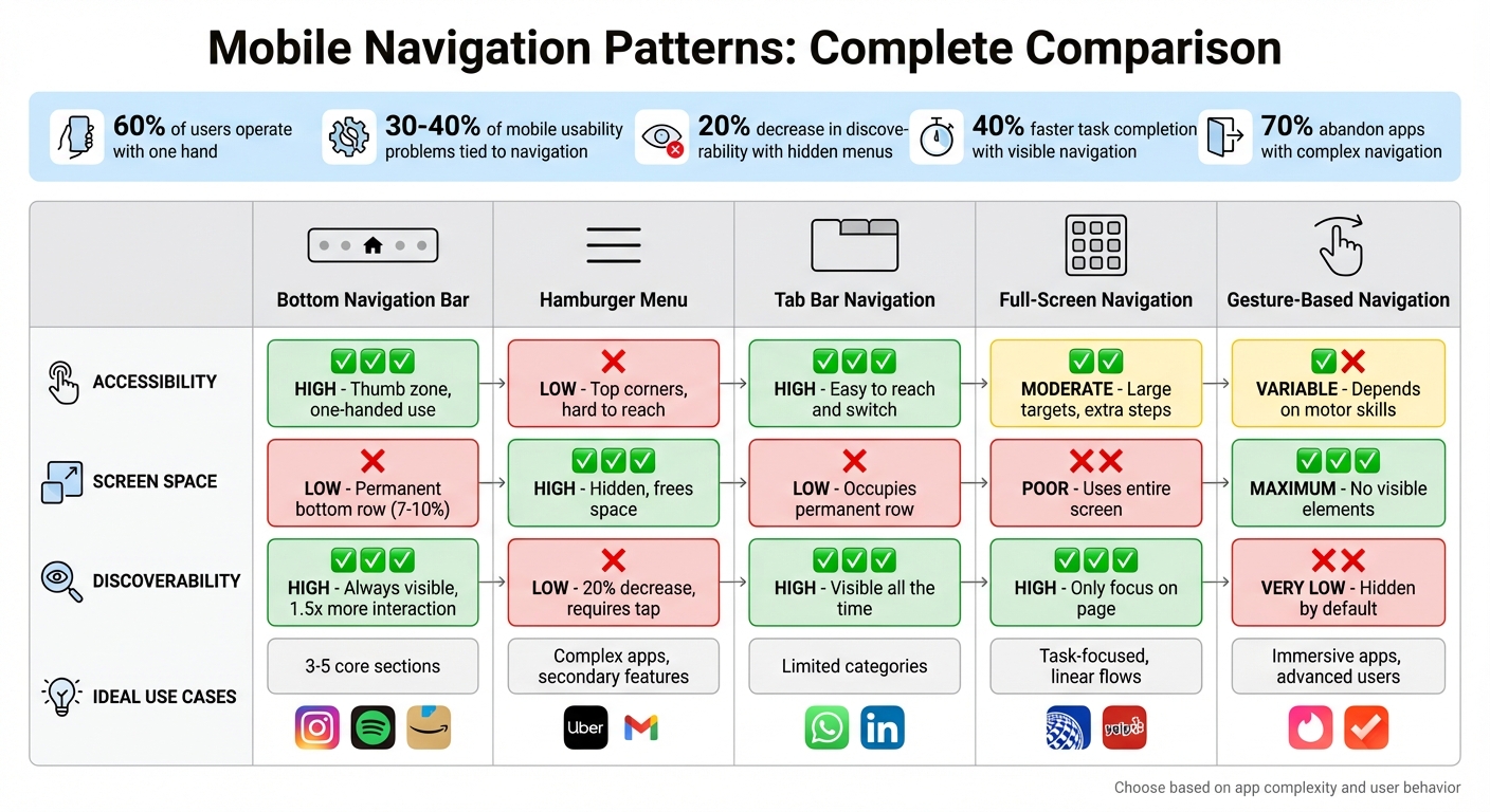
Mobile Navigation Patterns Comparison: Pros, Cons, and Best Use Cases
Every navigation pattern comes with its own set of trade-offs. Understanding these nuances can help you choose the best option for your app, ensuring users stay engaged rather than abandoning it out of frustration.
Here’s a comparison of five navigation patterns, evaluating them based on accessibility, screen space usage, discoverability, and ideal scenarios. This table summarizes how each performs against key usability factors discussed earlier.
| Navigation Pattern | Accessibility | Screen Space Utilization | Discoverability | Ideal Use Cases |
|---|---|---|---|---|
| Bottom Navigation Bar | High: Positioned in the thumb zone for easy one-handed use. | Low: Occupies a row at the bottom permanently. | High: Always shows primary destinations. | Apps with 3–5 core sections, e.g., Instagram and Spotify. |
| Hamburger Menu | Low: Often placed in hard-to-reach top corners. | High: Keeps options hidden, freeing up screen space. | Low: Requires a tap to reveal options. | Complex apps with many secondary features, e.g., Uber and Gmail. |
| Tab Bar Navigation | High: (When placed at the bottom) Easy to reach and switch. | Low: Occupies a row at the top or bottom. | High: Keeps main sections visible all the time. | Apps with clear, limited categories, e.g., WhatsApp and X. |
| Full-Screen Navigation | Moderate: Large targets but involves extra steps. | Poor: Uses the entire screen for navigation. | High: Displays options as the only focus on the page. | Task-focused apps with linear flows, e.g., United Airlines and Yelp. |
| Gesture-Based Navigation | Variable: Feels natural but depends on motor skills and memory. | Maximum: Eliminates all visible navigation elements. | Very Low: Navigation remains hidden by default. | Immersive apps or tools for advanced users, e.g., Tinder and Clear. |
The choice of navigation should align with your app's complexity and how users interact with it. For instance, bottom navigation bars and tab bars are excellent for discoverability and accessibility, particularly since 60% of users operate their devices with one hand. On the other hand, hamburger menus and gesture-based navigation free up screen space but risk frustrating users who can’t locate options within 10 to 15 seconds.
A smart approach might combine visible navigation for essential features with hidden menus for less frequently used options, striking a balance between usability and screen space efficiency.
Conclusion
Choose a mobile navigation pattern that fits your app's structure and matches how users interact with it.
The discussion above outlines the trade-offs between visibility, accessibility, and screen space. For apps with 3–5 key sections, bottom or tab bars are ideal, offering quick access and clear discoverability. Apps with deeper hierarchies might benefit from hamburger menus or hybrid designs, though hidden menus can sometimes lower engagement. For task-focused apps like banking or utilities, persistent and easily accessible navigation is crucial. Meanwhile, content-heavy platforms, such as news apps, may prioritize maximizing reading space over constant navigation visibility.
The key is understanding user intent - whether they’re browsing or completing specific tasks - and tailoring your design accordingly. You can even combine navigation patterns, but ensure the most important actions remain visible and easy to reach.
Don’t skip testing. Navigation issues account for 30–40% of mobile usability problems. Fixing these early can prevent expensive redesigns later. By aligning navigation with user behavior and testing with real users, you can fine-tune your app for better functionality and user satisfaction.
FAQs
How do I choose the best mobile navigation for my app?
When deciding on the best mobile navigation, think about how complex your app is and what your users need. For simpler apps, tab bars work well since they keep key options visible at all times. On the other hand, more complex apps might be better suited for hamburger menus or even full-screen navigation to manage a larger number of features.
Don’t forget about accessibility - design controls that are easy to reach and tap, especially for thumb use. And most importantly, test your navigation design with real users to make sure it feels natural and meets their expectations.
When should I use a hamburger menu instead of a bottom tab bar?
When your app includes numerous sections or features that don’t need to be front and center, a hamburger menu is a smart choice. It helps conserve screen space by tucking away less-used options, ensuring the main focus remains on the content.
On the other hand, a bottom tab bar works well for providing fast, consistent access to key areas of your app. However, it’s best suited for a limited number of options due to the space available.
How can I test if my mobile navigation is confusing users?
To determine if your mobile navigation is causing confusion, usability testing is a powerful tool. Watching how users interact with your navigation can reveal whether they can easily find and use its features. Additionally, gathering feedback through surveys and interviews provides valuable insights into their experience. Metrics like task completion times and bounce rates can also pinpoint areas where users might be struggling.
When navigation elements are hidden or difficult to locate, it can lead to frustration and a poor user experience. Testing allows you to uncover these issues and make improvements, ensuring your design feels intuitive and easy to use.