
Ultimate Guide to Mobile Form Optimization
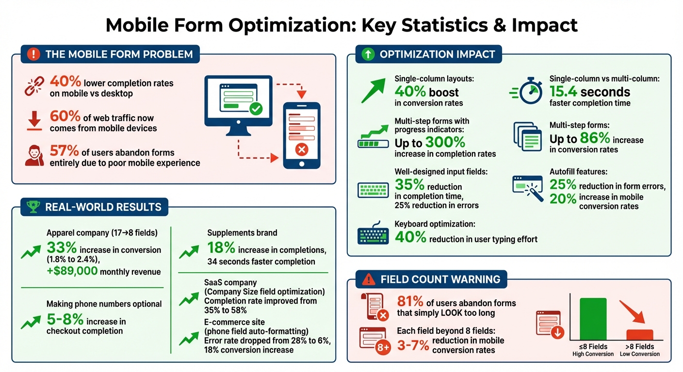
April 7, 2026Mobile forms are often a pain point for users, with 40% lower completion rates compared to desktop forms. If your forms aren’t easy to use on mobile devices, you’re likely losing leads. Here’s what you need to know:
- 60% of web traffic now comes from mobile, making mobile-first design essential.
- Poor mobile forms lead to 57% of users abandoning forms entirely.
- Simple changes like single-column layouts, autofill, and touch-friendly buttons can boost conversion rates by 40%.
- Splitting long forms into multi-steps and using progress indicators can increase completion rates by up to 300%.
The key is to reduce friction: optimize input fields, use smart validation, and leverage device features like autofill and native pickers. Track metrics like completion rates, abandonment rates, and error rates to identify issues and improve performance. Even small tweaks - like reducing unnecessary fields - can lead to big gains, like a 33% increase in conversion rates for one retailer.
In short, making your mobile forms easier and faster to complete can directly impact your bottom line. Let’s dive into the strategies that make this happen.
Mobile Form Optimization Statistics and Impact
Mobile Forms: A Way To Keep More Customers Engaged
sbb-itb-cef5bf6
Design Principles for Mobile Forms
Creating effective mobile forms goes beyond making them visually appealing. These designs address usability challenges that often lead to users abandoning forms.
Single-Column Layouts
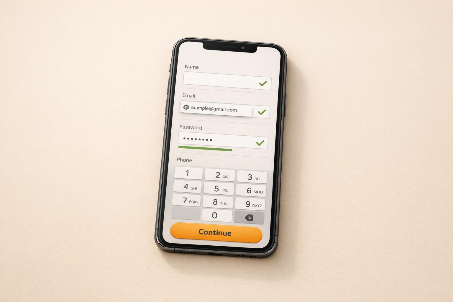
A vertical, single-column layout is the go-to choice for mobile forms. Why? It eliminates horizontal scrolling and creates a straightforward path for users to follow. By stacking fields vertically, users can simply scroll down to complete the form, reducing cognitive load and effort. Plus, using the full screen width ensures touch targets are large enough for easy interaction. Even fields like "First Name" and "Last Name", which are often side-by-side on desktop, should be stacked vertically on mobile. This layout not only prevents cramped interfaces but also allows autocorrect features to work more effectively.
Research backs this up: single-column layouts can speed up form completion by an average of 15.4 seconds compared to multi-column designs.
"The single most important layout decision you'll make is adopting a vertical, single-column structure." – Orbit AI
Positioning labels above input fields is another smart move. It keeps labels visible when the keyboard pops up and maintains a clean, logical flow. To make lengthy forms less daunting, consider breaking them into smaller, manageable steps.
Multi-Step Forms
Long forms can feel overwhelming, especially on mobile devices. Splitting them into steps with six or fewer fields per step helps users stay engaged and reduces fatigue. This approach also makes better use of limited screen space and recognizes that mobile users are often multitasking. Multi-step forms have been shown to increase conversion rates by up to 86%.
Including progress indicators, like a bar or step counter (e.g., "Step 2 of 4"), can further motivate users by showing how far they've come and how much is left.
"You wouldn't bombard a friend with 20 questions all at once - don't do it with your form or survey either." – Sheena Fronk, Typeform
Touch-Friendly Buttons and Elements
Mobile users navigate with their thumbs, not a precise cursor, so interactive elements need to be easy to tap. Buttons and touch targets should measure at least 44×44 pixels (Apple/WCAG guidelines) or 48×48 pixels (Google/Material Design). Smaller elements risk causing "fat-finger" errors, leading to frustration and reduced conversions.
| Element | Recommended Size | Spacing |
|---|---|---|
| Touch Targets | 44×44 to 48×48 pixels | 8–10 pixels between elements |
| Primary Buttons | Full width or bottom third placement | N/A |
| Checkboxes/Radio Buttons | Entire label clickable | 8–10 pixels minimum |
Spacing between elements is just as important as their size. Keep at least 8–10 pixels of space to avoid accidental taps. For checkboxes and radio buttons, making the entire label clickable increases the effective touch target.
Lastly, place primary call-to-action buttons in the bottom third of the screen, where thumbs naturally rest during one-handed use. To test usability, try completing the form one-handed while standing. If reaching buttons feels awkward, it's time for a redesign. These small adjustments can make a big difference in ensuring your forms are easy to use and accessible.
Input Field Best Practices
A well-designed input field can make a huge difference - it can cut form completion times by up to 35% and reduce errors by 25%. The secret lies in using HTML5 input types and tapping into native mobile features to make the process smoother for users.
Using the Right HTML Input Types
Choosing the correct input types can streamline user interactions, especially on mobile devices. For instance:
type="email"brings up a keyboard with easy access to "@" and "." keys, making email entry faster.type="tel"displays a large numeric keypad, reducing the likelihood of errors when entering phone numbers.type="url"provides shortcuts like "/", ".", and ".com", which are perfect for entering website addresses.
"The user with a specific 'tel' input type has a much easier time filling in the field than the user with a 'text' input type." – Adam Winsland, Head of Customer Success, Zuko Analytics
For numeric inputs like prices or ZIP codes, using type="text" with inputmode="decimal" is better than type="number". This avoids desktop increment arrows and ensures a clean numeric keypad on iOS. Similarly, native date pickers triggered by type="date" are more user-friendly than custom JavaScript calendars. Also, setting the input font size to at least 16px prevents iOS from zooming in unnecessarily when users tap on a field.
These optimizations, combined with native browser and device autofill features, can make forms much easier to use.
Autofill and Native Mobile Features
The autocomplete attribute is a game-changer for mobile forms. It allows browsers to auto-fill stored information like names, addresses, and credit card details. With over 50 supported values, including one-time-code for SMS verification, autofill can reduce form errors by 25% and increase mobile conversion rates by 20%.
"Even more important than showing the correct mobile keyboard is showing helpful autocomplete suggestions." – Alex Holachek, UI Engineer
Take advantage of device capabilities to further simplify the process. For example, let users scan IDs with their phone cameras, use GPS for location data, or rely on biometrics like FaceID or TouchID for password-free logins. Additionally, the enterkeyhint attribute can customize the keyboard's Enter key label to match the form's context, improving usability.
Alternatives to Dropdowns and Complex Selectors
Simplifying option selection can significantly reduce user frustration. Dropdown menus, while common, often hide options and require multiple taps and scrolling. Instead, consider these alternatives:
- Radio buttons: Ideal for fewer than five options, as they display all choices at once and allow single-tap selection.
- Searchable input fields: For longer lists, such as countries or job titles, a searchable field that filters options as the user types is much faster than scrolling.
<datalist>element: This combines the benefits of a text input and dropdown menu. On iOS, it shows suggestions above the keyboard, while on Android, it provides a scrollable dropdown.- Checkboxes: For multiple selections, checkboxes are easier to use than multi-select dropdowns.
Reducing Friction and Errors
To improve mobile form performance, reducing friction and errors is key. Mobile users tend to have far less patience than desktop users - they’re one-third as tolerant, to be exact - and face five times more friction per field. This lack of patience is evident in the numbers: 57% of users abandon forms entirely when the experience is subpar.
Inline Validation and Clear Error Messages
One effective way to reduce errors is through inline validation. By validating fields as users exit them, you can address mistakes immediately, while the context is still fresh. This eliminates the frustration of combing through a long form after a failed submission.
Error messages should be clear and actionable. Instead of vague phrases like "Invalid input", provide specific feedback, such as "Phone number must be 10 digits" or "Email must include an @ symbol." Place these messages directly below the field in a high-contrast color to ensure they’re noticeable, even on smaller screens.
Additionally, save all entered data to avoid forcing users to re-enter information - a major frustration point. Positive reinforcement, like green checkmarks for correctly completed fields, can also help. These small wins build confidence and keep users motivated to finish the form.
Field Focus and Progress Indicators
Highlighting the active input field with distinct border colors or shadows helps users stay oriented, especially on mobile devices where screen space is limited. This visual cue ensures users know exactly where they are in the form, reducing confusion.
Another way to minimize friction is by carefully evaluating the necessity of each field.
Asking Only for Required Information
Every field you include adds potential friction. Research shows that adding more than eight fields can reduce mobile conversion rates by 3-7% for each additional field. Even worse, 81% of users will abandon a form if it simply looks too long, regardless of its actual complexity.
To combat this, apply the "need vs. nice-to-have" test to every field. If the data isn’t essential to achieving your goal, leave it out. For example, an apparel company cut its checkout fields from 17 to 8 in 2026, boosting mobile conversion rates from 1.8% to 2.4%. That 33% increase translated to an extra $89,000 in monthly revenue. Similarly, a supplements brand earning $800,000 per month saw an 18% uptick in form completions and shaved 34 seconds off the average completion time by reducing fields and adding inline validation.
Consider making phone numbers optional unless they’re absolutely necessary for delivery coordination. This small adjustment alone can increase checkout completion rates by 5-8%. For non-essential details, like marketing preferences or account passwords, collect them later - on the confirmation page instead of during the initial form process.
Advanced Optimization Techniques
Once you've nailed the basics of mobile form design, it's time to take things up a notch. These advanced techniques tap into device capabilities to reduce friction and improve performance.
Keyboard Optimization Strategies
Fine-tuning the virtual keyboard can make a world of difference when it comes to form completion. By using the correct HTML5 type attributes - like email, tel, or url - you can trigger keyboards tailored for specific inputs. For example, setting type="email" brings up a keyboard with quick access to the @ symbol and .com shortcuts, saving users from switching between character sets.
Want even more control? Use the inputmode attribute to refine the keyboard layout further. To avoid iOS zooming, ensure input fields have a minimum font size of 16px. For name fields, enable autocapitalize="words", but turn it off for email and URL fields to prevent the system from "correcting" valid entries into something invalid. These small tweaks can cut down user typing effort by 40% or more. Plus, enabling autofill functionality can increase mobile conversion rates by 20%.
For SMS verification fields, take advantage of autocomplete="one-time-code". This feature allows the operating system to pull the verification code directly from the user's messages, eliminating the need for manual entry.
Keyboard optimization doesn’t stop there. Password entry is another area where thoughtful adjustments can make a big impact.
Password Field Handling
Password fields are often a pain point for mobile users. Adding a visibility toggle - usually represented by an eye icon - can help users confirm their input, reducing login errors and abandoned forms. To make this feature thumb-friendly, ensure the toggle button is at least 48x48 pixels. For returning users, consider integrating biometric options like Face ID or Touch ID to bypass manual password entry altogether.
Another helpful addition is displaying password requirements upfront. A real-time checklist (e.g., "8+ characters", "1 number") that updates as users type provides clear guidance and minimizes frustration. Also, keep paste functionality enabled so users can rely on password managers. This is crucial for handling complex, unique passwords.
Using Device Features
Modern mobile devices come packed with tools that can simplify data entry and streamline the form experience. For instance, camera and document scanning can use OCR technology to pull data directly from physical IDs, passports, or driver's licenses. This is especially handy for forms that require identity verification, like those in finance or travel.
Another game-changer is geolocation, which can auto-fill fields like country, state, or city based on GPS data. Pair this with the Google Places API to make entering an address as easy as a few taps. For long-form text areas, voice-to-text technology allows users to dictate their input, avoiding the hassle of typing on a small screen.
"Cameras, biometrics, voice tools and geolocalisation are all features of mobile devices that can be leveraged to recreate the form journey and in many respects, make mobiles preferable to desktop devices for certain types of forms." - Adam Winsland, Head of Customer Success, Zuko Analytics
When it comes to date and time inputs, always stick with native pickers by using the appropriate HTML input types (e.g., type="date"). These built-in tools are designed for thumb-friendly interaction and are far more intuitive than custom dropdowns or sliders. For multi-step forms, consider using localStorage or sessionStorage to save progress locally. This way, if a user gets interrupted or loses their connection, they won’t lose their data.
Measuring and Improving Form Performance
"You can't improve what you don't measure." – Michael T, Product Designer, GetWorkForm
To make your mobile forms more effective, you need to track the right metrics. Studies show that analyzing form performance can increase conversion rates by 35% and is ten times more effective than relying on guesswork. These insights are essential for pinpointing issues and optimizing performance.
Key Metrics for Mobile Forms
Start with the completion rate, which is calculated as:
(Completed Submissions / Total Form Starts) × 100.
This metric is your primary indicator of success. For simple forms with 2–5 fields, aim for a 70–90% completion rate. More complex forms with 13+ fields typically fall between 30–50%. Falling short of these benchmarks signals room for improvement.
The abandonment rate highlights how many users start your form but don’t finish it. By tracking this at the individual field level, you can identify where users drop off. Any field with an abandonment rate above 20% needs immediate attention.
Another key metric is average completion time, which can reveal whether your form is too complicated or unclear. For instance, if users take 45 seconds to fill in a single field (like a phone number), it’s often due to confusing formatting instructions.
Keep an eye on the error rate (percentage of fields triggering validation errors) and the field refocus rate (how often users go back to edit completed fields). Rates above 15% and 20%, respectively, suggest usability issues. Lastly, monitor your start rate:
(Form Starts / Form Views) × 100.
If fewer than 40% of viewers begin filling out the form, it might appear too daunting or unappealing.
Tools for Analyzing Completion Rates
To dig into these metrics, leverage tools that provide detailed insights into user behavior. Start with Google Analytics 4, which tracks events like form_start, form_abandon, and form_submit. You can also set up custom events, such as field_focus, field_blur, and validation_error, to identify problem areas.
For visual feedback, platforms like Hotjar, Crazy Egg, FullStory, and Microsoft Clarity offer heatmaps and session recordings. These tools can show where users mis-tap, which fields cause hesitation, or how interface elements like keyboards obstruct the form.
Google PageSpeed Insights is another valuable tool, helping ensure your form loads and becomes interactive in under three seconds on a 3G connection. Speed is critical for preventing user drop-off.
Don’t rely solely on emulators for testing. Use platforms like BrowserStack or Sauce Labs to test your forms on actual iOS and Android devices. Real hardware testing uncovers issues like touch accuracy, orientation shifts, and keyboard behavior that simulators can miss. Additionally, tools like Chrome DevTools allow you to throttle network speeds to 3G, letting you see how your form performs in real-world conditions.
A/B Testing Mobile Form Variations
Once you’ve identified problem areas through metrics, A/B testing can help you determine what changes improve performance. Start with a baseline of 100–200 submissions to ensure your tests are reliable. Test one variable at a time - like button color, field order, or the layout (multi-step vs. single-page) - so you can clearly see what’s driving the results.
Focus on areas with high friction. For example, fields with abandonment rates over 20% or error rates above 15% are ideal candidates for testing. Run your tests for at least a full week to account for variations in user behavior throughout the week. Aim for at least 100 conversions per variant before drawing conclusions.
Here’s a real-world example: In November 2025, a SaaS company found a 65% abandonment rate on their "Company Size" field. By A/B testing its placement (moving it to the end) and making it optional, they boosted their completion rate from 35% to 58%. Similarly, an e-commerce site noticed a 28% error rate on mobile phone fields compared to just 8% on desktop. After adding auto-formatting and using inputmode="tel", the mobile error rate dropped to 6%, and conversions increased by 18%.
Always segment your A/B test results by device type. What works on mobile may not have the same effect on desktop, and vice versa. Lastly, track which traffic sources yield the best results. For instance, direct traffic often converts at 65%, while paid ads typically convert at around 25%.
Conclusion
Optimizing mobile forms isn’t something you do once and forget - it’s a continuous process of testing and improving. With mobile traffic now making up over 60% of all web browsing, well-optimized forms can have a direct impact on your bottom line. The difference in conversion rates between desktop and mobile highlights just how much revenue is slipping through the cracks.
By focusing on clean design and real-time validation, you can transform your forms into powerful tools for capturing leads. These strategies not only help convert more visitors but also reduce the chances of users abandoning the process midway. As mobile technology advances, these principles provide a solid foundation for future adjustments.
That said, the work doesn’t stop there. Mobile platforms are always changing, and an update to iOS or Android can disrupt what’s currently working. Regular testing on actual devices - not just emulators - is critical, as emulators can’t fully replicate how users interact with touchscreens and mobile keyboards. Tools like analytics and session recordings can also reveal where users encounter issues, giving you actionable insights.
To get started, evaluate your current performance. Measure your form completion rates and implement one change at a time to track its impact. The strategies outlined here align with the mobile-first philosophy embraced at SEO Werkz, where we’ve seen consistent improvements by prioritizing mobile usability. Interestingly, forms designed with mobile in mind often end up performing better across all platforms. Every unnecessary field you remove, every keyboard interaction you simplify, and every obstacle you eliminate adds up to meaningful improvements. Long-term success depends on constant testing and refining to keep your forms performing at their best.
FAQs
Which 3 mobile form changes will increase conversions fastest?
Improving mobile form conversions doesn’t have to be complicated. Here are three quick adjustments that can make a big impact:
- Make touch targets larger: Ensure buttons and interactive elements are at least 44×44 pixels. This helps users tap accurately and reduces frustrating errors.
- Stick to a single-column layout: Avoid horizontal scrolling by designing forms in a single column. This keeps things clean and easy to read.
- Set the right input types: Use input fields like email, number, or tel to automatically bring up the correct keyboard. This makes filling out forms faster and more convenient.
These small tweaks can significantly improve the user experience and lead to better conversion rates.
How can I identify which form fields cause drop-offs on mobile?
To figure out which form fields are causing users to drop off, start by analyzing their behavior. Tools like heatmaps or session recordings can help you spot where users abandon the form or struggle to complete certain fields. Pay attention to incomplete or error-prone areas.
Another helpful tactic is to test fields individually. Pair this with inline validation, which provides real-time feedback to users, reducing frustration and helping them correct mistakes as they go.
By combining analytics, user testing, and real-time validation, you can take a well-rounded approach to identify and fix problem areas in your forms.
When should I use a multi-step form instead of a single page?
When you're dealing with complex data collection, mobile-heavy traffic, or trying to make the process feel easier for users, a multi-step form can be a game-changer. By splitting the form into smaller, manageable sections, you help users stay focused, reduce mental effort, and cut down on the chances they'll abandon the process - this is especially important on mobile devices.
For simpler tasks with just a few fields, a single-page form might do the trick. But when the process is longer or more detailed, multi-step forms are often the better choice.