Ultimate Guide to CTA Placement for Landing Pages
July 16, 2026CTA placement can change conversions by double digits. In plain English: put your main button where people are most ready to click, not where you assume it should go.
Here’s the short answer:
- Put a main CTA in the first screen for simple offers like free trials, quote requests, or appointment booking.
- Put repeat CTAs after proof like testimonials, pricing, or results when people need more info first.
- Use mid-page and bottom CTAs on long pages so readers don’t have to scroll back up.
- On mobile, make buttons easy to tap and test a sticky CTA near the bottom of the screen.
- Check A/B tests, scroll depth, heatmaps, and click data to see what spot gets more conversions.
A few numbers stand out:
- Above-the-fold CTAs can get up to 44% more clicks for simple offers.
- Lower CTA placement can beat early placement by 30% to 35% for high-commitment offers.
- CTAs placed after proof can improve conversions by 25% to 68%.
- Sticky CTAs on long mobile pages can lift conversions by about 17%.
Here’s the core idea: there is no one best CTA spot for every landing page. The right placement depends on offer type, page length, user intent, and device. If I had to boil the whole article down to one line, it would be this: show the CTA at the moment a visitor has enough trust to act.
7 Call to Action CTA Best Practices for Guaranteed Landing Page Conversions
sbb-itb-cef5bf6
Core CTA Placement Rules for Landing Pages
CTA placement follows a few steady rules. It’s not about finding one magic spot that works on every page. The job is simpler than that: put one clear CTA where visitors feel most ready to act.
These rules give you the starting point for where that CTA should sit.
Above the Fold, Below the Fold, and First-Screen Visibility
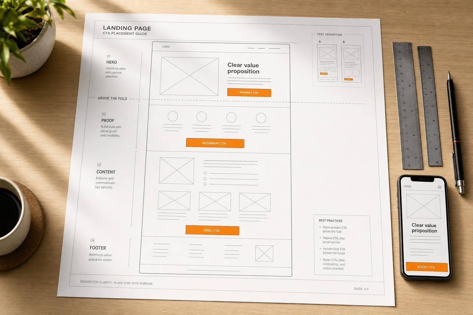
Above the fold means the first screen people see before they scroll. On desktop, that usually includes the hero, headline, subheadline, and one primary CTA. On mobile, space gets tight fast, so the CTA needs to stay easy to see and easy to tap.
For simple, low-friction offers like free trials, newsletter signups, and basic quote requests, above-the-fold CTAs can get up to 44% higher clickthrough rates.
But that doesn’t mean higher is always better.
For complex or high-commitment offers - consulting engagements, enterprise software, or multi-step financial services - putting the CTA lower on the page can beat early placement by about 30–35%. People need a bit more context before they’re ready to commit.
The practical rule is straightforward: match first-screen CTA placement to the complexity of the offer and the visitor’s intent. After that, visual flow helps you choose the exact spot.
Eye Flow, Whitespace, and Visual Direction
Most people scan pages in patterns. On text-heavy layouts, that usually looks like an F-pattern. On cleaner, more visual layouts, it often looks like a Z-pattern.
That matters because CTAs work best when they sit along the natural scan path.
On a Z-pattern layout, the primary CTA often performs best at the bottom-right of the hero section, where the eye tends to finish the Z. On F-pattern pages, placing the CTA right under the headline or lining it up with the left column keeps it in the path people already follow.
Whitespace helps too. So does contrast. If the button color doesn’t show up elsewhere on the page, the CTA feels like the clear next step instead of just another element fighting for attention.
Directional cues can help nudge attention in the right direction as well. Arrows, or even images of people looking toward the button, can pull the eye from the headline and benefit points straight to the CTA.
On mobile, the same idea still applies - but now you also have to think about thumb reach and tap comfort.
Mobile Reach, Tap Targets, and Sticky Access
On smartphones, CTA placement isn’t just a visual choice. It’s a physical one.
Most people hold their phone near the bottom and use their thumb to tap, which makes the lower half of the screen the most comfortable area for a primary action. A CTA stuck near the top is simply harder to reach. And if tapping it takes extra effort, many users won’t bother.
Size matters too. Mobile UX guidelines recommend interactive targets be at least about 44 pixels on their smaller side, with enough space between nearby elements to cut down on missed taps and frustration.
For long-form mobile pages, sticky CTAs are often the fix. A bar that stays pinned near the bottom of the viewport keeps the main action in view no matter how far someone scrolls. On long-form pages, sticky CTAs can lift conversions by about 17%.
A few details make a big difference here:
- Keep the sticky bar above system gesture areas and away from the very bottom edge.
- Use direct labels like "Get a Free Quote" or "Schedule a Call."
Once these rules are in place, the next step is matching CTA placement to each part of the page.
Best CTA Locations by Page Section
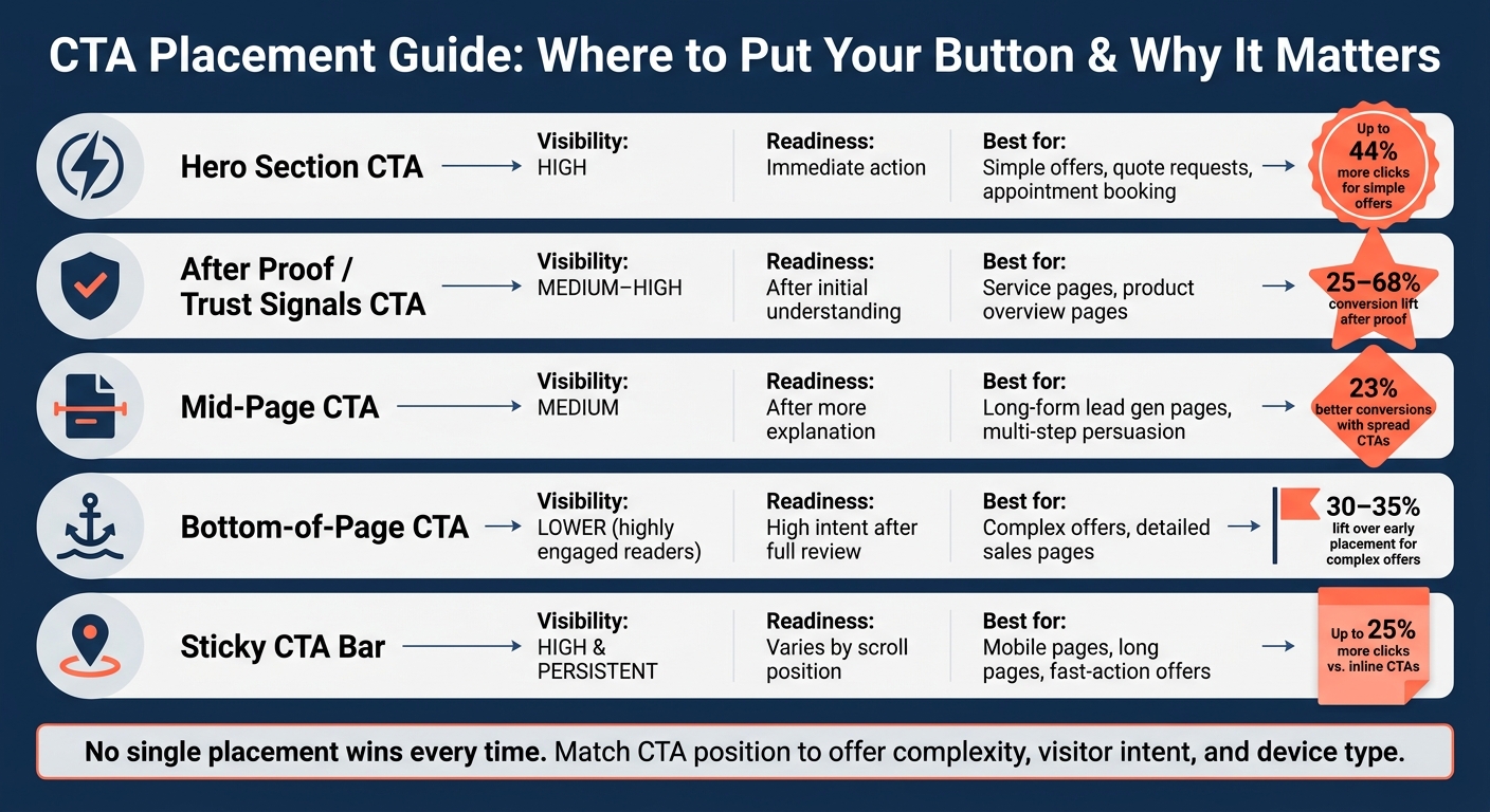
CTA Placement Guide: Where to Put Your Button & Why It Matters
Where you place a CTA changes how often people act on it. The right spot depends on page length, how much explaining the offer needs, and how ready the visitor is. The basic rule is simple: show the CTA when the visitor has seen enough proof to feel comfortable taking the next step.
Here’s a quick map of where each placement tends to work best:
| CTA Location | Visibility | Readiness | Best-Fit Use Cases |
|---|---|---|---|
| Hero section | High | Immediate action | Simple offers, quote requests, appointment booking |
| After proof | Medium to high | After initial understanding | Service pages, product overview pages |
| Mid-page section | Medium | After more explanation | Long-form lead generation pages, multi-step persuasion |
| Bottom-of-page section | Lower for highly engaged readers | High intent after full review | Complex offers, detailed sales pages |
| Sticky CTA | High and persistent | Varies by scroll position | Mobile pages, long pages, fast-action offers |
Pages that place CTAs at the top, mid-page, and bottom often beat pages that rely on just one CTA. Research shows that long-form pages with complex offers convert 23% better when CTAs are spread across the page instead of packed above the fold.
Hero Section CTA for Immediate Action
Use one main CTA beside or just below the headline when the offer is simple and the visitor is likely ready to act right away. This works best for high-intent actions like quote requests, appointment booking, or other low-friction offers.
Keep the hero focused. One primary CTA, backed by a short trust cue like "Trusted by 5,000+ U.S. businesses" or "Free estimate, no credit card required," gives people enough confidence to move without dumping too much on them at once. If you need a second option, make it a plain text link instead of another button. Two buttons in the hero can split attention fast. If the offer needs more context, move the CTA farther down the page.
CTAs After Benefits, Proof, and Major Content Blocks
After someone reads your benefits, sees a testimonial, or checks a pricing summary, they usually feel more sure about what you offer. That’s the moment to ask again. Placing a CTA right after trust signals can increase conversions by 25–68%.
The copy should match the proof they just saw. Generic text like "Submit" feels flat. A line like "See Similar Results - Request Your Marketing Audit" or "Get My Custom SEO Plan" feels more connected to the page. It lowers friction because the next step makes sense in context. It doesn’t feel like a jump; it feels like the next move.
Mid-Page, Bottom-Page, and Sticky CTAs on Long-Form Pages
On long pages, interested visitors will keep scrolling. But they shouldn’t have to climb back to the top when they’re ready. A mid-page CTA, placed after a meaty section like a problem/solution breakdown, feature set, or short case study, gives ready readers a clear point to act.
Bottom-of-page CTAs serve a different type of visitor. These are the people who read everything first, then decide. This spot works well when the page has to earn trust before asking for action. It tends to convert less often, but the intent is higher. A short recap above the button helps connect the dots, like "You've seen how our SEO campaigns improve rankings and ROI. Ready to get your custom strategy?" Then follow it with a direct label such as "Request Your Custom SEO Proposal" or "Schedule a 30-Minute Strategy Call."
Sticky CTA bars keep the main action in view across long pages and can earn 25% more clicks than inline CTAs in similar tests. On mobile, this can matter even more, since people scroll fast and don’t always stop at the exact spot you want. These placements give you a solid starting point for testing scroll depth, clicks, and conversion lift.
How to Test and Optimize CTA Placement
Once you spot a few likely CTA positions, the next step is simple: test them with real user data. Guesswork won't cut it here. A CTA can look perfect in a mockup and still underperform once actual visitors hit the page.
Here are the main ways to check what’s working:
| Method | What it measures | Key metrics informed |
|---|---|---|
| A/B testing | Performance differences between placement variants | Conversion rate, form submissions, revenue per visitor |
| Scroll-depth analysis | How far users scroll before leaving | Section reach, CTA exposure rate |
| Heatmaps | Visual attention and interaction patterns | Hover behavior, attention concentration, ignored areas |
| Click tracking | Actual CTA and page-element clicks | Click-through rate, button engagement, competing click paths |
A/B Testing Different CTA Positions
A/B testing is the most direct way to see whether a placement change actually improves results. The idea is straightforward: test top-of-page, after-proof, and sticky placements against each other while keeping everything else the same.
That matters because even a small shift in position can change how people act. Testing CTA buttons alone can boost conversion rates by about 14.8%. In one landing page test, moving the hero CTA above the fold increased purchase revenue per visitor from €3.14 to €3.61 - a 14.6% increase - while checkout starts per visitor went up 23.8%.
Those numbers make the point pretty clearly: placement works best when it's based on data, not personal taste.
Using Scroll Depth, Heatmaps, and Click Data
Before you move anything, figure out why the CTA is underperforming. Is the issue visibility? Attention? Too many other things to click?
Scroll-depth analysis is usually the fastest place to start. If your analytics show that only 35–40% of visitors reach the section where your main CTA appears, then low conversions point to a visibility issue before they point to a messaging issue. In that case, moving the CTA higher on the page - or repeating it sooner - should be the first move.
Heatmaps add context. They show where users focus and where they don't. If the CTA sits in a low-attention area while people hover around a pricing table or testimonial block nearby, that’s a strong sign the button belongs closer to the part of the page getting more engagement. Sites that use heatmap data to reposition CTAs into high-attention zones report 25–40% conversion-rate gains.
Click tracking fills in the last gap. It shows whether users are clicking the main CTA or drifting toward other page elements like nav links, secondary buttons, or other distractions. If a big share of clicks goes anywhere but the main action, trimming those competing paths can help win back lost conversions.
When Lower CTA Placement Can Outperform Early Placement
The first CTA on the page doesn’t always win. For more involved offers - like B2B services, healthcare, and financial services - people often need time to read, compare options, and build trust before they act.
That changes where the best CTA may belong. If deeper sections get more engagement, test a lower CTA there instead of pushing an early ask. A "Talk to Sales" or "Schedule a Strategy Call" CTA placed after a case study, ROI breakdown, or detailed benefits section can reach a more informed visitor with stronger intent.
In cases like that, scroll data and heatmaps can point you to the section where attention is highest. From there, test that lower-placement version against the current layout and see which one pulls more action.
Building a CTA Placement Strategy That Supports ROI
CTA placement works best when you treat it like a system, not a design choice. It should line up with the offer, what the visitor wants, and the main conversion goal. Once you test a few placement options and find what wins, turn those patterns into a framework you can reuse.
Matching CTA Placement to Offer Type and Traffic Intent
Simple lead offers usually need one CTA near the top and one repeat later on. More complex pages need CTAs at each big decision point.
| Scenario | Recommended CTA placement pattern |
|---|---|
| Simple lead offer | Hero CTA; repeat once near the bottom. |
| Complex service page | Hero CTA; repeat after benefits, proof, and pricing. |
| Long-form sales page | Hero, mid-page, bottom, and sticky mobile CTA. |
Use this table as your starting map. Then adjust it based on traffic intent.
Warm traffic often acts sooner. They may not need much convincing. Cold traffic is different. In most cases, they need proof before you ask for the click.
That means placement should match offer complexity and visitor intent, not just the page layout. A clean design helps, sure. But if the CTA shows up before the visitor is ready, it can fall flat.
Key Takeaways for Better Landing Page Performance
Pages with CTAs at the top and bottom often beat pages with only one CTA. The reason is pretty simple: people shouldn't have to scroll all the way back up after reading the benefits, proof, or pricing.
Repeat the primary CTA at natural decision points. That keeps the path easy and cuts friction.
On mobile, placement also needs to fit thumb reach and scroll habits. Use large tap targets, and give high-intent actions sticky access so the CTA stays close at hand.
Treat CTA placement as something you test and refine over time. Use behavior data to pick the winning pattern. Let scroll depth, heatmaps, and click data show you what should become the default.
FAQs
How many CTAs should a landing page have?
There’s no one-size-fits-all number of CTAs for a landing page. You want enough to give visitors a clear next step - like signing up or making a purchase - without turning the page into a wall of buttons.
Repeating CTAs can work well because people read pages in different ways. Some scroll fast. Some pause and skim. Some need a little more context before they click. Putting the same CTA in a few smart spots can help you meet those different habits.
That said, more isn’t always better. Too many CTAs can muddy the message and leave visitors unsure about what to do next. SEO Werkz recommends using data-driven methods, like A/B testing, to figure out the right number and placement for your audience and goals.
Should desktop and mobile CTA placement be different?
Yes. CTA placement should change between desktop and mobile because people use each device in different ways, and the screen space isn't the same.
On mobile, put CTAs above the fold so people can spot them fast. Leave enough white space around each one too. That helps prevent accidental taps, which can get annoying in a hurry.
On desktop, you have more room to work with. That gives you options like placing CTAs in a sidebar or below the final paragraph. Even then, the goal stays the same: keep them clear, easy to reach, and never so heavy-handed that they crowd the reader.
How long should I run a CTA placement test?
Run a CTA placement test on a recurring cycle of one to two months. SEO Werkz suggests a monthly or every-other-month rhythm as part of a steady CRO roadmap.
As the test runs, track performance metrics and combine the numbers with qualitative insights to see why users act the way they do. Once you have a winner, roll it out and move straight into the next test.