Progressive Web Apps (PWAs) are transforming mobile-first SEO. With mobile devices driving 60% of global web traffic and Google prioritizing mobile-first indexing, PWAs offer a solution for faster load times, better user experiences, and improved search rankings.
Here’s why PWAs matter for SEO:
PWAs align with Google’s Core Web Vitals and mobile-first priorities, making them a smart choice for businesses looking to improve SEO and user engagement.
Speed plays a key role in mobile SEO rankings, directly affecting your site's visibility in search results. Progressive Web Apps (PWAs) address this issue with technologies that leave traditional mobile websites feeling slow in comparison.
Service workers act as a programmable middleman between the browser and the internet, intercepting all requests your site makes. On a user's first visit, the service worker caches essential assets like HTML, CSS, and JavaScript. For return visits, these files load instantly from the device's local storage, bypassing slow network connections.
"A service worker intercepts all network requests, enabling offline functionality, background sync, and push notifications. Without a properly registered and updated service worker, you have a web app, not a PWA." - Digital Applied
This setup allows static elements of the user interface to load in under 0.5 seconds on repeat visits. Meanwhile, updated content is fetched in the background, giving users the impression of near-instant loading - even on unreliable 3G networks.
Different caching strategies fine-tune performance:
Google's Workbox library simplifies these strategies, so you don’t have to manually code complex caching logic.
Google makes it clear: "Website speed is one of the signals used by Google's algorithm to rank pages". With mobile-first indexing as the standard, your site's mobile load time is now a critical factor in search rankings.
The business impact of speed is undeniable. A mere 0.1-second improvement in mobile site speed can boost retail conversions by 8.4% and increase average order value by 9.2%. Conversely, a one-second delay can slash conversions by 20%. These user behaviors - lower bounce rates and longer session durations - signal higher quality to search engines, which reward faster sites with better rankings.
The results speak for themselves. Twitter Lite, a PWA, saw a 65% increase in pages per session and a 20% drop in bounce rate. These changes not only enhanced user experience but also strengthened organic search performance.
PWAs go beyond caching to deliver even faster performance and stronger SEO outcomes. For example, pre-caching assets during service worker installation ensures critical resources are ready before users need them. IndexedDB stores large datasets locally, cutting down on redundant API calls.
On average, PWAs achieve 2-3x faster repeat load times than native apps. They can also reduce mobile page load times by over 40%. Optimized PWAs often achieve a Largest Contentful Paint (LCP) of under 0.5 seconds on return visits - well below Google's 2.5-second benchmark for "good" performance.
The size of the app also matters. For instance, Twitter’s PWA is just 600 KB, compared to its 23.5 MB Android app. This lightweight design means faster downloads, lower data usage, and quicker time-to-interactive - all of which improve Core Web Vitals scores and, in turn, search rankings.
To fully leverage these advantages:
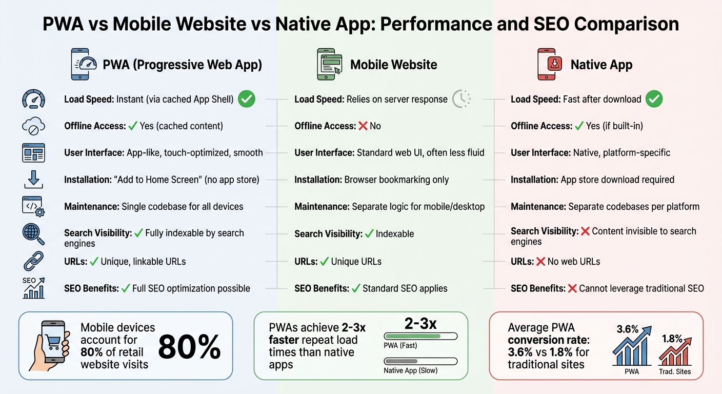
PWA vs Mobile Website vs Native App: Performance and SEO Comparison
Mobile devices now account for nearly 80% of retail website visits. PWAs (Progressive Web Apps) cater to this trend by offering a single, responsive codebase that adjusts seamlessly to any screen size - whether it’s a smartphone, tablet, or desktop. But this isn’t just about making content fit smaller screens; it’s also about aligning with Google’s mobile-first indexing requirements.
PWAs are built using HTML, CSS, and JavaScript, which naturally support responsive design. Additionally, the App Shell Architecture separates your site’s core UI elements - like headers, navigation, and layout - from its dynamic content. This ensures that the core framework loads instantly on any device. The HTML5 History API further enhances SEO by maintaining clean, unique URLs for each page, making it easier for search engines to crawl and index content independently. Tools like Google’s Lighthouse can verify your PWA’s mobile-friendliness, ensuring it meets modern standards.
This responsive approach gives PWAs a clear edge over traditional mobile websites.
One of the biggest distinctions between PWAs and traditional mobile websites lies in their architecture and performance. Traditional sites often use a monolithic structure where the front end and back end are tightly linked, which can slow down rendering. PWAs, on the other hand, typically use a headless architecture. By decoupling the front end and back end, they enable faster rendering through APIs.
| Feature | PWA | Mobile Website |
|---|---|---|
| Load Speed | Instant (via cached App Shell) | Relies on server response |
| Offline Access | Yes (cached content) | No |
| User Interface | App-like, touch-optimized, smooth | Standard web UI, often less fluid |
| Installation | "Add to Home Screen" (no app store) | Browser bookmarking only |
| Maintenance | Single codebase for all devices | Separate logic for mobile/desktop |
The benefits of PWAs are evident in real-world examples. For instance, Lancôme’s 2023 PWA implementation used service workers to pre-cache resources, reducing page load times by 84%. This led to a 17% increase in conversions, a 53% jump in mobile sessions on iOS devices, and push notifications that recovered 8% of abandoned carts.
These architectural and performance advantages translate into a smoother, more reliable user experience across devices.
PWAs leverage Progressive Enhancement, allowing them to function on older browsers while offering advanced features on modern ones. The Web App Manifest - a JSON file - controls how PWAs appear across platforms, including home screen icons, splash screens, and display modes like "standalone" or "fullscreen".
This consistency delivers measurable engagement benefits. For example, in mid-2025, Shop Dog Marketing transformed a Colorado auto repair shop’s website into a PWA. As a result, mobile load times dropped from 4–6 seconds to just 0.9 seconds. Over 90 days, the site saw a 38% decrease in bounce rate, a 29% increase in appointment bookings, and a 22% rise in interactions with its Google Business Profile. These improvements not only enhance user engagement but also signal search engines that the site provides high-quality content, boosting its rankings.
Pinterest’s experience further highlights the potential of PWAs. After realizing that only 1% of mobile users were converting to their native app, Pinterest revamped its mobile experience as a PWA. The result? A 40% to 60% increase in core engagement metrics, ad revenue, and time spent on the site. On average, conversion rates for PWAs were 36% higher than those of native mobile apps.
PWAs clearly offer a blend of speed, functionality, and SEO advantages that traditional mobile websites struggle to match.
PWAs (Progressive Web Apps) stand out because they exist on the open web, unlike native apps that are locked within app stores. This means PWAs have unique, linkable URLs, which makes them easier for search engines to discover and index. This feature ties directly into the benefits of mobile-first SEO, offering a clear advantage in organic search visibility.
Native apps operate within closed ecosystems like app stores, making their content nearly invisible to search engines like Google. On the other hand, PWAs are built with standard web technologies, allowing them to leverage unique URLs. This means search engines can crawl and index their content seamlessly. As a result, PWAs can benefit from traditional SEO techniques, such as backlinking, content optimization, and keyword targeting - strategies that native apps can't utilize.
That said, there's a technical consideration to keep in mind. Google indexes PWAs in two stages. First, it fetches and indexes server-side rendered (SSR) content. Later, it processes JavaScript to render the full content. As Tom Bennet from Builtvisible explained during the 2018 Google I/O Conference:
"Googlebot defers rendering JavaScript until sufficient resources are available"
To minimize delays in indexing, it's critical to implement SSR along with clean URL structures, like using "/products/shoes" instead of "/#/products/shoes." These steps ensure that search engines can index your content promptly and completely.
By improving visibility, PWAs naturally drive more organic traffic.
PWAs' shareable and linkable nature makes them excellent for generating organic traffic. Every page in a PWA is accessible and shareable via search engines and social media, creating multiple user entry points. This is a stark contrast to native apps, which require users to download the app before accessing its content.
The results speak for themselves. In 2022, AliExpress adopted a PWA and saw a 104% increase in conversion rates for new users across all browsers, along with a 74% increase in session duration. Similarly, UK-based retailer George reported a 31% rise in conversions and a 50% reduction in bounce rates after switching to a PWA setup. These successes were largely driven by better search visibility, allowing users to directly find specific products through Google without the hassle of downloading an app.
To maximize your PWA's discoverability, consider submitting XML sitemaps through Google Search Console. This helps search engines locate all deep-linked content. Additionally, make sure your robots.txt file doesn’t block Googlebot from accessing critical JavaScript and CSS resources. These optimizations not only enhance organic traffic but also strengthen your mobile-first search rankings.
PWAs (Progressive Web Apps) don't just enhance site speed and responsiveness - they also influence user engagement metrics that indirectly impact SEO. While Google's John Mueller has clarified that "PWAs currently don't have any advantage in Google Search", the story is more layered. As Peyton R from Stack Daily puts it:
"PWAs don't just improve user experience - they subtly but powerfully influence SEO metrics in ways you might not expect."
Metrics such as bounce rates, session durations, and conversion rates are key behavioral signals that help search engines identify valuable content and align with mobile-first indexing priorities.
Quick loading times are a game-changer for reducing bounce rates. Thanks to service workers, PWAs cache vital components like the "app shell", enabling repeat visits to load almost instantly. This matters because 53% of mobile users leave a site if it takes longer than three seconds to load. By integrating PWA features, businesses have reported bounce rate reductions ranging from 15% to 38%.
PWAs also keep users engaged in challenging conditions, such as low connectivity. By serving cached content instead of error pages, they maintain user interaction in places like parking garages or subway tunnels. These lower bounce rates send a clear message to search engines: your content is relevant and worth ranking.
PWAs deliver app-like features - smooth scrolling, easy navigation, and push notifications - that not only extend session durations but also drive repeat visits. For example, when Pinterest revamped its mobile site into a PWA, it saw a 60% increase in time-on-site and a 44% jump in ad revenue.
The impact on conversions is equally impressive. On average, PWAs boast a 3.6% conversion rate, compared to 1.8% for traditional e-commerce sites. Lancôme experienced a 17% increase in overall conversions and an 8% recovery in abandoned cart conversions using push notifications. Spotify, after transitioning to a PWA, reported a 46% surge in free-to-paid subscriber conversions.
Tools like push notifications and "Add to Home Screen" prompts also play a big role in bringing users back. For instance, Voot, a streaming service, saw session times increase by 39% and daily visits rise by 15% after launching its PWA.
Although search engines don't directly rank PWAs higher, they do value the behavioral improvements PWAs bring. Metrics like longer dwell times, more pages viewed per session, and increased conversions signal relevance to search engines. On average, PWAs generate 5.1 pages per session, and many businesses report a 140% increase in time-on-site after adoption. These metrics complement Google's Core Web Vitals - key performance indicators like Largest Contentful Paint (LCP) and First Input Delay (FID) - which are essential for ranking mobile-first content.
Dan from Shop Dog Marketing highlights the future importance of these metrics:
"In 2026, if your website does not load fast enough or render cleanly, AI Overviews may ignore you - even if your content is strong. PWAs fix that problem."
Progressive Web Apps (PWAs) represent more than just a technical improvement - they're a game-changer for businesses aiming to thrive in a mobile-first world. By leveraging tools like optimized service workers, app shell design, and intelligent caching, PWAs deliver the speed, reliability, and user engagement metrics that search engines prioritize. For instance, when an auto repair shop in Colorado reduced its mobile load time from 4–6 seconds to just 0.9 seconds using a PWA, it experienced a 38% drop in bounce rate and a 29% boost in appointment bookings within three months.
But it’s not just about speed. PWAs seamlessly align with Core Web Vitals standards, enhance visibility compared to native apps, and keep users engaged with features like offline functionality and push notifications. The measurable improvements in conversions highlight their effectiveness.
Dan from Shop Dog Marketing emphasizes this shift:
"PWAs are no longer 'new tech.' They are becoming the default expectation for usability, speed, and local visibility".
Looking ahead to 2026, as AI-driven search increasingly favors fast and efficient websites, businesses without PWAs risk falling behind.
The advantages of PWAs extend beyond technical performance. They offer a unified codebase that works across platforms, are fully indexable, and significantly improve SEO by enhancing load times, user experience, and behavioral signals. This combination creates a ripple effect, boosting both search rankings and conversions.
More than just a technical tool, PWAs are a cornerstone of a robust digital strategy. Whether you're managing an e-commerce store, a local service business, or a content-driven platform, adopting PWA technology positions you to meet evolving ranking factors and AI-driven search trends. By embracing PWAs, you ensure your business stays competitive in the mobile-first era, delivering both enhanced SEO performance and tangible business outcomes.
PWAs can play a direct role in improving Google rankings, especially when it comes to mobile-first SEO. Their ability to load quickly and provide a smoother user experience aligns perfectly with the factors search engines prioritize. This often results in better rankings, making PWAs an effective option for businesses looking to boost their online visibility.
Yes, content from PWAs can be indexed, even if they rely heavily on JavaScript. To make this happen, focus on optimizing how JavaScript is rendered and ensure your content is accessible to search engines. Using techniques like server-side rendering (SSR) or a combination of server-side and client-side rendering can make it easier for search engines to access and understand your content effectively.
For a PWA, pay attention to Largest Contentful Paint (LCP), Interaction to Next Paint (INP), and Cumulative Layout Shift (CLS). These metrics measure how quickly content loads, how responsive interactions are, and how stable the layout feels - essential for creating a smooth user experience and improving search engine rankings. Optimizing these areas helps your PWA meet mobile-first SEO standards effectively.
Implementing a CRM can transform how businesses manage customer relationships, but it often comes with challenges. From poor data quality to low user adoption, these hurdles can derail your project. The good news? Most issues are predictable and solvable. Here's a quick look at the 12 most common CRM implementation challenges and how to address them:
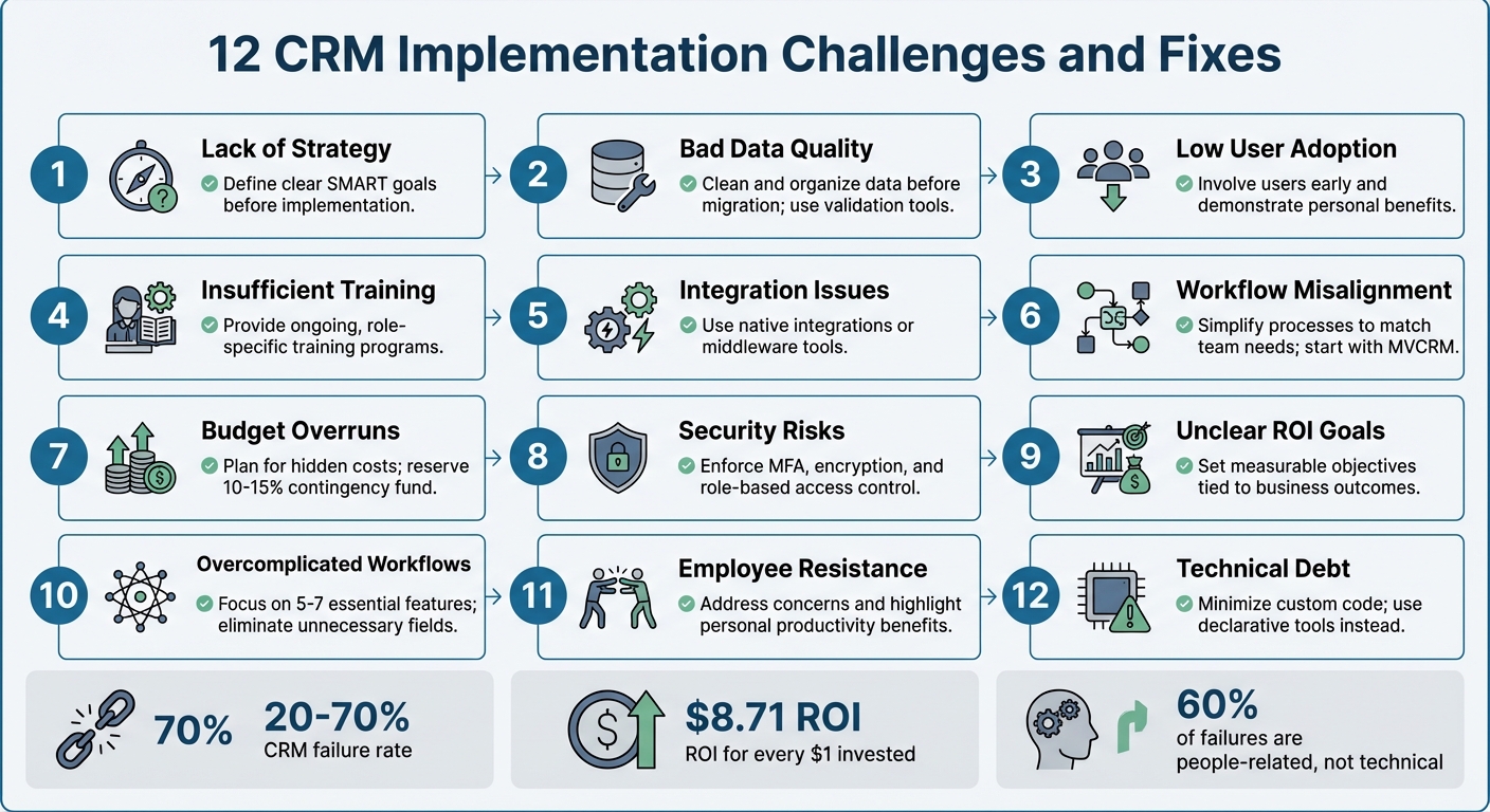
12 Common CRM Implementation Challenges and Solutions
Implementing CRM software without a clear roadmap is like trying to build a house without any blueprints. Many companies treat CRM as just another IT installation, rather than the transformative tool it can be for managing customer relationships. This mindset partly explains why nearly one in three CRM initiatives fail to deliver results, according to a 2023 Forrester report.
The issue often lies in focusing on the "what" before defining the "why." Without identifying specific problems the CRM should address - like reducing lead response time by 50% - the system risks becoming an underutilized database. A striking example is Vodafone's 2013 rollout of a new enterprise CRM and billing system. Due to poor planning, the initiative resulted in billing errors, incorrect pricing, and ultimately a £4.6 million fine from Ofcom.
A strong CRM strategy begins with setting SMART goals - objectives that are Specific, Measurable, Achievable, Relevant, and Time-bound. For instance, instead of vaguely aiming to "improve customer loyalty", set a concrete target like "increase customer retention by 10% within the next fiscal year". It's also critical to secure executive sponsorship, which signals that the CRM initiative is a business priority, not just another tech project. When leadership is disengaged, teams are left guessing at priorities, and departments often work toward conflicting goals.
"A CRM is more than software - it's a business philosophy. The most common failures of CRM projects stem from treating the implementation as a technology installation rather than a strategic change initiative."
- Twelverays Agency
The solution? Start small with a Minimum Viable CRM (MVCRM). Focus on essential processes, like lead management and pipeline tracking, before layering on additional features. TrekkSoft, a SaaS company, followed this approach in 2014 by adopting HubSpot CRM to streamline their marketing tools. Under Lucy Fuggle, their Head of Content Marketing, this targeted strategy led to a 376% increase in new leads, a 429% boost in organic traffic, and a 92% rise in marketing-qualified leads.
To avoid a "garbage in, garbage out" scenario, conduct a "why" audit, engage key stakeholders early, and establish clear data governance policies. With a solid strategy in place, the next step is ensuring high-quality data and a smooth migration process.
A CRM packed with duplicate, outdated, or incorrect data is like a ship with a leaky hull - it won’t get you very far. Here’s a startling fact: 91% of CRM data becomes unreliable within just one year, and almost half of all companies lose over 10% of their annual revenue because of poor data quality. When sales teams start doubting the accuracy of the data, trust in the system crumbles, and with it, the likelihood of successful CRM adoption.
Simple mistakes, like inconsistent formatting - think "USA" versus "United States" - can lead to typos and duplicate entries. On top of that, B2B data decays at an alarming rate of 30% to 70% annually due to factors like job changes and company rebranding. Migration introduces its own set of headaches: legacy data structures often don’t match up with the new CRM’s naming conventions, creating field-mapping issues that complicate the process.
So, how can these challenges be tackled? Careful migration planning is key. Take Tokara Solutions, for example. In June 2025, they successfully migrated a CRM for an aviation services company moving from a limited legacy system to a modern platform. Their approach included a detailed pre-migration audit, cleaning and consolidating data, creating customized field mappings, and running two full test migrations in a sandbox environment. The result? A seamless transition with 100% data migrated and zero downtime during the cutover.
"Your CRM must be the undisputed, single source of truth for all customer information. The moment your team starts questioning the data's accuracy, they'll stop trusting the system."
- AddToCRM
To address these issues, preparation must begin well before migration. Start with a pre-migration audit to identify duplicates and incomplete records. Use tools like Dedupe.io to eliminate duplicates and validate email and phone formats before importing. Replace free-text fields with dropdown menus to enforce uniformity, and set up automated validation rules to block duplicate entries at the point of capture. A phased migration strategy - testing smaller segments of data - can help catch and fix errors before they spread. Above all, ensure your data is clean before importing. Clean, reliable data is the backbone of a successful CRM, supporting the strategic goals discussed earlier.
After ensuring clean data and a smooth migration, the next big challenge is getting users to actually embrace the CRM. Even the most sophisticated system will fail if employees don’t use it. In fact, poor user adoption is the leading cause of CRM failures, responsible for 38% of cases. While 91% of companies with more than 10 employees have implemented CRM software, simply having the tool isn’t enough to guarantee success.
So, why do employees resist? Many see CRMs as tools for management to monitor performance rather than as resources to help them close deals faster. Add to this extra steps in their workflow and unreliable data, and it’s no surprise that some users revert to spreadsheets. Field teams, in particular, struggle with systems that lack mobile access, and inadequate training only deepens their frustration.
The fallout from low user adoption can be catastrophic. Take Avon, for example. In 2016, the beauty company abandoned a $125 million SAP-based CRM rollout after a Canadian pilot program. The system was so complicated that representatives quit, causing major disruptions and turning the investment into a complete loss. Similarly, Vodafone UK’s CRM migration in 2016 left 10,452 customers without proper credits. Complaints tripled, and the company faced a $6.2 million fine from Ofcom. Clearly, even with clean data and a strong strategy, user engagement is essential to avoid such costly failures.
How can companies tackle this? Start by involving end-users - sales reps, marketers, and support staff - early in the process. Including them in the selection phase fosters a sense of ownership and ensures the tool aligns with their day-to-day needs. Show employees how the CRM can make their lives easier, like reducing admin work or helping them hit commission goals. Appoint “CRM Champions” within each department to provide peer support and relay feedback to leadership. Simplify the system by hiding irrelevant modules and tailoring dashboards to specific roles.
"A CRM should be a secret weapon that saves time."
- Add to CRM Guide
When companies get user adoption right, the results can be game-changing: a 29% increase in sales, a 34% boost in productivity, and 42% more accurate forecasting. On average, every $1 invested in a well-adopted CRM delivers a return of $8.71. The secret lies in transforming the CRM from a data-entry chore into a productivity tool through automation, tailored training, and strong leadership support to establish it as the single source of truth.
Weak training and poor change management can derail even the best CRM rollouts. According to Gartner, 50%–70% of CRM projects fail, and nearly 60% of these failures stem from people-related issues. A common mistake? Treating training as a one-time event instead of an ongoing, role-specific process.
The typical top-down approach often feels like a "compliance trap", where employees are told what to do without understanding how it benefits them. If users don’t see clear advantages - like closing deals faster, cutting down on admin work, or improving commission tracking - the CRM can come across as more of a monitoring tool than a helpful resource. This disconnect often leads teams back to their comfort zones: spreadsheets, personal email accounts, or other familiar tools, leaving the CRM underutilized.
Take Experian’s Salesforce rollout as an example. To address training gaps, Experian implemented Whatfix, a digital adoption platform that offers in-app, contextual guidance. The results were eye-opening: onboarding time shrank from six hours to just 40 minutes, support queries dropped by 55%, and first-year productivity soared by 72%. Lee Glenn, Global Digital Adoption and Training Specialist at Experian, shared, "Our traditional LMS courses couldn't keep pace with the scale and speed of change… Building Flows and in-app guidance with Whatfix is easy".
The right approach involves continuous, tailored training. For example, sales reps need hands-on practice with daily deal management, while managers benefit from training in reporting and analytics. Instead of marathon workshops, try bite-sized microlearning sessions - 5 to 10 minutes each - that focus on specific tasks. Pair this with peer support within teams to keep the momentum going. Don’t underestimate the power of executive sponsorship, either; projects with strong leadership backing are 73% more likely to succeed.
Investing in ongoing training and support can lead to a 40% higher ROI on CRM initiatives. Treat training as a strategic priority, not just a technical formality. Use real company data during practice sessions, create feedback loops to address user challenges, and link CRM usage to performance metrics and compensation plans. This ensures the CRM becomes a tool employees rely on, not avoid. Remember, up to 70% of CRM success hinges on effective training and implementation - not just the software itself.
With a solid training framework in place, the next step is ensuring your CRM integrates smoothly with existing systems.
Adding a new CRM to your existing tech stack might seem simple in theory, but the reality often tells a different story. A striking 63% of organizations face challenges like data synchronization issues, system compatibility problems, or even staff resistance during the integration process. The root cause? Many businesses rely on a mix of tools - marketing automation platforms, accounting software, support systems, and outdated databases - that don’t naturally work together.
One of the most glaring issues is data silos. For example, your sales team might use one platform to track customer interactions, while your support team relies on another. This disconnect prevents a unified view of the customer. In fact, 52% of companies struggle to share customer data effectively across departments because of these isolated systems. The result? Confusion and inefficiency. A sales rep might label a lead as "Active", while the support team sees the same account marked as "Canceled", leading to duplicate or conflicting outreach efforts. These visible issues often hint at deeper technical hurdles.
Legacy systems add another layer of complexity. Many older platforms lack modern APIs or rely on outdated protocols, making it difficult to sync with cloud-based CRMs. Even when APIs are available, mismatched formats - like differences in phone number or date formatting - can disrupt automated workflows. It’s no surprise that 72% of CRM migrations experience failures in at least one critical integration, such as email sync or accounting software connections.
These technical obstacles come with a hefty price tag. Poor data quality, often exacerbated by integration issues, causes 44% of businesses to lose 10% of their annual revenue. But when integration is done right, the rewards are clear: a well-integrated CRM can increase business productivity by up to 30%. To achieve this, prioritize native integrations whenever possible. Native connectors, supported directly by vendors, are more reliable and easier to maintain. If native options aren’t available, middleware platforms like Workato or Make can help bridge the gaps.
Before diving into CRM integration, it’s crucial to map out your data flows visually. Determine which system will act as the "source of truth" for different types of data - your CRM might handle customer contact details, while your ERP system manages order history. Start with trial migrations using a sample of 1,000–5,000 records to catch any mapping errors early. For the final migration, schedule the cutover during off-hours, such as Friday evening through early Sunday morning, to minimize disruption. And always have a rollback plan ready in case something goes wrong. It’s worth noting that phased migrations boast a 98% success rate, compared to just 87% for "Big Bang" approaches.
Addressing these integration challenges is essential for creating a unified CRM system that aligns with your broader business goals. By taking the right steps, you’ll set the stage for smoother operations and better outcomes.
A CRM, no matter how capable, can fall short if its workflows don’t align with how your team actually operates. Nearly half of CRM implementations fail, mostly because of poor user adoption caused by unclear processes and unnecessary complexity. This often stems from viewing CRM setup as a purely technical IT project instead of a strategic business transformation. When this happens, the real-world sales methods your team relies on every day are overlooked.
How can you tell if workflows are misaligned? One clear sign is when sales reps stick to using spreadsheets or notebooks instead of the CRM. These "shadow systems" highlight a disconnect between the CRM and your team’s actual needs. Another major indicator: 52% of sales leaders say their CRM ends up costing them opportunities instead of creating them. The culprit? Over-complicated processes that turn skilled salespeople into data-entry machines, bogging them down with unnecessary steps.
"The software doesn't create process clarity; it reflects whatever workflows are built into it." - Axis Consulting
Trying to make a CRM do everything for everyone often leads to scope creep, where businesses overload the system with features to address every possible scenario. This creates technical debt, making future updates difficult and frustrating. In fact, 33% of businesses report major issues with CRM customization alone. To avoid this, workflows need to reflect real-world practices, ensuring the CRM drives revenue instead of becoming a burden.
The solution? Start with a Minimum Viable CRM (MVCRM). Focus on the core processes that directly impact revenue, like lead management and pipeline tracking. Keep it simple by limiting your sales pipeline to 5–7 essential stages. Involve team members from different departments early in the planning process to ensure the CRM addresses their actual challenges. This approach not only simplifies workflows but also aligns the CRM with broader business goals.
Rather than rolling out the CRM all at once, take a phased approach. Start with one motivated team, refine workflows based on their real-world feedback, and then expand. Before configuring any software, map out your customer journey and internal processes on paper. Every new CRM field or feature should solve a widespread issue or improve efficiency - not add unnecessary complexity.
"Customization should only be used to remove friction from a core workflow, never to add complexity for an edge case." - Add to CRM
Managing hidden CRM costs is critical to the success of any project, especially since CRM initiatives often exceed budgets by 25%-40% due to unforeseen expenses. It's not just about the monthly subscription fee - it's the additional costs that sneak in. For example, a medium-sized company with 300 users could end up spending $1.08 million annually on an enterprise CRM once all related expenses are included.
While software licenses grab most of the attention, the real budget-eaters are data migration, integrations, training, and downtime. Data migration alone can cost anywhere from $1,000 for simple transfers to $40,000 for more complex projects involving multiple sources. On top of that, custom integrations, staff training, productivity dips during the transition, and ongoing maintenance can significantly inflate costs. In fact, long-term expenses are often dominated by maintenance. A common rule of thumb? For every $1 spent on the CRM subscription, expect to spend another $1 on implementation.
DIY implementations can be particularly risky, often leading to delays and expensive rework caused by misconfigurations. Add in scope creep - where every "nice-to-have" feature and custom field adds complexity - and costs can spiral out of control. Staying disciplined with your budget is key to maintaining the strategic focus established early on.
"Limit add-ons to essentials that enhance productivity." - Adobe
To stay within budget, consider these strategies:
The table below highlights key cost categories and practical ways to manage them:
| Cost Category | Estimated Range (10 Users) | Cost-Saving Strategy |
|---|---|---|
| Annual Subscription | $1,500 – $36,000 | Choose plans with essential features; skip unnecessary add-ons. |
| Setup & Migration | $1,800 – $10,000 | Use vendors offering free migration or automated tools. |
| Training | Varies | Rely on in-app guidance and free vendor tutorials. |
| Reduced Productivity | $3,000 – $12,000 | Roll out in phases to minimize disruptions. |
| Additional Integrations | $0 – $18,000 | Focus on native integrations instead of custom APIs. |
Security issues and compliance gaps can leave your CRM vulnerable to serious risks. Consider this: 83% of organizations have faced at least one data breach, with the global average cost of a breach now exceeding $4.4 million. Weak or stolen passwords contribute to over 80% of data breaches, while 60% are linked to unpatched software vulnerabilities. These numbers emphasize the critical need for strong security protocols in CRM systems.
On the compliance side, regulations such as GDPR, CCPA, and HIPAA come with steep penalties for violations. For instance, GDPR fines can reach up to 4% of global annual revenue, and FINRA has imposed more than $88 million in fines for recordkeeping violations in recent years. Upcoming changes to the CCPA in 2026 will require compliance with Global Privacy Control (GPC) signals and mandate pre-use notices for AI-driven decision-making. Healthcare organizations must ensure they have Business Associate Agreements (BAAs) in place, while financial services need thorough audit trails for client communications. With regulatory fines increasing, addressing security vulnerabilities is no longer optional - it’s essential.
From a technical standpoint, CRM systems face risks like insufficient encryption for data at rest and in transit, lack of Multi-Factor Authentication (MFA), excessive user permissions, and vulnerabilities in third-party integrations. Insider threats - where employees or contractors misuse their access - are another growing concern.
To strengthen defenses, enforcing MFA and using Role-Based Access Control (RBAC) can help limit data access. Look for CRM providers that offer AES-256 encryption for stored data and SSL/TLS protocols for data in transit. Automated security patches are also vital to address risks from unpatched software. Additionally, AI-driven threat detection can significantly lower breach costs, with a median reduction of $2.44 million.
Here’s a quick look at some common security risks and how to mitigate them:
| Security Risk | Cause | Mitigation Strategy |
|---|---|---|
| Unauthorized Access | Weak passwords / Lack of MFA | Enforce MFA and strong password policies |
| Data Interception | Inadequate encryption | Use AES-256 encryption and SSL/TLS protocols |
| Compliance Fines | Non-compliance with regulations | Conduct regular compliance audits and data mapping |
| Insider Misuse | Excessive user permissions | Implement Role-Based Access Control (RBAC) |
| System Exploitation | Unpatched software vulnerabilities | Enable automatic updates and security patches |
Without clear objectives, CRM projects often fall short. Nearly half of CRM implementations struggle due to undefined strategies and mismatched goals, with 48% of decision-makers stating their CRM fails to meet their needs. Geoffrey Hodgson, Marketing Manager at Tokara Solutions, highlights this issue:
"One of the biggest reasons CRM projects fail is the absence of well-defined goals. Many businesses rush into CRM adoption without a clear vision... assuming the technology alone will resolve inefficiencies."
Defining clear goals not only provides direction but also lays the groundwork for tracking ROI and driving ongoing improvements.
The financial stakes are hard to ignore. On average, every $1 invested in CRM delivers $8.71 in returns. Yet, 52% of sales leaders report that their CRM systems end up costing them opportunities instead. The key difference between success and failure often lies in setting specific, measurable targets. For example, instead of vague aspirations like "improve customer service", effective CRM strategies aim for tangible outcomes, such as reducing lead response time by 40% or boosting pipeline value by 25%. Clear ROI tracking turns CRM from a cost center into a powerful business tool.
"CRM ROI can be one of the highest-leverage investments a company makes - but only when it's measured with the same discipline applied to any other strategic investment." – Optrua
To get started, organize goal-setting workshops with leadership and department heads before selecting your CRM platform. Capture baseline metrics like current lead conversion rates, customer acquisition cost (CAC), sales cycle length, and churn rates to create a foundation for measuring progress. Monitor user adoption closely, as it serves as a critical indicator of success. Keep in mind, ROI isn’t instant - initial improvements often appear within 3–9 months, while full returns might take 12–24 months.
Incorporate CRM metrics into regular performance reviews and team meetings to emphasize its importance. For example, calculate productivity gains by tracking time saved on administrative tasks. If each sales rep saves three hours per week, multiplying that by their hourly rate provides a clear picture of annual financial benefits. Setting specific goals, such as cutting lead response times by 40%, not only provides measurable benchmarks but also integrates CRM usage into daily operations, turning it into a vital business asset. Clear, measurable targets are essential for unlocking the full potential of CRM solutions.
One common obstacle in CRM adoption is overly complicated workflows. If logging a call or creating a lead involves endless clicks, tabs, and mandatory fields, productivity takes a hit. Sales reps often find themselves bogged down in data entry instead of focusing on selling. In fact, 23% of users cite manual data entry as their biggest frustration with CRM systems.
"More fields, more steps, more approvals. It might seem like better tracking, but it's building friction into your system. Overengineering CRM workflows often backfires." – Axis Consulting
The repercussions of such complexity are clear. Teams may start avoiding the CRM altogether, updating it inconsistently or using only a fraction of its features. Many revert to simpler tools like spreadsheets and notebooks because the system feels more like a hurdle than a help. Nearly half of CRM implementations fail due to poor user adoption driven by unnecessary complexity. Even more telling, 90% of businesses don't utilize all the features their CRM offers, often because the system is over-engineered.
The solution? Adopt a Minimum Viable CRM (MVCRM) approach. Focus on the core processes that directly impact revenue, such as lead management and pipeline tracking. Cut out the "nice-to-haves" that clutter the system. Keep your sales pipeline simple with just 5–7 essential stages to maintain clarity and efficiency. Leverage intelligent conditional logic to streamline workflows, reduce manual inputs, and minimize clicks. Annual audits can help identify and remove unused modules, redundant fields, and other unnecessary features that add complexity.
Before introducing any custom field or workflow, ask yourself: does this change benefit the majority of users, or is it solving a rare issue? A CRM should save time, not waste it. Simplifying workflows not only boosts user adoption but also reinforces the CRM's value as a critical business tool. A streamlined system ensures your CRM works for your team - not the other way around.
For a CRM system to succeed, your team has to embrace it. Resistance often comes from fear of the unknown, concerns about losing control, or the belief that a new system will add to their workload instead of reducing it. Many employees view CRMs as tools for monitoring rather than productivity, which can stall adoption. Interestingly, over 60% of CRM failures are tied to "people" issues like poor change management, while technical problems are rarely the main cause. This challenge ties closely to issues like low user adoption and inadequate training.
The reasons behind resistance are easy to understand. A CRM can reveal performance gaps, leaving some employees feeling exposed or less indispensable, especially if they previously controlled key customer data. Others may see the system as a time sink - CRM adoption can significantly increase data entry tasks, making it feel like busywork. If the CRM is presented as a tool for management oversight rather than something that helps employees meet their goals, the "What's In It For Me?" question remains unanswered, and resistance solidifies.
"Resistance isn't a technical flaw, it's a human one. It stems from fear of the unknown, perceived complexity, and a lack of clarity on personal benefit." – ArionERP
To tackle this resistance, you need to align the CRM's features with the specific needs of your team. For example, show sales reps how the CRM can help them close deals faster or reduce time spent on repetitive tasks. Involve key team members from different departments early in the planning process so they can shape workflows that solve their pain points. Designate internal champions - team members who can mentor their peers and provide frontline support. Leadership also plays a critical role; when management actively uses the CRM, it sets an example for the rest of the team.
Beyond addressing personal value, tailor training to individual roles. Show each user how the CRM can make their daily tasks easier. Use automation tools to simplify processes, like one-click data capture from emails or social platforms, turning the CRM into a productivity booster instead of a time-consuming task. Companies that actively manage change during CRM rollouts are six times more likely to see successful implementation and improved results. When employees view the CRM as a tool that supports their work rather than burdens it, resistance naturally fades away.
Custom code can seem like a quick solution during CRM implementation, but it often comes with hidden costs. Technical debt is the term used to describe the accumulation of shortcuts and outdated code that bogs down your system and complicates future updates. Alarmingly, 60% to 75% of custom CRM code turns into technical debt within just two years. What starts as a tailored solution frequently morphs into "spaghetti code" - disorganized scripts that make debugging and updates a nightmare.
The upkeep required for custom code is no small task. On average, maintaining custom Salesforce setups demands 1,200 developer hours annually, which is 2.5 times more than standard configurations. Even then, only 25% of custom Apex code lasts three years without needing a significant rewrite. With platforms like Salesforce and HubSpot releasing three major updates each year, custom code must be rigorously tested and often rebuilt to keep functioning. This creates what’s known as "innovation drag", where IT teams spend the bulk of their time fixing outdated integrations instead of focusing on new AI tools or revenue-generating features. To keep costs and complications in check, reducing custom code is essential.
"Technical debt - the accumulated cost of shortcuts, outdated code, and deferred refactoring - is the single largest hidden cost of CRM customization." – Vantage Point
The financial toll is hard to ignore. Custom CRM setups come with a 40% to 60% higher total cost of ownership over three years compared to marketplace solutions. The risks are also greater - organizations with heavily customized systems experience a 28% upgrade failure rate, compared to just 4% for those using pre-built apps. For industries like healthcare and finance, the stakes are even higher. The "compliance tax" makes validation costs 2.4 times higher for custom code versus pre-certified solutions.
These numbers highlight the importance of limiting custom code. Just like integration and data quality problems, unchecked customization can derail your CRM’s effectiveness. To avoid this, adopt a "Buy First, Build Surgically" strategy. Use custom development sparingly, focusing on areas that offer a genuine competitive edge - ideally no more than 10% of your CRM’s functionality. Whenever possible, rely on declarative tools like Salesforce Flow or HubSpot Workflows instead of custom scripts.
To further minimize technical debt, follow best practices:
When custom code is unavoidable, ensure it’s well-structured and thoroughly documented. A shortcut today can easily turn into a costly headache down the line.
Here’s a breakdown of some common CRM challenges, their ripple effects on businesses, and practical ways to tackle them. As emphasized earlier, issues like data quality, integration, and security play a major role in determining the success of any CRM implementation. These tables provide a quick reference to the problems and their resolutions.
Data Quality and Migration Challenges
| Challenge | Business Impact | Solution |
|---|---|---|
| Bad Data Quality | 10% annual revenue loss; 20-30% drop in productivity; inaccurate reports and failed sales forecasts. | Use automated data capture and enrichment tools; enforce strict data governance policies. |
| Migration Problems | Data silos, missing customer history, downtime, frustrated teams, and reliance on spreadsheets. | Perform a pre-migration audit; adopt a phased migration strategy; keep verified backups. |
| Duplicate Records | Fragmented customer views; wasted marketing budgets; sales teams contacting the same lead repeatedly. | Deploy real-time duplicate detection tools; create processes for merging duplicate records. |
Integration and System Connectivity Issues
| Challenge | Business Impact | Solution |
|---|---|---|
| Integration Problems | 52% of sales leaders believe CRM creates missed opportunities; leads to data silos and manual workarounds. | Focus on native connectors; utilize middleware (iPaaS) to bridge gaps; adopt an API-first approach. |
Security and Compliance Risks
| Security/Compliance Problem | Business Impact | Solution |
|---|---|---|
| Unauthorized Access | Data breaches, financial losses, and damage to reputation. | Use Multi-Factor Authentication (MFA) and Role-Based Access Control (RBAC). |
| Regulatory Non-compliance | Legal penalties (e.g., GDPR/CCPA fines) and operational disruptions. | Implement end-to-end encryption; schedule regular automated compliance audits. |
| AI-Driven Phishing | Stolen credentials and fraudulent communications. | Utilize AI-based monitoring systems; provide ongoing user security awareness training. |
| Shadow IT / Unvetted Plugins | Vulnerabilities from unapproved tools and integrations. | Enforce strict vetting for third-party plugins and API usage. |
| Insider Threats | Internal data leaks and unauthorized changes. | Apply Zero Trust principles; monitor user behavior continuously. |
The numbers are striking: poor data quality alone causes 44% of companies to lose 10% of their annual revenue, while over half of sales leaders feel CRM systems hinder opportunities. These statistics underline the importance of addressing these challenges head-on to protect both the bottom line and operational efficiency.
Looking back at the 12 challenges outlined, implementing a CRM system can be a game-changer if done right. Despite failure rates hovering between 20% and 70%, the key to success lies in viewing CRM as a strategic transformation for your business - not just another software installation.
To keep your project on track, start by addressing potential hurdles early. For example, clean your data before migration, involve end-users from the beginning, and set SMART goals directly tied to revenue outcomes. It's worth noting that about 60% of CRM failures stem from people-related issues rather than technical problems, highlighting the importance of change management and proper training. When done well, the rewards are impressive: companies can see a 29% boost in sales performance and an ROI of up to $8.71 for every $1 spent. Organizations that provide ongoing support even report a 40% higher ROI.
A phased deployment strategy can also make a big difference. Start with a Minimum Viable CRM, secure executive buy-in, and focus on delivering quick wins. This approach not only showcases value early but also sets the stage for long-term growth while avoiding the pitfalls of technical debt that can complicate future updates. Ultimately, your CRM should feel like a powerful ally - saving time and streamlining operations, not creating extra work.
A successful CRM strategy hinges on a few key elements: clear goals, accurate data, team involvement, and a well-thought-out implementation plan. Begin by aligning your CRM goals with your overall business objectives - this ensures that the strategy directly supports your company's growth.
Next, prioritize clean, reliable data. Without accurate information, even the best CRM tools won't deliver meaningful results. Equally important is getting your team on board early. Involving them from the start not only fosters buy-in but also helps ensure smoother adoption when the system goes live.
Roll out the implementation in phases to make the transition manageable. Provide training that focuses on real-world, practical use so your team can see the immediate benefits. Lastly, track results from day one to measure progress and identify areas for improvement.
Before migrating your data to a new CRM, it's crucial to make sure it’s in top shape. Start by checking for accuracy, consistency, and proper formatting. Eliminate duplicates, fix any inconsistencies, and validate the data thoroughly to sidestep potential migration problems. Also, ensure the data is structured to meet the new CRM's requirements. Taking these steps can help minimize errors and prevent data loss during the migration process.
To encourage CRM adoption without piling on extra tasks, make it a natural part of existing workflows. Adjust the system to fit smoothly into current processes, ensuring it feels like a tool that simplifies work rather than complicates it. Provide concise, focused training sessions that emphasize quick, practical benefits. Foster a mindset that values accurate data entry, and clearly show how the CRM improves both personal efficiency and team results. This approach can inspire users to embrace the system without feeling overwhelmed.
Social media data visualization simplifies raw metrics like engagement rates or follower growth into clear visuals - charts, graphs, or maps - making insights easier to understand and act on. It’s essential for tracking performance across platforms, spotting trends, and communicating results effectively to stakeholders. Key takeaways:
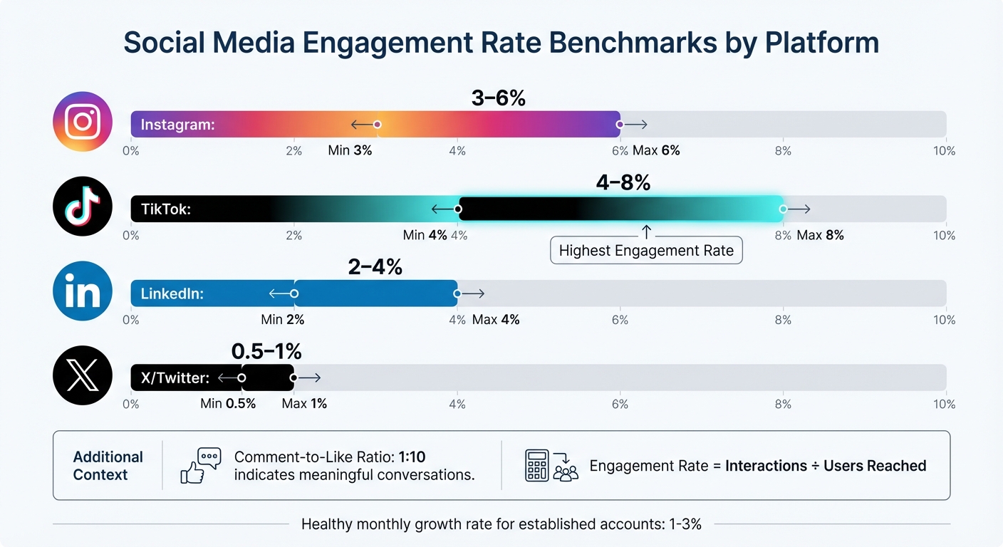
Social Media Engagement Rate Benchmarks by Platform
Stick to monitoring 4–6 core metrics that align with your business goals. Overloading a dashboard with too much data can be just as unhelpful as relying on a cluttered spreadsheet. Focus on how these metrics provide insights into engagement, audience behavior, and content performance to inform better strategies.
Engagement metrics highlight how your audience interacts with your content - likes, comments, shares, and saves all fall under this umbrella. The engagement rate (interactions divided by the number of users reached) is especially useful since it reflects activity from actual viewers, not just followers. Typical benchmarks include:
A comment-to-like ratio of around 1:10 can indicate that your content is sparking meaningful conversations rather than just passive engagement.
"Keeping engagement rate in mind means I constantly assess visuals and copy and ask 'why would anyone care?'"
While engagement is key, knowing your audience adds another layer of insight.
Beyond just counting followers, focus on qualitative data about your audience. For established accounts, a monthly growth rate of 1% to 3% is considered healthy. Understanding demographics - such as age, gender, and location - can help you tailor content more effectively. Tools like geographic heat maps are especially useful for scheduling posts across time zones or tapping into regional trends.
Personalization matters: 60% of people are willing to share their data for a tailored experience, and companies that prioritize personalization can see up to 40% more revenue. These insights allow you to move away from generic messaging and create content that resonates with specific audience segments.
Content performance metrics help you understand what works and what doesn’t. Comparing reach (unique viewers) with impressions (total views) can reveal whether your content is expanding its audience. A reach-to-impression ratio above 0.7 suggests you're attracting new viewers, while a ratio below 0.5 might indicate your content is primarily cycling through existing followers.
For video content - a dominant format on social media - track metrics like completion rate and average watch time to see where viewers drop off. Live videos, which can generate six times more engagement than regular videos, should also be monitored separately.
Pay attention to saves and bookmarks, as these are high-value engagement signals. Educational posts tend to get more saves, while relatable content often drives shares. Applying the 80/20 rule - where 20% of your content generates 80% of your engagement - can help you refine your content strategy.
Creating a useful social media dashboard means turning raw data into insights that people can act on. The way you design a dashboard depends on who will use it. For instance, C-suite executives need a high-level view of strategic outcomes and ROI, while social media managers need detailed data to track daily performance. Start by identifying the audience and what decisions they need to make.
Choosing the right chart type is key to making your data clear and actionable. Here’s a quick guide:
| Metric Category | Recommended Chart Type | Primary Use Case |
|---|---|---|
| Trends | Line Chart | Analyzing follower growth or engagement trends |
| Comparison | Bar/Column Chart | Comparing platform performance |
| Proportion | Donut/Pie Chart | Showing audience demographics |
| Flow/Process | Funnel Chart | Tracking conversion steps |
| Performance | Bullet/KPI Chart | Monitoring progress toward goals |
Avoid using red to represent growth, as it can be misinterpreted negatively. Instead, stick to brand colors or gradients that move from light to dark to highlight trends over time.
Dashboards should make key information instantly clear. Since 77% of marketers check their social media dashboards weekly or daily, readability is critical.
"Put your KPIs (Key Performance Indicators) front and center when you load your social media dashboard. You should be able to tell, at a glance, how your social page is performing." - Tristan James, Assisted
Here are some tips for readability:
The type of data you use depends on your goals.
| Data Type | Primary Use Case | Recommended Chart Types | Target Audience |
|---|---|---|---|
| Real-Time | Campaign adjustments, ad optimizations | Tables, Gauges, Live Feeds | Social Media Managers, Ad Specialists |
| Historical | ROI reporting, trend analysis | Line Charts, Area Charts, Bar Charts | C-Suite, Clients, Marketing Directors |
When using historical data, include notes about external factors - like holidays or platform updates - to explain fluctuations. This context prevents misunderstandings and helps stakeholders see the bigger picture. Automated dashboards can also save time, reducing hours of manual data collection to just about 20 minutes.
The right tool can save you hours of manual work by automating data collection and reporting. In fact, 71% of marketers rely on multiple dashboard tools to track their social media performance efficiently.
Databox is a go-to choice for teams aiming to simplify their reporting process. It integrates with more than 130 platforms and features a user-friendly, drag-and-drop interface. With over 4,000 pre-built metrics and options for automated report delivery via Slack or email, it centralizes data without requiring technical know-how.
"The data we're getting from Databox is used in every decision that we make."
- Harry Falowski, Digital Analyst at Conair
Tableau caters to enterprises that need advanced analytics and polished visuals. Its drag-and-drop dashboards and Tableau Prep tool for data cleaning make it ideal for handling complex datasets. However, it does require training and comes at a higher cost - $75 per user per month.
Google Looker Studio is a free tool perfect for teams already using Google Analytics 4 or Google Ads. It syncs data automatically into real-time reports, making it a great option for small businesses or startups looking for professional-grade dashboards without spending extra.
Klipfolio uses "PowerMetrics" to bring together data from various social platforms into a single, easy-to-read display. It’s designed to help teams analyze audience engagement and demographics, cutting down on manual data collection.
Whatagraph is tailored for agencies, offering connections to over 40 data sources and providing white-labeled reports. With 100+ pre-built templates for platforms like LinkedIn Ads and Instagram Business, it’s built for efficiency. For example, in 2026, Maatwerk Online claimed they saved 100 hours monthly by switching to Whatagraph.
"Whatagraph saves time and energy for our marketing specialists. And the hours we're saving is just pure profit."
- Lars Maat, Co-Founder
Each of these tools has its own strengths, so the best choice depends on your team’s needs, technical skills, and budget. Picking the right tool can simplify your data visualization process, ensuring your insights are clear and actionable.
When selecting a tool, consider factors like team size, budget, and the need for technical expertise. Real-time dashboards are a priority for many marketers - 67% ranked them as a top feature in 2025.
| Tool | Starting Price | Key Strength | Best For |
|---|---|---|---|
| Google Looker Studio | Free | Google ecosystem integration | Small businesses, startups |
| Databox | $72/month | 130+ integrations, automated delivery | Data-driven teams, agencies |
| Tableau | $75/user/month | Advanced analytics, interactive visuals | Enterprise analysts |
| Whatagraph | $199/month | 40+ data sources, white-label reports | Marketing agencies |
| Sprout Social | $199/month | Social listening, sentiment analysis | Mid-market to enterprise brands |
Using pre-built templates can save significant time. Both Databox and Whatagraph offer hundreds of templates for specific platforms, helping you launch professional dashboards quickly. Additionally, automating report delivery via email or Slack - on a daily, weekly, or monthly basis - keeps stakeholders informed without requiring extra effort.
For better accessibility, consider using colorblind-friendly palettes, such as blue-orange combinations, and avoid red-green schemes. About 8% of U.S. users experience color vision deficiencies, so thoughtful design ensures your visualizations are clear to everyone.
Creating clear and actionable social media dashboards requires more than just following design principles. Even with advanced tools, certain missteps can make your visualizations less effective. Let’s take a closer look at some common pitfalls and how to avoid them.
Packing a dashboard with too many metrics can overwhelm users and dilute its purpose. Ideally, focus on 3–5 primary metrics to keep things clear and actionable. When dashboards are overloaded with data points, stakeholders may face decision paralysis rather than gaining meaningful insights.
Often, this issue stems from misaligned goals - adding metrics without defining what success looks like for a campaign. For instance, if the goal is lead generation, metrics like impressions or "likes" might take up space without offering valuable insights.
"Decide what metrics you care about in social... Once you dial in what you care about on social, then you can start developing your dashboard."
- Joe Martin, CloudApp
Another common mistake is mixing metrics for different audiences. Executives need high-level summaries, while teams working on execution require more detailed data. Combining both into one view can make the dashboard ineffective for everyone. Instead, create separate dashboards - an executive scorecard for leadership and a tactical dashboard for your social media team.
"Don't try and do too much, or you'll overwhelm yourself. Ask yourself what is most needed in this view... Keep it simple, and you'll be able to view as well as understand the data rather than just look at a whole bunch of numbers."
- Meg Coffey, Coffey & Tea
To make your dashboards more effective, stick to key performance indicators (KPIs) that align directly with your business goals. Eliminate unnecessary elements like gridlines, 3D effects, or redundant labels. Position the most critical KPIs at the top or center of the dashboard and use aggregated views to combine related data points, ensuring clarity and focus.
Using the wrong chart type can lead to confusion and misinterpretation. Since users spend an average of just 1.7 seconds on a Facebook post when browsing on mobile, your visualizations have to communicate insights instantly.
The key is to match your chart type to the data and the story you want to tell. For example, pie charts can be hard to interpret because humans struggle with judging angles. Donut charts, which emphasize the arc length, are often easier to read. Similarly, always start bar and area charts at zero on the y-axis to avoid exaggerating differences. When dealing with long category names, horizontal bar charts work better than vertical ones, as they avoid awkward diagonal or truncated text.
"A chart can either tell a crystal-clear story - or completely confuse your audience."
- Luzmo
For visuals intended for social sharing, stick to simple formats like bar, line, or map charts. Complex visuals, such as Sankey diagrams or chord diagrams, can overwhelm fast-scrolling audiences. This is especially important considering that 40% of software users rate their dashboard experience as a 3 out of 5 or lower, often due to unclear or overly complicated charts.
With most social media analytics viewed on mobile devices, resizing a desktop dashboard for smaller screens often leads to cluttered visuals and unreadable text. A proper mobile-friendly design ensures your data remains accessible and easy to interpret.
Mobile optimization involves adjusting the scale, detail, and annotations for smaller screens. This means scaling layouts for smartphones, reducing detail to highlight a single trend or outlier, and simplifying annotations by removing extra gridlines or axis labels. Given that 77% of social media marketers check their dashboards daily or weekly, mobile-friendly designs are crucial for quick, on-the-go insights.
"It's not ok to simply take your chart designed for your big home office monitor and paste it into your social post. Marks, text, axes and all other aspects need to be considered for the smaller form factor."
- Andy Cotgreave, Senior Technical Evangelist, Tableau
Responsive design is essential. Your layout should adapt seamlessly to different screen sizes and orientations. Place key metrics at the top for easy visibility, use minimal text, and ensure the design is clean enough to convey the message in just a few seconds. A good mobile visualization tells a clear story at a glance without requiring users to zoom or scroll.
Social media data visualization transforms raw numbers into actionable insights. The core principles are simple: keep visuals clean and easy to understand, prioritize mobile-friendly designs, and customize content for your audience and platform. With users spending just 1.7 seconds on a Facebook post, your visuals need to make an immediate impact.
Choose the right chart for your story - bar charts for comparisons, line graphs for trends - and skip overly complex visuals that might confuse fast-scrolling users. Accessibility is equally important. Around 8% of people in the U.S. have color vision deficiencies, so using colorblind-friendly palettes ensures your visuals are inclusive.
Automation can cut manual tasks by up to 80%, giving you more time to focus on strategic analysis. It's no surprise that 67% of marketers rank real-time dashboards among their top-three must-have features for the future. The tools and strategies outlined here are already becoming industry norms.
These insights provide a foundation for immediate, impactful changes.
To put these takeaways into action, start by auditing your current KPIs - whether that's engagement, audience growth, or conversions - and select a visualization tool that aligns with your team's skills and budget.
Integrate automation by connecting social media APIs to eliminate manual data entry and enable real-time tracking. Use the design tips and metric strategies discussed earlier to refine your dashboards. Regularly review your metrics to ensure they adapt to shifting business priorities.
"The goal isn't perfect measurement - it's better decisions"
To effectively measure success, it’s crucial to select KPIs (Key Performance Indicators) that match your business goals and offer clear, actionable insights. Instead of overwhelming yourself with too many metrics, focus on 4-6 key ones that directly reflect your objectives. For example:
Make sure these KPIs are not only relevant but also measurable over time. Use tools like dashboards to monitor progress consistently. This way, you can identify trends early and adjust your strategy as needed to stay on track.
To calculate ROI from social media, use this formula: (Revenue Generated - Investment Cost) ÷ Investment Cost, then multiply by 100 to express it as a percentage. Focus on tracking key metrics such as sales, leads, and website traffic that directly result from social media efforts.
Utilizing dashboards with real-time data - like engagement, reach, and conversions - can provide clear insights. Detailed reports on KPIs, such as follower growth and campaign performance, make it easier to showcase ROI and justify your spending to stakeholders.
When designing dashboards for mobile devices, simplicity is your best friend. Start by using responsive design to ensure charts and tables adjust seamlessly to different screen sizes. Stick to showing only the most important data points to keep things clear and focused.
Make sure to include touch-friendly elements - buttons and interactive features should be large enough and well-placed for easy tapping. For visualizations, go with straightforward chart types like bar or pie charts, which are easier to interpret on smaller screens. These steps help make dashboards more user-friendly and functional for mobile users.
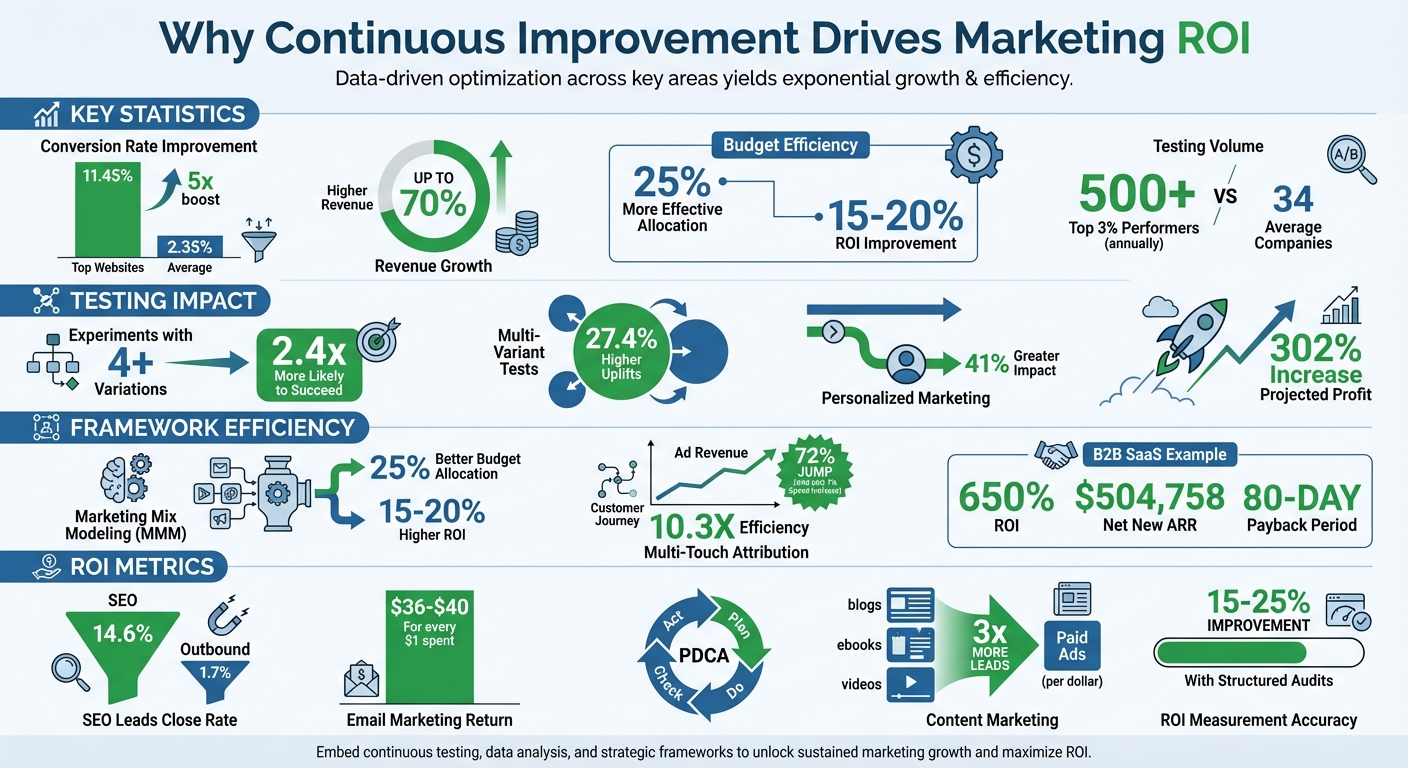
Want better ROI from marketing? Continuous improvement is the answer. Instead of risky overhauls or expensive campaigns, this method focuses on small, data-driven changes that deliver measurable results over time. Inspired by the "Kaizen" philosophy, continuous improvement follows the PDCA cycle: Plan, Do, Check, and Act. Here's why it works:
Continuous improvement turns marketing into an ongoing experiment, ensuring every dollar works harder. By tracking key metrics like Customer Lifetime Value (CLV) and refining strategies regularly, businesses can achieve sustainable growth and long-term profitability.
Continuous Improvement Marketing ROI Statistics and Impact
Businesses that prioritize continuous improvement see impressive revenue growth. Studies reveal that top-performing marketing organizations achieve up to 70% higher revenue growth compared to their competitors. What sets these leaders apart? They rely on standardized KPI frameworks and advanced measurement tools instead of intuition or outdated metrics. These findings align directly with the continuous improvement framework, showcasing its powerful effect on ROI.
The most successful companies don’t just measure - they measure smarter. Top marketers use what’s called the "Measurement Trifecta":
This combined approach provides a well-rounded view of campaign performance. By leveraging first-party data and attribution insights, companies can improve marketing spend efficiency by 20%. One study even found that continuous testing and optimization led to a 302% increase in projected profit - all without increasing marketing budgets.
When it comes to testing, more variation equals better results. Research shows that experiments with four or more variations are 2.4 times more likely to succeed and deliver 27.4% higher uplifts than basic A/B tests. Personalized marketing also makes a big difference, driving a 41% greater impact compared to generic approaches.
The contrast in testing frequency is striking. While the average company runs about 34 experiments annually, the top 3% of high performers conduct over 500 experiments per year.
"Continuous improvement comes from continuous testing and optimization, not one-time research that lets you 'set it and forget it'".
This iterative process creates what experts call an "ROI flywheel" - a system where parallel testing accelerates insights and speeds up the deployment of winning strategies. Over time, these compounding gains fuel even greater success. Together, strategy optimization and iterative testing are the backbone of an effective continuous improvement framework.
Top marketers rely on structured frameworks to turn raw data into actionable strategies. These frameworks create a systematic approach to measuring success and ensure every marketing dollar is put to good use.
Marketing Mix Modeling (MMM) helps identify the key drivers behind sales performance. By using regression analysis, it separates "Base Sales" (stemming from brand strength) from "Gradual Sales" (influenced by marketing campaigns). This separation allows marketers to pinpoint which efforts actively drive sales instead of simply benefiting from existing brand momentum.
A well-rounded approach to measurement often includes the "four-legged stool":
MMM also identifies when marketing channels hit their saturation point - where additional spending stops delivering returns. Businesses using MMM typically reallocate budgets 25% more effectively and achieve 15–20% higher ROI.
While MMM provides a high-level view, diving deeper into individual touchpoints can sharpen campaign strategies even more.
Unlike last-click attribution, Multi-Touch Attribution (MTA) spreads credit across all touchpoints that influence a conversion. This matters because poor data visibility and reliance on last-click attribution waste nearly half (47%) of marketing budgets.
Different MTA models cater to various needs:
A great example is Billy Footwear. By adopting MTA with first-party tracking, the company shifted its budget from overperforming email campaigns to underutilized Instagram awareness ads. This adjustment led to a 72% jump in ad revenue year-over-year, achieved with just a 7% increase in ad spend - a 10.3X efficiency boost.
Beyond understanding touchpoints, focusing on customer longevity can further refine marketing strategies.
CLV analysis is essential for assessing long-term profitability. Instead of prioritizing one-off sales, CLV considers repeat purchases, upgrades, and the total revenue a customer generates over their lifetime. This shifts the perspective of marketing from being a cost to a significant value driver.
For B2B SaaS companies, CLV also helps monitor payback periods - the time it takes for marketing investments to break even. Many top-performing companies achieve payback periods as short as 80 days. For instance, in 2025–2026, TripMaster - a B2B SaaS firm - generated $504,758 in Net New ARR in a single year by implementing a disciplined CRO strategy paired with LTV-focused attribution. This approach delivered an impressive 650% ROI.
"Improving ROI by knowing your customer lifetime value (CLV) can help you better align your spend with the highest margin prospects." – Bluprintx
Metrics are the backbone of effective marketing strategies, transforming vague efforts into actionable insights. Yet, 63% of businesses struggle to measure the success of their content marketing, and only 21% of marketers can confidently link content performance to revenue. This disconnect often arises from inadequate attribution systems that fail to map the entire customer journey. Reliable metrics not only help quantify success but also fuel the ongoing tweaks needed to enhance ROI.
For example, awareness content should be evaluated based on impressions and organic clicks, while conversion-focused content must demonstrate its impact through sales and revenue attribution. In B2B marketing, 40–60% of conversions are "assisted," meaning they involve multiple content interactions before a final decision is made. Understanding this journey is critical. Below, we’ll explore how to measure content performance and conversions to refine your strategy.
Content performance hinges on visibility and engagement. Metrics like organic impressions and search visibility scores indicate whether your content is reaching its intended audience [36,38]. Once it’s visible, click-through rates (CTR) reveal how enticing your titles and meta descriptions are. For instance, the top search result typically garners 28–32% of clicks, while those below the fold often receive less than 2%.
Engagement metrics dig deeper, assessing how well your content aligns with user intent. Tools like GA4 replace traditional bounce rates with "Engaged Sessions" and "Engagement Rate" for a more accurate picture of user satisfaction [37,38]. Additionally, tracking scroll depth at intervals like 25%, 50%, 75%, and 90% - alongside average engagement time - can help identify which content resonates most [35,36]. Custom events, such as measuring 75% scroll depth or 3 minutes on a page, highlight high-quality traffic more likely to convert.
Looking ahead, businesses must also keep an eye on AI referral traffic from tools like ChatGPT and Claude, as well as AI platform citations, to gauge their visibility in AI-driven search results. With 48% of companies reporting declines in organic traffic from 2024 to 2025 due to AI search, tracking these new metrics is becoming essential.
While these metrics capture audience behavior, conversion metrics reveal how well those interactions translate into revenue.
Conversion metrics are the key to fine-tuning strategies that maximize ROI. At its core, the marketing ROI formula is simple: ((Net Profit from Marketing / Marketing Investment) × 100%). However, reaching that number requires monitoring several supporting metrics.
Start with conversion rate optimization (CRO), which measures how effectively visitors turn into leads or customers [39,41]. Metrics like Customer Lifetime Value (CLV) and Customer Acquisition Cost (CAC) reveal acquisition efficiency. Aim for an LTV:CAC ratio of 3:1 to ensure sustainable growth; anything below 2:1 signals inefficiency, while ratios above 5:1 may indicate missed growth opportunities [37,42,43].
Don’t overlook micro-conversions - actions like downloads, newsletter signups, or webinar registrations. These smaller steps are critical indicators of how top-of-funnel content supports eventual sales [35,41]. For B2B marketers, using attribution windows of at least 90 days helps capture the extended sales cycles typical in this space.
"SEO should ultimately be about revenue. Just like every other marketing channel." – Ken Marshall, Chief Growth Officer, RevenueZen
The data supports this approach: SEO leads close at a rate of 14.6%, compared to just 1.7% for outbound leads. Similarly, email marketing delivers an average ROI of $36 to $40 for every $1 spent [41,43], and content marketing generates three times more leads per dollar than paid ads. These benchmarks can guide your efforts toward measurable, continuous improvement.
Knowing your metrics is one thing, but applying them effectively is where the magic happens. Here's a telling statistic: 61% of highly successful companies perform two or more marketing audits each year. Even more compelling, organizations that use structured campaign performance audits often enjoy 15–25% increases in marketing ROI. The key difference between campaigns that plateau and those that thrive often boils down to three essential practices: conducting a comprehensive audit, analyzing the real impact of each tactic, and establishing a habit of regular reviews.
Start with a focused 10-to-15-day audit sprint. The goal? To measure customer value, cash payback, and channel-level profitability - not just surface metrics like clicks or leads. Pull data from your CRM, ad platforms, email tools, and analytics, and bring it all together in a unified dashboard. This eliminates data silos and reduces blind spots that could distort your ROI calculations.
Before diving into analytics, set SMART objectives by aligning key performance indicators (KPIs) like Customer Acquisition Cost (CAC) and revenue growth with actual marketing outcomes. Compare your internal data to industry benchmarks. For example, B2B tech engagement typically lands between 15–18%. Look for "opportunity gaps" and flag segments with an LTV:CAC ratio below 2:1 or a long payback period for immediate attention. Establishing this baseline is crucial for making meaningful and ongoing improvements to your marketing strategies.
Not every tactic pulls its weight equally when it comes to ROI. In fact, 80% of online purchases involve multiple touchpoints, so relying on last-click attribution alone won't cut it. Multi-touch attribution (MTA) offers a more accurate picture by distributing credit across all significant interactions. This approach often improves ROI measurement accuracy by 15–25% compared to last-click models.
Dig deeper by analyzing ROI at a more granular level - think specific combinations of channels, personas, creative assets, and geographic regions - rather than relying on broad averages that can mask inefficiencies. Partner with your finance team to align on shared formulas for metrics like LTV, CAC, and Payback Period. This ensures consistency and builds trust at the executive level.
Here’s a simple framework for reallocating resources:
When calculating ROI, use gross margin-adjusted revenue to align with your finance team’s standards. Once you've identified underperforming and high-performing segments, create a formal system for ongoing evaluation.
Sustained improvement requires regular check-ins. Schedule weekly ROI meetings with teams from Marketing, RevOps, and Finance to review current performance and adjust budgets based on the latest data. These meetings shift your approach from reactive to proactive, enabling smarter, data-driven decisions.
Keep an improvement log where you document details like the date, the area tested, the metrics involved, your hypothesis, the results, and the next steps. This log turns casual observations into a structured resource and helps avoid repeating past mistakes. To streamline reporting, standardize naming conventions for campaigns and UTM parameters - for example, {Year}_{Quarter}_{Campaign-Type}.
Finally, adopt the PDCA (Plan-Do-Check-Act) cycle to turn small, incremental changes into a reliable growth engine. Each review cycle builds on the last, creating a system where improvement becomes second nature.
Turning marketing expenses into measurable profit hinges on a commitment to continuous improvement. Businesses that embrace data-driven strategies and advanced attribution models see ROI measurements improve by 15–25% in accuracy. The difference between campaigns that merely survive and those that excel lies in viewing marketing as an ongoing experiment rather than a static, one-and-done effort.
Small, consistent adjustments - like tweaking email subject lines, fine-tuning ad targeting, or refining landing pages - can lead to significant growth over time. These incremental gains, even as small as 1%, add up and make a noticeable impact when compounded.
This approach also shifts the focus from vanity metrics to genuine profitability. By analyzing metrics like Customer Lifetime Value (CLV) and reallocating budgets from underperforming segments (with an LTV:CAC ratio below 2:1) to high-performing ones (above 3.5:1), businesses can make decisions based on financial outcomes instead of intuition.
"If CMOs can assign a true ROI to Marketing cost, they can inspire confidence in the decision-making process for marketing allocation, even in trying times".
Data-driven adjustments don’t just boost ROI - they elevate overall marketing performance. About one in three improvements identified through continuous improvement programs directly impacts financial results. On average, these initiatives save $70,000 in their first year, with over 30% of those savings recurring annually. This compounding effect builds long-term value, whether you're optimizing conversion rates, refining attribution models, or experimenting with new creative ideas.
The key is to start where you are. Establish a baseline, document your tests, and commit to regular reviews. The most successful organizations in 2026 won’t necessarily be the ones with the deepest pockets - they’ll be the ones consistently improving their marketing investments over time.
The PDCA cycle is a structured approach to continuously improve your marketing efforts. Here's how to get started:
By consistently applying this process, you can fine-tune your marketing strategies and achieve better results over time, ensuring your efforts yield the highest return on investment.
Multi-Touch Attribution (MTA) is a method that assigns credit to multiple touchpoints throughout the customer journey. This approach is especially useful for complex digital campaigns, as it provides detailed insights into how various channels work together to drive results. By analyzing each interaction, MTA helps you understand which touchpoints play a key role in conversions and how they contribute to the overall customer experience.
On the other hand, Marketing Mix Modeling (MMM) offers a broader view, focusing on the overall effectiveness of your marketing efforts. It evaluates the impact of media, market trends, and budget allocation over time. This method is ideal for high-level strategic planning, helping you understand how different factors influence your overall performance.
In essence, MTA is best for granular, detailed attribution, while MMM is suited for shaping long-term strategies and making informed budget decisions. Together, they provide a comprehensive view of your marketing efforts.
A good LTV:CAC ratio usually ranges between 3:1 and 5:1. This means that the lifetime value (LTV) of a customer should ideally be three to five times higher than the cost of acquiring that customer (CAC). When your ratio falls within this range, it indicates a solid balance between how much you're spending to gain customers and the profits they bring over time.
By 2026, your mobile site isn’t just important - it’s everything. Google’s mobile-first indexing means it exclusively uses your mobile website to rank and index your content. If your mobile site is slow, incomplete, or hard to navigate, your rankings and sales will suffer - no matter how good your desktop site is.
Here’s why this matters:
To stay competitive, e-commerce businesses must focus on:
Mobile-first indexing isn’t just a trend - it’s the new standard. If your mobile site underperforms, you’re losing visibility, traffic, and revenue.
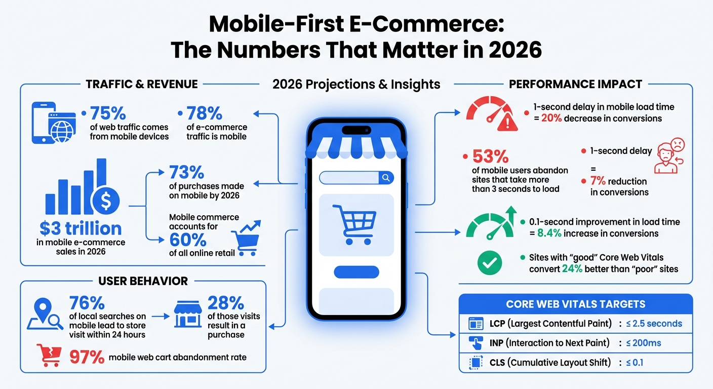
Mobile-First E-Commerce Impact: Traffic, Revenue, and Performance Statistics 2026
Mobile-first indexing means Google primarily uses the mobile version of your website to crawl, index, and rank content - regardless of the device being used by the searcher. Essentially, Googlebot now operates as a mobile-focused, headless Chromium engine. What this crawler encounters on your mobile site becomes the foundation for your site's indexed content. If any critical information - like product descriptions, customer reviews, or structured data - is missing from your mobile version but present on desktop, Google will act as though it doesn’t exist.
By 2024, Google fully transitioned to mobile-first indexing for all websites. This means the desktop version is no longer a fallback option. Your mobile site isn’t just a secondary version - it’s the only version that matters for search rankings. This shift has especially profound implications for e-commerce, as discussed in the next section.
For e-commerce, mobile-first indexing directly influences your revenue. Google now evaluates your site entirely based on its mobile performance. If your mobile checkout is clunky, product images load slowly, or key features are hidden to save screen space, those flaws will hurt your rankings - even if your desktop site is flawless. Azra Kassam from Shopify explains it best:
"A flawless desktop site cannot compensate for weak mobile performance" - Azra Kassam, Shopify
The stakes are even higher when you consider user behavior. A whopping 76% of local searches on mobile lead to a store visit within 24 hours, and 28% of those visits result in a purchase. If your mobile site struggles to deliver a seamless experience, you’re not just losing search rankings - you’re losing sales. From page speed to intuitive navigation, every detail of your mobile site determines whether customers can find, trust, and buy from you. As Google’s indexing metrics grow more advanced, optimizing for mobile has become a necessity for staying competitive.
Since its introduction, mobile-first indexing has evolved beyond simply checking if a site is mobile-friendly. By 2026, Google’s evaluation system has become far more sophisticated. It now considers how efficiently your site can be crawled and rendered. This is where the concept of a "Render Budget" comes into play. Pages built with JavaScript-heavy frameworks can take up to 20x longer to crawl compared to static HTML. For example, while a static HTML page might take just 150 milliseconds to index, a JavaScript-intensive page can take over 2,500 milliseconds.
Another major focus is Interaction to Next Paint (INP), a metric that tracks how quickly your site responds to user interactions like taps or clicks. This directly affects user experience and usability. Additionally, there’s the "2MB Cliff" - a soft limit where HTML payloads larger than 2MB risk being truncated, leaving some of your content unindexed.
AI-driven search tools, such as Google’s Search Generative Experience, now prioritize mobile-optimized content when generating snippets and answers. These advancements mean that mobile performance doesn’t just affect rankings - it also impacts how users engage with your site and, ultimately, how much revenue you generate. The bar for mobile optimization continues to rise, and e-commerce businesses must adapt quickly to stay visible and competitive.
In today’s mobile-first world, Google treats mobile content as the primary version of your site. That’s why ensuring your mobile and desktop versions display the same information is critical for maintaining strong search rankings. This concept, known as content parity, means that everything from product descriptions and FAQs to structured data, internal links, and image alt text must be identical across both versions.
Here’s why it matters: Googlebot Smartphone handles 80% to 95% of crawl activity on healthy websites. This makes the mobile version the main source for ranking signals. If important content only appears on the desktop version, it’s likely to be ignored by Google. To avoid this, metadata, schema markup, and internal linking must remain consistent across mobile and desktop versions.
E-commerce sites often make the mistake of creating a "Lite Version" for mobile to speed up load times. While this might seem like a smart move, it can hurt rankings since Google indexes only what’s visible on mobile. Features like simplified menus or JavaScript-triggered accordions can hide key internal links or content, making it invisible to Googlebot.
Another issue is Graph Fragmentation, where developers remove Schema.org nodes - like Review or Author - from the mobile version to save space. This disrupts the Knowledge Graph and can weaken your site’s credibility signals (E-E-A-T).
To ensure content parity, use a responsive design with a single URL and unified codebase. If you need to hide content visually on mobile, rely on CSS (e.g., display: none) rather than JavaScript, so the content remains in the initial HTML and is still indexable by Googlebot. For collapsible elements like accordions, opt for semantic HTML5 tags like <details> and <summary> instead of JavaScript-based toggles. These tags are recognized by Google as integral parts of the page content.
"A travel blog regained lost rankings by switching from JavaScript-based itinerary toggles to semantic HTML5 tags." - Search Engine Zine, 2026
Also, double-check that internal links, metadata, and schema markup are consistent across both versions. Tools like Google Search Console’s "Test Live URL" feature can help ensure that nothing - like footer content or FAQs - gets omitted due to rendering issues or truncation.
Keeping mobile and desktop content aligned isn’t just about rankings - it’s also about delivering a seamless experience for users while meeting Google’s expectations for mobile-first indexing.
Mobile site speed isn't just a technical detail - it directly impacts revenue. By 2026, over 70% of e-commerce traffic will come from mobile devices. Even a small delay can cost big. For instance, a 1-second delay in load time can slash conversions by 7%, and 53% of mobile users will leave a site that takes more than 3 seconds to load. On the flip side, improving load times by just 0.1 seconds can increase conversions by as much as 8.4%.
Speed also affects search rankings. With Google’s mobile-first indexing, your mobile site’s performance plays a key role in how you rank. Metrics like Core Web Vitals - Largest Contentful Paint (LCP), Interaction to Next Paint (INP), and Cumulative Layout Shift (CLS) - are official ranking factors. Sites rated as "good" on these metrics convert 24% better than those rated "poor".
Here’s a real-life example: In January 2026, a Miami-based sneaker store optimized its Shopify site by improving its LCP from 5.8 seconds to 1.9 seconds and its INP from 450ms to 120ms. The results? A jump in conversion rates from 1.2% to 3.4% and an extra $180,000 in monthly revenue.
To improve mobile performance, focus on these three Core Web Vitals:
Here’s a quick reference:
| Metric | Good (Target) | Needs Improvement | Poor |
|---|---|---|---|
| LCP (Largest Contentful Paint) | ≤ 2.5s | 2.5s – 4.0s | > 4.0s |
| INP (Interaction to Next Paint) | ≤ 200ms | 200ms – 500ms | > 500ms |
| CLS (Cumulative Layout Shift) | ≤ 0.1 | 0.1 – 0.25 | > 0.25 |
Companies are already seeing results from optimizing these metrics. For example, Trendyol cut its mobile INP by 50% (from 963ms to 481ms), leading to a 1% increase in click-through rates from product listings to detail pages. Similarly, Vodafone improved its LCP by 31%, which boosted its lead-to-visit rate by 15% and drove an 8% increase in total sales.
Improving mobile performance often starts with optimizing images. Converting key assets like hero banners and product images to WebP or AVIF formats can reduce file sizes by 25–34% compared to JPEGs. However, avoid lazy-loading critical visuals like hero banners. Use attributes like fetchpriority="high" and add <link rel="preload"> tags to ensure these images load immediately. Also, define explicit width and height attributes to prevent layout shifts.
Another key area is third-party scripts. Remove any unused scripts that haven’t been active in the last 90 days. For essential ones, use the async or defer attributes to stop them from blocking the page’s rendering. Shopify’s Carpe is a great example: by improving its LCP by 52%, the company increased conversions by 5% and grew revenue by 15%.
Finally, upgrade your infrastructure. Using a Content Delivery Network (CDN) with edge caching can reduce latency by 200–800ms. For returning visitors, enabling TLS 1.3 with 0-RTT can save an additional 450–650ms by skipping repeated cryptographic handshakes. For JavaScript-heavy sites, "progressive hydration" is a smart strategy - it prioritizes loading critical elements like navigation menus before less important ones like footers.
Each of these optimizations can make a meaningful difference, both in user experience and your bottom line.
Responsive design is essential for meeting Google's mobile-first indexing standards. It works by using a single URL and unified HTML codebase that adjusts seamlessly to any screen size. This approach prevents indexing errors and saves crawl budget. A properly configured viewport meta tag (<meta name="viewport" content="width=device-width, initial-scale=1">) ensures your site displays correctly on mobile devices without requiring users to pinch and zoom.
With responsive layouts, relative units allow content to adapt automatically to different screen sizes. Tools like Flexbox and CSS Grid make it easy to reflow content. For instance, a three-column product grid on a desktop can collapse into a single-column layout on a 375px-wide phone screen without needing separate mobile-specific code. Starting in 2024, mobile-first indexing applies to all websites, meaning Google primarily evaluates your mobile version for rankings.
These principles form the backbone of a website that works well across devices, ensuring a smooth mobile experience.
The details matter when creating a mobile-friendly e-commerce site. Start with touch targets - buttons, links, and form fields should be at least 48×48px with 8px spacing to avoid accidental taps. Place key actions, such as "Add to Cart" or checkout buttons, within thumb-friendly zones for easy access.
For text, use a base font size of at least 16px and a line height between 1.5 and 1.7 to improve readability and avoid unintended zooming on iOS devices. Simplify navigation with a hamburger menu or a bottom tab bar featuring 3–5 main sections for one-handed use. During checkout, opt for a single-column layout, enable guest checkout by default, and offer one-tap payment options like Apple Pay and Google Pay to streamline the process.
Another tip: use HTML5 input types (e.g., type="email", type="tel") to trigger the correct mobile keyboard. This small adjustment can make form completion much faster. A well-optimized mobile UX not only boosts conversions but also supports better rankings under mobile-first indexing.
Even with solid design principles, certain missteps can ruin a mobile experience. One major error is desktop-first thinking - designing for large screens and then shrinking the layout for mobile. This often leads to slow, bloated pages that frustrate users, contributing to cart abandonment rates as high as 97%.
Avoid hover-dependent menus or effects, as touchscreens don’t support hover states, making hidden content inaccessible. Similarly, don’t hide critical content like product descriptions or reviews using display: none. If Google can’t see it, it won’t index it. Instead, use HTML5 accordions with <details> and <summary> tags to make content collapsible yet crawlable.
Stay away from intrusive interstitials, like full-screen pop-ups, as Google penalizes these on mobile (exceptions include legal notices like age verification or cookie consent). Be mindful of autoplay videos and unoptimized images as well. Using modern formats like WebP or AVIF and the srcset attribute ensures images are properly sized for various screen widths, improving load speed and user experience.
"If your site isn't responsive, no amount of speed optimization will fix mobile-first indexing issues."
- Greg Bernhardt, SEO Strategist, Shopify
Google uses three Core Web Vitals to evaluate your site: Largest Contentful Paint (LCP), Interaction to Next Paint (INP), and Cumulative Layout Shift (CLS). These metrics directly influence how your e-commerce site ranks in search results.
Here’s the key takeaway: real user data matters more than lab results. Google relies on actual user metrics from the Chrome UX Report rather than Lighthouse scores. To capture this data, use the Web Vitals JavaScript library to monitor performance from real mobile visitors. Regularly review Google Search Console’s Core Web Vitals report - weekly checks can help you catch and resolve issues before they impact your rankings.
Keep your Time to First Byte (TTFB) under 800ms by implementing server-side caching and optimizing database queries. Also, monitor your HTML payload size - Google has an approximate soft limit of 2MB for initial HTML. Content beyond this limit, such as product descriptions or footer links, may not be indexed.
Make sure your site performs well on 4G connections, as this is Google’s baseline for mobile indexing. A site that loads quickly on Wi-Fi but lags on 4G will face ranking challenges.
Once you’ve gathered performance data, test across a range of devices to ensure consistent real-world results.
While Chrome DevTools is great for quick checks, testing on actual devices is essential for accurate performance insights. Focus on real smartphones, especially mid-tier Android devices, as Google uses these as performance benchmarks. Check your analytics to determine the devices your customers use most and prioritize testing on those models.
"Don't just test the iPhone 17. Your customers might be on a Pixel, and everything could look funky there."
- Greg Bernhardt, Shopify SEO Strategist
Use Google Search Console’s URL Inspection tool to see how Google’s Smartphone bot renders your site, including the HTML and screenshots. Test responsive breakpoints (320px–1,920px) to prevent horizontal scrolling issues. Additionally, run the Google Rich Results Test with the mobile user agent selected to confirm that your schema markup displays properly on mobile templates.
Re-test after any changes to your theme, apps, or hosting. Consistent testing ensures your site remains mobile-friendly and ready for Google’s indexing standards.
Building on the principles of content parity, it’s critical to ensure that your mobile design reflects the latest updates to your product offerings and user experience. Every element - text, internal links, schema tags, and image alt attributes - must be identical on both mobile and desktop. If your mobile version hides key content like product reviews or specifications behind a "load more" button requiring JavaScript, that content won’t be indexed by Google.
Stick to responsive design settings and proper viewport configurations, as outlined in the Maintaining Content Parity section, to maintain consistency across devices.
Even if no changes have been made, run weekly performance audits. Use Google Search Console’s Mobile Usability report to identify issues like undersized tap targets (less than 48×48px) or font sizes smaller than 16px. Compress your LCP image to under 100KB for mobile breakpoints and preload it to improve load times. Avoid intrusive interstitials - Google penalizes mobile sites with pop-ups that block main content on page load.
Google's focus on mobile-first indexing has permanently reshaped how e-commerce sites are evaluated. With mobile devices driving 78% of traffic and 73% of purchases by 2026, ignoring mobile optimization is essentially leaving money on the table. Desktop-only strategies just don’t cut it anymore.
The numbers speak volumes: improving mobile load time by just 0.1 seconds can increase conversions by 8.4%, while a one-second delay can slash them by 20%. Considering mobile commerce is expected to generate $3 trillion in sales this year - accounting for nearly 60% of all online retail - failing to prioritize mobile optimization could cost businesses dearly.
"If your mobile store is underperforming, you are ignoring the majority of your potential revenue." - Elementor
To meet both user expectations and search engine requirements, businesses need to focus on mobile performance. This includes maintaining consistency between mobile and desktop content, optimizing Core Web Vitals for real-world 4G speeds, and eliminating obstacles like cumbersome checkout processes. With mobile web cart abandonment rates averaging 97%, success hinges on more than just speed. Features like thumb-friendly navigation, one-tap payment options, and responsive interfaces are essential.
Mobile-first optimization is not a "set it and forget it" task. Changes like site migrations, theme updates, or hosting adjustments can unexpectedly impact performance. That’s why weekly performance monitoring and quarterly audits are crucial to keeping your site fast, user-friendly, and competitive in the mobile-first landscape. Regular testing and updates ensure your site stays ahead in this ever-evolving digital environment.
To check what Google has indexed from your mobile site, head to Google Search Console. There, you can review your indexed pages and coverage reports. Another quick method? Perform a site: search (e.g., site:yourdomain.com) directly on a mobile device or using mobile emulation tools.
Make sure the content on your mobile site matches your desktop version. Why? Because Google primarily uses the mobile version of your site for indexing and ranking. Keeping content consistent across both versions is key for mobile-first indexing.
To address mobile content parity issues effectively, make sure all essential content is included in the initial HTML response. Avoid relying on JavaScript interactions, such as "load more" buttons, since Google might not index content hidden behind them.
Conduct regular parity audits to ensure your mobile and desktop versions are aligned. This includes verifying that metadata and structured data are consistent across both versions.
Additionally, prioritize responsive design and speed optimization. Pay close attention to metrics like Largest Contentful Paint (LCP) to enhance user experience and maintain search engine visibility.
To optimize Largest Contentful Paint (LCP) for mobile, aim to ensure it loads within 2.5 seconds. This metric is crucial for mobile-first indexing in 2026 because it directly affects both user experience and search rankings.
LCP measures how quickly the largest visible content (like an image, video, or block of text) on a page loads. A slow LCP can frustrate users and lead to higher bounce rates, which can hurt your site’s performance in search results.
To improve LCP, focus on:
By addressing these areas, you can significantly boost LCP performance, ensuring your site meets the 2.5-second benchmark for a better mobile experience and stronger search visibility.
Local events can be a game-changer for small businesses trying to stand out in local search results. By hosting or participating in community events, businesses send strong "local relevance signals" to Google, improving visibility and rankings. Here's why this works:
For example, Speedy’s Auto Care in Ohio hosted a car show, leading to a 63% traffic boost and 37 new appointments in just 10 days. Similarly, Julie’s Garden Landscaping secured 162 backlinks and $8,900 in new revenue after sponsoring a local event.
Local events aren’t just about SEO - they help businesses build real connections with their communities while improving online visibility. Start small, track results, and grow your presence both online and offline.
Local Events SEO Impact: Key Statistics and Results for Small Businesses
Small businesses often struggle to compete in local search results due to three key challenges. These issues reveal why standard SEO strategies often fall short and how participating in community events can help address these obstacles.
Competing with large national chains is a steep uphill battle. Big companies dominate local search results thanks to their higher domain authority, leaving small businesses with little room to shine on broad search terms.
Adding to the problem, many small businesses unknowingly hurt their own rankings by having inconsistent NAP (Name, Address, Phone) data. For example, a coffee shop might list "123 Main St." on Google Business Profile but "123 Main Street" on Yelp. Such discrepancies signal unreliability to search algorithms. On top of this, a lack of local trust signals - like backlinks from community websites, local citations, or active social media presence - further weakens their credibility. According to Moz’s Local Search Ranking Factors study, these elements are among the most important for appearing in the Google Map Pack.
Another common issue? Many small businesses don’t create geographically specific content, like blog posts about local events or news. Without this, they appear less relevant to local searchers, making it harder to build visibility.
Declining foot traffic has a ripple effect on online visibility. Here’s the reality: 64% of customers read online reviews before visiting a local business. If foot traffic is low, there are fewer opportunities to gather fresh reviews, which impacts how legitimate a business appears in search results.
The stakes are even higher when you consider that 78% of local mobile searches lead to an offline purchase. For businesses struggling to draw people in, search engines may interpret this as a sign that they’re not a vital part of the local community. Without new reviews or updated photos, their profiles seem inactive, further reducing their visibility. This inactivity is especially damaging when 70% of consumers are more likely to visit a business that has a complete and regularly updated Google Business Profile.
As foot traffic dwindles, businesses often turn to traditional advertising, which offers little in terms of long-term local impact.
Traditional advertising is costly and offers little lasting value. While these ads might provide short-term visibility, they don’t build the digital authority or community trust that fuels sustainable growth. They’re transactional - bringing in some customers today but failing to create the backlinks, social mentions, or branded searches needed for organic success.
The numbers paint a clear picture: 40% of local SEO campaigns deliver a 500% return on investment, compared to just 22% for Pay-Per-Click campaigns. Local SEO connects small businesses with high-intent customers actively searching for nearby solutions, while traditional ads take a broader, less targeted approach.
Community-focused SEO strategies, like those driven by local events, offer a cost-effective alternative. They generate backlinks from local news outlets, fresh content, and social engagement - all without the hefty price tag of traditional advertising. While big brands dominate general search terms, they often overlook the hyper-local opportunities that small businesses can capitalize on.
Local events can significantly boost your search rankings by showing Google that your business is deeply connected to the local community. Hosting or sponsoring events can trigger several ranking factors, from fresh content and backlinks to increased branded searches and social activity. Let’s explore how these events help improve local visibility, earn backlinks, and build trust within the community.
Local events are a direct way to improve visibility by engaging nearby audiences. Search engines reward businesses that actively participate in their local communities. Creating a dedicated event page on your website and promoting it through your Google Business Profile adds fresh, location-specific content optimized with local keywords like "[City] [Industry] Event."
The results of such efforts can be impressive: businesses have reported a 63% increase in organic traffic, a 42% growth in branded search volume, and noticeable improvements in conversions within weeks of promoting an event. Using event schema markup, you can make your event details - like dates, locations, and ticket links - stand out in search results. Regularly updating your Google Business Profile with event-related content keeps it active, signaling to Google that your business is relevant and engaged locally. This can improve your chances of appearing in the coveted Map Pack.
"Google's AI loves to move things up that are local to you and the timing on them is close to the near future." - Dan Gudema, SEO Turbo Booster
Event partnerships are a goldmine for earning high-quality local backlinks, which are crucial for competing with larger brands. Collaborating with event organizers, sponsors, and other local businesses naturally generates backlinks and citations. When your business’s Name, Address, and Phone Number (NAP) appear on partner websites, it signals to search engines that you’re an integral part of the community.
Take the example of Julie's Garden Landscaping in Seattle. By sponsoring a booth at the Kirkland Home + Garden Show, Julie created an optimized event page with schema markup and submitted listings to over 20 local directories. The campaign resulted in 162 new quality backlinks, a 103-position increase in organic keyword rankings, and 217 website visitors tracked using UTM parameters. Even better, five new recurring clients signed on, adding $8,900 in quarterly revenue.
| Event Promotion Channel | Primary SEO Benefit | Target Metric |
|---|---|---|
| Local Directories (Eventbrite, Yelp) | Citations & Backlinks | Referral Traffic |
| Google Business Profile Posts | Local Map Visibility | Directions/Call Requests |
| Website Event Landing Page | Keyword Rankings | Organic Search Traffic |
| Social Media (Hashtags/Tags) | Social Signals & Engagement | Branded Search Volume |
| Local News/PR Outreach | High-Authority Backlinks | Domain Authority |
By promoting your event effectively, you can secure backlinks from authoritative local sources like Chamber of Commerce websites, community calendars, and local news outlets. One well-executed local event can generate over 160 high-quality backlinks, boosting your domain authority and overall SEO performance.
The benefits of local events go beyond technical SEO. They help build trust with the community, which search engines take into account. When your business actively participates in local events, it becomes more than just a name on a search results page - it becomes a trusted part of the community. This trust often translates into online behaviors that positively impact your rankings.
Attendees at your events often share their experiences on social media, tag your business, and post photos. These social signals show search engines that your business is active and popular. Additionally, happy attendees frequently leave positive reviews mentioning the event, further reinforcing your local relevance.
"When your business becomes part of the digital conversations around local events... you send strong signals that your shop is active, local, and trusted." - Dan, Author at Shop Dog Marketing
Strategic participation in events can lead to higher rankings for over 100 localized search queries within six months. As branded searches increase, Google interprets this as a sign of high authority, boosting your visibility and helping you stand out in local search results.
Follow these steps to create event pages that rank well in search engines, engage your local audience, and measure results effectively.
Always create a dedicated landing page for each event instead of burying details in a blog post. A standalone page is easier for search engines to index and rank. For recurring events, stick with an evergreen URL like "/austin-food-festival" rather than a year-specific one. This approach helps maintain link authority over time.
Make sure to include the event name, location, and date in key places: your page title, H1 header, meta description, and image alt text. For example, if you're hosting a "Classic Car Show in Elyria, OH", optimize your copy around that phrase to target local searches.
Take advantage of Event Schema markup (JSON-LD) to enable rich snippets in search results. Embedding a Google Map on your page can further reinforce the event's location. Also, ensure your NAP (Name, Address, Phone) details are consistent across your site, Google Business Profile, and event directories.
Promote your event through your Google Business Profile and reputable local event directories like Eventbrite, Yelp, or your local Chamber of Commerce. This not only increases visibility but also builds backlinks. Use UTM parameters in your shared links (e.g., "?utm_source=EventName&utm_medium=social&utm_campaign=Spring2026") to track traffic sources accurately.
For example, Speedy's Auto Care saw impressive results after optimizing their event page: a 63% increase in organic traffic, a 42% jump in branded search volume, and 37 new appointments within just 10 days.
Once your event page is live, involving the local community can amplify its reach.
Collaborate with non-competing local businesses like hotels, restaurants, or transportation companies. These partnerships can earn you natural backlinks when they promote your event on their websites. You can also reach out to local bloggers or influencers, offering VIP access in exchange for coverage and links.
Hosting events like charity fundraisers, workshops, or food drives can deepen community ties. Create a unique hashtag for your event and include it on all promotional materials. Encourage attendees to tag your business in their posts - this user-generated content boosts engagement and visibility.
After the event, ask attendees for reviews that highlight local details. Update your event page with photos, videos, and a recap to keep the page active and engaging. This not only extends the event's lifespan but also signals to search engines that your business is actively involved in the community.
"Nothing beats real community involvement for building local authority that search engines (and people) trust." – Jen Ruhman, Owner, Jen Ruhman SEO
These efforts can significantly enhance your event's visibility, but tracking the results is just as important.
Keep an eye on key metrics before, during, and after the event. Use tools like Google Analytics to monitor total visitors, bounce rate, and time-on-site for your event page. The UTM parameters you added earlier will help isolate event-related traffic. Additionally, check Google Business Profile Insights for increases in discovery searches, direction requests, or phone calls.
Track branded search volume to gauge your business's growing authority. Google Search Console is great for monitoring ranking changes for geo-targeted keywords like "[Service] in [City]." Meanwhile, tools like Moz, Semrush, or Ahrefs can help you track new backlinks from event directories, local news sites, and partner websites.
For example, Julie's Garden Landscaping in Seattle used UTM-tagged links to track their participation in the Kirkland Home + Garden Show in August 2024. The campaign brought 217 website visitors, boosted rankings for 103 organic keywords, earned 162 new backlinks, and generated $8,900 in quarterly revenue from five new clients.
| Metric Category | Specific Metrics to Track | Recommended Tools |
|---|---|---|
| Website Traffic | Total visitors, bounce rate, time-on-site | Google Analytics (with UTMs) |
| Local Visibility | Discovery searches, direction requests, calls | Google Business Profile Insights |
| SEO Authority | Domain authority, new backlinks, local citations | Moz, Semrush, Ahrefs, Linkody |
| Search Performance | Keyword ranking changes, click-through rates (CTR) | Google Search Console |
| Engagement | Social shares, hashtag usage, attendee reviews | Social Media Analytics, Yelp, Facebook |
Finally, conduct a thorough audit 1–3 months after your event to assess long-term ranking improvements. While traffic spikes might happen immediately, meaningful SEO gains often take weeks or months to fully materialize.
This article has highlighted how local events tackle common SEO hurdles while fostering trust within the community. For small businesses, local events present an affordable way to not only improve search rankings but also build stronger connections with their audience. By hosting or taking part in community activities, you create opportunities that lead to impactful results.
Participating in events can drive up organic traffic and increase branded searches. The best part? These benefits don’t require huge budgets. Even small initiatives - like organizing a workshop or being a drop-off point for donations - can spark local interest and earn quality backlinks.
"The overwhelming majority of the value from hosting events comes from the event itself, so don't get lost in the link building aspects of the strategy. You should be hosting events because that's the type of sh*t real businesses do." – Kane Jamison, Founder, Content Harmony
Start with smaller events, track your progress, and build genuine local credibility. Events not only bring a human touch to your brand but also create a level of trust that’s hard to achieve through digital strategies alone. Take these steps today to strengthen your local presence and see long-term SEO benefits.
Hosting or participating in a local event is a fantastic way to connect with your community while enhancing your online presence. Think about organizing something that ties into your industry or local interests - like a charity fundraiser, a community service project, or a free workshop showcasing your products or services. Events like these not only foster stronger community relationships but also create opportunities for valuable local media coverage.
Why does this matter for SEO? These events can lead to citations, backlinks, and social media buzz. For example, local news outlets might mention your event, linking back to your website. Attendees could leave glowing reviews or share their experiences on social media, further amplifying your reach. All of this activity helps build your local SEO, making your business more visible in search results.
To build local backlinks through events, consider sponsoring or hosting one. This approach can earn your business mentions on community calendars, local news websites, and social media platforms. To maximize the impact, share engaging content like blogs, photos, and videos related to the event. Actively participate in discussions with local media and online communities to amplify your presence. These combined efforts can inspire others to link to your site, helping improve your SEO with relevant, high-quality local backlinks.
Event-driven SEO efforts typically start showing results within 6 to 12 weeks. The exact timeline can vary based on factors such as the nature of the event, the industry you're targeting, and the strategies you use. By maintaining consistent efforts and ensuring your optimizations are on point, you can often see progress sooner.
Header tags (H1 to H6) are essential for organizing web content and improving SEO. They create a clear structure that helps search engines understand your page and makes content easier to read. Here's what you need to know:
Why it matters:
Quick Tip: Use tools like Screaming Frog or Google Search Console to audit your header tags and fix issues like missing or duplicate H1s.
Header tags are a simple yet effective way to boost SEO and improve content readability. Let’s dive deeper into how to use them effectively.
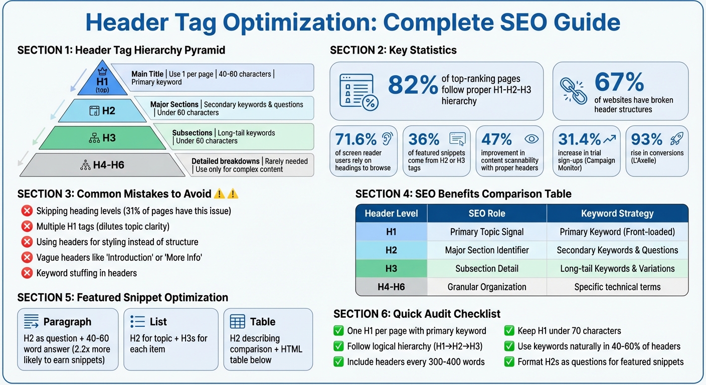
Complete Guide to Header Tag Hierarchy and SEO Best Practices
Header tags work like a pyramid of importance. The H1 sits at the top as the main topic, H2s divide the content into major sections, and H3–H6 tags provide additional layers of detail. This hierarchy helps search engines and screen readers interpret your content effectively.
The structure flows in descending order: H1 → H2 → H3 → H4, and so on. Skipping levels disrupts this flow. As John Mueller, Google's Search Advocate, puts it:
"We do use H tags to understand the structure of the text on a page better".
When organized properly, header tags create a clear structure that aids indexing, scanning, and navigation. For instance, 71.6% of screen reader users rely on headings to browse web pages. Now, let’s dive into the role of each header level, starting with the H1.
Think of your H1 as the "book title" of your page. It defines the entire page's subject for both visitors and search engines. Best practice is to use it only once per page. While Google allows multiple H1s without penalties, sticking to one ensures clarity.
For optimal impact, keep your H1 between 40 and 60 characters. This length strikes a balance between being descriptive and concise. Also, include your primary keyword naturally - nearly all pages ranking on Google’s first page feature their main keyword in either the title or H1 tag.
It’s important to distinguish the H1 from the title tag. The <title> tag appears in browser tabs and search engine results, while the <h1> is the headline visible on your webpage. They can be similar but serve different purposes: the title tag drives clicks, while the H1 introduces the content to visitors already on your page.
H2 tags function like "chapter titles", breaking your content into primary sections. Each H2 should represent a distinct subtopic or theme, guiding readers through the article. Aim for concise H2s, keeping them between 3 and 7 words.
H3 tags add another layer of detail, dividing H2 sections into smaller, more specific points. For example, an H2 on "SEO Benefits of Header Tags" might include H3s such as "Improved Indexing" and "Better User Experience." This creates a nested structure where each layer supports the one above it.
Tags H4 through H6 are rarely needed unless you’re working with highly detailed content, like technical manuals or legal documents. For most web pages and blogs, sticking to H1 through H3 is sufficient. Regardless of the level, keep header lengths between 10 and 70 characters to ensure they’re easy to scan and understand.
One of the most common errors is skipping heading levels, such as jumping from H1 to H3 or H2 to H4. This disrupts the semantic flow and can confuse both search engines and assistive technologies. As Pope Tech explains:
"When a heading is skipped, the user might think they missed a heading or aren't able to access it".
Another mistake is using header tags for their visual appearance rather than their structural role. If you want text to appear larger or bolder but it doesn’t fit the content hierarchy, use CSS styling on a regular paragraph tag instead. Header tags are for organizing content, not design.
Using multiple H1 tags can dilute your page’s main topic. While it won’t directly harm your rankings, it creates confusion about your page’s focus. Similarly, avoid vague headers like "Introduction" or "More Info." These add no value for search engines or readers. Lastly, steer clear of keyword stuffing in headers - it disrupts readability and could lead to penalties. Instead, use keywords naturally where they fit.
| Issue | Impact | Solution |
|---|---|---|
| Skipping levels | Confuses structure; hinders accessibility | Follow H1 → H2 → H3 order |
| Multiple H1s | Reduces topic clarity | Use one H1 as the main title |
| Styling misuse | Sends incorrect signals to search engines | Use CSS for design, not header tags |
| Vague text | Misses keyword opportunities | Write specific, descriptive headers |
| Keyword stuffing | Hurts user experience; risks penalties | Place keywords naturally and sparingly |
Avoiding these mistakes sets the stage for more advanced header strategies in SEO.
Optimized header tags do more than just structure your content - they actively contribute to better search rankings and user engagement. When used effectively, they signal relevance to search engines, improve indexing, and make your pages easier for users to navigate. Let’s break down the key SEO benefits of optimized header tags.
Search engines prioritize header tag text over regular body text, making headers prime real estate for keywords. Start with your H1 tag, which should feature your primary keyword prominently - ideally, at the very beginning. For instance, if your target keyword is "email marketing platform", place it right at the start of your H1 for maximum impact.
Use H2 tags for secondary keywords or question-based phrases. This approach helps capture a wider range of search queries while keeping your content focused. H3 tags are perfect for long-tail keywords and related terms. These add depth to your content without resorting to keyword stuffing.
Here’s a real-world example: In 2025, Campaign Monitor boosted trial sign-ups by 31.4% by aligning their H1 headlines with specific search queries, rather than sticking with a generic "Email Marketing Platform" header. Similarly, L'Axelle saw a 93% rise in conversions after switching their H1 from a passive description to a more engaging, benefit-driven headline. These examples highlight the direct link between keyword-focused headers and business growth.
| Header Level | SEO Role | Keyword Strategy |
|---|---|---|
| H1 | Primary Topic Signal | Primary Keyword (Front-loaded) |
| H2 | Major Section Identifier | Secondary Keywords & Questions |
| H3 | Subsection Detail | Long-tail Keywords & Semantic Variations |
| H4-H6 | Granular Organization | Specific technical terms or niche details |
A well-structured header hierarchy supports passage indexing, a Google feature that allows specific sections of your page to rank independently for niche queries. Even if your page doesn’t focus entirely on a single topic, clear H2 and H3 tags help search engines identify and rank individual sections.
Headers also play a critical role in featured snippets. Research indicates that 36% of featured snippets are sourced directly from H2 or H3 tags. To increase your chances of earning a featured snippet, frame your H2 tags as user questions (e.g., "How do header tags improve SEO?") and follow them up with a concise 40–60 word answer.
Google may also use H2 tags to create clickable "jump links" in search results, which increase the visibility of your listing. These links make your page more noticeable and clickable. As John Mueller, Google’s Search Advocate, explains:
"Header elements are a 'really strong signal' that informs Google's understanding of a page's topics".
Beyond helping with indexing, optimized headers improve the overall user experience.
Headers make your content scannable, which is crucial for user engagement. Most people skim through online content rather than reading it word-for-word. Headers act as clear signposts, guiding users to the information they’re looking for.
The impact of scannability is measurable: Content with a proper header hierarchy sees a 47% improvement in how easily users can navigate and understand the material. This improved navigation reduces cognitive load, keeps visitors on your page longer, and lowers bounce rates - all factors that positively affect your rankings.
Headers also enhance accessibility. Screen readers rely on them to navigate content efficiently, and using a proper header hierarchy ensures compliance with WCAG 2.1 standards. This not only improves accessibility but also contributes to better SEO performance.
Crafting headers that work for both search engines and users is all about balance. Headers should guide search engine crawlers while making content easy and enjoyable for readers to follow. By following these strategies, you can structure headers in a way that boosts search performance and keeps visitors engaged.
Before you dive into writing headers, take the time to figure out what your audience is searching for. This step builds on the SEO advantages of header tags and ensures your content aligns with user intent. Start by identifying whether users are looking for information or ready to take action. Your H1 and first H2 should directly reflect this intent, while other headers can explore related or secondary topics.
When adding keywords to headers, keep it natural. Place primary keywords in your H1 and H2 tags, and use secondary or related terms in H3s and H4s. For longer-tail keywords, reserve them for deeper subsections. This way, you can cast a wider net for search queries without losing focus.
Another effective approach is to rephrase H2 or H3 tags as questions like "How does header tag optimization work?" Follow each question with a brief, concise answer (around 40–60 words). This format not only improves readability but also increases your chances of being featured in search snippets.
Clarity and readability should always come first. Headers should be engaging, to-the-point, and ideally between 3 and 10 words. If adding a keyword makes a header feel clunky, prioritize making it sound natural over forcing the keyword.
Avoid filler phrases like "Introduction to", as they add unnecessary length without contributing value. Keep your H1 under 70 characters to ensure it displays properly in search results, and aim for H2 and H3 tags to stay below 60 characters.
Consistency is key when it comes to formatting. Decide whether you'll use Title Case or Sentence Case and apply it uniformly across your site. As Google's John Mueller advises:
"Headings are best when they 'accurately reflect the content that follows.'"
A clear and consistent header structure is essential for both user experience and SEO. Stick to a logical hierarchy: use one H1 for your main title, H2s for major sections, and H3s through H6s for subsections. Skipping levels - like jumping from an H1 to an H3 - can confuse both search engines and screen readers, disrupting the flow of your content.
Plan your headers before you start writing. Think of them as a roadmap: the H1 is your title, H2s are chapter headings, and H3s and H4s are the finer details. Breaking up text with headers every 3–5 paragraphs also makes your content easier to scan, helping users find what they need faster. In fact, pages with well-structured headers can see up to 36% longer average time spent on the page.
Remember, headers are for organizing content, not styling. Use them to define the structure, while CSS takes care of the visual design.
| Header Level | Purpose | Character Limit | Keyword Strategy |
|---|---|---|---|
| H1 | Main Title / Central Theme | Under 70 characters | Primary keyword (front-loaded) |
| H2 | Major Sections / Chapters | Under 60 characters | Secondary keywords & questions |
| H3 | Subsections | Under 60 characters | Long-tail & related variations |
| H4–H6 | Detailed Breakdowns | Flexible | Specific technical terms |
Once you've nailed the basics of header tags, it's time to level up. Advanced techniques can help you target featured snippets, align headers with broader SEO strategies, and even optimize for voice search. Surprisingly, headers play a bigger role in these areas than you might think.
Did you know that about 36% of featured snippets come from H2 or H3 tags? Think of each header as a mini answer block for search engines.
One effective strategy is to phrase your H2 tags as direct questions that match user searches. For example, in April 2024, Search Engine Journal snagged a featured snippet for "How to remove default search engine in Chrome?" simply by using that exact question as an H2 tag, followed by a short, clear paragraph. In fact, question-based H2s are 2.2 times more likely to earn featured snippets.
Formatting also matters. For paragraph snippets, place a 40-60 word answer right after your H2 in a <p> tag. For list snippets, use an H2 for the main topic and H3s for each step or item. A great example is WebMD, which earned a featured snippet for "how to relieve migraine fast" by structuring their H2s as distinct relief methods. Google pulled these into a bulleted list automatically.
Headers also help define content boundaries for search engines. According to Single Grain, large language models (LLMs) treat headers as clear markers for where one answer ends and another begins.
| Snippet Type | Header Strategy | Content Requirement |
|---|---|---|
| Paragraph | H2 phrased as "What is" or "Why" question | 40-60 word direct answer in <p> tag |
| List | H2 for topic; H3s for list items | Sequential steps formatted as subheadings |
| Table | H2 describing the comparison | Data in a standard HTML table below |
These strategies make your headers work harder, seamlessly tying into your overall SEO efforts.
Headers aren't standalone elements - they're part of what experts call the "SEO Content Trinity": header tags, title tags, and meta descriptions. When these three work together, they send strong signals to search engines and create a better user experience.
A popular approach is the H1/H2 Partnership Model. Your H1 grabs attention with a compelling, benefit-driven message, while your H2 provides context and incorporates primary keywords. For instance, L'Axelle increased conversions by 93% when they changed their H1 from "Feel fresh without sweat marks" to "Put an end to sweat marks!".
Clean header structures can also boost traffic and reduce bounce rates. One B2B SaaS blog saw a 156% traffic increase (from 12,000 to 31,000 monthly visitors) by fixing duplicate H1s and improving the flow from H1 to H2 to H3. They also reduced their bounce rate by 32%.
For best results, aim to include keywords naturally in 40-60% of your headers. Overdoing it can make your content look spammy. You can also enhance your headers with schema markup - like FAQPage schema for question-based H2s - to improve clarity and eligibility for rich results.
Voice search is booming, with over 8.4 billion devices now in use globally. Headers play a pivotal role in capturing these conversational queries. Voice searches tend to be longer and more natural, so your headers should reflect that.
Instead of a simple header like "Header Tag Benefits", reframe it as a question: "What are the benefits of using header tags for SEO?" This mirrors how people actually speak their queries. Interestingly, 40% of voice search responses come from featured snippets, so the snippet strategies mentioned earlier are crucial here too.
For voice search, structure your headers as "answer-first" units. Each H2 or H3 should clearly state the topic at the start, making it easier for NLP systems and voice assistants to extract the information. Research shows that QA accuracy improves by 18-27 percentage points when content is well-structured with explicit headers.
Keep your header hierarchy simple - stick to H1 through H3. Deeply nested headers (like H4-H6) can confuse retrieval systems, especially for voice and AI search. Use straightforward, literal phrasing instead of clever or abstract headings. As Google's John Mueller puts it:
"Header elements are a 'really strong signal' that informs Google's understanding of a page's topics".
| Strategy | Traditional SEO Heading | Voice/LLM-First Heading |
|---|---|---|
| Goal | Keyword relevance & scannability | Self-contained "answer units" |
| Phrasing | Short, keyword-heavy fragments | Natural language questions |
| Context | Relies on surrounding text | Front-loads entities for standalone clarity |
| Structure | Can be deep (H1-H6) | Shallow and predictable (H1-H3) |
When working on header optimization, steering clear of common mistakes is just as important as following best practices. Even small errors can negatively impact your SEO and make your content harder to navigate. Thankfully, once you know what to watch out for, these mistakes are often easy to fix. Below are three frequent errors and advice on how to address them effectively.
Having more than one H1 tag on a page can confuse both search engines and assistive technologies like screen readers. For users relying on screen readers, each H1 tag is treated as equally important, making it harder to distinguish the main content from supporting sections. A study found that 71.6% of screen reader users depend on headings to navigate content.
From an SEO perspective, multiple H1 tags dilute your page’s main topic. This can lead to search engines misinterpreting your content and even rewriting your search snippet using an unintended heading. Additionally, SEO audit tools are likely to flag this as an error.
To avoid this, stick to a single H1 tag per page. Place it at the top of your main content and ensure it includes your primary target keyword. Aligning your H1 with your title tag can also help prevent Google from altering your snippet.
Maintaining proper header sequencing is equally important, as explained below.
Skipping header levels disrupts the logical flow of your content and makes it harder for search engines and screen readers to interpret your page structure. Think of your headers as a roadmap: the H1 is your title, H2s are chapters, and H3s are sub-sections within those chapters. Ignoring this sequence can confuse both users and search engines.
Interestingly, 31% of web pages have skipped header levels. If you’re tempted to skip a level because an H3 looks too small, adjust its style using CSS instead of jumping to an H4. Proper sequencing is crucial because screen readers rely on this order to help users navigate content. Tools like Screaming Frog or HeadingsMap can assist in identifying any skipped levels during your audits.
While skipping levels is problematic, overloading your content with too many low-level headers can also cause issues.
Data shows that only 8% of top-ranking pages use H4 tags, and fewer than 2% use H5 or H6 tags. Overusing these low-level headers can clutter your page and dilute the importance of your primary H1 and H2 tags. When every few paragraphs have a subheading, search engines may struggle to identify your main topics, and readers might find it harder to locate key information.
Excessive subheadings can overwhelm users and complicate navigation for those relying on screen readers. Google’s John Mueller has emphasized:
"Headings on a page help us to better understand the content on the page... sometimes having a clear heading on a page gives us a little bit more information on what that section is about".
Save H4–H6 tags for content that genuinely requires detailed breakdowns, such as highly technical guides or documents exceeding 5,000 words. For most content, focus on a straightforward structure using H1, H2, and H3 tags. Aim to include a header every 300–400 words to keep your content scannable and easy to read.
To make the most of header tags, you need to consistently monitor their performance. While avoiding common pitfalls is a good start, using specialized tools is essential for spotting and fixing header issues across your site. Manual checks might work for a few pages, but larger websites require automation to handle the scale. Below are some of the top tools that can help you manage and optimize header tags effectively.
Audit tools are designed to pinpoint specific header tag issues. One standout option is Screaming Frog SEO Spider, a desktop application that performs in-depth website crawls. It’s great for identifying skipped heading levels, missing H1 tags, and duplicate headers on large sites. The free version supports up to 500 URLs, while the paid version ($279/year) offers unlimited crawling. Aleyda Solis, Owner of Orainti, highlights its value:
"The Screaming Frog SEO Spider is my 'go to' tool for initial SEO audits and quick validations: powerful, flexible and low-cost."
Another reliable choice is Semrush Site Audit, which organizes issues into categories like errors, warnings, and notices. This makes it easier to prioritize fixes. It can scan 100 pages and generate a comprehensive report in about three minutes.
For a quick look at individual pages, the SEO Pro Extension offers instant visibility into your H1–H6 structure right in your browser. Meanwhile, Google Search Console is indispensable for checking how Google renders your headers, especially on sites relying heavily on JavaScript.
| Tool | Best For | Starting Price | Key Header Feature |
|---|---|---|---|
| Google Search Console | Indexing verification | Free | Displays rendered header HTML |
| Screaming Frog | Technical bulk audits | Free (500 URLs) / $279/year | Detects skipped levels and duplicate H1s |
| Semrush Site Audit | Prioritized fixes | Free (100 pages) / $139.95/month | Issue severity categorization |
| Sitebulb | Guided fixes | $18/month | Explains error resolution |
| SEO Pro Extension | Quick page checks | Free | Instant outline view |
Armed with these tools, you can streamline header optimization by following a structured audit process.
Begin by crawling your entire site with a tool like Screaming Frog or Semrush Site Audit to map out all your H1–H6 tags. Look for hierarchy issues, such as skipping from H2 to H4, which can confuse both search engines and screen readers. Ensure every page has a single H1 tag that incorporates your primary keyword.
Next, identify duplicate H1 tags across multiple pages. Duplicate headers can weaken your topical relevance, so it’s important to address these promptly. For widespread problems like missing H1 tags, start by fixing them at the CMS template level before tackling individual pages.
For sites that rely on JavaScript, use Google Search Console’s URL Inspection tool to make sure header tags are rendered properly. This step is critical to confirm that search engines see your headers as intended.
Finally, export your audit findings as a CSV file and share it with your team. Focus on resolving template-level issues first, then move on to high-priority pages. For manual checks, browser extensions like the SEO Pro Extension can help you verify that headers are being used for structural purposes, not just for visual styling.
Header tag optimization plays a crucial role in improving SEO performance by making content clearer for search engines and more navigable for users. Here's a compelling statistic: 82% of top-ranking pages follow a proper H1-H2-H3 hierarchy, while 67% of websites struggle with broken header structures, potentially harming their rankings. This gap highlights a major opportunity for businesses to refine their header strategies and gain a competitive edge.
To optimize headers effectively, start with a logical hierarchy. Use one H1 tag per page (ideally 20–70 characters) that includes your primary keyword. Follow it with H2 tags for main sections and H3 tags for subtopics, ensuring you don’t skip levels - jumping from H1 to H3 can confuse search engines and screen readers alike. Aim to naturally incorporate keywords into 40–60% of your headers, striking a balance between SEO and readability to avoid spam penalties.
Properly structured headers also open the door to featured snippet opportunities. For example, formatting H2 tags as questions can double your chances of earning a featured snippet, and 36% of featured snippets are sourced directly from H2 or H3 tags. Beyond SEO, well-organized headers make content 47% faster to scan, which can significantly boost user engagement. Armed with these strategies, businesses can make meaningful improvements to their content structure.
To put these strategies into action, start with a comprehensive audit of your website's current content. Tools like Screaming Frog or SEMrush Site Audit can help identify missing H1 tags, duplicate headers, or broken hierarchies. Begin by fixing template-level issues in your CMS, then address high-traffic pages individually for maximum impact. Establish clear editorial guidelines that outline character limits, formatting rules, and keyword usage to ensure consistency moving forward.
If you’re ready to take your header optimization to the next level, SEO Werkz offers tailored SEO solutions. Their team can assist with detailed audits, scalable fixes, and the creation of long-term content strategies that align header optimization with broader on-page and technical SEO goals. A well-structured header strategy is a key piece of the puzzle for sustained SEO success.
No, your H1 doesn’t have to be an exact replica of your title tag. However, they should be closely aligned in topic. This approach helps both users and search engines understand the content better, boosting your page's relevance and SEO effectiveness.
Each major section of a page should include a single H2 tag. The total number of H2 tags will depend on the length and structure of the content. Using multiple H2 tags is a best practice as it helps clearly organize subtopics, making the content easier to read and improving its SEO performance.
Absolutely, headers play a key role in AI and voice search optimization. Using well-structured header tags (H1 to H6) establishes a clear hierarchy for your content, making it easier for search engines and AI systems to interpret your webpage's main topics.
When you include keywords in your headers, you increase the likelihood of appearing in featured snippets or voice search results. Why? AI relies on these headers to pull out relevant information and match it to user queries, enhancing the content's relevance and visibility.
YouTube SEO directly affects how long viewers stay on your videos. The platform prioritizes content that keeps people engaged, using metrics like audience retention to decide whether to promote your video. If viewers leave early, YouTube is less likely to recommend it. Here’s what matters most:
Focus on creating videos that deliver on their promise, use data to identify weak spots, and optimize metadata for relevance. Retention isn’t just a metric - it’s what drives your video’s success on YouTube.
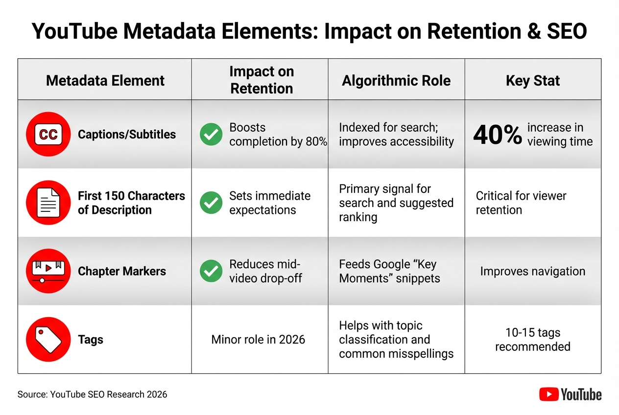
YouTube Metadata Elements Impact on Audience Retention and SEO
Mismatched metadata that prioritizes clicks over viewer satisfaction can quickly tank your video's performance. Let’s dive into some common errors that hurt audience retention.
Chasing high-volume keywords without considering what your audience actually wants can backfire. If viewers expect one thing but get something completely different, they’ll leave - fast. This disconnect between expectation and reality sends a clear signal to YouTube’s algorithm to stop recommending your video.
Here’s why: YouTube operates more like a prediction engine than a simple search engine. It prioritizes viewer behavior over text-based metadata. A study of 1.6 million videos revealed that only 6% of top-ranking videos used exact keyword matches in their titles, but 75% used related terms that aligned with viewer intent.
"Keywords tell the algorithm what your video is about; engagement signals tell it whether your video is worth showing." – DigitalApplied
High click-through rates paired with poor retention are a red flag for the algorithm. While targeting unrelated but trending keywords might give you a temporary bump in views, it ultimately hurts your channel’s credibility and algorithmic standing. Using misleading visuals only makes things worse.
Custom thumbnails can increase your click-through rate by 8–15x compared to auto-generated ones. But here’s the catch: if your title and thumbnail overpromise and your content doesn’t deliver, you’re setting yourself up for failure. Viewers who feel misled will leave within seconds, causing a steep drop in your retention graph.
YouTube’s algorithm prioritizes viewer satisfaction, not just clicks. Clickbait tactics might get you some initial views, but the algorithm quickly notices when people bounce, limiting your video’s reach.
"A video that gets clicked but not watched actually hurts your channel's algorithmic standing." – DigitalApplied
This goes beyond just one video. If viewers feel tricked, they’re more likely to click “not interested,” sending negative feedback that impacts your entire channel. Rebuilding trust after this kind of damage is no small feat. Now, let’s look at how incomplete metadata can further undermine your retention.
Incomplete metadata and missing captions confuse the algorithm, making it harder to connect your video with the right audience. When your metadata is vague or incomplete, your video gets shown to viewers who might not stick around.
Captions, on the other hand, can significantly improve retention. They not only make your video more accessible but also include searchable text that boosts indexing. Videos with subtitles see a 40% increase in viewing time, and viewers are 80% more likely to watch to the end when captions are available. Without captions, you miss the opportunity to rank for key phrases mentioned in your content.
The first 150 characters of your video description are critical. This is where you set expectations for viewers and provide a primary signal for YouTube’s search and suggestion algorithms. If this space is filled with generic or irrelevant text, viewers may lose interest and click away.
| Metadata Element | Impact on Retention | Algorithmic Role |
|---|---|---|
| Captions/Subtitles | Boosts completion by 80% | Indexed for search; improves accessibility |
| First 150 Chars of Description | Sets immediate expectations | Primary signal for search and suggested ranking |
| Chapter Markers | Reduces mid-video drop-off | Feeds Google "Key Moments" snippets |
| Tags | Minor role in 2026 | Helps with topic classification and common misspellings |
Let’s dive into strategies that can help keep viewers glued to your videos. These approaches not only align your content with what people are searching for but also ensure you deliver on their expectations.
Focus on keywords that match what your audience is actively looking for. When your video addresses a specific problem or question, viewers are more likely to stick around. Traffic driven by search often results in higher retention rates compared to random clicks from social media.
Optimizing for viewer intent can have a big impact: watch time can increase by 22%, and impressions can grow by 52%. Long-tail keywords - phrases with three or more words - are especially effective, generating three times higher click-through rates than shorter, more generic terms. Notably, 91% of high-ranking videos use these longer phrases to target specific intents.
To find the right keywords, try typing your topic into YouTube’s search bar while in Incognito mode. The autocomplete suggestions can provide clues about what viewers are searching for, whether it’s tutorials ("how to"), comparisons, or buying advice. For educational videos, focusing on "how-to" queries is a smart move - they often lead to longer watch times.
Also, include related terms naturally in your script. For example, if your video is about "YouTube SEO", mention terms like "retention", "CTR", or "algorithm." YouTube’s AI picks up on these connections, helping your video reach the right audience.
Once you’ve nailed your keywords, make sure your title, thumbnail, and opening moments deliver on the promise.
Your title and thumbnail are your first chance to grab attention, but your opening moments are where you seal the deal. Within the first 15–30 seconds, you need to validate the viewer’s expectations. This is the most critical period, as it’s where retention tends to drop off sharply.
In those opening seconds, answer these three questions: Who is this video for? What will they gain? Why should they trust you?. Avoid wasting time on long intros or generic greetings - get straight to the point. Over 33% of viewers exit within the first 30 seconds if they’re not engaged.
Keep your titles concise - under 60 characters - to avoid truncation on mobile. Place your main keyword within the first 40 characters for maximum impact. For thumbnails, stick to bold, high-contrast colors and limit text to 3–5 easy-to-read words. Thumbnails with expressive or emotional faces often perform 3–5 times better in click-through rates than neutral ones.
If you can retain 70–80% of viewers past the 30-second mark, your video is more likely to gain traction and go viral. To keep viewers engaged, switch things up - use different camera angles, add B-roll, or include text overlays every 5–7 seconds. These small changes, known as pattern interrupts, can boost total watch time by 28%.
Once your video grabs attention, your metadata should reinforce its relevance to both viewers and the algorithm.
Your video description and tags play a key role in helping YouTube’s algorithm understand your content. This is especially crucial for newer channels that lack an established viewer base.
Write a description that’s around 200 words, with your main keywords appearing in the first 2–3 sentences. This section is visible in search results and can influence both rankings and whether viewers click on your video. Adding timestamps to create chapters is another great tactic - it helps viewers navigate your content and allows Google and YouTube to index specific sections.
For tags, stick to 10–15 well-researched, specific terms. Start with your primary keyword and include variations, such as common misspellings or slang terms. While tags are less influential than titles or descriptions, they still assist with topic classification.
When your metadata accurately reflects your video’s content, the algorithm is more likely to recommend it to viewers who will watch it all the way through. And that’s exactly what you’re aiming for.
YouTube Analytics offers a clear window into your SEO strategy's strengths and weaknesses. It tracks every second of viewer behavior, showing where your content keeps audiences engaged and where it falls short. This data is essential for identifying gaps between your metadata and the actual content, helping you realign viewer expectations with what your video delivers.
Your audience retention graph is a key indicator of whether your SEO is attracting the right viewers. If over 55% of your audience exits within the first 60 seconds, there's likely a mismatch between what your title and thumbnail promised and what the video provided. For context, successful videos generally retain 70% or more of their audience during the introduction.
Different graph patterns can highlight specific issues:
To evaluate your SEO's effectiveness with new viewers, compare retention rates between new and returning audiences. If new viewers - those arriving via search - drop off faster than returning subscribers, your intro might not be effectively converting search traffic. Adjust your opening to deliver on the promise of your keywords.
"The cool thing about YouTube is they give us super detailed graphs for every video that show the exact second we lose a viewer." - MrBeast
Check your traffic sources to identify potential keyword issues. If viewers arriving via "YouTube Search" leave faster than those from "Suggested Videos", your keyword targeting might be too broad or attracting the wrong audience.
Analytics can reveal whether your video’s packaging matches its content. For example:
After publishing, run a 48-hour check. If your CTR is below 4%, test a new thumbnail or adjust your title to spark curiosity. Use YouTube Studio’s thumbnail testing tool to compare designs and choose the most effective option.
To optimize your metadata, include your primary keyword within the first 40 characters of the title and rewrite the first 150 characters of the description to clearly highlight the video’s value. If your "YouTube Search" traffic accounts for less than 20% of views, your keyword targeting needs improvement.
Leverage retention spikes to refine your metadata. If a specific segment is frequently rewatched, add a chapter timestamp with a keyword-rich title to highlight it. These chapters can even appear as "Key Moments" in Google search results, boosting your SEO visibility.
Use your performance data to refine your content strategy. Sort your videos by Average Percentage Viewed to identify top-performing content and look for patterns in topics, presentation styles, or keyword strategies.
Create a "spike library" by cataloging moments in your best-performing videos that viewers rewatched. These moments reveal what resonates most with your audience and can guide future content planning.
Only 16.8% of YouTube videos achieve a 50% average retention rate. If your videos consistently surpass this benchmark, focus on those topics. Videos retaining more than 65% of viewers past the first minute often see a 58% higher average view duration.
Analyze your "Suggested Videos" data to ensure your content aligns with your niche. If 70-80% of the videos driving traffic to your channel are on-topic, your SEO and content strategy are working in harmony with YouTube’s algorithm. Even a 10-point increase in your channel’s average retention can lead to a 25% or greater boost in impressions from YouTube’s recommendations.
Finally, track your "Views Per Unique Viewer" metric to identify topics that encourage binge-watching. A high ratio signals that viewers are engaging with multiple videos in a single session, strengthening your content loop and signaling to the algorithm that your channel is hitting the mark.
YouTube SEO is all about keeping viewers engaged, not just matching keywords. The platform’s algorithm focuses more on how people interact with your content than just the metadata. That means your titles and thumbnails need to match your video’s content accurately to avoid drop-offs and keep viewers watching. When your strategy aligns with what viewers want, you build watch time, which drives YouTube’s recommendations - responsible for 70% of the platform’s watch time.
Retention data is your secret weapon. Videos that hold at least 50% of viewers until the end are four times more likely to rank on the first page of search results. By analyzing retention graphs, identifying successful topics, and refining your metadata, you can create a sustainable growth strategy. As Ali Abdaal puts it:
"YouTube doesn't reward views - it rewards watch time. A video with fewer views but higher watch time will rank higher than a viral clip with a low retention rate."
This insight makes it clear: focusing on retention isn't optional - it’s essential for long-term success.
For businesses aiming to use YouTube as a key organic traffic channel, the technical side of optimization can feel overwhelming. That’s where SEO Werkz comes in. They provide end-to-end YouTube optimization services, combining keyword research, analytics, and custom thumbnail design to help you boost click-through rates and retention. By analyzing retention graphs, they identify where viewers drop off and use strategies like playlists and end screens to extend session watch time - a metric YouTube's algorithm loves.
If you're facing challenges like low retention, misleading metadata, or a lack of strategy, expert help can make a big difference. SEO Werkz offers tailored solutions for your audience and niche, turning YouTube into a reliable source of leads. Schedule a free consultation to see how smarter SEO practices can improve your video performance and grow your channel for the long haul.
For most videos, try to keep a retention rate between 40% and 60%. If your video runs longer, aim for at least 45% or higher. The better your audience retention, the more likely YouTube is to recommend your content, which can significantly improve your video's overall performance.
To figure out if your title and thumbnail are affecting retention, take a close look at click-through rate (CTR) and audience retention in YouTube Analytics. A low CTR could mean your title or thumbnail isn’t grabbing attention, while early drop-offs might signal that they’re misleading or not aligned with the content. Test updates to your titles or thumbnails and compare the metrics before and after to see if the changes boost engagement and retention.
To quickly boost watch time, focus on updating metadata like titles, descriptions, and thumbnails. These elements play a big role in grabbing attention and encouraging clicks.
Another key tactic is diving into audience retention data. By analyzing where viewers drop off, you can tweak your content structure and opening hooks to keep people engaged right from the beginning. Small adjustments here can make a big difference in how long viewers stick around.
Trade shows are bustling with potential leads, but did you know that 60% of attendees at large events never visit your booth? Geotargeting solves this by delivering personalized ads to attendees based on their real-time location. This strategy works before, during, and after trade shows to boost engagement and ensure you're connecting with the right audience. Here's what you need to know:
Geotargeting not only drives booth traffic but also provides measurable results, like impressions, clicks, and conversions. By combining it with tools like identity resolution and lookalike audience targeting, you can maximize ROI and turn trade show interactions into long-term business opportunities.
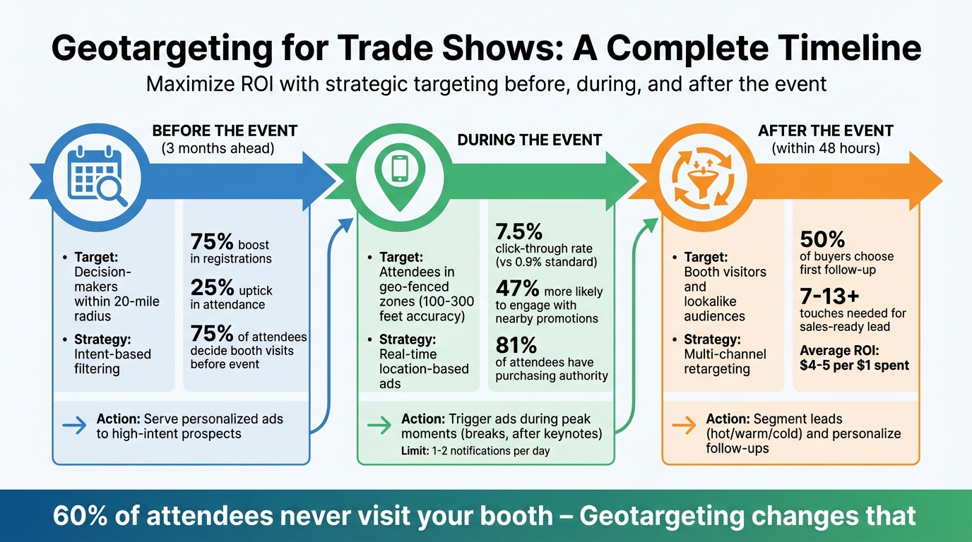
Geotargeting Strategy Timeline for Trade Shows: Before, During, and After Event
Intent-based filtering is a method that identifies potential attendees by analyzing their online behavior and search patterns. It helps pinpoint professionals actively researching solutions similar to yours. By tracking search habits, content downloads, and social media activity, you can identify prospects and serve them targeted ads at least three months in advance.
This approach is crucial for effective geotargeting, ensuring your pre-event ads are seen by those most likely to engage.
Since many attendees finalize their event plans early, reaching them ahead of time is critical. Combining intent data with firmographic filters - like job titles, company size, and industry - helps you focus on decision-makers rather than casting a wide, unfocused net. For example, you could target CIOs or IT directors who have recently interacted with related content. Use these insights right away to craft personalized outreach campaigns before the event.
"You can use [intent data] to find the right audience for your events. If you have a big event coming up and you want to know who's interested, that's a way to use Intent that people might not think about."
- Erin Scheller, Sr. Director of Demand and Revenue Marketing, Bombora
Focus your efforts on prospects within a 20-mile radius of the event location who demonstrate high intent scores. Pay attention to event-specific hashtags and engagement with industry-related ads on platforms like LinkedIn and Facebook. Use this data to personalize your outreach - invite them to schedule demos ahead of time or mention topics they’ve been researching. When done right, leveraging intent data for event promotion can result in a 75% boost in registrations and a 25% uptick in attendance, making it one of the most impactful strategies for pre-event marketing.
Geo-fencing uses GPS, Wi-Fi, or RFID technology to create a virtual boundary around your trade show venue. Once an attendee's device enters this perimeter, your ads are instantly delivered through mobile apps, browsers, or push notifications, offering a direct channel to connect with event-goers.
Instead of casting a wide net, focus on targeting specific areas within the venue. Use building contours to pinpoint zones like individual exhibition halls or even competitor booths. For example, you could send a message like, "Looking for an alternative? Visit us at Booth #678!" to attendees near a rival's location. This level of precision is possible because geo-fencing technology typically has an accuracy range of 100–300 feet.
Timing your ads is just as important as their placement. Peak moments - like coffee breaks, lunch hours, or right after keynote sessions - are ideal since attendees are more likely to check their phones. For instance, triggering ads immediately after a major keynote can help you reach an audience that's energized and ready to explore. Geo-fenced campaigns often outperform standard digital ads, with click-through rates as high as 7.5%, compared to the 0.9% average for typical Facebook ads.
Make sure your ad creative encourages immediate action. Include clear details like your booth number and time-sensitive offers. For example, an ad saying, "Stop by Booth #117 in the next 30 minutes for a free demo and gift!" can drive traffic effectively. In fact, 47% of consumers are more likely to engage with businesses offering nearby promotions.
Don’t limit your geo-fencing to just the venue. Expand the perimeter to include nearby hotels, airports, or popular dining spots to catch attendees during their downtime. To avoid overwhelming users, keep notifications to a maximum of 1–2 per day.
Trade shows are a goldmine for connecting with decision-makers. In fact, 81% of attendees hold purchasing authority, and 92% attend these events to explore new products and services. The real challenge? Making sure your message reaches the right people - the ones who have the power to sign contracts.
Geofencing is a good starting point, as it captures device signals from everyone at the event. But to focus on high-value prospects, you need to go further. By combining geofencing with firmographic filters and identity resolution, you can zero in on decision-makers like VPs or C-suite executives in large tech firms. This way, your ad spend is directed toward the people who can actually impact your bottom line.
Identity resolution tools take it up a notch by linking anonymous device data from your geofence to enriched contact records. This means you can create a detailed list of on-site decision-makers, giving your sales team a clear priority list for follow-ups. With this enriched data, you can refine your targeting even more by focusing on specific areas where decision-makers are likely to gather.
Instead of casting a wide net over the entire venue, set up smaller geofences in strategic zones. Think VIP lounges, executive sessions, or even competitor booths. This approach ensures your ads are seen by the decision-makers actively seeking solutions, not just by general attendees.
"Geofencing captures intent signals that traditional ABM can't see. Then, ABM turns those signals into coordinated sales and marketing action." - Propensity
Timing is also key. Schedule your ads during high-traffic times, like morning coffee breaks, lunch, or when attendees are back at their hotels. These are prime moments to grab the attention of decision-makers.
Booth-specific promotions combined with geotargeting can turn digital interactions into physical visits. With 75% of attendees deciding on their booth stops before the event even starts, there's a small but crucial window to capture the attention of those still undecided. The key? Timely, location-based offers that stand out.
Here’s how it works: craft exclusive, event-only deals that attendees can only claim by visiting your booth. Think flash sales, live product demonstrations, or giveaways that require them to show your ad at the booth. For instance, you might create an ad that says, "Show this message at Booth #247 for a free consultation" or "Stop by Booth #247 within the next hour for 20% off." These incentives give attendees a clear reason to leave the digital space and visit your booth in person.
Timing is everything. Schedule these ads during high-traffic moments - like coffee breaks, lunch hours, or right after major keynotes. But don’t overdo it; limit yourself to one or two notifications per day to avoid overwhelming attendees. Also, make sure your booth number is front and center in your ad design - nobody wants to waste time searching for your location.
"A well-placed geofencing ad that offers attendees a freebie or exclusive experience can send foot traffic your way." - Results Repeat
Another smart move? Set up geofences around competitor booths. This allows you to serve ads to attendees who are already exploring similar products. A timely offer, like a better deal or a unique feature, could convince them to pivot and check out your booth instead. Not only does this strategy boost immediate traffic, but it also lays the groundwork for meaningful connections after the event.
Just because the trade show is over doesn’t mean your work is done. The key is to act fast - launch retargeting efforts within 48 hours while your brand is still fresh in attendees' minds. This is critical, especially since half of buyers tend to go with the first follow-up they receive, yet fewer than 70% of exhibitors actually have a formal post-event plan in place.
Start by uploading your booth visitor list to platforms like Facebook, LinkedIn, or Google Ads for list-based retargeting. Another smart move? Use tracking pixels on your QR code or event landing pages. Why? Because up to 97% of visitors leave your page without converting.
Here’s a real-world example: A precision plastics manufacturer in Ohio used this strategy during an industry expo in June 2025. They directed 42 booth visitors to a pixel-tagged landing page and launched retargeting ads on LinkedIn and YouTube within 24 hours. The result? 19 additional engagements, 11 exploratory calls, and 3 major contracts that added up to a $900,000 sales pipeline.
To maximize your efforts, segment your leads:
Make your ads memorable. Include visuals like a photo of your actual booth to help attendees recall your brand amidst the sea of exhibitors they encountered. These tailored follow-ups help transform fleeting trade show encounters into meaningful, long-term relationships.
"Retargeting ads are meant to keep your brand on the top of mind, so an ambiguous ad will not ring the bells in your potential attendees' mind." – Kerri Moore, Senior Content Marketing Manager, Bizzabo
Consistency is key. Keep your post-event messaging clear and branded. Combine retargeted display ads with personalized emails and even LinkedIn outreach. Remember, it often takes 7 to 13+ touches to turn a lead into a sales-ready prospect. Mention the trade show by name in your follow-ups, and personalize them further by having the outreach come from a specific sales rep, complete with their photo and direct contact information.
Once you've gathered valuable attendee data, you can take your campaign further by reaching beyond those who stopped by your booth. Lookalike audiences help you find online users who share similar characteristics and behaviors with your top customers. This means you’re not just targeting booth visitors - you’re connecting with thousands of prospects who closely align with your ideal customer profile. Combined with retargeting, lookalike audience targeting significantly broadens your reach.
To get started, focus on creating a high-quality seed audience. This involves filtering your CRM data to include only high-value clients or past attendees who showed strong engagement. Keep in mind that platforms like Facebook typically require a minimum of 1,000 people in your seed audience to build an effective lookalike group. To meet this threshold, consider pulling data from tools like HubSpot, Salesforce, website analytics, or even attendee lists from previous webinars.
"Think of it like this: garbage in, garbage out. If your seed audience isn't representative of your ideal customer profile (ICP), your lookalike audience will be off too." – Deepak Gupta, Co-founder/CEO, Gracker
For B2B trade shows, take it a step further by layering lookalike targeting with firmographic filters - like job titles (e.g., C-suite executives, VPs), company size, or industry type. You can also experiment with different lookalike audience sizes. A 1% similarity audience offers more precision, while a 5% audience provides a broader reach.
Use these lookalike audiences to build awareness before your event, targeting them in the weeks leading up to the show. After the event, continue engaging these audiences to maintain your brand’s visibility. This strategy not only extends your campaign’s lifespan but also ensures your brand stays top of mind long after the event wraps up.
Tracking your geotargeting campaigns is essential. Without it, you could be wasting money and missing out on critical insights. The right metrics help you determine if your ads reached the right audience, brought them to your booth, and delivered qualified leads.
Start by focusing on advertising engagement metrics like impressions, reach, and click-through rates (CTR). For example, geofenced audiences often achieve CTRs as high as 7.5%, compared to just 0.9% for standard Facebook ads. To measure booth traffic, you can use tools like QR code scans, badge scanners, or even Wi-Fi signals. Additionally, identity resolution tools that connect anonymous device IDs to real contact records are becoming increasingly valuable for precise measurement.
Once you've engaged attendees through geotargeting, measuring performance is critical for improving your strategy. Keep an eye on conversion rates, such as lead-to-MQL (25%–35%) and MQL-to-SQL (13%–26%). To calculate your cost per lead (CPL), divide your total event spend by the number of qualified leads - typically averaging around $840. If your CPL is much higher, it might be time to adjust your targeting filters or shrink your geofence radius.
Finally, assess the overall impact by tracking metrics like event-sourced pipeline value and ROI. On average, companies generate $4 in revenue for every $1 spent on trade shows, with top performers aiming for $5 per $1. Use custom tracking links and dedicated landing pages for your geotargeted ads to tie conversions back to specific campaigns. This data will guide your future campaigns, showing you which zones, ad formats, and targeting strategies deliver the best results.
When targeting trade show attendees, making your ad creative stand out on mobile devices is non-negotiable. Why? Because most people will see your geotargeted ads on their smartphones, and mobile users decide whether to engage with an ad in just two seconds. That means your creative has to grab attention immediately.
Start with concise ad copy - five words or fewer can increase visitation rates by 67%. Pair this with high-quality visuals, as images can be processed in as little as 13 milliseconds. For example, instead of a generic message like "Visit our booth to learn about our innovative solutions", go for something punchier like "Booth 312 - Free Demo."
Adding subtle GIF animations can further boost engagement. These animations improve click-through rates by 25% and visitation rates by 44%, without the slow load times of full videos. For trade shows, consider using a dynamic distance overlay to show how close attendees are to your booth. A simple message like "Our booth is just 500 feet away" can increase visitation rates by 53%.
Your call-to-action (CTA) should feel natural for mobile users. Swap "Click Here" for "Tap Here" or "Discover". Including a "buy now" CTA can also improve visitation performance by 51%. And don’t forget to make your booth number prominent and easy to spot - attendees shouldn’t have to search for it in tiny print.
Finally, design your ads for vertical viewing. Use common mobile banner sizes like 300x50 or 320x50 pixels, high-contrast colors, and large fonts. Keep file sizes small to avoid delays and ensure smooth performance. This combination of clear messaging, sharp visuals, and mobile-friendly formatting ensures your ad stands out on even the smallest screens.
Geotargeting opens the door to new opportunities at trade shows, helping businesses connect with the 60% of potential leads who might otherwise never visit their booth. By combining pre-event campaigns, real-time geo-fenced ads, and post-event retargeting, companies can create an engagement strategy that goes far beyond the show floor.
The numbers speak for themselves: geofenced campaigns can achieve click-through rates (CTR) as high as 7.5%. In 2023, HawkSEM demonstrated the power of geotargeting by driving a 588% increase in form submissions for Nava Health through data-focused campaigns. As Sam Yadegar, Co-founder and CEO of HawkSEM, explained:
"By utilizing geotargeting campaigns, HawkSEM's digital marketing strategies, and ConversionIQ, we were able to garner a whopping 588% more form submissions for Nava Health".
These results highlight the importance of technical expertise. Success in geotargeting requires precise execution, from setting up virtual boundaries to managing identity resolution, while also ensuring compliance with GDPR and CCPA regulations. Partnering with professional digital marketing agencies can simplify this process, as they handle crucial tasks like A/B testing, real-time optimizations, and data refinement to turn anonymous impressions into actionable leads.
If you're ready to implement these strategies, SEO Werkz offers tailored digital marketing services, including paid search, retargeting, and custom campaigns, to help turn trade show attendees into qualified leads.
When it comes to trade show geotargeting, there’s no one-size-fits-all price tag. Costs can vary widely depending on factors like the size of the event, the geographic range you’re targeting, and the specific tools or platforms you choose to use.
To keep things organized, it’s smart to roll geotargeting expenses into your overall trade show marketing budget. For some, this might mean spending a few hundred dollars, while others could allocate several thousand. If you’re looking for a more accurate estimate tailored to your needs, it’s worth consulting a digital marketing professional with experience in geofencing and location-based advertising.
Tracking booth visits through geofenced ads involves using location-based marketing tools to define virtual boundaries around your event space. When attendees' mobile devices cross into this geofenced zone, these tools can tag the devices, allowing for real-time ad targeting and engagement.
To take it a step further, foot traffic tracking technologies can measure how many tagged devices actually entered your booth. This approach gives you a clearer picture of your campaigns' performance, offering more precise insights than traditional methods like badge scans.
When running geotargeting campaigns, staying compliant with GDPR and CCPA regulations requires careful attention to user privacy. Start by obtaining clear, informed consent before collecting or using location data. Be upfront about how you plan to use this data and ensure users fully understand your practices.
It's equally important to prioritize data security. Protect any collected information against unauthorized access. Additionally, always provide users with an opt-out option for location tracking, giving them control over their data.
If you're using tools like GPS or IP-based geolocation, handle them responsibly. Incorporate privacy notices that clearly explain your geotargeting methods and ensure all practices align with legal requirements. Transparency and respect for user privacy are key to maintaining compliance.
A/B testing is a must for e-commerce stores aiming to boost conversions and revenue. It helps you make data-driven decisions by testing changes like product images, checkout buttons, or pricing strategies before rolling them out. With tools tailored for e-commerce, you can integrate seamlessly with platforms like Shopify, track revenue, and test without needing developers. Here are 10 tools to consider:
| Tool | Key Features | Starting Price | Ideal For |
|---|---|---|---|
| Personizely | Visual editor, audience targeting | $19/month | Small to mid-sized stores |
| Kameleoon | AI personalization, fast testing | ~$495/month | High-traffic businesses |
| AB Tasty | Multivariate, emotion-based tests | ~$60,000/year | Larger enterprises |
| Optimizely | Advanced experimentation | ~$36,000/year | Enterprise-level e-commerce |
| VWO | Multivariate, server-side testing | Custom pricing | All business sizes |
| Adobe Target | Machine learning personalization | Custom pricing | Enterprise-level solutions |
| Dynamic Yield | Personalization, recommendations | ~$25,000/year | Large-scale optimizations |
| Zoho PageSense | Heatmaps, session recordings | $19/month | Budget-conscious stores |
| Compose | Pay-as-you-go | $0.0012/MTU | Shopify-focused brands |
| Unbounce | Landing pages, AI testing | $112/month | Conversion-focused stores |
Choose based on your budget, technical needs, and traffic volume. Tools like Zoho PageSense and Personizely are great for smaller businesses, while Kameleoon and Optimizely cater to enterprises. For Shopify users, Compose offers affordable and easy integration.
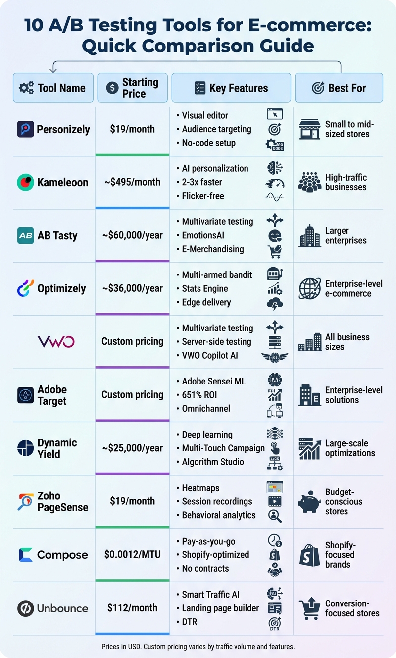
A/B Testing Tools Comparison: Features and Pricing Guide for E-commerce
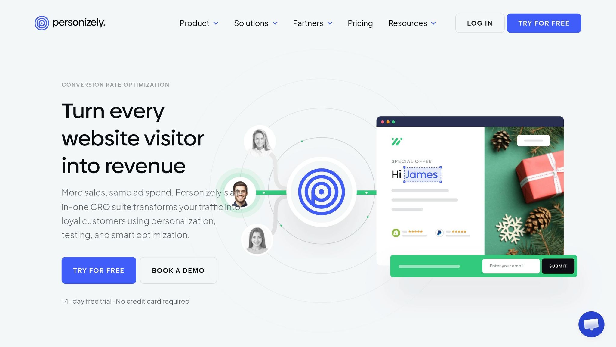
Personizely is designed specifically for e-commerce businesses, making it easy to test design changes without needing a developer. With its click-based visual editor, you can experiment with elements like product images, headlines, pricing, and shipping options while keeping track of how these changes affect revenue. Let’s dive into its standout features.
Personizely works seamlessly with popular platforms like Shopify, Wix, WordPress, Magento, and BigCommerce. For Shopify users, there’s even a native app available in the Shopify App Store, simplifying the installation process. This integration ensures that testing and optimization processes are smooth and efficient.
One of Personizely’s standout features is its ability to run A/B tests tailored to specific audience segments. Instead of showing the same variation to all visitors, you can target shoppers based on factors like location, device type, cart contents, or purchase history. This ensures your tests are more precise and reach the right people at the perfect moment.
Personizely offers three pricing tiers:
Each plan includes a 14-day free trial, and you can save 20% by opting for annual billing.
Beyond basic A/B testing, Personizely provides advanced tools like multivariate testing, server-side testing, and multi-page journey testing. It also eliminates flicker issues by instantly loading variations and allows for custom goal tracking, such as monitoring "Add to Cart" or "Purchase" actions.
Eren Kece from Dashl Beauty shared that Personizely helped save thousands in development costs while generating over $12,000 in additional revenue.
Kameleoon brings together web, full-stack, and feature experimentation into a single platform. Designed with e-commerce teams in mind, it balances robust testing capabilities with speed, claiming to be 2–3 times faster than other solutions, all while remaining flicker-free.
Kameleoon integrates seamlessly with Shopify and Shopify Plus, available directly via the Shopify App Store. Setting it up is straightforward - just a few clicks - and the app immediately begins tracking key actions like product views, transactions, cart activity, and collection views. Beyond Shopify, Kameleoon connects with over 50 tools, including GA4, Klaviyo, Triple Whale, Snowflake, BigQuery, and Salesforce. These integrations open the door to advanced personalization and data-driven insights.
"One of the biggest problems Shopify store owners have with testing is that they're not very technical and are therefore limited in what they can do. With the Shopify-Kameleoon App, there's no need for technical knowledge so you can start testing right away."
- Frederic de Todaro, Chief Product Officer, Kameleoon
Kameleoon uses AI-powered personalization to predict visitor intent in just 15 seconds. With over 45 segmentation criteria - including behavioral, contextual, technical, and demographic factors - you can create highly specific audience experiences. It also offers 17+ product recommendation algorithms, tailoring suggestions based on user browsing habits.
For example, in January 2019, French retailer Cdiscount leveraged Kameleoon’s machine learning to identify "undecided" visitors with moderate purchase interest. By targeting this segment with discount coupons - rather than offering them site-wide - they doubled the ROI of their promotional campaigns while maintaining profit margins.
Kameleoon supports multivariate testing, enabling you to test several variations of page elements at once to discover the best combinations. Additionally, its server-side experimentation allows you to optimize backend elements like pricing models or checkout processes without affecting site performance. The platform also offers a "Hybrid™" feature that combines the power of server-side testing with the simplicity of client-side tools, making it easier for non-technical teams to manage server-side experiments.
In January 2022, The Wine Collective used Kameleoon on their Shopify Plus store and saw a 5.3% boost in conversions along with an 18% drop in bounce rate.
Kameleoon’s pricing starts at ~$495/month, depending on your average monthly unique visitors. There are three unlimited license tiers available: Web Experimentation, Feature Experimentation, and AI-Powered Personalization. The platform holds strong user ratings, with a 4.6/5 on G2 and 4.9/5 on the Shopify App Store. While users appreciate its flicker-free performance and user-friendly segment builder, some mention that the documentation could be more thorough for complex setups, and pricing might be a hurdle for smaller businesses.
AB Tasty provides tools for experimentation and personalization, supporting over 1,100 e-commerce brands. With a 4.6-star rating on both G2 and Capterra, it enables online retailers to test, refine, and customize customer experiences - all without requiring extensive developer involvement.
AB Tasty works seamlessly with major e-commerce platforms like Shopify, PrestaShop, Salesforce Commerce Cloud, Magento, BigCommerce, and WooCommerce. Its Integration Hub facilitates no-code data exchanges with third-party tools, such as Google Analytics 4 and Contentsquare. Shopify users benefit from a native connector for smooth data flow, while PrestaShop and Magento users can rely on dedicated modules or APIs. For headless or custom setups, AB Tasty offers flexible integration options, including API-based real-time synchronization or scheduled data feeds in formats like CSV, JSON, or XML [30, 31].
AB Tasty's E-Merchandising module combines search, recommendations, and real-time merchandising into one tool. Features like EmotionsAI allow for emotion-based audience segmentation, while AdaptiveCX tailors experiences for anonymous visitors. For instance, in 2025, Clarins, a luxury skincare brand, used AB Tasty to test adding sun and moon icons to product tiles on their listing page. This small tweak led to higher conversions. Similarly, Diptyque experimented with variations of its checkout login interface, reducing exit rates and increasing conversions.
The platform supports various testing methods, including multivariate, server-side, split URL, and multi-page testing [34, 35]. Server-side experimentation helps test backend elements like algorithms and pricing models without causing the disruptive "flicker effect." AB Tasty employs a Bayesian statistics engine to identify winning variations with confidence. ASICS, for example, integrated AB Tasty with Contentsquare to refine its "hycremental" experimentation process. By using behavioral segmentation, ASICS was able to fine-tune tests and drive revenue growth.
"You start with small individual optimizations, and test them separately so you understand what exactly the impact of those changes is. And after you've validated those results... you come up with a final, big optimization."
- Andrey Prokhorov, Digital Experience Optimization Manager, ASICS
These advanced testing tools work in harmony with AB Tasty's integration and personalization features.
AB Tasty offers custom pricing based on factors like traffic volume, the number of tests, and support requirements. Industry estimates suggest starting costs around $60,000 annually, with smaller enterprise setups beginning at roughly $1,000 per month. For high-traffic sites with complex needs, contracts can exceed $150,000 per year [36, 40]. While the initial investment may seem high, users often highlight the platform's capabilities as worth the cost. Many appreciate its intuitive visual editor and strong customer support, though some mention a learning curve and potential impacts on page load speeds due to JavaScript weight.
Optimizely is a platform designed specifically for experimentation, catering to high-traffic e-commerce sites. It’s been credited with helping digital leaders achieve a 37% boost in website engagement and a 35% increase in test impact. With a 4.2-star rating on G2, Optimizely is a choice for businesses seeking advanced testing tools and willing to invest significantly on an annual basis.
Optimizely integrates seamlessly with major e-commerce platforms, offering bi-directional integration with Shopify and Shopify Plus. This allows real-time synchronization of sales data, product catalogs, and shopper information with the Optimizely Data Platform (ODP). It also supports WooCommerce, syncing product and sales data, and Magento, catering to enterprise-scale needs. During beta testing, the Shopify Blog Sync feature showed a 111% increase in clickthrough rates for dynamic blog content.
These integrations, combined with Optimizely’s advanced testing capabilities, allow businesses to fine-tune every aspect of their e-commerce operations.
Optimizely provides a range of sophisticated testing tools:
These features empower businesses to experiment with confidence, improving user experience and performance.
Optimizely excels in personalization, offering 1:1 customization based on user behavior, context, and intent. The platform complements its A/B testing capabilities with AI-generated variations, thanks to "Optimizely Opal", an AI assistant that suggests experiment ideas and summarizes results. It also supports feature experimentation, allowing developers to test new features with controlled rollouts before a full-scale launch.
"We are able to identify what development work is worth pursuing and what isn't based on the experiment results deployed by their platform."
- Audrey Ortiz, CRO Marketing Manager at ServiceTitan
With these capabilities, Optimizely combines robust testing tools with advanced personalization to meet the demands of enterprise users.
Optimizely operates on a custom pricing model, with no publicly available fixed rates. Enterprise plans typically start between $36,000 and $50,000 annually, with some estimates suggesting a minimum of $25,000 per year. For businesses handling 10 million monthly impressions, the Web Business plan costs approximately $63,700 annually, while the Web Enterprise plan can reach $113,100 per year. High-traffic enterprise contracts may go beyond $200,000 to $400,000 annually.
Optimizely requires upfront annual commitments, with no option for monthly payments. While users appreciate its powerful reporting tools, the platform’s high cost and steep learning curve are often mentioned as challenges.

VWO stands out as a user-friendly yet powerful testing platform tailored for e-commerce. It has optimized 170 billion experiences across 675,000+ websites and serves 40,000+ customers in over 190 countries. With a 99% customer satisfaction rating and a swift first response time of 45 minutes, VWO has become a trusted choice for businesses worldwide.
VWO simplifies the integration process with a no-code Shopify app available in the Shopify App Store. This allows for quick installation of the VWO SmartCode, which automatically tracks key e-commerce events like product views, add-to-cart actions, checkout initiations, and purchases. These events can then be used to build metrics or funnels within VWO.
The platform also integrates seamlessly with tools such as Google Analytics 4, providing additional insights. For platforms that don't have native integrations, VWO offers an asynchronous JavaScript "SmartCode", ensuring it doesn't slow down your website.
VWO enables businesses to run multivariate testing (MVT), where multiple elements are tested simultaneously to find the best-performing combination. For instance, Provident Hotels & Resorts tested 12 combinations of form titles and CTA text with 27,500 visitors over a month, achieving a 9.1% increase in click-through rate.
The platform also supports server-side testing through SDKs in over eight programming languages, allowing for more complex backend experiments. Human Interest utilized this feature via a VWO-Contentful integration, which eliminated engineering bottlenecks and resulted in a 75.84% increase in lead form conversions.
Other standout features include:
VWO Personalize uses machine learning to analyze shopper behavior, location, and purchase patterns. Its VWO Copilot, powered by GPT-4, suggests testing ideas, automates variation creation, and identifies hidden audience segments.
An example of its impact: Flos USA, a lighting manufacturer, used VWO’s optimization tools to add CTAs to category listing tiles, resulting in 47% more orders and an 86% increase in revenue. Another test that updated color swatches on product pages boosted conversions by 19.35%.
"VWO is not just an A/B testing tool, but a comprehensive website utility tool."
- Ilse Normington, UX and Web Analyst at Eastpak
These features ensure that VWO doesn’t just test variations but actively improves user experiences, driving measurable results.
VWO’s pricing is based on Monthly Tracked Users (MTU) and the specific tools you choose. It offers three tiers:
The platform matches its flexibility with a 30-day free trial, giving businesses full access to its features without requiring a credit card. Specific pricing details are available upon request, ensuring tailored solutions for businesses of all sizes.
"VWO had clear and concise documentation... it had transparent pricing, and we could know how much we would need to pay once we confirmed that VWO suits our needs."
- Jared Brown, CEO, Hubstaff
Adobe Target provides robust testing and personalization tools tailored for e-commerce businesses. According to an IDC study, the platform delivered an impressive 651% ROI over three years, with some implementations achieving up to a 38% increase in conversion rates. For businesses already using Adobe’s ecosystem, it offers seamless integration and advanced AI-powered features that extend well beyond standard A/B testing.
Adobe Target works seamlessly with the Adobe Experience Cloud, particularly through Adobe Analytics (A4T), allowing you to use Analytics metrics and segments as your reporting source. The platform supports omnichannel delivery, enabling businesses to engage customers across web, mobile, email, and IoT.
For custom platforms, including Shopify, Adobe Target offers flexible deployment options like mobile SDKs, server-side APIs, and Node.js. These options allow businesses to run tests on the client side, server side, or both. Additionally, it integrates with Adobe Experience Manager (AEM) to incorporate Experience Fragments directly into tests and with Adobe Advertising to optimize landing pages for traffic from Google Ads and Microsoft Advertising.
Adobe Target supports multivariate testing (MVT), which explores all possible combinations of elements equally using full factorial testing. The platform includes tools like a traffic estimator to determine sample size needs and an element contribution report that pinpoints which elements drive the most impact.
The Auto-Allocate feature uses multi-armed bandit testing to dynamically adjust traffic toward the best-performing experiences. Traffic updates can occur as frequently as every two hours, making it ideal for time-sensitive events like Black Friday. For server-side testing, Adobe Target eliminates page flicker and speeds up load times through a unified delivery system that supports both server-side APIs and Node.js.
With Auto-Target, the platform leverages advanced machine learning to serve tailored experiences based on visitor profiles and past behavior. One implementation resulted in 182,000 additional clicks while reducing annual bounces by 150,000.
These advanced testing tools, combined with Adobe Target's seamless integrations, make it a powerful solution for optimizing customer experiences.
Adobe Target relies on Adobe Sensei machine learning to simplify and enhance personalization efforts. The Automated Personalization (AP) feature builds detailed visitor profiles and matches content to similar users. By aggregating data from multiple sources, the platform creates unified, cross-channel customer profiles.
The Recommendations feature suggests products based on user behavior, using algorithms like "People who bought this also bought that." These recommendations have been shown to drive a 70% higher conversion rate and a 55% increase in return sessions. Research indicates that 80% of consumers are more inclined to engage with companies offering personalized experiences, and 48% of marketers who adopted website personalization reported a double-digit revenue boost.
"Adobe is critical to my team. The customer is receiving an experience that is being personalized, but they don't realize it's being personalized. They just recognize that it's relevant for them." - Will Harmer, Senior Manager, Insights and Optimization, EE
One example of Adobe Target in action includes a 125% boost in engagement and the creation of 76 new audience segments. Additionally, the platform's AI Assistant helps streamline workflows by answering product questions, suggesting best practices, and assisting with campaign copy and imagery creation.
Adobe Target is designed for enterprise-level needs and offers customizable pricing based on factors like the number of digital properties, whether you opt for Target Standard or Target Premium, and the scope of omnichannel delivery across web, mobile, email, and IoT. Advanced features such as Automated Personalization, Recommendations, and Auto-Target are available only with Target Premium. Pricing is determined through a custom contract.

Dynamic Yield stands out among tools that combine testing with personalization, offering enterprise-level features tailored for impactful optimizations. Recognized by Gartner and Forrester for its capabilities, it earned the title of "Enterprise AB Testing Tool of the Year" in 2024.
Dynamic Yield seamlessly integrates with leading e-commerce platforms like Shopify, Magento, BigCommerce, Wix, and WordPress. It also connects with marketing tools such as DMPs, Google Tag Manager, GA4, and Adobe Analytics. Shopify users benefit from a dedicated app that allows them to manage experiments directly from the admin interface. Additionally, server-side templates and native support for SPAs (single-page applications) reduce the need for extensive developer involvement. These integrations provide a solid foundation for the platform's testing and personalization capabilities.
Dynamic Yield offers advanced testing options, including multivariate testing (MVT) and server-side testing, which enable backend optimizations without the issue of page flicker. Its multi-armed bandit algorithms automatically allocate traffic to the best-performing variations, while the Multi-Touch Campaign feature focuses on optimizing complete customer journeys.
"We used the Multi-Touch Campaign capabilities to drive changes and test the entire website journey for one of our key customer segments... we've seen great returns, with an increase of over 27% in the conversion rate for these customers." - Christian Ebhardt, Shop Manager, Chal-Tec
Dynamic Yield leverages deep learning models to deliver real-time product recommendations and adaptive content across web, email, and mobile platforms. Its Affinity Allocation feature updates user profiles in real time based on their interactions, ensuring recommendations evolve alongside user interests.
Real-world results highlight its effectiveness:
The platform's Algorithm Studio allows teams to create custom recommendation algorithms, while the Sorting Optimizer enables testing of category page sorting logic based on user preferences and business priorities. Dynamic Yield also ensures consistent experiences across multiple channels, including web, mobile apps, email, SMS, and push notifications.
Dynamic Yield uses an enterprise pricing model that varies based on traffic volume and required features, with starting costs around $25,000 annually.
Zoho PageSense is a comprehensive tool designed for e-commerce businesses, combining A/B testing with behavioral analytics like heatmaps and session recordings. With the ability to track over 3 million visitors daily, it provides a robust platform for improving conversion rates and understanding customer behavior.
Zoho PageSense makes integration simple. If you're using Zoho Commerce or Zoho Sites, the process is seamless with a single click. Shopify and Magento users can connect through custom code or Google Tag Manager. Additionally, integrations with Zapier and Zoho Flow expand its functionality, while the Chrome extension allows you to launch tests directly on live websites.
"It's a simple step integration tool into any website, just adding custom element code on target pages." - Rwabwogo B., General Manager Operations
These integration options ensure that businesses can easily set up and start testing without unnecessary technical hurdles.
Zoho PageSense offers server-side testing (also called full-stack testing), which runs experiments before the page fully loads - perfect for maintaining site performance during tests. For businesses running time-sensitive promotions like flash sales, the Multi-Arm Bandit testing feature is a game-changer. Using Thompson Sampling, it dynamically shifts traffic toward the best-performing variations in real time.
Other testing capabilities include:
These tools not only enhance testing precision but also allow businesses to make data-driven decisions faster.
Zoho PageSense takes personalization to the next level. It allows businesses to tailor their websites based on factors like demographics, browsing history, and interests. Audience segmentation options include parameters such as location, device type, traffic source, and even custom variables.
For more targeted experiments, its advanced URL targeting provides seven match types, letting you include or exclude specific pages as needed. On checkout pages, Form Analytics pinpoints fields that may lead to cart abandonment, while Custom Dimensions let businesses add attributes like pricing tiers or loyalty status to fine-tune personalization.
Zoho PageSense uses a tiered pricing structure based on Monthly Tracked Users (MTU). Here's a breakdown:
A 15-day free trial is available, requiring no credit card, making it easy for businesses to explore the platform before committing. Note that prices exclude applicable taxes.
Zoho PageSense offers a strong mix of tools and flexibility, making it a solid choice for e-commerce stores looking to optimize their websites effectively.

Compose operates on a pay-as-you-go model, charging just $0.0012 per Monthly Tested User (MTU). This means you only pay for active testers - no hidden fees, no minimums, and no contracts locking you in.
Compose is built with Shopify in mind, offering a seamless, no-code integration through the Shopify App Store. With a simple one-click "App Block" installation, the platform automatically adds the tracking script, allowing you to set up experiments directly in the Shopify Theme Editor using familiar templates. While it’s optimized for Shopify, Compose works with any website by installing a straightforward tracking code. For non-Shopify users or those needing manual setups, Compose provides thorough documentation, tutorial videos, and even a free one-hour technical onboarding session. Additionally, it integrates with Google Analytics 4 and BigQuery for advanced reporting capabilities.
Compose supports a range of testing options, including A/B/n (multivariate) testing, split URL testing, and split theme testing. A built-in JavaScript code editor allows for custom variants, while the QA testing mode ensures smooth execution with AWS Lambda@Edge-powered anti-flicker protection.
Other standout features include:
To streamline planning, Compose offers tools like collaborative hypothesis lists, experiment roadmaps, and PIE prioritization. However, it’s worth noting that server-side testing isn’t supported at this time.
"I have used a few different A/B testing tools and Compose is by far the best value. It gives you what you need without being overly complicated."
- Alex Nelson, eCommerce Manager, Cozy Earth
These robust features, combined with a user-friendly approach, make Compose a compelling choice for Shopify users and other e-commerce platforms.
Compose’s pricing stands out for its affordability. At $0.0012 per MTU, 100,000 testers would cost just $120 per month - making it over 4× cheaper than Convert and 5× cheaper than VWO.
For those needing extra support, an Advanced Support add-on is available for $200 per month, which includes chat support and monthly meetings with a dedicated success manager. Technical consulting is also offered at $400 for a half-day or $800 for a full day. The Shopify app itself is free to install, with all charges billed in USD.
Unbounce is a leading landing page builder that also offers robust A/B testing tools tailored for e-commerce stores. It integrates seamlessly with Shopify, supports payment platforms like Stripe and PayPal, and connects with HubSpot, Salesforce, Mailchimp, and Zapier. These features make it easier to create high-converting landing pages, which can generate double the revenue compared to standard category pages. Let’s dive into the advanced testing features Unbounce provides.
Unbounce supports both A/B and multivariate testing (MVT), allowing you to test multiple variations at the same time. One of its standout tools is Smart Traffic, an AI-powered feature that automatically directs users to the page variant most likely to convert. This tool factors in details like device type, location, and browser, and it starts optimizing after just 50 visits. To make decision-making easier, Unbounce includes built-in reporting with confidence levels, so you know exactly when to declare a winner.
Another key feature is Dynamic Text Replacement (DTR), which customizes landing page text to match a visitor’s search keywords. This personalization not only enhances the user experience but can also boost your Quality Score and conversion rates.
Unbounce offers tiered pricing in USD, making it accessible for businesses of various sizes.
All plans include a 14-day free trial, so you can test the platform risk-free.
"The A/B testing functionality is superb, with clear metrics on traffic weighting." - Verified User, G2 Review
Going (formerly Scott's Cheap Flights) is a great example of Unbounce in action. By tweaking their call-to-action (CTA) from "Sign up for free" to "Trial for free", they saw a 104% increase in trial starts. Similarly, the sustainable diaper brand DYPER used Unbounce to test landing pages that highlighted different value propositions. Over six months, this strategy led to over 6,000 conversions, primarily from long-term subscriptions.
Picking the right A/B testing tool comes down to three main factors: your budget, your team's technical know-how, and how well the tool fits into your current e-commerce setup. With the optimization and testing market expected to grow from $9.41 billion in 2025 to $34.83 billion by 2034, there are now 271 tools to choose from.
To get started, clearly outline your testing goals. Are you focusing on simple changes like button colors or headlines? Or do you need a tool for more advanced tasks, like full-funnel optimization with server-side testing? If your team doesn’t include developers, prioritize tools with no-code visual editors, such as Personizely or Zoho PageSense. For tests involving pricing or shipping thresholds, look for tools that track key metrics like Revenue Per Visitor (RPV) and Average Order Value (AOV). Also, ensure the tool includes anti-flicker technology to maintain a smooth experience for your users.
Your budget and expected return on investment (ROI) are just as important. For smaller stores, affordable options like Plerdy ($16/month) and Zoho PageSense ($19/month) are great starting points. Mid-tier tools like Personizely ($49/month) offer more advanced features. On the other hand, enterprise-level platforms such as Kameleoon (around $25,000/year) and AB Tasty (approximately $20,000/year) are designed for high-traffic businesses that need AI-driven personalization and robust security features.
When analyzing test results, focus on statistical accuracy. Choose tools that display confidence scores - usually in the 90–95% range - before deciding on a winner. Plan to run tests for at least one to two weeks to cover a full business cycle. The ideal tool will integrate effortlessly with your platform, provide actionable insights, and empower you to make data-backed decisions that improve conversions and revenue. By following these steps, e-commerce businesses can select a tool that drives growth and measurable results.
When picking an A/B testing tool, consider your store's traffic and specific goals. Smaller stores should look for tools that are easy to use, with features like visual editors and straightforward functionality. These tools simplify the process and are perfect for beginners.
On the other hand, larger stores with more traffic might benefit from platforms that offer advanced options like detailed targeting, in-depth analytics, and seamless integration with tools such as Shopify or Google Analytics.
The key is to align the tool’s capabilities with your needs. Make sure it fits your budget, handles your technical requirements, and has room to grow as your store scales.
To improve your e-commerce conversions, focus your A/B testing efforts on areas that directly influence user engagement and decision-making. Here are a few key places to start:
For the best results, test one element at a time. This approach helps you pinpoint exactly what's driving the changes in user behavior.
A/B tests generally need to run for 2 to 6 weeks, though the exact duration depends on factors like your website's traffic, business patterns, and the goals of the test. Running a test for too short a time can lead to unreliable results, while letting it run too long risks the influence of outside factors that could skew the data. The key is finding the right balance to achieve statistically sound and meaningful insights. To figure out the best timeframe for your test, tools like duration calculators can be incredibly helpful.


