In banking, not all leads are created equal. Lead scoring helps prioritize prospects by assigning a score based on their potential to convert. This article outlines five lead scoring models tailored for banking:
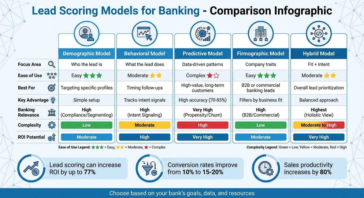
| Model Type | Focus Area | Ease of Use | Best For | Key Advantage |
|---|---|---|---|---|
| Demographic | Who the lead is | Easy | Targeting specific profiles | Simple setup |
| Behavioral | What the lead does | Moderate | Timing follow-ups | Tracks intent signals |
| Predictive | Data-driven patterns | Complex | High-value, long-term customers | High accuracy |
| Firmographic | Company traits | Easy | B2B or commercial banking leads | Filters by business fit |
| Hybrid | Fit + Intent | Moderate | Overall lead prioritization | Balanced approach |
Each model serves a unique purpose, so the best choice depends on your bank's goals, data, and resources. Whether you need simplicity or advanced analytics, these models can help maximize conversions and improve sales efficiency.
5 Lead Scoring Models for Banking: Comparison Chart
The Demographic Lead Scoring Model focuses on evaluating who a lead is rather than what they do. It assigns points based on specific details like job title, income level, location, age, and company size. This allows banks to identify prospects who closely align with their Ideal Customer Profile (ICP). By using this straightforward method, banks can fine-tune their scoring system to match their unique needs.
Banks can customize demographic scoring to align with their product offerings. For example:
Negative scoring also plays a critical role. Banks may deduct points for leads that are less likely to convert, such as those from unsuitable locations (–10 to –50 points), using personal email domains for business inquiries (–10 points), or operating in restricted industries. This ensures sales teams focus their energy on high-potential prospects.
This model is rule-based, making it easy for stakeholders to understand and implement. Banks can start small, focusing on essential variables like location, income, job title, industry, and age - no need for advanced predictive tools.
"Lead scoring is fundamentally math informed by context."
- Colin Price, Head of Growth, NC Squared
The flexibility of this model is a major advantage. For instance, if a bank launches a new mortgage product aimed at first-time homebuyers, it can quickly adjust scoring criteria to prioritize younger leads or specific income brackets. This adaptability supports quick pivots as business strategies shift.
Demographic scoring helps banks create clear priority levels (e.g., P1, P2, P3) for leads. For example:
One consulting firm using a similar model saw an 18% increase in revenue by focusing on high-priority leads.
With a well-developed demographic scoring system, organizations have reported conversion rate improvements - from a baseline of 10% to 15–20%. This ensures marketing budgets are spent on prospects who are most likely to convert.
| Demographic Attribute | Example Banking Criteria | Potential Point Value |
|---|---|---|
| Job Title | C-Level Executive / Business Owner | +20 to +25 points |
| Income/Revenue | High Net Worth / Enterprise Revenue | +15 to +20 points |
| Location | Within target branch zip codes | +10 points |
| Industry | Target sector (e.g., Real Estate) | +10 points |
| Email Domain | Personal email (Gmail/Yahoo) | –10 points |
| Role | Student or Job Seeker | –20 points |
The Behavioral Lead Scoring Model focuses on tracking what prospects do rather than who they are. It assigns points based on specific actions like using mortgage or HELOC calculators, downloading loan-related guides, clicking on email links, or repeatedly visiting pricing pages. These behaviors act as subtle clues, helping banks understand where a prospect stands in their financial decision-making journey - especially useful when decisions take time.
This model allows banks to identify high-intent behaviors that suggest a prospect is ready to take action. For instance, someone who uses a mortgage calculator three times in one week is likely much closer to applying than someone casually browsing general finance articles. Similarly, multiple visits to a mortgage rates page within a short period should trigger quick follow-up actions. By grouping leads based on their browsing history, banks can tailor their approach - for example, treating a credit card inquiry differently from a commercial loan request. Matching behaviors to financial intent ensures marketing strategies are more focused and effective.
Negative scoring further sharpens lead prioritization. For example, deducting points for visits to career pages or frequent trips to customer support sections - actions that suggest a lack of readiness for financial products - helps sales teams concentrate on leads with higher potential. Combining this behavioral data with demographic insights creates a solid foundation for more advanced predictive tools.
Banks can start by creating simple, rule-based scoring systems. For example:
As the system evolves, banks can add features like score decay, which reduces points for leads that become less engaged over time. This ensures sales teams focus on active prospects. To make the system work, marketing and sales teams must align on what qualifies as a Marketing Qualified Lead (MQL). If sales teams reject too many leads, it’s a sign the criteria need adjustment.
"Lead scoring only works when it's operationalized."
- Colin Price, Head of Growth, NC Squared
Behavioral scoring is particularly effective for speeding up lead response times. For example, routing a lead to a loan officer within five minutes of high-intent actions - like repeated visits to pricing pages - can boost conversion rates by 20–40%. Assigning higher points to more significant actions, such as completing a mortgage application versus opening an email, further sharpens prioritization. Leads engaging with high-value content, like webinars, often close at a rate of 75%, compared to an average of 50%.
Lead scoring can deliver impressive results. Companies have reported up to a 70% increase in lead generation ROI, with conversion rates from prospects to qualified leads jumping from 10% to 15–20%. For example, after a merger, healthcare technology firm Tebra implemented a combined scoring and routing system. This resulted in 40% faster response times and a 30% boost in conversion rates.
| Behavior Category | Action | Scoring Impact |
|---|---|---|
| High Intent | Pricing page visits (3+ times/week) | +25 points |
| High Intent | Mortgage/HELOC calculator usage | +20 points |
| Medium Intent | Whitepaper download | +10 points |
| Low Intent | General email open | +5 points |
| Negative | Career page visit | –10 points |
Next, we’ll dive into how predictive models take lead evaluation to the next level.
The Predictive Lead Scoring Model uses machine learning to sift through vast amounts of data and predict the likelihood of lead conversions. Unlike traditional models that rely on fixed rules based on demographics or behavior, this approach is dynamic. It continuously learns from conversion trends and evaluates factors like credit scores, loan purposes (purchase vs. refinance), property values, debt-to-income ratios, and transaction history to create a well-rounded view of borrower potential. These models update themselves frequently - every 6 to 24 hours - allowing them to adapt as market conditions change.
Predictive scoring helps banks identify which prospects are most likely to become long-term, profitable customers. By pulling together data from various sources - credit risk analyses, transaction records, and marketing interactions - it creates detailed profiles of potential clients. This enables banks to offer tailored solutions from the first interaction. Instead of gradually cross-selling products, they can bundle services like commercial loans, treasury management, and private banking right from the start. Advanced systems even assign high-value leads to the loan officers most likely to close the deal, based on past performance. This seamless integration of data supports smoother implementation.
"Banks aren't failing to scale AI because the algorithms lack horsepower; they're failing because no one can prove the algorithms are boosting profit. Until marketing, finance and risk agree on what 'winning' looks like, AI stays stuck in pilot mode."
- Mark Owens, Managing Director, Business Consulting, Grant Thornton Advisors LLC
Setting up a predictive lead scoring model follows a clear timeline: 1–2 weeks for preparing data, 3–4 weeks for training the model, and 5–6 weeks for deployment. To ensure the model is effective, banks need 500–1,000 historical conversions over a 12–18 month period. Before scaling, it's essential for marketing, finance, and risk teams to agree on shared KPIs, such as lifetime profit per borrower or risk-adjusted acquisition costs. Rather than trying to connect every data source immediately, banks should focus on high-impact ones like transaction history and credit utilization first.
Once implemented, predictive models significantly outperform manual methods. They boast accuracy rates of 70–85%, compared to the 45–60% typically achieved by traditional systems. By relying on data instead of subjective judgment, these models eliminate biases and the influence of the "loudest voice" in sales discussions. For example, a private bank using predictive scoring for loan products achieved an 85% conversion rate by targeting the top 10–15% of leads most likely to convert. These models also act as filters, quickly flagging low-priority or non-compliant leads before they reach sales teams.
Predictive lead scoring offers tangible benefits: companies using these models see 50% more leads converted while reducing acquisition costs by 33%. Businesses with well-developed scoring systems generate 192% higher revenue per email compared to those without. Sales teams also become more efficient, with productivity increasing by 33% as they focus on high-potential leads rather than wasting time on unqualified ones. To maintain accuracy, these models should be retrained every 3–6 months or refreshed automatically - Salesforce Einstein, for instance, updates every 10 days.
| Feature | Traditional Scoring | Predictive Scoring |
|---|---|---|
| Methodology | Manual rules based on assumptions | Machine learning from patterns |
| Data Points | Limited (5–10 attributes) | Extensive (hundreds or thousands) |
| Accuracy | 45–60% | 70–85% |
| Adaptability | Static; requires manual updates | Self-correcting in real-time |
Firmographic lead scoring takes a broader view, analyzing company-level characteristics instead of just individual behaviors. By evaluating factors like industry, revenue, company size, location, and tech stack, this model helps determine how well a company aligns with your bank's Ideal Customer Profile (ICP). This approach is particularly useful in commercial banking, where the overall attributes of an organization often provide a more reliable gauge of lead quality than the engagement level of a single contact.
For banks, firmographic data is a powerful tool for segmenting leads and assigning them to the right teams. Companies can be categorized by size - such as SMBs (under 100 employees), mid-market (100–499 employees), and enterprise (500+ employees) - to ensure they are directed to the appropriate banking division. This model also acts as a risk and compliance checkpoint, automatically reducing scores or disqualifying leads from restricted industries, companies below revenue thresholds, or businesses outside your service area. Tools like Clearbit and Snowflake can fill in missing firmographic details, such as estimated revenue or business model tags, to create a fuller picture of each lead.
"Company information is vital for B2B lead scoring because it's the characteristics of a business or organization that determines lead quality rather than the individual person..." - Twilio
Firmographic scoring is relatively simple to implement because it relies on explicit data - concrete facts that are often already in your CRM or provided directly by leads. To avoid overcomplicating the process, start with just five key firmographic variables instead of trying to analyze dozens. Reviewing past closed-won deals can help identify which traits - such as specific industries, revenue ranges, or job titles - are most likely to lead to conversions. For instance, job titles containing terms like "strategy" or "transformation" tend to have an 18% higher close rate compared to generic titles like "VP" or "Director". Regularly updating your scoring weights (quarterly, for example) ensures they stay aligned with market trends and your bank’s risk tolerance.
This model is especially effective at ensuring sales teams focus on leads that align with your ICP before engaging. Automated routing systems that handle scored leads within five minutes can boost conversion rates by 20% to 40%. However, firmographic scoring has its limits when used alone - it doesn’t account for the timing of a company’s buying intent. A lead that matches your ICP perfectly may not be ready to make a purchase. That’s why successful banks often combine firmographic scoring with behavioral data to create hybrid models, ensuring they focus on leads that are both a good fit and actively interested.
"High engagement from a poor-fit lead rarely converts into revenue." - Colin Price, Head of Growth, NC Squared
The returns on firmographic lead scoring can be impressive. Banks using this approach report up to a 70% increase in lead generation ROI compared to those without scoring systems. Conversion rates also see a significant boost, rising from 10% to 15–20%. By filtering out leads that don’t match your offerings or service tiers, firmographic scoring helps prevent wasted time and resources. When paired with behavioral data in a hybrid model, the results are even stronger, allowing banks to focus on leads that are both well-suited and ready to act.
A hybrid lead scoring model merges two critical elements: fit (who the lead is) and intent (what the lead is doing). This combination provides a well-rounded view of lead quality. Instead of relying on a single data type, this model integrates demographic and behavioral insights to pinpoint prospects who align with your bank's Ideal Customer Profile (ICP) and exhibit active interest. For instance, retail banks might pair income data with online tool usage, while commercial banks could match company size with content engagement. This layered approach also incorporates negative scoring, deducting points for less desirable leads like competitors, job seekers, or individuals from non-target regions.
Banks operate in a space where they must juggle strict regulatory and credit standards with the fast-changing behaviors of digital-age customers. A hybrid model helps by balancing these demands. It assigns weight to fit factors - such as credit scores, business revenue, and geographic location - alongside behavioral indicators like visits to pricing pages, email clicks, or webinar participation. This flexibility allows banks to prioritize based on the product type. For example:
This adaptable scoring system aligns with different banking needs, avoiding a rigid, one-size-fits-all solution. The tailored nature of this model also simplifies implementation, using straightforward, rules-based methods.
The key to success here is simplicity. Start small with no more than 10 scoring factors - five for fit and five for behavior. This keeps the system manageable and easy to understand. Most banks can implement a rules-based hybrid model using data already available in their CRM, without requiring advanced AI tools. Here’s how to get started:
Platforms like Salesforce or HubSpot can facilitate real-time score updates as prospects engage with your digital channels. By following these steps, banks can roll out a hybrid model quickly and effectively, without overwhelming their teams.
"A good lead scoring model is like the bouncer at a packed club - firm, fast, and focused on letting the right people through." - Hawke Media
The hybrid approach addresses the blind spots often found in single-method scoring. For example, in 2024, the education platform 360 Learning paired behavioral engagement scoring with automated workload-based assignment. This resulted in 97% routing accuracy and a 40% boost in conversion rates by responding to leads within 10 minutes. Similarly, healthcare tech company Tebra implemented a hybrid scoring and routing system post-merger, achieving 40% faster response times and a 30% rise in conversion rates. For banks, this means sales teams can concentrate on leads that are not only a good fit on paper but are also ready to engage.
Lead scoring delivers measurable results for banks. Studies show:
These outcomes are driven by better alignment between marketing and sales, quicker responses to high-priority leads, and reduced time spent on low-value prospects.
"Lead scoring performs best when it's tied to process (routing + SLAs) and governed as an evolving system - not a one-time rules sheet." - Pedowitz Group
The table below highlights the strengths and considerations of the lead scoring models discussed earlier, focusing on aspects crucial to banking institutions. These include how well each model aligns with banking-specific needs, the complexity of implementation, effectiveness in improving lead quality, potential return on investment (ROI), and how it supports common banking goals.
| Model Type | Banking Relevance | Complexity of Implementation | Effectiveness | ROI Potential | Alignment with Bank Objectives |
|---|---|---|---|---|---|
| Demographic | High (Compliance/Segmenting) | Low | Moderate | Moderate | Customer Acquisition (Targeting) |
| Behavioral | High (Intent Signaling) | Moderate | High | High | Customer Acquisition (Timing) |
| Predictive | Very High (Propensity/Churn) | High | Highest | Very High | Acquisition & Retention (Churn) |
| Firmographic | High (B2B/Commercial) | Low | Moderate | Moderate | B2B Customer Acquisition |
| Hybrid | Highest (Holistic View) | Moderate to High | Very High | Very High | Overall Efficiency and Growth |
"High-performing teams use a hybrid model that combines fit + behavior + intent and then calibrates it to pipeline conversion and sales capacity"
Ultimately, the best model for your bank depends on your data infrastructure, team expertise, and strategic goals. Each model has its unique advantages, allowing institutions to tailor their approach to meet specific needs effectively.
Lead scoring models are reshaping how banks approach customer acquisition and engagement by zeroing in on prospects with the highest intent. By categorizing leads into hot, warm, and cold groups, these models enable banks to tailor their outreach, leading to measurable boosts in ROI and efficiency.
The adoption of predictive analytics and AI-driven models takes this a step further, helping banks uncover ready-to-buy customers by detecting patterns that traditional methods might miss. As Mark Owens, Managing Director at Grant Thornton, points out:
"Banks aren't failing to scale AI because the algorithms lack horsepower; they're failing because no one can prove the algorithms are boosting profit".
However, success doesn’t come without challenges. For these models to deliver results, banks need alignment across marketing, finance, and risk departments, ensuring everyone agrees on what defines a qualified lead and how to measure success. Yet, implementation hurdles remain significant.
Integrating lead scoring systems is no small feat. Banks often grapple with fragmented data, managing decaying scores for inactive leads, and building effective trigger-based workflows. In fact, nearly 40% of banks report data quality issues as a major obstacle.
Strategic partnerships can make all the difference here. Collaborating with experts like SEO Werkz can help banks navigate these complexities. From integrating marketing automation tools to defining precise MQL-to-SQL criteria and establishing closed-loop reporting, professional support ensures that marketing efforts directly tie back to revenue. Trigger-based workflows, for instance, have proven to achieve 8x higher open rates compared to standard campaigns, turning potential challenges into opportunities for growth.
Whether your bank opts for demographic, behavioral, predictive, firmographic, or hybrid models, the goal remains the same: aligning sales efforts with the most promising prospects. By choosing a model that fits your data capabilities and strategic objectives, you can focus your resources where they’ll have the greatest impact. In today’s competitive environment, that’s a game-changer.
The ideal lead scoring model for your bank should pinpoint what qualifies a lead as "sales-ready" by emphasizing timing, intent, and fit. To do this, leverage both demographic and behavioral data to identify and prioritize leads with the highest likelihood of converting. By combining engagement metrics with fit criteria, you can help your sales team zero in on the most promising prospects efficiently.
To build a predictive lead scoring model, start by collecting demographic data like industry, company size, location, and growth stage. This helps determine how well a lead aligns with your ideal customer profile. Next, gather behavioral data, such as website visits, email opens, and content interactions, to gauge their level of interest. By blending these two types of information, you can better understand which leads are most sales-ready, making it easier to prioritize efforts and boost conversion rates.
To establish an MQL score threshold, start by determining what makes a lead "sales-ready" based on their fit and level of engagement. Assign a specific score range, such as 60–80 points, within your CRM or marketing automation platform. Then, set up routing rules to ensure leads exceeding this score are automatically passed to your sales team. Make it a habit to review and tweak the threshold regularly, using conversion rates and feedback from sales to fine-tune the process for better results.
In 2026, successful marketing depends on AI-powered segmentation tools that use real-time data and predictive analytics to personalize campaigns. These tools help businesses identify customer behaviors like churn risk, purchase likelihood, and engagement patterns, leading to higher conversion rates and increased revenue. With third-party cookies gone, first-party data and machine learning are essential for creating dynamic, updated segments. Here's a quick look at the top tools:
These tools vary in features, pricing, and scalability, catering to different business sizes and goals. Below is a quick comparison.
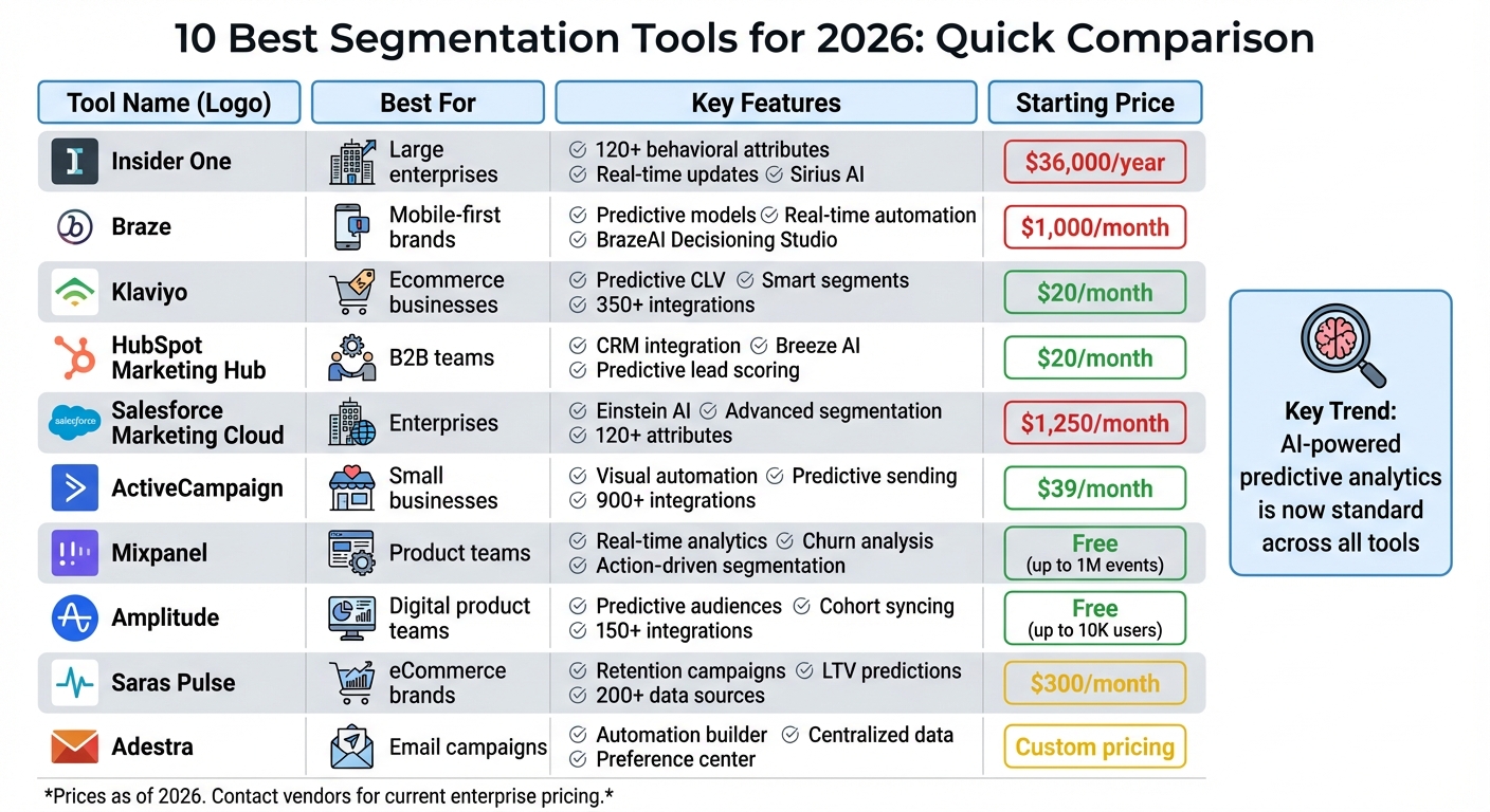
| Tool | Best For | Key Features | Starting Price |
|---|---|---|---|
| Insider One | Large enterprises | 120+ behavioral attributes, real-time updates | $36,000/year |
| Braze | Mobile-first brands | Predictive models, real-time automation | $1,000/month |
| Klaviyo | Ecommerce businesses | Predictive customer metrics, smart segments | $20/month |
| HubSpot Marketing Hub | B2B teams | CRM integration, predictive lead scoring | $20/month |
| Salesforce Marketing Cloud | Enterprises | Einstein AI, advanced segmentation | $1,250/month |
| ActiveCampaign | Small businesses | Visual automation, predictive sending | $39/month |
| Mixpanel | Product teams | Real-time analytics, churn analysis | Free (up to 1M events) |
| Amplitude | Digital product teams | Predictive audiences, cohort syncing | Free (up to 10K users) |
| Saras Pulse | eCommerce brands | Retention campaigns, LTV predictions | $300/month |
| Adestra | Email campaigns | Automation, centralized data | Custom pricing |
Choose the tool that aligns with your business size, customer data needs, and marketing goals for maximum impact.
Top 10 Segmentation Tools Comparison 2026: Features, Pricing & Best Use Cases
Insider One offers a powerful way to analyze customer behavior, processing over 120 behavioral attributes per user. This allows businesses to create highly detailed segments that go beyond basic demographics. It predicts factors like churn risk, purchase likelihood, lifetime value, and even more specific traits, such as discount sensitivity and preferred communication channels (email, SMS, or push notifications). With the introduction of Sirius AI in late 2025, the platform has taken segmentation to the next level by automatically generating segment descriptions and suggesting journey strategies. This reduces the time marketers spend on manual setup. Additionally, its predictive features work seamlessly with real-time segmentation, ensuring customer data stays up to date.
Segments are updated continuously, meaning membership is adjusted instantly, and messages are triggered across platforms like web, app, email, SMS, or WhatsApp. For example, if a customer abandons their cart or browses a specific product category, Insider One reacts immediately. A Digital Marketing Manager from a global department store highlighted its impact:
It enables tailored onsite experiences that resonate with individual customer interests.
Insider One is designed to handle enterprise-level operations, managing millions of user profiles across various regions without compromising performance. Pricing starts at $36,000 per year for mid-market plans, while enterprise solutions range from $100,000 to over $500,000 annually. The platform's capabilities have earned it recognition as a 2026 Gartner® Magic Quadrant™ Leader for Personalization Engines and the top spot in 11 categories in G2's Winter '26 reports.
Brands leveraging Insider One have reported impressive results, including a 259% boost in Average Order Value and an 18.8% increase in revenue per user after adopting its personalized recommendations. That said, the platform's deep segmentation features and robust capabilities come with a price tag and complexity that make it a better fit for large-scale businesses. As one analyst noted, while the 120+ attribute segmentation is a standout feature, it’s most valuable for companies with the resources and scale to maximize its potential. For smaller businesses or those just beginning to explore segmentation, the costs might outweigh the benefits.
Braze equips marketers with its Predictive Suite, which includes three built-in models: Predictive Churn, Predictive Purchases, and Predictive Events. These models help forecast customer disengagement, buying intent, and specific actions like plan upgrades. The platform also features the BrazeAI Decisioning Studio, which uses reinforcement learning to optimize the channel, message, offer, timing, and frequency for each individual customer. This replaces static rules with insights derived from behavioral data. Let’s explore how Braze enhances segmentation through predictive insights, real-time automation, and seamless integrations.
Braze's Intelligent Selection feature identifies the best-performing campaign variants for different sub-groups within a segment and dynamically adjusts traffic to favor the winning options. This AI-driven segmentation creates audiences based on real behavior and intent signals rather than relying on static rules. The results speak for themselves: AI-segmented campaigns have shown revenue increases of 20-40% per recipient compared to generic campaigns. For instance, Wyze experienced a 56% boost in conversions for its Cam Plus subscription by leveraging behavioral segmentation during onboarding. These tools allow marketers to target highly specific micro-segments with precision, improving overall campaign effectiveness.
Braze processes events in milliseconds, enabling instant messaging and real-time segment updates. Sarah Mitchell from ProPicked highlighted this capability:
Real-time data processing in milliseconds enables truly instantaneous triggered messaging at massive scale.
Showmax demonstrated the power of this approach, achieving a 204% increase in subscribers and a 12% improvement in win-back rates by using lifecycle segmentation with dynamic updates. The platform's Canvas Flow visual journey builder automates cross-channel orchestration, allowing marketers to use segments as entry points, decision nodes, and split paths within customer journeys. This ensures segmentation remains accurate and responsive as customer behavior evolves.
Braze integrates effortlessly with data warehouses like Snowflake, Azure, and Amazon via Cloud Data Ingestion (CDI), enabling marketers to query data directly without duplication. Its "Currents" feature streams real-time engagement data back to analytics tools for closed-loop reporting. Additionally, Braze connects to thousands of applications through Zapier, while its native Shopify integration supports real-time catalog syncing and pre-built cart abandonment templates. Through its Segment integration, Braze unifies data from 700+ sources into detailed customer profiles. These integrations provide a comprehensive view of customer interactions by consolidating data from multiple platforms.
Braze supports over 7.2 billion monthly active users across 2,300+ brands worldwide. Pricing starts at $1,000 per month, with mid-market plans ranging between $50,000 and $80,000 annually, and enterprise-level solutions exceeding $150,000 per year. For startups, Braze offers a special program with discounted rates for qualifying early-stage companies. The platform received a 9.0/10 rating from ProPicked in March 2026. However, reviewers note that initial setup requires significant engineering resources, and the enterprise pricing can be steep.

Klaviyo is at the forefront of using AI to shape personalized marketing strategies. Its AI tools calculate key customer metrics like predicted customer lifetime value (CLV), churn risk, and the expected date of the next order. These insights power "smart segments" such as "VIP at risk" or "winback ready", which trigger automated and personalized messages across email, SMS, and mobile push notifications. With its Segments AI feature, marketers can simply describe their target audience in plain English, and the platform will create complex, data-driven segments. Brands using these predictive segments have reported a 35% increase in revenue per email compared to traditional methods.
Klaviyo handles an impressive 2.5 billion daily events while retaining event-level data indefinitely, enabling detailed segmentation based on years of customer behavior. This allows the platform to generate predictive traits like churn risk, CLV, total expected future orders, and average time between purchases for every customer. Ben Zettler, Founder of Zettler Digital, highlights its ecommerce-focused design:
Klaviyo's advantage is that it was built for ecommerce from day one. Every SKU, order, and signal feeds back into segmentation and personalization automatically.
This deep data processing ensures that brands can build precise and effective marketing campaigns.
Klaviyo’s segments are constantly updated in real time, adapting to changes in customer behavior to keep messaging relevant. Automation triggers, or "flows", activate immediately based on predictive signals. For instance, the platform can send a retention offer when a customer's churn risk reaches a certain point. Its omnichannel campaign builder seamlessly coordinates email, SMS, push notifications, and WhatsApp, all on a unified dashboard with combined reporting. Brands transitioning to Klaviyo often see an average ROI of 48× after consolidating their marketing tools, according to the platform's data.
Klaviyo integrates with over 350 tools and offers flexible APIs to pull data from various sources. Native integrations with Shopify, WooCommerce, and BigCommerce enable detailed segmentation at the SKU level and product-based triggers. The platform also syncs segments directly with advertising platforms like Facebook and Google Ads, making it easy to create lookalike audiences, retarget existing customers, and exclude recent buyers from acquisition campaigns. Additionally, it connects with loyalty tools like Recharge and Rebuy, as well as helpdesk solutions, linking support tickets to customer profiles. Mike Tatum, Lifecycle Marketing Lead at Prismfly, explains:
When brands switch marketing automation platforms, the biggest gains usually come from better deliverability and smarter segmentation, not just flashy features.
These integrations make it easier to scale and optimize marketing efforts.
Klaviyo offers a free tier for businesses with up to 250 contacts and 500 email sends per month, making it a great option for startups. The paid Email Plan starts at $20/month for 251–500 contacts, scaling up to $350/month for 20,000 contacts and $700/month for 50,000 contacts. All pricing tiers include access to predictive analytics and smart segments. Klaviyo has earned an impressive 4.6/5 rating on both G2 and Capterra, with users praising its ecommerce integrations and advanced segmentation tools. However, some reviewers mention a steep learning curve for new users and quickly rising costs as contact lists grow.

HubSpot Marketing Hub combines CRM capabilities with AI-powered segmentation through its Breeze AI layer. This feature assigns engagement ratings - categorized as "High", "Medium", "Low", or "Unknown" - to audience segments before campaigns are launched. This allows marketers to tailor their strategies for less-engaged groups rather than applying a blanket approach. The platform’s predictive lead scoring evaluates hundreds of data points, such as firmographic details and behavioral patterns, to pinpoint which contacts are most likely to convert. According to HubSpot research, 78% of marketers rank subscriber segmentation as one of the most effective tactics for email campaigns.
HubSpot's smart lists operate dynamically, using real-time data like website activity, email interactions, and form submissions to update contact lists automatically. These lists are refreshed hourly, ensuring segmentation remains accurate and relevant. The platform’s AI models predict metrics like open rates, click-through rates, and conversion probabilities, which can lead to a 35% increase in revenue per email. Sarah Chen, Marketing Tech Editor, highlights HubSpot's strengths:
HubSpot is the strongest choice for B2B teams that want segmentation powered by the full sales + marketing context.
HubSpot’s App Marketplace offers over 1,500 native integrations, enabling seamless data sharing across marketing tools. The platform directly connects with major advertising platforms like Google Ads, Facebook Ads, LinkedIn Ads, and Instagram Ads, allowing marketers to sync audiences for precise ad targeting. For ecommerce, integrations with Shopify and WooCommerce let users harness real-time product and behavioral data to refine segmentation. Cassie Wilson Clark from HubSpot explains:
CRM-native platforms like HubSpot's email marketing software offer the strongest advantage. They eliminate data syncing issues and reduce tool fatigue.
With its built-in CRM, HubSpot ensures sales and marketing data remain unified. This integration underscores the platform’s focus on dynamic segmentation and streamlined workflows - key features that set it apart in 2026.
HubSpot's scalability is another standout feature, accommodating businesses with contact lists ranging from 500 to over 50,000 without the need for platform migration. The Free tier supports up to 1,000,000 contacts with basic forms and email tools, while the Starter tier starts at $20/month for 1,000 marketing contacts and includes basic automation. The Professional tier, priced at $890/month for 2,000 marketing contacts, offers advanced features like predictive lead scoring, smart content, A/B testing, and 300 active workflows. For larger enterprises, the Enterprise tier costs $3,600/month for 10,000 marketing contacts and includes custom behavioral events, multi-touch attribution, and 1,000 active workflows.
HubSpot’s "marketing contacts" model ensures businesses only pay for actively targeted contacts, while additional contacts can remain in the CRM for free. In 2026 testing, the platform scored 9.4/10 overall, with users praising its "best-in-class CRM + marketing integration" and "most intuitive visual workflow builder." However, some reviewers pointed out that the Professional and Enterprise tiers can become costly as contact lists expand.
Salesforce Marketing Cloud stands out as a tool that combines advanced AI capabilities with enterprise-level campaign management. Its Einstein AI technology is at the core, analyzing customer data to predict behaviors like purchase likelihood, churn risk, and engagement tendencies. Features like Einstein Engagement Scoring help marketers understand how likely customers are to open emails, click links, or convert. Meanwhile, Einstein Studio uses the Data Cloud to anticipate actions such as unsubscribes or purchases. For B2B teams, Einstein Lead Scoring dives into historical CRM data - examining factors like lead source, industry, and company size - to pinpoint the most promising prospects. According to Salesforce, 74% of marketers using AI report better segmentation outcomes.
The platform’s Generative Segmentation feature allows users to create audience segments with simple natural language prompts, such as "Find users who interacted with recent launches but haven’t made a purchase." This eliminates the need for technical expertise or SQL queries. Additionally, Einstein Attribution evaluates how different marketing touchpoints contribute to conversions, helping teams fine-tune their strategies. With the ability to analyze over 120 behavioral attributes per user, Salesforce Marketing Cloud is particularly well-suited for enterprises managing extensive customer databases. These predictive tools enable real-time, data-driven adjustments to audience targeting.
Salesforce also enables real-time audience updates through its Agentforce module, ensuring that smart lists automatically refresh based on behavioral triggers. However, the implementation process can be complex and typically requires significant IT support. Some users have noted a syncing delay of about 15 minutes when integrating with Pardot.
The platform’s Marketing Cloud Intelligence consolidates data from a wide variety of sources - advertising platforms, social media, email campaigns, and even offline interactions - into unified customer profiles. This Customer Data Platform (CDP) creates a single, unified view by combining data from websites, apps, loyalty programs, and connected devices. Salesforce has been recognized as a Leader in the Gartner Magic Quadrant for Multichannel Marketing Hubs for eight consecutive years as of 2025, and it has also held Leader status for Customer Data Platforms for two years.
Salesforce Marketing Cloud is designed to handle large-scale operations, making it ideal for enterprises. Pricing begins at $1,250 per month for Marketing Cloud Engagement, $3,000 per month for Marketing Cloud Intelligence, and approximately $108,000 annually for Data Cloud for Marketing. Implementation costs can range from $10,000 to over $100,000, with setup taking several months. While the platform received a 7.7/10 rating on TrustRadius - earning high marks for its features (93% satisfaction) and value (89%) - its implementation rating was only 3.0/10 due to the technical expertise required. For smaller teams, the steep costs and technical demands might pose challenges.
ActiveCampaign uses AI-powered predictive segmentation to help small and mid-sized businesses target their audiences more effectively. By analyzing past behaviors, demographics, and purchase history, it predicts which content will resonate with specific customer segments. This forward-thinking approach allows marketing teams to anticipate customer needs instead of reacting to them. Its AI-Suggested Segments feature identifies audience groups based on patterns in customer data, saving teams hours of manual work. For businesses looking for data-driven marketing solutions, this tool offers a powerful way to refine audience targeting.
ActiveCampaign also shines when it comes to automation. Its visual automation builder is highly flexible, letting marketers create workflows based on almost any condition, from custom event data to predictive sending. The Goals feature speeds up the customer journey, cutting average nurture times by 30% to 40% by advancing contacts as soon as they convert, rather than waiting for set time intervals. The platform’s Active Intelligence system provides real-time tracking of site visits, link clicks, and custom events, enabling instant responses to user behavior. With over 950 pre-built automation recipes, teams can launch complex campaigns with minimal setup time.
ActiveCampaign integrates seamlessly with over 900 tools, including Salesforce, Shopify, WooCommerce, WordPress, Facebook, and Google Ads. This ensures that customer data flows smoothly across platforms, enabling the creation of unified customer profiles for better segmentation. The platform has earned a 4.5/5 rating from over 14,000 customer reviews and is ranked #2 in market presence on G2’s 2025 Marketing Automation Grid.
Pricing is accessible, starting at $39/month for the Lite plan. The Plus plan, which includes AI-driven segmentation and personalized outreach, costs $79/month. For businesses managing 10,000 contacts, the Plus plan is priced at roughly $179/month - less than 20% of the cost of HubSpot's equivalent tier. All plans include a 14-day free trial and a 30-day results guarantee. While the platform’s advanced automation features may take some time to master, it’s designed to scale seamlessly, accommodating both small businesses and mid-market companies with more complex needs.
Mixpanel uses an action-driven method for segmentation, relying on AI to create groups based on user behaviors - like frequent visits to pricing pages or abandoning carts. Its Metric Trees help align these behaviors with specific business objectives.
The platform's Churn and Retention Analysis feature tracks user groups over time, identifying what keeps users engaged and spotting behaviors that might lead to churn. Drew Ashlock, Senior Product Manager, shared:
Mixpanel helps us enable our customers for success. What started as a need for simple marketing metrics turned into custom product metrics for more than 100 different stakeholders across the company.
These predictive tools are designed to facilitate timely, data-driven actions.
Mixpanel provides real-time analytics through customizable dashboards and AI-powered workflows. These tools surface actionable insights instantly, eliminating the need for SQL expertise. Its funnel tracking feature pinpoints where users drop off in their journey, enabling businesses to launch re-engagement campaigns at the right time. Additionally, automated insights continuously highlight opportunities for segmentation and outreach.
Mixpanel integrates smoothly with various marketing tools. Warehouse Connectors allow data syncing from platforms like BigQuery, while connections with Segment and reverse ETL solutions ensure seamless data flow across systems. This interoperability eliminates data silos and enables behavioral insights to power actions in email platforms, ad networks, and CRM systems.
Mixpanel caters to businesses of all sizes, offering a free tier that supports up to 1,000,000 monthly events and 10,000 session replays. The Growth plan starts at $20 per month, with an additional charge of $0.00028 per event beyond the first million. For enterprises managing billions of monthly events, the Enterprise tier offers unlimited events along with advanced features like governance tools, SOC 2 Type II and ISO 27001 compliance, and SSO/SAML integration. The platform also supports a thriving community of over 12,000 analytics professionals for peer collaboration.
Amplitude leverages propensity models to forecast user behaviors like conversions, churn, or feature engagement. These models drive what the platform calls "Predictive Audiences", enabling marketers to focus on high-potential customers with personalized reminders or win back at-risk users through tailored campaigns. Once these dynamic segments are created, Amplitude seamlessly integrates them into marketing tools for immediate campaign execution.
Damien Delautier, Chief Product Officer at Groupe Canal+, highlighted the platform's impact:
I sold the philosophy internally for a new way to do product. … We quickly realized there is only one tool that works for this, and it's Amplitude.
Amplitude's predictive segmentation is paired with real-time automation for swift action. Using AI-powered agents, the platform processes data instantly, monitoring user activity and streaming events to trigger actions in tools like Appcues or Sprig. This rapid data transfer ensures marketing campaigns can be activated without delay.
With connections to over 150 tools, Amplitude simplifies the process of syncing behavioral cohorts with email platforms, ad networks, and messaging systems. Its "Cohort Syncing" feature exports specific user groups - such as those who abandoned their cart but watched a demo - to platforms like Braze, Facebook Ads, or HubSpot for automated, highly-targeted campaigns. Additionally, Amplitude works seamlessly with major customer data platforms like Twilio Segment, mParticle, and Tealium, ensuring customer data is unified across the tech stack.
Madison Lukaczyk, Senior Manager of Business Intelligence, shared her perspective:
Amplitude allows us to really action our data. Going beyond just the insights, we're now able to engage users in ways that are most meaningful to them.
Amplitude supports over 11,000 digital products across various industries, including retail and healthcare. For startups, the platform offers a free plan that tracks up to 10,000 users per month - no credit card required. For larger enterprises, Amplitude provides a compelling ROI of 217% over three years, with an average payback period of just six months. It's no surprise that Forrester recognized Amplitude as a "Leader" in Digital Analytics Solutions in its Q3 2025 report, awarding it top scores in 21 different criteria.
Saras Pulse leverages AI and machine learning to predict customer lifetime value (LTV) and assess churn risk. This allows marketing teams to pinpoint high-value customers and identify those at risk of leaving, triggering automated retention campaigns to keep them engaged. Saras Analytics reports that using AI-driven segmentation can lead to a 25% increase in LTV, with companies seeing a 15% rise in sales compared to traditional segmentation methods.
In 2025, brands like HexClad (cookware) and Ridge (accessories) implemented Saras Pulse to move beyond static data analysis. By tapping into AI-powered insights and gaining daily updates on customer cohorts, these companies fine-tuned their strategies to better connect with high-value audiences. This predictive approach laid the groundwork for ongoing, dynamic segmentation, leading into the next evolution of customer engagement.
Saras Pulse’s dynamic segmentation engine ensures that audience cohorts are updated in real time as new data flows in. Every customer interaction - whether it’s a click, purchase, or message - automatically updates segments through Saras Daton. With over 200 data sources integrated, this eliminates the need for manual exports or complex SQL queries.
This automation has proven highly effective for brands. For example, companies using Saras Pulse have cut Klaviyo data costs by 95% by centralizing their data within the Saras ecosystem. True Classic saved over 1,000 hours of manual work, while another brand using a Customer 360 strategy achieved a 12% re-purchase rate from previously churned customers.
As segmentation strategies evolved in 2026, Saras Pulse expanded its integrations to streamline data synchronization for marketers. With over 200 connectors, the platform centralizes data from tools like Shopify, Amazon, Klaviyo, Meta Ads, and Google Analytics 4. Saras Daton powers this process, running more than 10 million jobs daily to ensure smooth data flow across platforms. Its ELT engine syncs live data with CRMs, analytics tools, and ad platforms, creating a unified and efficient data ecosystem. Marketers can also use the platform’s no-code segment builder to quickly design and activate audience segments.
Saras Pulse is designed to meet the needs of mid- to large-scale eCommerce and direct-to-consumer brands, offering flexible pricing to suit different business sizes. The Growth Plan starts at $300/month (or $250/month with annual billing) and includes all core features, over 200 integrations, and support for up to 10 users. For larger operations, the Enterprise Plan offers custom pricing, unlimited user access, advanced data support, and enterprise-level security features like encryption, role-based access, and PII masking.
Adestra's Automation Program Builder makes it easy for marketers to design customer journeys that react to user behaviors. For instance, you can set up automated welcome emails for new subscribers or create nurture campaigns triggered by specific actions, like downloading a resource or leaving items in a shopping cart.
It also features a preference center, where subscribers can choose how they want to hear from you. This helps maintain a clean contact list and minimizes widespread unsubscribes.
Adestra simplifies data management by offering a single customer view, pulling information from various systems through automated imports. With all customer data in one place, marketing teams can create better-targeted segments and run campaigns with greater accuracy.
Adestra's segmentation features are complemented by its ability to integrate with popular marketing platforms. It connects with Salesforce and Shopify, allowing teams to manage lists, launch campaigns, or trigger automated email sequences tied to store activity - all without leaving these platforms.
It also works with BlueConic for multi-channel orchestration in enterprise-level campaigns. Through its partnership with ONEcount, Adestra leverages unified data and AI to send personalized emails to specific audience segments at the best times. These integrations make Adestra a standout choice for marketers looking to optimize segmentation and automation efforts in 2026.
When it comes to choosing a segmentation tool for 2026, the key is to match the platform to your specific business needs and goals. For e-commerce brands, tools like Klaviyo shine with their focus on purchase behavior and customer lifetime value predictions. On the other hand, B2B teams will benefit more from platforms like HubSpot, which excel in lead scoring and seamless CRM integration. If your company is mobile-first, real-time tools like Braze - offering instant push notifications and in-app messaging - are a perfect fit.
Why Predictive Analytics Matters
Predictive analytics has shifted from being a nice-to-have to an absolute must. These tools can pinpoint high-value customers and identify potential churners with incredible accuracy, fueling higher conversions and revenue. But the real game-changer? Combining predictive insights with real-time responsiveness.
The Power of Real-Time Segmentation
Today’s customers demand personalization based on their most recent actions - not what they did yesterday. That’s why batch segmentation, which updates overnight, is no longer sufficient. Platforms offering dynamic membership - where users move in and out of segments instantly - ensure your messaging stays relevant to what someone did just minutes ago.
Scalability Is Key
As your business grows, scalability becomes non-negotiable. Enterprise-level tools like Insider are built to handle millions of user profiles and hundreds of behavioral attributes per person. Smaller platforms, however, may struggle to keep up. If your customer data is scattered across multiple platforms, consider starting with a foundational tool like Segment before diving into activation platforms.
Match the Tool to Your Goals
Your primary objective should guide your choice. If retention is your focus, opt for platforms designed to boost customer loyalty. For acquisition-heavy strategies, tools like HubSpot offer a more comprehensive approach. And if your team lacks technical expertise, prioritize no-code platforms with visual builders to ensure smooth adoption.
Ultimately, the right segmentation tool transforms raw data into actionable decisions, enabling you to create campaigns that are hyper-personalized, scalable, and driven by both predictive and real-time insights. The future of segmentation is here - make sure your business is ready to embrace it.
AI segmentation in 2026 thrives on analyzing data such as customer behavior patterns, real-time activity, engagement scores, and purchase history. These dynamic factors allow AI to pinpoint micro-segments, anticipate future actions, and adjust segment memberships automatically. To get the most out of this approach, prioritize gathering insights that can directly inform and refine segmentation strategies.
Choosing the right segmentation tool hinges on factors like your business size, the amount of data you handle, and your specific objectives. If you're running a smaller business, look for platforms that are easy to use and offer automation to simplify processes. On the other hand, larger companies often need tools powered by AI to manage complex, unstructured data effectively. Think about whether you need features like real-time insights, in-depth behavioral analysis, or advanced segmentation capabilities. The tool you pick should match your growth ambitions and work seamlessly with your existing systems.
Real-time segments work without cookies by using AI-driven behavioral data, predictive analytics, and contextual signals. Instead of relying on stored cookie data, these tools group users dynamically based on their current actions and patterns.
Email personalization can drive better engagement and higher revenue. Here are five effective ways to use personalized product recommendations in your email campaigns:
Personalized recommendations not only improve email performance but also account for 30% of total revenue despite representing just 7% of site visits. Start with one or two strategies, monitor key metrics like open and conversion rates, and refine your approach for the best results.
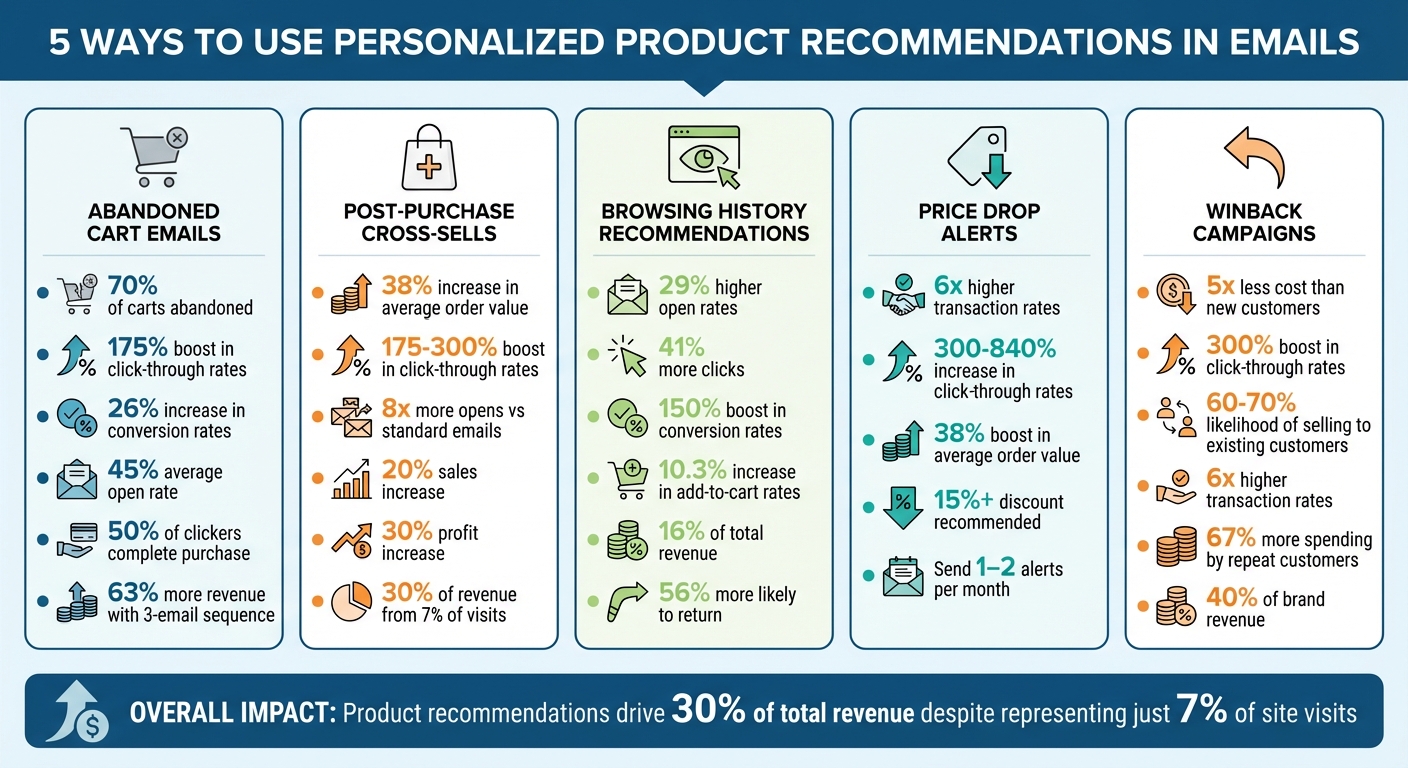
5 Email Personalization Strategies: Performance Metrics and Impact Comparison
Abandoned cart emails are a direct response to a shopper's demonstrated interest in specific products. With 70% of online shopping carts left behind before checkout, these emails are a powerful way to re-engage potential customers. People abandon carts for various reasons - maybe they changed their minds, found a better deal, or simply got distracted. By including personalized product suggestions, you can stay on their radar and offer alternatives that align with their preferences. This approach keeps your brand relevant and encourages higher engagement.
Adding tailored product recommendations to abandoned cart emails significantly increases engagement. For instance, personalized suggestions can boost click-through rates by 175% and extend browsing time by 344%. These emails already perform well, with an average open rate of 45%. Even better, 21% of recipients who open these emails click through to revisit their cart. That’s a level of engagement most email campaigns can only dream of, making these emails the perfect place to include smart product recommendations.
The numbers speak for themselves: 50% of users who click through an abandoned cart email go on to complete their purchase. When personalized product suggestions are added, conversion rates can increase by as much as 26%. Sending more than one email also makes a difference - brands using a three-email sequence see 63% more revenue compared to sending just one reminder. Timing is critical here: send the first email within 30–60 minutes of abandonment, follow up 24 hours later with social proof, and send a final reminder 48–72 hours after the cart was abandoned.
Modern email tools make it easy to include personalized recommendations with features like drag-and-drop "Recommended Product" blocks or "Smart Banners" that use dynamic content based on browsing behavior. To make the most of these tools, keep the focus on the abandoned item. Place recommendations below the main call-to-action button and include options like frequently bought together items, related accessories, or even lower-cost alternatives. This ensures the suggestions enhance the email without overshadowing its primary goal.
After a purchase, customers are often more receptive to suggestions that complement their original buy. This makes post-purchase emails a great opportunity to recommend related products. For instance, if someone purchases steak knives, it’s logical to suggest a gourmet seasoning set that pairs well with their new tools. Modern recommendation engines take this a step further by using collaborative filtering to analyze what other customers purchased alongside the same item. By aligning these recommendations with past purchases, businesses can naturally increase customer interest and engagement.
Adding personalized product suggestions in emails can lead to click-through rate increases of anywhere from 175% to 300%. Transactional emails - like order confirmations or shipping updates - are especially effective, generating 8x more opens and clicks compared to standard promotional emails. Repeat customers are an even bigger win, as they tend to spend 67% more than first-time buyers.
Cross-selling done right can boost sales by 20% and profits by 30%. Personalized product recommendations also increase the average order value (AOV) by around 38%. Even though product recommendations account for just 7% of site visits, they drive nearly 30% of total revenue. Plus, personalized experiences encourage loyalty - 78% of customers are more likely to make repeat purchases when they feel the experience is tailored to them. This not only improves short-term sales but also strengthens customer lifetime value over time.
The tools for implementing cross-sell emails have become easier to use than ever. Many platforms now include drag-and-drop “Recommended Product” blocks that automatically pull items based on purchase history. AI-powered systems can integrate with providers like Klaviyo and GetResponse, automating the process and removing the need for manual segmentation. To maximize impact, focus on a few highly relevant recommendations and include social proof, like customer reviews or star ratings, to build trust quickly. Since many people check emails on their phones, keep subject lines short (under 50 characters) and use clear, high-quality images to grab attention.
Browsing history offers a clear window into what customers are actively interested in right now. It captures those "subtle signals" that reveal true intent - whether someone is checking out running shoes, researching kitchen gadgets, or comparing laptop models . Unlike purchase history, which reflects past actions, browsing behavior highlights immediate needs and curiosity. For instance, if a customer is exploring camping tents, they’re likely in the research phase. Sending an email featuring those tents or related outdoor gear at this point can grab their attention. These insights often lead to stronger engagement with personalized emails.
Shoppers love personalization - 62% of them prefer tailored recommendations. Emails crafted around recent browsing activity hit customers when their interest is at its peak. In fact, personalized promotional emails boast 29% higher open rates and 41% more click-throughs compared to generic ones. A great example? In 2024, men’s fashion retailer Pako Lorente introduced browsing-based "Similar Products" sections in their emails. The result? Around $49,000 in products were added to carts within the first month. Additionally, over 80% of marketers have reported better performance after using real-time, dynamic content in their email campaigns.
Higher engagement often leads to more conversions. Recommendations based on browsing behavior can boost conversion rates by up to 150%. They also increase add-to-cart rates by 10.3% and can contribute as much as 16% of total revenue. While product recommendations make up only 7% of site visits, they account for nearly 30% of revenue. By showing customers the exact product they were browsing - along with a few similar options - you make the buying process smoother. Plus, 56% of shoppers say they’re more likely to return to a site that offers personalized recommendations, which builds loyalty while driving sales.
These days, setting up browsing-based recommendations is simpler than ever. Many email platforms now include dynamic blocks that automatically update with a customer’s latest browsing activity. The most advanced systems even use real-time widgets, ensuring the products shown are current and in stock when the email is opened. To avoid overwhelming recipients, stick to showcasing 3–5 highly relevant products. Including real-time star ratings and customer reviews can also help confirm the relevance of your suggestions . For customers with limited browsing data, fallback options like bestsellers or featured items ensure your email still feels complete. This streamlined approach makes it easier to turn browsing interest into actual purchases.
Price drop alerts are a smart way to connect with shoppers who are hesitant to buy. These alerts focus on customers who have shown interest in a product but haven’t completed the purchase. By keeping an eye on the items they frequently view, businesses can match their browsing habits with a timely discount. This creates a personalized message that feels relevant, unlike generic sale emails that often get ignored. It’s a great addition to strategies like recovering abandoned carts.
Personalized emails aren’t just more appealing - they’re also far more effective. Research shows they can lead to transaction rates that are up to 6× higher than generic emails. Including both the original price and the discounted price helps highlight the deal, while adding urgency with phrases like "limited stock" or "offer ends soon" taps into the fear of missing out. Even something as simple as showing star ratings can make the offer more convincing .
Price drop alerts are powerful tools for turning interest into action. Discounts of 15% or more tend to grab the most attention, with studies showing that targeted emails can increase click-through rates by 300% to 840%. They can also push average order values up by around 38%. To maximize results, aim for discounts that exceed 15% - enough to motivate shoppers to act quickly.
Thanks to marketing automation platforms, setting up price drop alerts is straightforward. Tools like Klaviyo, Mailchimp, and GetResponse work seamlessly with eCommerce platforms like Shopify. These systems can track customer browsing habits, monitor product prices, and send alerts automatically when a price drops. To avoid overwhelming customers, stick to 1–2 alerts per month per person and make sure they’re sent as soon as the price changes. This keeps the process efficient and avoids "discount fatigue."
Winback campaigns focus on reconnecting with customers by using insights from their past behavior. By analyzing purchase history, browsing habits, and abandoned carts, you can recommend products that align with their previous interests. For instance, if someone bought running shoes three months ago, suggesting complementary athletic gear feels natural and relevant. Additionally, showcasing new arrivals introduced during their absence can demonstrate how your brand has evolved [30, 33]. Targeting customers who have been inactive for 30–90 days often yields the best results.
Personalized winback emails go beyond generic "we miss you" messages by offering tailored product recommendations that resonate with the recipient. This approach can boost click-through rates by up to 300%. In fact, 74% of marketers say that personalized content leads to higher engagement. Adding elements like star ratings and customer reviews not only builds trust but also eases purchase hesitation. Since 35% of recipients decide whether to open an email based on the subject line, incorporating urgency into it can increase open rates by 12%.
Reactivating lapsed customers is significantly more cost-effective than acquiring new ones - it costs five times less. Plus, the likelihood of selling to an existing customer ranges from 60% to 70%, compared to just 5% to 20% for new prospects [35, 38]. Personalized emails are particularly effective, generating six times higher transaction rates. Furthermore, 91% of consumers are more likely to shop with brands that offer relevant recommendations. Repeat customers also tend to spend 67% more than new ones and contribute to about 40% of a brand's revenue [34, 35]. With modern automation tools, tapping into these benefits is easier than ever.
Platforms like Klaviyo, Mailchimp, and GetResponse make launching winback campaigns straightforward [34, 36]. These tools integrate seamlessly with eCommerce systems, enabling you to set up automated workflows triggered after specific periods of inactivity - typically 30 to 90 days. A multi-step email sequence works best: start with a friendly reminder, follow up with personalized product suggestions, include an incentive like a discount, and wrap up with a "last chance" message. While only 24% of recipients might engage with the first email, data shows that 45% interact with subsequent messages in the series. This structured approach ties directly to the broader strategy of using personalization to drive re-engagement and conversions.

Personalized product recommendations transform email campaigns into focused, results-oriented conversations. The five strategies discussed - abandoned cart recovery, post-purchase cross-sells, browsing history recommendations, price drop alerts, and winback campaigns - are tailored to meet specific customer behaviors and needs.
These methods are more than just effective; they can lead to impressive results. For example, they’ve been shown to boost ROI by 122% and generate six times higher transaction rates. By leveraging customer data, these strategies create highly personalized and engaging email experiences.
The road to success involves constant testing and fine-tuning. Since results can vary depending on your audience, it’s smart to start small. Focus on one or two strategies that align with your current data and email tools. Keep a close eye on metrics like open rates, click-through rates, and conversions to see what resonates best with your audience.
As Saitej Makhijani from SendX explains, "It can take some trial and error finding out what works for your business, but once you implement email personalization, the benefits follow".
Experimentation is key. For instance, you might test different recommendation algorithms - cart abandoners might respond well to complementary items, while homepage browsers could be drawn to best sellers. You can also tweak how recommendations are visually presented. Some tests show that removing prices can increase click-through rates by 37%.
Personalization's impact is undeniable. Around 80% of businesses report a 38% boost in average order value thanks to personalization. Even more striking, product recommendations drive nearly 30% of total revenue, despite accounting for just 7% of site visits. With modern automation tools making implementation easier than ever, these strategies can help refine your campaigns and keep engagement on the rise.
To make product recommendations in emails feel personal, start by gathering data on your customers' behaviors and preferences. Focus on key details like their browsing history, previous purchases, interactions with specific product pages, and even abandoned shopping carts. By analyzing this information, you can suggest products that align with each customer’s interests, increasing both engagement and the likelihood of conversions.
When deciding how many products to include in an email, there's no magic number. Instead, prioritize quality and relevance to keep your audience interested. Carefully choose personalized recommendations and place them in strategic spots, like welcome emails or dedicated product sections. The goal is to present a manageable number of options so readers feel intrigued, not overwhelmed.
Track essential metrics such as click-through rates (CTR), conversion rates, and overall engagement in your email campaigns. Pay close attention to how CTR and conversions change after implementing personalized recommendations. Beyond email performance, keep an eye on metrics like time spent on your website and repeat purchase behavior. These can reveal valuable insights into customer loyalty and how well your recommendations are connecting with your audience. By analyzing these trends, you’ll get a clearer picture of whether your efforts are delivering tangible results.
Want to make your next campaign better than the last? Post-campaign audience behavior analysis is the key to understanding what worked, what didn’t, and how to improve. Here’s what you need to know:
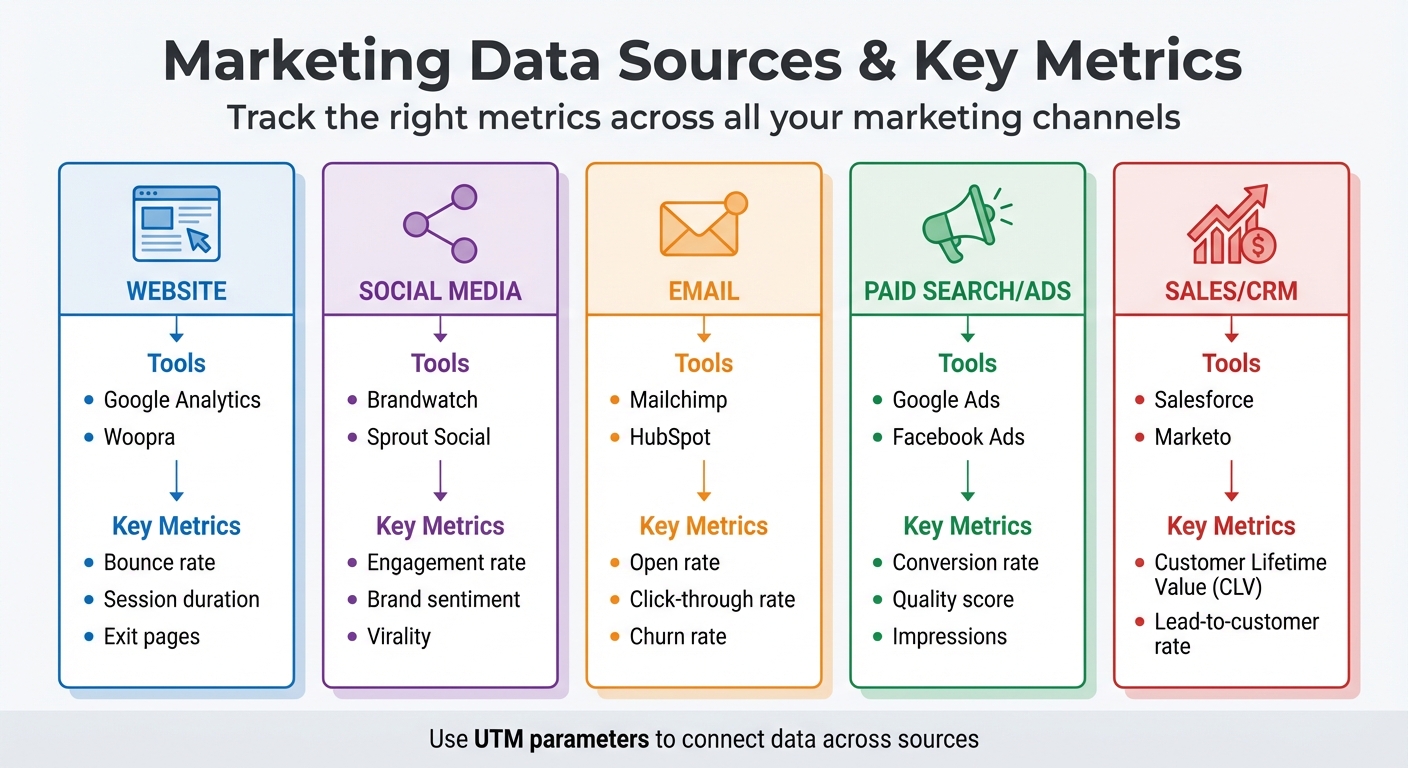
Marketing Data Sources and Key Metrics Comparison Guide
To understand how your campaign performed, you need to gather data from every touchpoint. This means looking beyond a single Google Analytics report. A full analysis requires pulling information from all the platforms where your audience engaged with your brand.
Different channels offer their own analytics tools, each tailored to specific types of engagement. For example:
One essential tool for tying all this data together is UTM parameters. These tags let you add specific identifiers - like source, medium, and campaign name - to your URLs. This way, you can trace exactly which channel or message brought visitors to your site. Without UTM tags, traffic might show up as "direct" or "referral", making it harder to pinpoint its origin.
| Data Source Category | Common Tools | Key Metrics |
|---|---|---|
| Website | Google Analytics, Woopra | Bounce rate, session duration, exit pages |
| Social Media | Brandwatch, Sprout Social | Engagement rate, brand sentiment, virality |
| Mailchimp, HubSpot | Open rate, click-through rate, churn rate | |
| Paid Search/Ads | Google Ads, Facebook Ads | Conversion rate, quality score, impressions |
| Sales/CRM | Salesforce, Marketo | Customer Lifetime Value (CLV), lead-to-customer rate |
Once you've gathered your data, the next step is to ensure it's accurate and complete.
Raw data can be messy, so it’s crucial to validate its accuracy before diving into analysis. Start by cleaning up your data. For example, filter out internal traffic using IP filtering to ensure employee activity doesn’t skew your results. If you notice unusual spikes in untracked channels or referral traffic, it could mean tracking links are broken and need fixing.
Whenever possible, automate your data collection. Automated tools minimize human error, which is common with manual data entry. Platforms like Camphouse or Segment can pull data from multiple sources into a single dashboard, making it easier to spot discrepancies. For instance, if Facebook reports 500 conversions but your website analytics only show 350, you may have a tracking issue that needs investigation.
Cross-check your numbers to ensure consistency. Break down data by device type (mobile vs. desktop) and compare metrics like bounce rates to industry benchmarks. A bounce rate between 26% and 40% is considered excellent, while rates above 70% might signal engagement problems or tracking errors. Tools like Hotjar or Microsoft Clarity can help confirm whether your data aligns with user behavior by providing heatmaps and session recordings.
Accurate data is the foundation for understanding your campaign’s success, so take the time to get it right.
Once you've gathered data, it's time to zero in on metrics that actually influence your business goals. Not all numbers are created equal - some may look impressive but have little impact, while others provide a clear picture of your performance.
The key is to align your metrics with your campaign's objectives. For instance, if you're aiming to boost brand awareness, focus on exposure metrics. If driving sales is your goal, conversion metrics should take center stage. Keith Kakadia, Founder of Sociallyin, sums it up perfectly:
"Every social media post either builds your business or drains your budget. Running a campaign without a clear measurement strategy is like exploring uncharted territory without a map".
With accurate data in hand, choosing the right metrics ensures your analysis leads to actionable insights. Metrics can generally be grouped into three main categories: engagement, conversion, and behavioral. Each type serves a different purpose - engagement reflects how your audience interacts, conversion shows whether your efforts drive results, and behavioral data uncovers why users take (or don’t take) action. Let’s dive into engagement metrics first.
Engagement metrics track how actively your audience interacts with your content. These include likes, comments, shares, saves, and reposts . High engagement can amplify your organic reach, as platforms tend to favor content with strong interaction - potentially saving you money on ad spend.
But don’t just look at raw numbers. To get a more accurate view, calculate engagement as a percentage of total reach or impressions. For example, while 1,000 likes may seem like a lot, if your content reached 100,000 people, that’s just a 1% engagement rate. For video campaigns, prioritize metrics like average watch time and completion rates rather than simply counting views.
Another valuable tool is brand sentiment analysis, which categorizes audience mentions as positive, negative, or neutral. This helps gauge public perception and emotional responses to your campaign . Additionally, tracking Share of Voice (SOV) shows how much of the industry conversation your brand dominates. In fact, 94% of business leaders agree that insights from social media data positively influence revenue and decision-making.
Conversion metrics directly tie your campaign to measurable business outcomes. For example, Click-Through Rate (CTR) measures how many people who see your content actually click on it, while Conversion Rate reveals the percentage of those clicks that lead to actions like purchases, sign-ups, or downloads .
Other key metrics include Cost Per Acquisition (CPA), which tells you how much you're spending to gain each new customer or lead, and Return on Ad Spend (ROAS), which measures the revenue generated for every dollar spent on ads. Improving conversion rates can dramatically increase ROI - by as much as 223%.
Don’t forget to consider Customer Lifetime Value (CLV), which estimates the total revenue you can expect from a customer over the course of their relationship with your brand. Even if your CPA seems high initially, a strong CLV can justify the investment over time. A robust CRM system can help you connect campaign activity to these longer-term outcomes.
Next, let's look at behavioral metrics to understand what happens after users land on your website.
Behavioral metrics shed light on what users do once they visit your website. Bounce rate, for instance, measures the percentage of visitors who leave without interacting further. An excellent bounce rate falls between 26% and 40%, while anything above 70% may signal issues with engagement. Other useful metrics include average session duration and pages per session, which indicate how deeply visitors engage with your site .
Funnel drop-off points are another critical area to monitor. For example, if 500 people add items to their cart but only 150 complete the checkout process, you’ve identified a specific area to improve. Tools like Hotjar and Microsoft Clarity offer heatmaps and session recordings, helping you visualize where users click, scroll, and spend time. These insights can reveal navigation challenges and friction points .
Breaking down behavioral data by device type - such as mobile versus desktop - can also uncover platform-specific issues. Behavior flow reports are particularly helpful for pinpointing these differences. Keep in mind that mobile-optimized websites tend to achieve more than double the conversion rates of non-optimized ones .
Breaking down your analysis by channel can uncover unique audience behaviors: social media excels at driving engagement, email captures interest, and websites often lead to action.
It's also essential to separate organic from paid performance to better allocate budgets for future campaigns. As B2B Marketing Expert Daniel Clark points out:
"76% of consumers are more likely to make a purchase based on personalized experiences"
Channel-specific insights are key to delivering that level of personalization. Let’s explore each channel in detail.
Leverage native analytics tools like Meta Business Suite, LinkedIn Analytics, TikTok Analytics, and YouTube Studio to track metrics such as reach, impressions, and interactions. Comparing content formats - like Reels versus Stories or carousel posts versus single-image posts - can help identify what resonates most with your audience.
Go deeper with sentiment analysis and social listening tools to understand brand perception. These tools can track hashtags, competitor mentions, and industry trends to provide a fuller picture of how your brand is perceived.
Audience segmentation by demographics such as age, gender, and location is another critical step. Since 74% of people use social media to guide purchasing decisions, identifying which groups engage most actively can help you refine your campaigns. To stay organized, track posting times and content performance in a spreadsheet, using green highlights for improvements and red for declines. This visual method makes it easier to spot trends and adjust strategies accordingly.
Once you’ve gathered insights from social media, the next step is analyzing email campaigns to understand subscriber engagement.
Email marketing metrics like open rate and click-through rate (CTR) can reveal how well your content connects with subscribers. Crafting personalized subject lines can lead to impressive results: a 41.8% boost in open rates, a 14% increase in CTR, and 10% higher conversions.
Pay close attention to your unsubscribe rate, as spikes may signal that your messaging isn’t hitting the mark. Another valuable metric is Click-to-Open Rate (CTOR), which shows how engaging your content is for those who opened the email. This metric helps you assess whether the email delivered on the promise of its subject line.
Deliverability metrics like bounce rates (both hard and soft) and spam complaints are just as important. These factors directly affect your sender reputation, which can make or break your campaign’s success. Given that email marketing can yield an ROI of up to 4,400% - or $44 for every $1 spent - maintaining a clean email list by removing invalid addresses is crucial. Use these insights to fine-tune your segmentation and messaging in future campaigns.
With email engagement covered, turn your attention to website behavior and paid ad performance for a complete picture.
For website and paid ad tracking, Google Analytics 4 (GA4) is the go-to tool. UTM tagging, as discussed earlier, ensures accurate attribution of traffic and conversions. When you link Google Ads to GA4 with auto-tagging, detailed campaign data is automatically imported into your dashboard.
Use GA4’s custom reporting features, like Explorations, to analyze specific segments. For instance, compare mobile and desktop users or evaluate organic search traffic against paid campaigns. The "Pages and screens" report can highlight issues like 404 errors, which may be causing drop-offs in campaign traffic. Since organic search typically accounts for over 50% of online traffic, understanding how paid campaigns complement this is essential.
Attribution modeling helps determine which touchpoints contribute most to conversions. First-click attribution credits the initial channel that introduced users to your brand, while last-click focuses on the final interaction before conversion. For campaigns involving multiple touchpoints, linear or time-decay models provide a more balanced view. Tools like heatmaps and session recordings (e.g., Hotjar) offer additional insights by showing exactly where users click, scroll, or lose interest. These insights can guide you in optimizing your landing pages and user flows for better performance in future campaigns.
To truly understand what drives your campaign's success, you need to go beyond basic metrics. It's not just about knowing what happened - it's about uncovering the why and figuring out how to replicate those results. Advanced analysis techniques can help you dig deeper into audience behavior and fine-tune your strategies.
By 2026, a surprising 67% of B2B marketing teams still rely on last-touch attribution, which often leads to budget misallocations. This is a major issue because the average B2B buyer interacts with over 27 touchpoints during an extended sales cycle. In contrast, companies using multi-touch attribution have seen a 19% boost in marketing ROI within just one year. The challenge lies in selecting the right analysis method and ensuring your data infrastructure can support it.
Multi-touch attribution (MTA) assigns credit to every interaction along the customer journey, giving you a complete picture of how conversions happen. Unlike last-touch models, which focus only on the final step, MTA highlights the value of early and mid-funnel activities. This approach helps identify "gateway pages" (key entry points) and "influencer pages" (those that guide users through the funnel) that are often overlooked.
Last-touch models tend to over-credit bottom-of-funnel channels like branded search or retargeting, undervaluing the channels that create awareness. To address this, start with a baseline model like linear or U-shaped attribution. Linear models divide credit equally across all touchpoints, offering a straightforward perspective. For businesses handling 300+ conversions per month, data-driven attribution uses machine learning to assign credit based on each touchpoint's statistical impact.
| Attribution Model | Credit Distribution | Best Use Case |
|---|---|---|
| Last-Click | 100% to the final interaction before conversion | Short sales cycles or impulse purchases |
| Linear | Equal credit distributed across all touchpoints | Teams transitioning from single-touch models |
| Data-Driven | Machine learning assigns credit based on impact | High-volume businesses with 300+ conversions/month |
Custom MTA models can increase ROI measurement accuracy by 15–25% compared to standard models, but they require careful calibration. For instance, adjusting lookback windows (30, 60, or 90 days) to match your sales cycle is crucial.
"Google Analytics only lets you compare data from 90 days prior to conversion, making it obsolete for longer sales cycles, ongoing comparisons, and historical comparisons."
– Mark Sullivan, Director of Demand Generation, CallRail
Once you've allocated credit across touchpoints, you can dive into behavior patterns using cohort analysis.
Cohort analysis groups users based on shared traits, like signup date or specific actions, to track their behavior over time. This method reveals trends that aggregate data might miss.
For example, you can group users by their signup date (acquisition cohorts) or by specific actions they take (behavioral cohorts). Acquisition cohorts help you measure how customer quality changes over time, while behavioral cohorts reveal which actions lead to long-term value.
A key metric to watch is the retention plateau, where the retention curve levels off after an initial drop. This is often a sign of product-market fit. As KISSmetrics notes:
"A 25% retention rate that is improving by two percentage points per month is more promising than a 40% rate that is declining."
– KISSmetrics Editorial
For most small businesses, weekly data strikes the right balance - daily data can be too noisy, while monthly intervals might delay insights. Look for sharp drops in retention (e.g., between days 7–14) to time re-engagement efforts like emails or in-app notifications. You can also use UTM parameters to segment cohorts by campaign, helping you identify which ads attract loyal customers versus one-time clickers.
A great example comes from Spearmint LOVE, an online clothing retailer. In 2015–2016, they used cohort analysis to study purchasing patterns among mothers at different pregnancy stages. By timing their ad campaigns to match these patterns, they achieved an incredible 991% year-over-year growth.
While attribution models can show where credit goes, incrementality testing answers a different question: Did your campaign actually drive additional sales, or would those conversions have happened anyway? Incrementality testing uses controlled experiments to measure your campaign's true impact.
This method is becoming increasingly important. By 2025, 73% of marketing leaders considered incrementality testing essential, up from 41% in 2023. Without it, brands waste an average of 23% of their marketing budget on activities that don't drive incremental results.
Incrementality testing is especially useful for high-intent channels like branded search and retargeting, where customers might convert without seeing an ad. For instance, a major CPG brand in 2025 used incrementality testing to reassess its TV advertising. Traditional attribution models credited TV with 35% of conversions, but testing revealed it only drove 8% in incremental sales. This insight led to a $2.3 million budget reallocation and a 31% boost in overall marketing ROI.
To get started, run tests for 4–6 weeks to cover the full customer lifecycle. Focus on your highest-budget channel first to maximize potential ROI gains. Make sure your sample size is large enough - typically between 5,000 and 50,000 users per group - to detect meaningful trends.
"Incrementality testing for marketing campaigns has evolved from a luxury for large advertisers to an essential practice for any brand serious about marketing ROI."
– InfluenceFlow
You can use built-in tools from platforms like Meta or Google Ads, though these often require allocating 10–30% of your budget to control groups. Alternatively, third-party tools like Measured, Recast, and Northbeam offer more flexibility but can cost $5,000 to $50,000 or more per month. The best approach combines incrementality testing for strategic insights with attribution models for day-to-day execution.
Taking your analysis to the next level means translating insights into actionable strategies. Gathering data and running advanced analyses is just the first step. The real payoff comes when those insights fuel meaningful changes that improve your campaigns and drive results. Without a clear plan, even the most detailed data remains just numbers on a screen.
Start by breaking down your audience data to uncover which groups contributed most to your campaign's success. Segment by demographics like age, gender, or location, as well as by device type (mobile vs. desktop) and traffic source. For instance, you might find that users coming from paid social channels behave differently from those arriving through organic search.
Next, take a closer look at where users drop off in your funnel. Are they leaving at the landing page, during form submissions, or at checkout? Pinpointing these friction points is key to identifying opportunities for improvement.
To get a clearer picture of your bottom line, calculate your true profit by subtracting costs like discounts, ad spend, and operational expenses from your total revenue. As Muhammed Tüfekyapan, Founder of Growth Suite, puts it:
"Revenue is the most dangerous metric in holiday marketing when measured alone."
Also, compare campaign results to your baseline metrics. Look at conversion rates during non-campaign periods to determine if your efforts are driving new growth or just speeding up existing demand. This helps you measure the actual impact of your marketing.
Finally, evaluate brand sentiment using social listening tools. Engagement numbers alone won’t tell you if your campaign resonated positively or sparked backlash. Qualitative insights provide the context you need to refine your messaging and improve future strategies.
Use these insights to make immediate adjustments. For example, tweak your content strategy based on engagement metrics like session duration and page views. If certain topics keep users engaged longer, focus on those while phasing out underperforming content.
Address bottlenecks in your funnel by refining conversion paths. If your analysis shows significant drop-offs at specific steps, work on simplifying those processes. Keep in mind that mobile-optimized websites can achieve more than double the conversion rates of non-optimized ones.
Reallocate resources toward high-performing channels based on attribution data. For instance, if your email campaigns are delivering strong click-through rates - typically between 2% and 5% - but other channels are lagging, shift your budget accordingly. Businesses that prioritize conversion rate optimization can see up to 223% higher ROI.
After each campaign, create a one-page retrospective. Document what went well, what didn’t, and actionable steps for improvement. Over time, these retrospectives become a valuable resource, offering unique insights to guide future campaigns.
Don’t forget: 80% of consumers are more likely to engage with brands that deliver personalized experiences. Use behavioral segmentation - not just demographics, but also motivations and habits - to craft targeted messaging that resonates with each audience segment.

To turn insights into impactful strategies, consider working with experts who specialize in data-driven marketing. SEO Werkz provides dedicated account managers to develop custom strategies focused on ROI.
As a full-service agency, SEO Werkz covers SEO, social media, PPC, content creation, web design, and retargeting. They integrate data from all touchpoints into a unified approach, bridging gaps between sales, social media, and finance teams for a complete view of campaign performance.
The agency places a strong emphasis on Conversion Rate Optimization (CRO), ensuring that your traffic translates into measurable results. They also employ advanced tools like CallRail for call tracking, linking digital campaigns to offline outcomes.
Recognized by The Manifest as one of Salt Lake City’s top-reviewed marketing agencies in April 2022, SEO Werkz has a proven record of turning analysis into real business improvements. From optimizing search metadata to fine-tuning social media strategies, their expertise can help you take your campaigns to the next level.
Post-campaign audience behavior analysis goes beyond just crunching numbers - it lays the groundwork for smarter, more effective marketing strategies. Every campaign tells a story through its data, unveiling the motivations behind customer actions and transforming marketing efforts into a more precise, repeatable process.
Consider this: companies that rely on data are 23 times more effective at acquiring customers, 19 times more likely to maintain profitability, and can see up to a 223% boost in ROI by leveraging behavioral insights. These aren't small wins; they're the kind of results that distinguish successful businesses from those stuck in guesswork.
By following the steps outlined earlier, you can chart a clear path forward. Start by gathering accurate data from all your channels. Focus on meaningful metrics like engagement, conversions, and behavioral trends. Dive deeper into your analysis with tools like multi-touch attribution and cohort analysis. Then, act on those insights - refine your targeting, address bottlenecks, and shift resources toward tactics that deliver the best results.
This approach aligns with the wisdom of industry leaders. As Steve Jobs famously said:
"Marketing is about values. It's a complicated and noisy world... we have to be really clear about what we want them to know about us".
Post-campaign analysis provides that clarity. It reveals which messages hit the mark, which channels performed best, and where your audience experience needs improvement.
To maintain this strategic advantage, make post-campaign analysis a consistent part of your process. Share insights with your team, update buyer personas with real-world data, and treat each campaign as a stepping stone for the next. This cycle of continuous learning and refinement strengthens your marketing efforts over time.
Tracking metrics like reach, impressions, engagement (including click-through rate, likes, shares, and comments), conversions, and ROI is key. These numbers tell you how far your campaign reached, how your audience responded, and whether it achieved its goals. Focusing on these insights helps you measure success, pinpoint areas to tweak, and make smarter, data-backed decisions for your next campaign.
To keep your tracking data reliable, it’s essential to audit your analytics setup regularly. Start by reviewing your tracking configurations to spot any gaps or errors. Make sure events and conversions are firing as expected, and double-check that traffic sources are being attributed correctly. Routine checks for inconsistencies will help you maintain dependable insights, which are key for making smarter decisions.
Attribution testing is all about figuring out how credit is distributed across different marketing channels based on user interactions. It highlights which channels are driving conversions. That said, it can sometimes lean toward giving too much credit to paid campaigns.
On the other hand, incrementality testing digs deeper. It measures the actual impact of your campaign by isolating the conversions that happened because of your efforts. This is done through controlled experiments, using test and control groups, to give you a more accurate view of what’s really working.
Migrating CRM data without thorough validation can cost you. Studies show 83% of migration projects fail or exceed budgets, and 15% of organizations skip critical post-migration checks. This leads to issues like corrupted data, broken relationships, or duplicate records - problems that can disrupt operations and erode user trust.
To avoid this, focus on these key steps:
Skipping validation can lead to expensive fixes and operational challenges. Investing 30–40% of your migration budget in validation ensures smoother transitions and long-term data integrity.
CRM Data Migration Validation Statistics and Best Practices
A structured validation process is crucial to ensure your migrated CRM data is accurate and dependable. Let's break down the essential steps.
Start by comparing the total number of records in your source and target CRM systems. Before migration begins, export record counts by object - such as contacts, companies, and deals - from your source CRM. This will be your baseline for comparison.
During migration, use automated tools to check record counts at key milestones: 25%, 50%, and 75% progress. This helps catch errors early. Once the migration is complete, compare the total records in your target CRM dashboard with your baseline. A difference of ±1% is typically acceptable.
If you find mismatches, investigate immediately. Common issues include unintended filters, duplicate merging, or silent batch failures. Fixing these problems after migration can be ten times more expensive than addressing them during validation. Also, involve sales and marketing managers in verifying record counts - they often spot nuances that automated checks might miss.
Once record totals align, shift focus to individual field accuracy. Record counts show how much data transferred, but field-level checks reveal how well it transferred. These checks can uncover subtle issues like time zone shifts, lost decimal points, or corrupted special characters.
Create a Field Mapping Matrix to document source and target field names, data types, transformation rules, and default values. This serves as your go-to reference. Be sure to include edge cases like maximum field lengths, unusual characters, and null values in your test dataset.
For large datasets (over 100,000 records), validate at least 5% of records. For medium datasets (10,000–100,000 records), aim for 10%. Smaller datasets (under 10,000 records) may need a 20% check.
Pay close attention to critical fields such as revenue, customer IDs, and consent indicators, which may require 100% validation. Also, confirm that transformation rules - like converting emails to lowercase or names to title case - were applied correctly. Ensure target field lengths are sufficient to avoid truncation during the transfer.
As Tom Redman from Harvard Business Review points out:
"The cost of bad data is an insidious tax on your business. You're paying for quality problems you don't even know you have."
CRM data is interconnected, so it's vital to check that relationships between records remain intact. For example, ensure foreign keys in the target system still reference valid parent records.
Use cross-table queries to confirm that related data is properly associated. For instance, verify that historical invoices are linked to the correct customer profiles or that child accounts are still tied to their global parent accounts. Test hierarchical (parent-child) and many-to-many relationships to ensure everything is in order.
The most effective way to validate these relationships is through business process testing. Run real-world scenarios on the migrated data: create an order for a migrated customer, generate a report for a sales rep's opportunities, or check that emails are attached to the right lead record. These tests often uncover relationship issues that technical checks might miss.
Plan for at least three migration rehearsals. Use the first to identify mapping gaps, the second as a full dress rehearsal with business validation, and the third to confirm that the process is repeatable. This approach ensures a smoother final migration.
Once you've confirmed that records have been transferred, it's time to make sure the data quality supports your business processes.
Inconsistent data formats can disrupt integrations and confuse users. For example, phone numbers should align with the E.164 international standard (e.g., +15551234567) to ensure compatibility with calling systems. Dates should follow the U.S. format (MM/DD/YYYY) to avoid reporting errors, and currency fields should use ISO codes like USD, EUR, or GBP instead of outdated symbols.
Pay special attention to picklist mapping. If your old system included 47 industry types but your new CRM only supports 15 standardized options, make sure every legacy value is mapped to the correct new category. Spot-checking is crucial for fields that have transitioned from free-text inputs to dropdown menus, as automated tools may miss subtle errors in categorization.
As William Flaiz, a Digital Transformation Executive, aptly states:
"Your new CRM is going to be exactly as good as the data you put in it."
Also, confirm that character encoding has preserved special characters, ensuring no data is lost or corrupted.
Once formats are standardized, verify that business rules and workflows still operate as expected.
Technical checks ensure data has been moved, but business logic testing ensures it works as intended. Test workflows like order creation, commission reporting, and automated emails to confirm that calculated fields, triggers, and SLA timers function correctly. Key metrics such as pipeline revenue and open case volumes should also match between the old and new systems.
Timestamp fields, such as "Created Date" and "Last Activity Date", are particularly critical. These fields drive trend reports and customer lifecycle analytics, so they must be transferred accurately. Avoid resetting original creation dates, as this can compromise historical reporting.
Before the final production cutover, test your data in a sandbox environment. Import a small sample - typically 5% to 10% of real records - to see how triggers, integrations, and automations behave. This step can uncover issues like workflows misfiring or integration webhooks failing because of format mismatches.
Data quality matters - a lot. Poor data quality can cost organizations an average of $12.9 million annually. Investing in these checks now can save you from expensive fixes down the line.
After migration, ensure long-term integrity with regular audits and monitoring.
After implementing record and field-level checks, advanced validation techniques take your CRM system to the next level by ensuring both functional performance and security compliance. These methods go beyond basic data quality checks, ensuring your CRM meets the demands of real-world business operations.
User Acceptance Testing (UAT) evaluates your migrated data in real-world business scenarios, involving the actual users who will rely on the system. Instead of merely confirming that fields are filled correctly, UAT ensures users can perform critical tasks - like completing a sales cycle or resolving a customer case. Start by identifying the 5–8 most important business processes, such as a "lead-to-cash" journey or "service-to-resolution" workflow, and create test scripts that mirror daily operations. Conduct these tests in a sandbox environment that reflects the production system, complete with realistic data, proper security roles, and active integrations.
UAT uncovers practical issues that may disrupt workflows. For instance, 83% of senior executives say their biggest hurdle is getting teams to adopt the new system. A key warning: if users encounter issues like duplicate records or poorly formatted data during UAT, their trust in the system may erode permanently. As Cloud Consulting Inc explains:
A CRM can pass functional tests but still fails to meet business needs. UAT catches this.
Organizations that follow thorough UAT procedures can reduce migration-related issues by 92%. While UAT focuses on real-world usability, automation can handle the heavy lifting of large-scale data validation.
For large-scale data migrations involving millions of records, manual validation simply isn’t practical. Automated tools are essential for managing repetitive tasks like record count reconciliation, checksum comparisons, and schema validation. These tools not only reduce human error but also speed up the process significantly. Advanced platforms enable real-time ETL monitoring to catch errors mid-migration, while AI-powered solutions identify subtle anomalies that traditional methods might overlook.
AI-driven testing can validate data up to 85% faster than manual methods. For example, tools like those from DataLark can prevent up to 95% of data issues before the system goes live. Allocate 30–40% of your migration budget to validation efforts to ensure a smooth transition. Use checksums and cryptographic hash values to detect bit-level data corruption, automate schema validation, and run dry tests in a sandbox to identify mapping or transformation issues before the final cutover.
Accurate data is only part of the equation. If your CRM system can’t handle production-level performance or meet security standards, the migration isn’t truly complete. Establish pre-migration benchmarks for response times, throughput, and resource usage to detect any performance regressions in the new system. Conduct load and stress tests simulating peak usage scenarios - like "Black Friday" traffic levels - to confirm the system can handle real-world demands.
Security validation is equally critical. Ensure sensitive data remains encrypted during extraction, transfer, and storage, particularly in regulated industries. Map user roles, security groups, and permissions to prevent unauthorized access. To maintain compliance with privacy regulations, consider using data masking or synthetic data in test environments while still creating realistic scenarios.
Document each step of the validation process. Maintain detailed audit trails of test results, defect resolutions, and validation steps to meet regulatory requirements like GDPR or SOX. Define clear rollback criteria - such as data loss exceeding 0.01% or major performance issues - before proceeding with the migration. As DEV Community emphasizes:
Robust automated testing isn't just a nice-to-have for successful migrations - it's absolutely non-negotiable.
Starting with clean, validated data is important, but keeping it accurate over time is just as crucial. Data quality can degrade quickly with everyday use. For example, B2B contact data decays at nearly 30% annually due to changes like job transitions or company restructuring. Without regular upkeep, duplicate records can skyrocket - reaching rates as high as 10–30% in just a few months.
The key to preserving data quality lies in proactive monitoring instead of waiting to fix problems after they arise. As Validity puts it:
Data monitoring isn't the same as data cleaning. Cleaning is reactive - it's manual, periodic, and usually done after mistakes have already caused trouble. Data quality monitoring, on the other hand, is proactive and often automated.
This difference is critical. The 1-10-100 rule highlights that preventing a data issue costs $1, addressing it early costs $10, but fixing it after it causes significant damage costs $100.
Set up automated systems to monitor your data with clear standards and alert mechanisms. For instance, you might require 95% of your contact records to include valid email addresses, triggering real-time alerts if this threshold is breached. For phased migrations or ongoing integrations, validate every delta import batch to ensure data from source systems transfers accurately and without corruption.
Use data observability tools to detect hidden issues like data freshness, schema changes, or unexpected volume shifts. These tools often rely on machine learning to catch anomalies that traditional rule-based methods might overlook. For real-time replication, monitor data arrival times to identify delays that could lead to outdated records.
Additionally, create dedicated reporting channels - like Slack or email - for users to flag daily data issues. Assign clear responsibilities to different teams: for example, Sales Ops might manage pipeline fields, while Marketing Ops oversees contact attributes. During the first 30–90 days after a migration, deploy a specialized data triage team to address issues quickly during this critical adjustment period.
Once real-time monitoring is in place, complement it with periodic audits.
Incorporate tiered audits into your data maintenance routine to catch problems early and ensure long-term alignment with business goals. For example:
| Audit Frequency | Focus Area | Key Activities |
|---|---|---|
| Monthly | Duplicates & Entry | Run deduplication scripts; review new record creation patterns. |
| Quarterly | Field Usage | Identify unused fields; verify picklist alignment; check for "free-text" abuse. |
| Semi-Annual | Workflows & Access | Clean up automated workflows; review user permissions and IP access levels. |
| Annual | Strategy & Archive | Review data retention policies; archive inactive records or "dead" data. |
To prevent invalid data at the entry point, enforce mandatory fields and real-time validation for emails or phone numbers. Advanced fuzzy matching algorithms can automatically merge duplicates like "Jon Smith" and "Jonathan Smith". Define a clear survivorship model to determine which record takes precedence during merges - often the most recently updated or the one with the most complete data history.
Neglecting data quality can have serious financial consequences. Businesses can lose up to 30% of their annual revenue due to poor data, with 90% of CRM contact records incomplete and 20% entirely unusable. Regular audits not only combat this decay but also ensure compliance with regulations like GDPR and CCPA, where poor data hygiene can result in hefty fines. As IntegrateIQ emphasizes:
A CRM migration isn't complete when the data is moved. It's complete when your teams confidently use the new system, keep data clean, and maintain workflows that align with your business goals.
Ensuring data validation after a CRM migration is not just a step in the process - it’s a safeguard for your organization’s future. With only 36% of data migration projects achieving success, and around 15% of organizations bypassing post-migration validation, skipping this critical phase can lead to persistent inaccuracies and operational challenges.
As outlined earlier, migration should be seen as a process of continuous refinement, not a one-time task. The Umbrex CRM Playbook captures this mindset perfectly:
The cutover should feel boring because the interesting problems were resolved weeks earlier.
To achieve this, conduct at least three full-scale tests, establish readiness checkpoints, and allocate a significant portion of your migration budget - 30–40% - specifically for validation. This preparation ensures issues are addressed long before they can disrupt operations.
Post-migration, prioritize reconciling essential metrics like pipeline totals and renewal dates, verifying that record relationships and business logic are functioning as intended. Engage end-users in the testing process to uncover real-world issues. Industry benchmarks recommend aiming for at least 95% data fidelity to ensure a reliable migration. Remember, even if the record counts match perfectly, broken relationships or faulty logic can render the migration ineffective.
Validation doesn’t stop at go-live. Introduce a "hypercare" phase lasting at least three weeks, during which automated monitoring tracks performance against predefined thresholds. Schedule regular audits - monthly for duplicate records, quarterly for field reviews, and annually for strategic evaluations. The 1-10-100 rule highlights the importance of early intervention: addressing a data issue proactively costs $1, fixing it later costs $10, and resolving it after significant damage costs $100.
As William Flaiz, Digital Transformation Executive, wisely noted:
Your new CRM is going to be exactly as good as the data you put into it.
After completing a CRM data migration, the first step is to check the accuracy and completeness of the data. Verify that all records were transferred without issues, are properly mapped to their corresponding fields, and remain uncorrupted. Double-check for missing or duplicate information to ensure the data stays reliable and consistent.
To fix broken relationships after a CRM migration, the process starts well before the migration itself. Begin by auditing and cleaning your data. This means removing duplicate entries, correcting inconsistencies, and standardizing formats. These steps help ensure that connections between records - like contacts and accounts - stay intact.
During the migration, carefully map fields to align with the new system. Running test migrations can help catch and fix issues before finalizing the process. Once the migration is complete, take the time to validate linked records to confirm everything transferred correctly. To maintain data integrity over time, consider scheduling regular audits or using automated tools to monitor and fix issues as they arise.
To keep tabs on data quality after go-live, set up a system to track critical metrics such as completeness, accuracy, duplication, and timeliness. Incorporate real-time checks during the migration process and follow up with post-migration tests to confirm data integrity. Make it a habit to routinely check for problems like missing fields or duplicate records. Automated validation tools can be a great ally here, offering ongoing monitoring to help maintain strong data quality standards.
Soft 404 errors occur when a webpage appears valid to search engines (returns a "200 OK" status) but lacks meaningful content, such as empty pages, placeholders, or irrelevant information. These errors can harm your site's SEO by wasting crawl budgets, diluting link equity, and cluttering indexes.
Properly managing soft 404 errors ensures better search engine performance and user experience.
Soft 404 vs Standard 404 Error Comparison Chart
A soft 404 error happens when a page returns a "200 OK" status code, signaling that it loaded successfully, even though the page itself is missing, empty, or offers little to no value. Essentially, the server claims the page exists, but its content is irrelevant or unhelpful for search results.
Google uses machine learning to identify these errors. It reviews pages by rendering them and looking for phrases like "page not found" or "no results" in the HTML. Interestingly, this detection can vary based on the device - a URL might be flagged as a soft 404 on mobile but not on desktop.
A study from 2004, titled "Towards an Understanding of the Web's Decay," revealed that over 15% of dead links on the web were due to soft 404 errors. This disconnect between the server's response and the page's actual content creates confusion for both users and search engines, potentially leading to low-value pages being indexed.
A standard (hard) 404 error occurs when a server correctly returns a "404 Not Found" or "410 Gone" status code, clearly indicating that the requested resource is unavailable. This is the proper way to handle missing pages, as it provides clarity and avoids wasting crawl resources.
The main difference lies in how search engines handle these responses. With a proper 404 or 410 status, the crawler notes the error and moves on without further effort. As explained by the Google Search Relations team:
"404/410, they don't waste crawl budget... A soft 404, on the other hand, means 'you're not putting anything in the index and wasted crawl budget'".
This distinction highlights the importance of proper error handling for both search engine efficiency and user experience.
| Feature | Standard 404 (Hard) | Soft 404 |
|---|---|---|
| HTTP Status Code | 404 (Not Found) or 410 (Gone) | 200 (OK) |
| Search Engine Action | Page is removed from the index; crawling stops | Page may still be indexed; crawler analyzes content |
| Crawl Budget | Not wasted; crawler moves on | Wasted; crawler processes the full page |
| User Experience | Clear error message with navigation options | Confusing; may lead to blank pages or unexpected redirects |
| Official Status | Defined HTTP protocol status | Algorithmic label by search engines |
Standard 404 errors are straightforward and often guide users with helpful navigation. In contrast, soft 404s can confuse users, leading them to blank pages or unexpected redirects. This confusion can result in frustration and higher bounce rates. Proper error handling is essential to maintain an efficient crawl process and provide a better user experience.
Soft 404 errors occur when search engines misinterpret a page's purpose due to technical issues or content shortcomings. These errors arise when there's a mismatch between the server's response and the actual value the page provides. Addressing the root causes of these errors is crucial for maintaining a well-functioning website and ensuring search engines correctly interpret your content.
The primary causes can be grouped into three main categories: thin content, incorrect HTTP status codes, and dynamic pages with no results. Each of these issues can mislead search engines, leading to wasted crawl budget and potential harm to your site's search performance. Let's break down how each factor contributes to soft 404 errors.
"A Soft 404 is a wolf in sheep's clothing. It looks like a real page to search engines, but it offers no value to users. It tells Google 'I'm here!' while simultaneously telling the user 'I'm empty.'" - Marcus D., SEO Specialist at The Ocean Marketing
One of the most common triggers for soft 404 errors is pages with minimal or placeholder content. When a page lacks substance, Google's algorithms often flag it as ineffective, even if the server delivers the correct 200 OK status.
Examples of thin content include:
For e-commerce sites especially, maintaining empty category pages can lead to frequent soft 404 issues. To avoid this, SEO experts suggest ensuring every page has at least 250 words of original, meaningful content.
Misconfigured servers often return a 200 OK status for pages that no longer exist, creating a classic soft 404 scenario. This happens when content management systems (CMS) like WordPress or Shopify are set to treat every request as successful, regardless of whether the requested page exists.
Search engines expect missing pages to return a 404 (Not Found) or 410 (Gone) status. When they encounter a 200 OK instead, they analyze the page as if it's valid, wasting crawl resources on URLs that shouldn't be indexed. Redirecting deleted URLs to unrelated pages - like the homepage - compounds the issue, as search engines interpret this as failing to provide the requested content.
This problem not only disrupts efficient crawling but also lays the groundwork for errors in dynamic pages, which we'll explore next.
Dynamic pages, such as internal search results or product filter pages, often produce soft 404 errors when they display "0 results" while still returning a 200 OK status. This is particularly common in e-commerce sites with faceted navigation, where users can apply multiple filters to refine their search.
For example, searching for "red shoes in size 15" might yield no matches, leaving a valid-looking page with no content. Search engines see this as a soft 404, which can lead to index bloat - when your site's index becomes cluttered with low-value URLs, spreading crawl resources too thin.
Other causes include script errors or database issues that prevent key content from loading, even if standard elements like headers and footers appear. On JavaScript-heavy sites or Single Page Applications (SPAs), client-side routing problems or script failures can leave users with blank pages that still return a 200 OK status.
Soft 404 errors can waste your crawl budget and weaken link equity, so it's important to catch them using both automated tools and manual checks. Google Search Console (GSC) is a reliable starting point - it flags potential soft 404s and provides a list of affected pages. However, automated tools aren't foolproof, so manual reviews are essential to confirm issues and uncover any missed by GSC.
When diagnosing soft 404s, compare what Googlebot sees with your server's response. A page might appear fine to you, but if Googlebot encounters a blank page or a "No results found" message while receiving a 200 OK status, it qualifies as a soft 404. Start with automated detection in Google Search Console, then verify flagged pages manually.
Google Search Console offers a straightforward way to identify soft 404 errors. Here's how to use it:
For deeper analysis, use the URL Inspection Tool:
Here’s a quick breakdown of GSC features and how they help with soft 404 detection:
| GSC Feature | Purpose for Soft 404 Detection | Key Metric to Watch |
|---|---|---|
| Pages Report | High-level identification | "Soft 404" count under "Why pages aren't indexed" |
| URL Inspection | Individual page diagnosis | HTTP response vs. rendered content |
| Test Live URL | Real-time verification | Current indexing eligibility |
| Export Data | Pattern recognition | "Linked from" and "Last crawled" dates |
| Validate Fix | Recovery tracking | Status of validation cycle (Passed/Failed) |
After fixing soft 404 errors, use the "Validate Fix" button to alert Google. This prompts Google to recrawl the updated URLs and refresh their indexing status. If you're working with Single Page Applications, check the URL Inspection tool for failed XHR requests. If critical data files return a 404 while the page shell returns a 200, Google will classify it as a soft 404.
While tools like GSC are invaluable, manual reviews provide the final confirmation. Open flagged URLs in a browser and look for signs like "Page Not Found", "No results found", or placeholder content such as "Coming Soon".
To verify the HTTP status code:
Ctrl + Shift + I on Windows/Linux or Command + Option + I on macOS).200 but the page content is missing or displays an error, you've identified a soft 404.You can also analyze user behavior. Pages with unusually high bounce rates or very low "Time on Page" metrics often indicate empty or irrelevant content. Cross-reference these pages with GSC's soft 404 list to spot patterns. For bulk status code checks, use external tools like httpstatus.io to verify multiple URLs without opening each one individually.
Soft 404 errors can be resolved by ensuring pages return the correct status codes, improving thin content, or setting up proper redirects. The right approach depends on whether the page should exist, whether it provides value, and where users should be directed.
If your server mistakenly returns a 200 OK status for a missing or empty page, you need to configure it to return a 404 (Not Found) or 410 (Gone) status instead. Custom error pages that display friendly messages but still return a 200 OK status should also be avoided.
For Apache servers, this involves modifying your .htaccess file to ensure missing files trigger a 404 response. For IIS servers, you can adjust the web.config settings. WordPress users should check their theme and plugin settings, as tools like AIOSEO Redirection Manager might serve deleted or expired content with a 200 OK status. Single Page Applications (SPAs) can also cause soft 404s when failed API requests result in the page shell loading with a 200 status. Using server-side rendering (SSR) or pre-rendering can help search engines receive the correct status code.
If content has been permanently removed, use a 410 (Gone) status to signal search engines to drop the URL from their index faster. After making these updates, verify the changes using the URL Inspection Tool in Google Search Console.
| Status Code | Meaning | Search Engine Perception | Recommended Use |
|---|---|---|---|
| 200 OK | Success | Page exists and should be indexed | Live, valuable content |
| 404 Not Found | Missing | Page is gone; stop indexing it | Deleted pages or broken links |
| 410 Gone | Permanent Removal | Page is gone forever; remove from index | Content that will never return |
| Soft 404 | Mismatch | Page appears missing but server responds "OK" | Error state that needs fixing |
Soft 404 errors often occur when pages return a 200 OK status but lack meaningful content. You can either enrich these pages with valuable, original content or remove them entirely and return a 404 or 410 status.
For e-commerce sites, improving product pages by adding detailed specifications, customer reviews, usage tips, or FAQs can make a big difference. As John Mueller, Senior Search Analyst at Google, explains:
"It's not just about the words on the page – layout, design, and visuals matter too."
- John Mueller
If a page is no longer needed, it should return a 404 Not Found or 410 Gone status. Pages that serve users but have low SEO value, like internal search results or thank-you pages, should be set to noindex. Google typically removes a 404 page from its index within a month.
A technical SEO audit of the Shopify store ISLE Surf & SUP revealed that if one of its 48 JavaScript files failed to load, the product list would disappear, displaying "0 items found" and triggering a soft 404. The solution was to implement hydration or server-side rendering to ensure content visibility, even if individual scripts failed.
When a page has moved or has a relevant alternative, use a 301 (Permanent) redirect to maintain SEO value and link equity. Redirects should lead to contextually relevant content, as redirecting to an unrelated page or the homepage may still be flagged as a soft 404.
Map old URLs to the most appropriate new pages or category archives instead of generic destinations. Avoid redirect chains or loops, and update internal links to point directly to the new location. For pages that have no suitable replacement, use a 410 (Gone) status instead of a redirect.
You can test your redirects using the URL Inspection Tool in Google Search Console or your browser's Network tab to confirm they return a 301 status and point to the correct destination. The "Validate Fix" function in Search Console can prompt Google to recrawl and update the page status.
Between 2023 and 2024, 4 Day Week, a job platform, addressed technical crawl issues and refined its SEO strategy under Julian Canlas at Embarque. This effort helped the platform achieve 21,000 monthly search clicks within three months.
Once these fixes are in place, it's essential to take steps to prevent soft 404 errors from occurring in the future.
Taking a proactive stance is key to saving your crawl budget, safeguarding rankings, and keeping your site in top shape for both users and search engines. Alongside methods for detecting and fixing soft 404s, these strategies help you maintain long-term SEO health.
Frequent audits help you spot thin or low-value pages before Google flags them. For larger sites with frequent updates, aim to audit content in batches every 1–3 months. Smaller sites can get by with audits once or twice a year. Pay close attention to pages like blog posts older than six months or product pages with fewer than 1,000 organic sessions per month.
Follow a simple four-step framework to manage content: update, consolidate, redirect, or remove. Between 2024 and 2026, audits revealed this typical breakdown: 40–45% updates, 15–20% consolidations, 10–15% redirects, and only 5–10% removals.
Before deleting any page, check its backlinks. Pages with strong links should either be refreshed or redirected to preserve their link equity. Sites that remove 20–30% of their lowest-quality pages often see improved rankings for their remaining content. This happens because link authority consolidates and keyword cannibalization is reduced.
A cautionary tale: Between late 2024 and mid-2025, HubSpot saw a 70–80% drop in organic blog traffic after Google's March 2024 Core Update. The update penalized the site for hosting off-topic content - like "famous quotes" and "resignation letter examples" - which diluted its topical depth and triggered a site-wide suppression from Google's Helpful Content System.
By conducting regular audits, you ensure that earlier fixes remain effective and your site stays aligned with search engine expectations.
Google Search Console is your go-to tool for spotting soft 404 errors. It flags pages that return a 200 OK status but display signs of thin content or "not found" messages. Check the Pages report at least monthly - or weekly for larger sites - to catch soft 404s before they affect your rankings.
Export the list of flagged URLs as a CSV to identify patterns. For example, you might notice that certain subfolders, dynamic parameters, or CMS plugins are creating empty pages. Addressing these root causes prevents the issue from recurring. Regular monitoring also ensures that the fixes you’ve implemented continue to work over time.
Many CMS platforms and plugins return a 200 OK status even when a page is missing or deleted. Properly configuring your CMS can prevent these errors and improve your site’s overall performance.
Leverage SEO plugins with redirection managers to handle changes effectively. Use 301 redirects for moved content and 410 codes for permanently removed pages. E-commerce sites, in particular, should watch out for faceted navigation plugins that generate countless dynamic URLs for empty product combinations, such as out-of-stock items with specific color or size filters. These are often flagged as soft 404s by Google. To manage these, use canonical tags on parameter-based URLs or block crawlers from indexing empty filter combinations via robots.txt.
Also, ensure your robots.txt file isn’t blocking critical CSS or JavaScript files. If Google can’t render a page properly, it may assume the page is empty - even if users see it correctly. For Single-Page Applications, implement server-side rendering to make sure Googlebot can access key content without requiring user interaction.
Soft 404 errors can confuse search engines and frustrate users, leading to wasted crawl budgets and poor user experiences. As Marcus D. from The Ocean Marketing explains:
"A soft 404 is a wolf in sheep's clothing. It looks like a real page to search engines, but it offers no value to users".
These errors can weaken your site's credibility, increase bounce rates, and negatively affect rankings and conversions.
To address soft 404 errors, ensure your site returns proper 404 or 410 status codes for non-existent pages. Use 301 redirects wisely by pointing users to the most relevant pages instead of redirecting everything to the homepage. Additionally, enhance or remove thin content that doesn't align with user intent. Tools like Google Search Console and Screaming Frog can help you identify problematic URLs and ensure JavaScript-dependent pages are properly rendered for crawlers.
Once fixes are in place, ongoing prevention is key to maintaining SEO performance. Conduct regular audits - monthly if possible - and pay special attention to dynamic pages. For e-commerce sites, monitor pages created by empty filters or out-of-stock items to ensure they return appropriate status codes.
Keep in mind, SEO progress often takes 4–8 weeks to show results. Consistent monitoring helps retain link equity and ensures both users and search engines stay focused on your high-quality content.
For long-term success and to avoid future soft 404 issues, consider seeking professional help to refine your technical SEO. If you're looking for tailored support, SEO Werkz can help optimize your website for better performance.
Soft 404 errors can negatively impact both your search rankings and crawl budget. These errors happen when a page sends a "200 OK" status code but doesn’t actually provide useful or relevant content. This misleads search engines, wasting valuable crawl resources on pages that offer little value. As a result, indexing of important pages gets delayed, and it may give the impression of poor site management, which can hurt your rankings.
On top of that, soft 404s also frustrate users by directing them to pages that fail to meet their needs, leading to a poor user experience. Addressing these errors not only improves crawl efficiency but also boosts overall SEO performance.
When deciding on the right HTTP status codes for your pages, here’s a quick breakdown:
Lastly, for soft 404s (when a page displays as missing but doesn’t return a proper 404 code), make sure the status code accurately reflects the page's state. This improves both SEO and user experience.
Google might label a page as a soft 404 on mobile but not on desktop because it evaluates these errors differently depending on the device type. This discrepancy occurs due to variations in how the page loads or responds on mobile devices compared to desktops, leading to different outcomes during Google's assessment.
Visualizing marketing KPIs can transform raw data into actionable insights. With 230% more data available today than in 2020, marketers need clear dashboards and charts to identify trends, track performance, and make decisions faster. Here’s how to do it:
Key takeaway: Keep visualizations simple, focused, and actionable to save time and improve decision-making. Whether it’s spotting underperforming campaigns or reallocating budgets, well-designed KPI dashboards can drive better results.
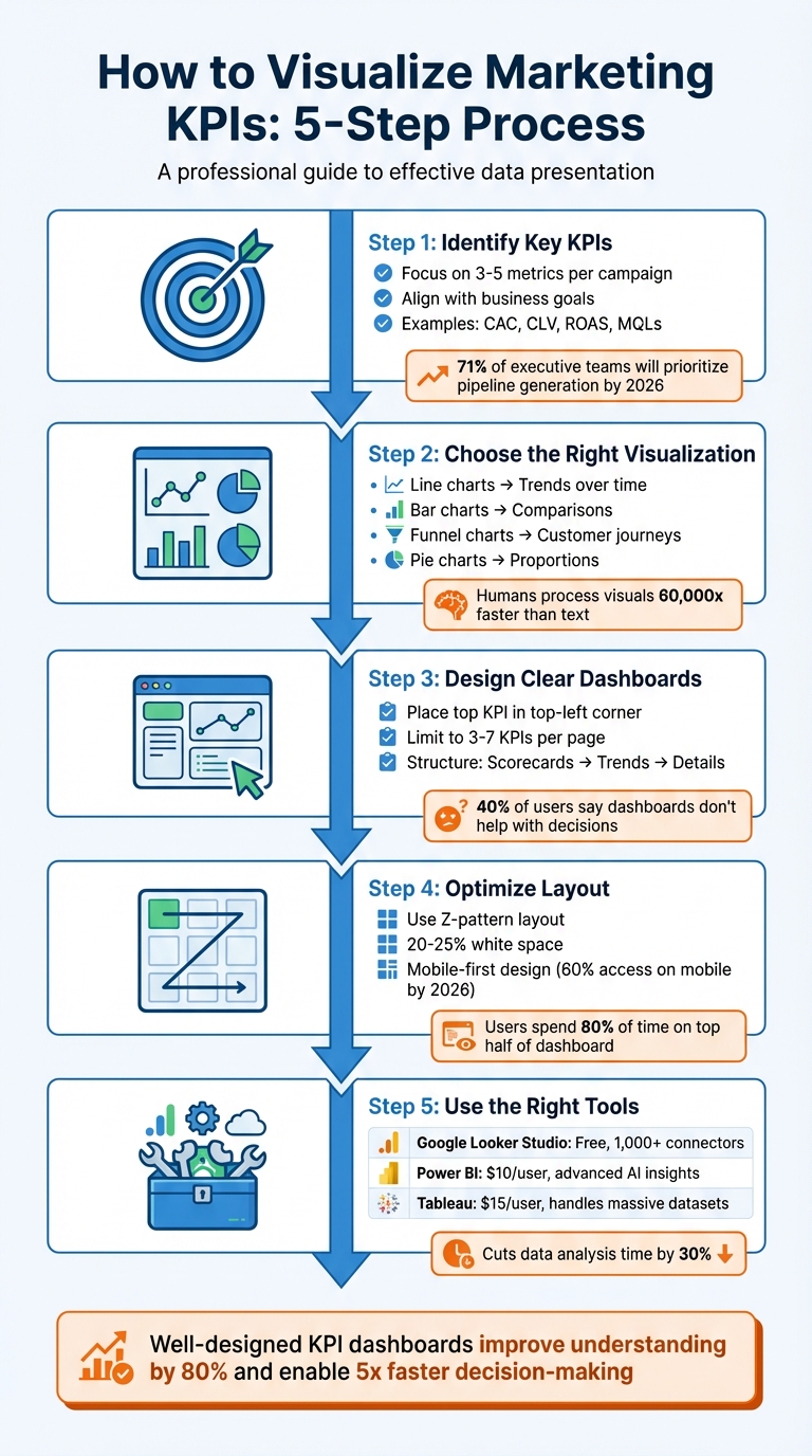
5-Step Process for Visualizing Marketing KPIs
Before diving into dashboards or charts, it’s crucial to pinpoint the metrics that actually drive your business outcomes. One common misstep marketers make is tracking everything instead of focusing on what truly impacts the bottom line.
Begin by identifying the primary business metric that signifies success for your organization - this could be revenue, profit margin, or customer lifetime value (CLV). Then, link it directly to your marketing efforts. Every KPI you track should prompt a clear action or decision when it changes.
To ensure alignment, match KPIs to the stages of the customer journey:
By 2026, 71% of executive teams will prioritize metrics like pipeline generation and revenue influence over traffic or engagement, reflecting a shift toward outcome-driven metrics. Additionally, 83% of executives now expect marketing teams to demonstrate ROI through data-backed dashboards.
"Every metric should answer 'so what?' - if a number doesn't drive decisions, it doesn't belong on the dashboard." - Stephen Few, Dashboard Researcher
Keep your focus narrow - limit KPIs to 3–5 per campaign. Balance lagging indicators (e.g., total monthly sales) with leading indicators (e.g., conversion rates) to get a well-rounded perspective.
The right KPIs depend on your business goals, but some metrics consistently provide actionable insights:
Looking ahead to 2026, AI Visibility is emerging as a critical KPI. It tracks how often your brand appears in AI-generated responses on platforms like ChatGPT or Google AI Overviews compared to competitors. As search evolves toward zero-click results, this metric will help gauge your presence in this changing landscape.
Ultimately, focus on metrics you can directly influence and tie to revenue. For example, 74% of businesses say their top marketing goal is converting leads into customers. This makes the lead-to-customer conversion rate one of the most valuable KPIs to track. Whatever metrics you choose, always provide context - compare them against historical data, industry benchmarks, or specific goals rather than presenting raw numbers alone.
After identifying your core KPIs, the next step is selecting the visual format that conveys their story most effectively. The aim isn’t to create something overly complicated - it’s to make the data’s meaning instantly clear. Since humans process visuals 60,000 times faster than text, choosing the right chart type is crucial for delivering insights at a glance. Let’s dive into how to match your data types with the perfect visualization formats.
Once your KPIs are set, pair each metric with a visual that best represents its nature. For instance:
"The most effective visualization isn't always the most complex – it's the one that makes your data's story immediately clear to your client." - Jay Kang, Swydo
To keep your visuals clean and focused, follow these tips:
| Chart Type | Best Use Case | Marketing KPI Example | Advantages |
|---|---|---|---|
| Line Chart | Trends over time | Monthly website traffic | Clearly shows direction and seasonality |
| Bar Chart | Comparing categories | ROAS by channel | Highlights performance differences |
| Pie Chart | Showing proportions | Traffic by source | Visualizes distribution of the whole |
| Heat Map | Highlighting frequency | Seasonal sales trends | Reveals patterns and peak activity periods |
| Funnel Chart | Sequential process stages | Lead-to-sale conversion | Identifies drop-off points in the journey |
| Scatter Plot | Relationship between variables | Ad spend vs. revenue | Exposes correlations and outliers |
For consistency, use the same colors for specific categories (e.g., Paid Search in orange, Organic in blue) to make your visuals easier to interpret. Lastly, avoid 3D effects, as they can distort data relationships and reduce clarity.
Once you've matched your KPIs with the right visual formats, the next step is creating a dashboard that’s actionable and easy to understand. Here’s the reality: 40% of users say their dashboards don’t help with decision-making, and 34% find them cluttered with irrelevant data. The fix isn’t about adding more data - it’s about designing with purpose. A great dashboard should deliver its core message in under five seconds.
To start, place your most important KPI in the top-left corner, where viewers naturally begin scanning. This "hero metric" should stand out - make it 2–3 times larger than the supporting labels to create a clear visual hierarchy. From there, structure the layout like a funnel: high-level scorecards at the top, trend charts (e.g., line graphs) in the middle, and granular details (like tables) at the bottom. This mirrors how decision-makers process information: big picture first, details later.
"Structure it like a funnel - big picture first, details later." - Jase Rodley, SEO Consultant
Group related metrics together. For example, if you’re showing ad spend over time, place it next to spend by channel for better clarity. Use white space to separate sections and keep things visually clean. Dashboards designed this way help organizations make decisions five times faster than their competitors.
One common mistake? Trying to cram too much into a single dashboard. Humans can only process 5–7 pieces of information at a time, so keep each dashboard page focused on 3–7 high-impact KPIs. Anything more risks overwhelming your audience, leading to "decision paralysis."
To prioritize, ask yourself: What decision does this number help me make? If the answer isn’t obvious, remove the metric or move it to a drill-down view. For instance, raw impression counts might look impressive, but if they don’t guide budget allocation or creative strategy, they’re just noise.
"If a metric hasn't influenced a decision in 60 days, delete it." - Julia Moreno, Dataslayer
Tailor dashboards to your audience and their specific needs. Executives care about revenue, ROI, and customer acquisition costs. Managers need insights on channel performance and conversion rates. Specialists benefit from granular data like A/B test results and keyword performance. When you design dashboards with the audience in mind, you ensure they see only what’s relevant to their role.
| Dashboard Level | Target Audience | Key Focus Areas |
|---|---|---|
| Executive | CMO / Leadership | Revenue impact, ROI, CAC trends, pipeline |
| Manager | Campaign Managers | Channel performance, spend pacing, CPL, conversions |
| Specialist | Analysts / Coordinators | Ad set data, A/B test results, keyword performance |
Place primary KPIs as single-metric scorecards at the top for maximum impact. Include the current value, a comparison to the previous period (e.g., "+12% vs. last month"), and a clear indicator of whether you’re on track. Avoid confusing jargon - use straightforward titles like Cost per New Customer instead of acronyms like CPA.
Static numbers don’t inspire action. Conditional formatting adds meaning by highlighting what needs attention. Stick to universal color conventions: green for positive trends, red for issues, and yellow for warning signs. But don’t rely on color alone - about 7% of people are colorblind. Add icons like arrows or checkmarks and shapes to reinforce the message.
Trend indicators are also essential. Show percentage changes (e.g., "↑ 18% vs. last month") or progress toward goals using "Actual vs. Target" comparisons. Progress bars can visually demonstrate how close you are to hitting milestones.
In tables, conditional formatting can flag key insights. For example, highlight campaigns with a ROAS below 1.0 in red and those above 4.0 in green. For keyword rankings, use yellow or orange to mark terms on pages 2–3 (positions 11–30) - these are "striking distance" opportunities that could move to page one with extra effort. Always include a data freshness timestamp so viewers know when the information was last updated.
"One screen, three sections: High-level results, channel performance, actionable recommendations." - Elena Novikova, CEO, Lumus Inc.
A dashboard's layout can make or break its effectiveness. It's not just about presenting data; it's about guiding users to act on it quickly. Research shows users spend 80% of their time focusing on the top half of a dashboard. Yet, despite the potential of dashboards, only 20% are actively used, and a staggering 75% are deemed ineffective by users. The issue isn't the data itself - it's how the information is presented.
With around 60% of users accessing marketing dashboards on mobile devices by 2026, layouts must adapt seamlessly to various screen sizes. Prioritizing a mobile-first design ensures critical KPIs are easy to access, typically stacking them vertically at the top. Here's how to refine your dashboard layout for better decision-making.
Start with what matters most. Place your top KPI in the top-left corner, where it grabs attention immediately and drives decisions. According to Fitts' Law, placing key elements closer to the user's focal point and making them larger improves efficiency.
A Z-pattern layout works best - organize elements from left to right and top to bottom. Begin with 4–6 high-level KPI scorecards at the top, offering a "5-second story". These KPIs should act as North Star metrics, giving users a quick snapshot of success or failure.
Use a tiered approach to information design:
This structure aligns with how decision-makers process information. In fact, 74% of business leaders prefer concise, actionable metrics over lengthy reports.
| Dashboard Zone | Focus Level | Content Type |
|---|---|---|
| Top-Left | High | Key North Star KPI (e.g., Revenue, ROI) |
| Top-Right | High | Filters and date range controls |
| Middle | Medium | Trend lines and distribution charts |
| Bottom | Low | Detailed tables and supporting data |
Strategic use of white space is essential. By dedicating 20–25% of the layout to white space, you reduce visual fatigue and help users focus. For related metrics, like "spend over time" and "spend by channel", align them horizontally to create logical groupings. Use background colors or borders to visually separate sections and make navigation easier.
"Dashboards aren't novels. Your audience won't read every number. That's why layout matters as much as the data itself." – Coupler.io
Once you've nailed the placement of high-priority KPIs, the next step is to group and filter additional metrics for deeper insights.
Organize metrics in a way that aligns with the customer journey: Awareness, Consideration, Conversion, and Retention. For example, group metrics like impressions and reach under "Awareness", while click-through rates and engagement belong under "Consideration."
Position related metrics close together to provide context. For instance, place cost-per-acquisition (CPA) data next to conversion volume. This way, users can quickly assess whether rising CPA correlates with changes in conversions. Use the three-section rule for single-screen views: high-level results at the top, channel performance in the middle, and actionable insights at the bottom.
Interactive filters are critical for maintaining a clean and functional layout. Place date pickers and global filters in the top-right corner, where users naturally expect them. Filters allow users to refine data by dimensions like channel, campaign, region, or device type. Cross-filtering adds another layer of interactivity, updating all visualizations based on a single click (e.g., selecting "Social Media" in a performance chart updates the entire dashboard to show only social data).
For larger datasets, include drill-down functionality. This feature lets users click on a high-level metric to reveal detailed insights without cluttering the main view. To avoid overwhelming users, consider using tabbed layouts to separate categories like Paid Search, Social Media, Email, and Organic. Tabs eliminate the need to scroll endlessly through charts while keeping the dashboard organized.
Keep filters limited to essential dimensions - Date, Channel, Campaign, and Region. Too many filters not only complicate the interface but can also slow down loading times, especially when pulling data from multiple sources. By balancing simplicity with functionality, you can create a dashboard that drives action and keeps users engaged.
Once your dashboard layout is optimized, the next step is choosing the right visualization tools to simplify your reporting. These tools turn raw data into insights you can act on. Modern platforms automate data updates, connect to various sources, and eliminate the need for manual CSV exports.
When selecting a tool, focus on data connectivity. The best platforms integrate seamlessly with sources like Google Ads, Meta Ads, LinkedIn, and CRM systems. For example, Google Looker Studio supports over 1,000 data sets and connectors, while Power BI and Tableau are designed for handling large datasets with advanced modeling features. Automation is another key feature - tools that refresh dashboards frequently (every 15 minutes to daily) ensure your data stays up-to-date without manual effort.
Interactive features elevate a dashboard from functional to exceptional. Look for slicers that allow filtering by date or channel, drill-down options for detailed exploration, and tooltips for added context. Customization options, like themes and fonts, help align dashboards with your brand, creating polished reports for stakeholders. If you need advanced analytics, tools with AI-driven insights, predictive capabilities, or robust calculation languages like Power BI's DAX can handle complex KPI modeling.
Google Looker Studio is a great fit for small businesses and marketers within Google's ecosystem. It's free for basic use, with a Pro version costing $9 per user, per project, per month. It offers 21 free native connectors for Google products and over 700 partner-built options. However, it struggles with more than five data sources or complex transformations. For platforms like Facebook Ads, third-party connectors like MetricWiz (around $5 per month) can help bridge gaps.
Microsoft Power BI is ideal for enterprises that rely on Microsoft tools and need advanced analytics. Starting at $10 per user, per month, it uses DAX (Data Analysis Expressions) for sophisticated KPI calculations and predictive analytics. The AppSource marketplace provides custom visuals for niche reporting needs. However, beginners may find the interface challenging and rigid.
Tableau is built for enterprises managing large-scale data. Viewer plans start at $15 per user, per month, with higher-tier licenses for creators and explorers. Its drag-and-drop interface makes it easy to create interactive visuals, but its high licensing costs and need for specialized training can be drawbacks. Google Sheets is still handy for quick data manipulation, though it has a limit of 10 million cells and is harder to maintain for complex filtering.
| Tool | Best For | Main Strength | Main Weakness |
|---|---|---|---|
| Looker Studio | Small businesses & Marketers | Free, user-friendly, integrates with Google | Slows with 5+ data sources or complex blending |
| Power BI | Microsoft-centric enterprises | Advanced AI insights, deep data modeling (DAX) | Steep learning curve, rigid interface |
| Tableau | Large-scale data analysis | Handles massive datasets, interactive visuals | High cost, requires training |
| Google Sheets | Quick, one-off analysis | High control over data and formulas | Hard to manage for complex filtering |
Once you've selected a tool, these tips will help you get the most out of it.
Plan before you build. Sketch your dashboard layout on paper or a digital tool to ensure a logical flow. Start with high-level KPIs, then add trends and detailed breakdowns. This approach avoids the common mistake of building dashboards around available data instead of actionable insights.
"Design visualizations around decisions, not metrics. Before building a chart or dashboard, ask what action it should trigger." – Manolo Pereira, Reporting Ninja
Keep formatting consistent. Use standardized number formats like $1,000.00, uniform font sizes, and cohesive color schemes across all pages. Replace jargon like CPC or ROAS with clear terms like "Cost per Click" to make data accessible to non-marketing stakeholders.
Avoid overloading with metrics. Limit each dashboard page to about six key metrics or three to four views. Use conditional formatting - green for >90% goal achievement, red for <50% - so users can quickly gauge performance. Always include data source citations and a "last updated" timestamp to build trust with stakeholders.
Make dashboards accessible. Use colorblind-friendly palettes and avoid relying solely on red/green indicators. Add icons like arrows to reinforce visual cues. Automate data flows with marketing intelligence platforms to keep dashboards updated in near-real-time. When blending data from multiple sources, ensure that fields like Date or Campaign Name match exactly to avoid errors.
Clear and actionable KPI visualizations are key to cutting through the overwhelming amount of marketing data today. By following a straightforward five-step process - identifying KPIs, selecting the right visuals, designing dashboards, optimizing layouts, and choosing effective tools - you can see measurable results. For example, using the right visualization can cut data analysis time by 30%, while well-designed charts can improve understanding by up to 80%. These tools help teams move beyond just looking back at past performance ("What happened last month?") to diving deeper into analysis ("Why did it happen, and what steps should we take next?"). This shift not only speeds up decision-making but also enhances campaign performance and ensures alignment across marketing, sales, and finance teams.
"The real secret is not in collecting more data, but in choosing the right metrics and presenting them so well your team can act instantly." – Reportz.io
To harness these benefits, take immediate steps to audit your dashboards. Cut out metrics that don’t directly inform decisions - whether that means pausing campaigns, scaling efforts, or tweaking messaging strategies. Highlight your most impactful KPIs at the top, automate data updates to save time, and design each chart with a clear purpose in mind. Above all, ensure that every chart is easy to interpret at a glance.
Focus on what truly matters. By applying these principles consistently, you’ll drive quicker, smarter decisions and see a measurable return on your marketing efforts.
Ready to take your dashboards to the next level? SEO Werkz specializes in turning complex marketing data into actionable insights. For more tips and strategies, check out our blog at SEO Werkz.
Start by pinpointing the critical questions your team needs to address and aligning your KPIs with those strategic objectives. Prioritize actionable metrics - the ones that directly influence decisions - while steering clear of metrics that look good but offer little value (often called vanity metrics). For better clarity, keep dashboards concise, limiting them to about six key metrics per page. Lastly, select KPIs that matter most to your stakeholders, such as conversion rates or engagement levels. These will help you spot trends and make quicker, smarter decisions.
The best chart to use depends on the specific KPI you’re analyzing. Here’s a quick guide:
Each chart type serves a unique purpose, so choosing the right one ensures your data tells the story you want.
Your marketing dashboard needs to update in real-time - or at least as often as your data changes - to give decision-makers the most up-to-date insights. In a fast-moving world, these timely updates are especially important for remote teams that rely on accurate, current information to make decisions. If real-time updates aren't feasible, daily refreshes should be the goal to keep your data relevant and useful.
Google Data Studio (now Looker Studio) makes campaign reporting easier by turning raw data into clear visuals. It connects to over 500 platforms like Google Ads, GA4, and Facebook Ads, automating real-time updates. Templates save time by offering pre-built dashboards for tracking metrics like ROI, conversions, and engagement across PPC, SEO, and email campaigns.
Here’s a quick look at 10 useful templates:
These templates simplify reporting, save hours of manual work, and help you make faster, data-driven decisions.
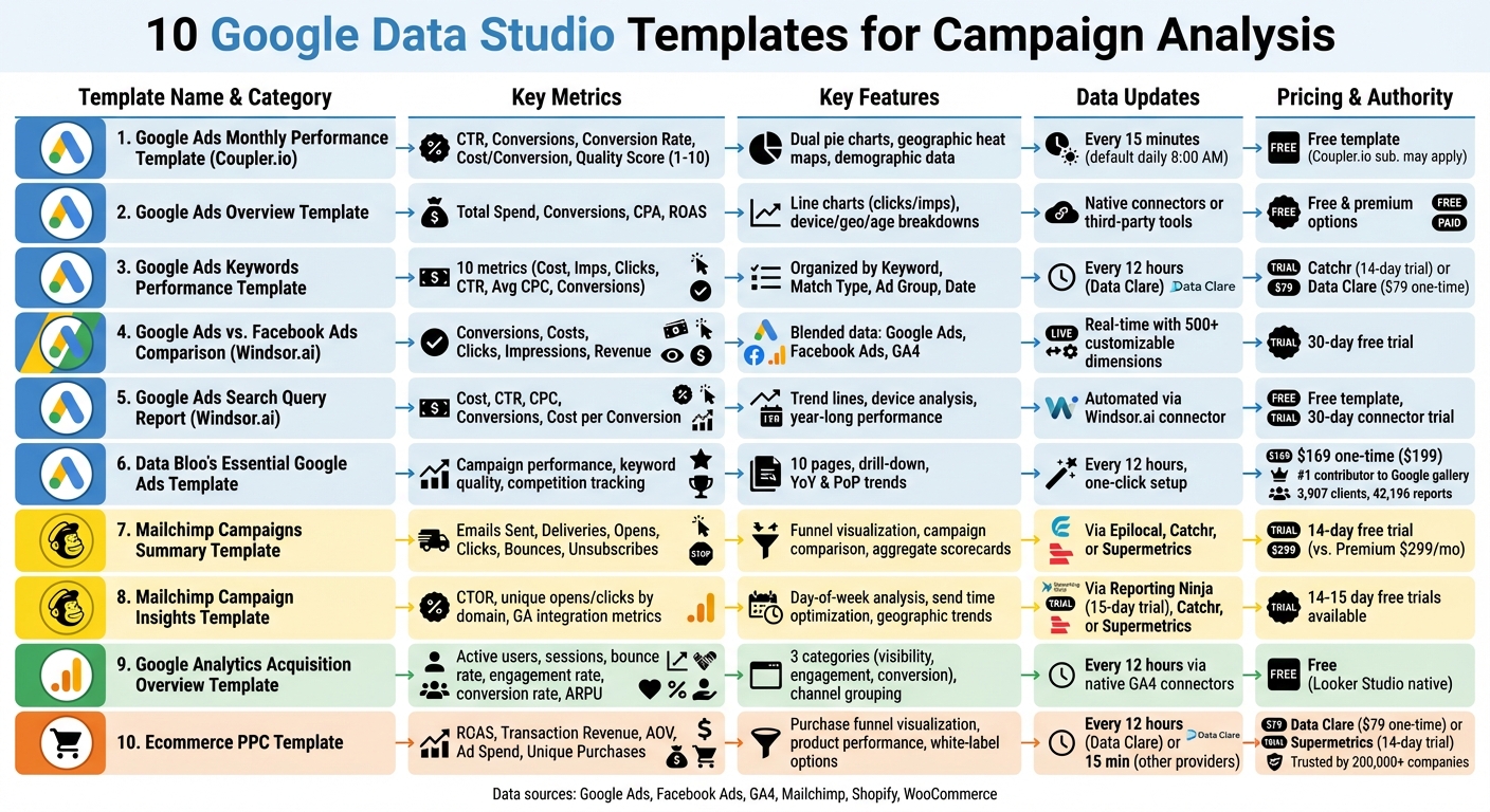
10 Google Data Studio Templates for Campaign Analysis Comparison
This free tool simplifies monthly reporting and planning by focusing on key metrics. It connects directly to your Google Ads account using Coupler.io's built-in connector, pulling data automatically - no need for manual CSV exports. This automation makes it easier to track and analyze performance.
The dashboard covers crucial metrics like CTR, conversions, conversion rate, cost per conversion, and conversion value. Dual pie charts provide a clear comparison of spend allocation versus conversion performance, helping you identify campaigns with the best ROI. Additionally, geographic heat maps offer insights into regional performance, along with demographic data like age, gender, and device type.
You can schedule data updates as frequently as every 15 minutes (default is once daily at 8:00 AM). Monthly trend charts and a keyword performance table highlight seasonal trends and conversion details, making it easier to fine-tune your budget.
A Quality Score tracker (rated 1–10) evaluates how relevant your keywords, ads, and landing pages are. The dashboard also shows your Search Impression Share, which reflects the percentage of available impressions your ads capture. A side-by-side comparison of spend versus conversions helps you quickly spot areas to reallocate your budget for better results.
Setting up the template is quick and takes only a few minutes, thanks to the included guide. While the template itself is free, you may need a Coupler.io subscription depending on how often you refresh data or the volume of information you handle.
This template offers a clear snapshot of your entire Google Ads account, making it simple to evaluate account health and spot performance trends quickly. It serves as a starting point for tracking detailed performance metrics.
The dashboard includes scorecards for Total Spend, Conversions, CPA, and ROAS, all with comparisons to previous periods. Additionally, line charts plot clicks and impressions over daily, weekly, or monthly intervals, helping you spot performance shifts at a glance.
Designed to complement more detailed templates, this overview focuses on delivering essential account-level insights. Setting it up is straightforward: copy the template, link your data source, and watch the dashboard populate with your data. You can connect directly to Google Ads via Looker Studio's native connectors or third-party tools like Windsor.ai.
"Building a template from scratch takes time and a well-designed dashboard require an analytical and business understanding of the data sources." – 3pie Analytics
The template also provides detailed breakdowns by device, geography, age, and campaign. Interactive filters allow for quick analysis of date ranges or account switching. Options include both free and premium templates, making it accessible for a range of budgets.
Once you've analyzed broader account metrics, it's time to zoom in on the details. This template is designed for keyword-level performance tracking, offering a precise way to optimize your campaigns.
It tracks 10 key metrics such as Cost, Impressions, Clicks, CTR, Average CPC, Total Conversions, Conversion Rate, and Cost per Conversion. Plus, it includes competitive insights like "Search lost absolute top Impression Share" caused by budget or rank issues.
The data is organized by Keyword, Match Type, Ad Group, and Date, making it easy to compare strategies across broad, phrase, and exact match types. This approach helps uncover high-intent keywords while flagging underperformers for potential exclusion as negative keywords.
To streamline the process, you can integrate Google Ads data using no-code tools like Catchr or Data Clare. Catchr offers a free plan with a 14-day trial for its connector subscription, while Data Clare requires a one-time payment of $79 and updates every 12 hours.
"A must-have template if you are serious about Google Ads. It's a great way to extract good info. from SEO data and use in Google Ads campaigns." – Green Peas, Verified User
The template also includes robust filtering options to isolate specific ad groups. This allows you to evaluate which match types deliver the best ROI. For example, keywords with high conversions but low impression shares could indicate bidding opportunities. On the flip side, keywords with high costs but zero conversions should be excluded to prevent wasted spend.
Managing multiple advertising platforms can quickly scatter your data, making it harder to analyze performance. This template simplifies the process by combining metrics from Google Ads and Facebook Ads into a single, unified view.
It pulls data from Google Analytics 4, Google Ads, and Facebook Ads, merging key metrics like conversions, costs, clicks, and impressions. This gives you a clear picture of how your campaigns and channels are performing, all in one place.
| Metric Category | What's Tracked | Data Source |
|---|---|---|
| Cost & Reach | Spending, Clicks, Impressions | Google Ads & Facebook Ads |
| Conversion | Leads, Purchases, Revenue | Google Analytics 4 |
| Analysis Levels | Channel Level, Campaign Level | Blended Data |
These metrics are the backbone of effective cross-channel analysis, helping you compare performance across platforms with accuracy.
To get the most out of this template, ensure your Facebook Ads are tagged with UTM parameters. Without proper tagging, Google Analytics might misattribute conversions, leaving you with incomplete data for comparison.
Once you've copied the template, double-check all filters to confirm that the data is displayed correctly across platforms.
Windsor.ai provides a 30-day free trial to explore the template and its connectors. With access to over 500 customizable dimensions and metrics, you can track KPIs tailored to your needs. Plus, you can make further adjustments using Looker Studio's "Edit" mode.
If you're running Google Ads campaigns, knowing the exact search terms that trigger your ads can make a huge difference. This template from Windsor.ai digs deeper than basic keyword data, offering detailed insights into the specific queries users type before clicking your ads. It’s a powerful way to understand user intent and improve campaign performance. Here’s how you can set it up and make the most of its metrics.
Start by signing up on Windsor.ai, linking your Google Ads account, and selecting Looker Studio through the "Google Ads by Windsor.ai" community connector. The best part? No coding or messy CSV exports are required for setup.
Once connected, the template provides a clear view of search term performance. It tracks key metrics like cost, CTR, CPC, conversions, and cost per conversion, allowing you to compare current results with past performance. Trend lines show how queries have performed over the last year, helping you spot seasonal trends and patterns.
| Metric Category | What It Tracks |
|---|---|
| Cost & Efficiency | Spend, CPM, CPC, Cost per Conversion |
| Engagement | Clicks, CTR, Impressions, Number of Search Terms |
| Conversion | Conversions, Conversion Rate, Revenue |
With these insights, you can refine your campaigns by eliminating irrelevant queries and adding high-performing ones to your keyword list. The template also lets you analyze performance across devices, so you can see if specific queries work better on mobile or desktop. Plus, it’s free to use, with a 30-day trial for the Windsor.ai connector available.
Data Bloo's Essential Google Ads Template stands out as a versatile tool in the world of Google Data Studio templates. With its one-click setup, all you need to do is connect your Google Ads account using the native Looker Studio connector. Once linked, the data refreshes automatically every 12 hours, keeping your reports up-to-date without manual intervention.
The dashboard is thoughtfully organized across 10 pages, covering everything from campaign performance and keyword analysis to geolocation, audience insights, and even competition tracking. One of its standout features is the drill-down functionality, which allows you to click on a chart and dive deeper into the details - no need to jump between views.
For campaign and keyword analysis, this template really delivers. The Campaign Mining table lets you filter campaigns by their status - active, paused, or deleted - making it easier to compare performance. The Keyword Quality Score segment highlights underperforming keywords that might be eating up your budget unnecessarily. Additionally, you can monitor Year-on-Year (YoY) and Period-on-Period (PoP) trends to evaluate how your campaigns are progressing over time.
The Competition Trends page is another standout feature. It tracks metrics like Overlap Rate and Outranking Share, giving you a clear picture of where you stand against competitors. These insights are invaluable for refining your bidding strategies based on actual data rather than assumptions.
Data Bloo's credibility in this space is noteworthy. They are the #1 contributor to Google's official Looker Studio gallery, boasting 3,907 clients globally and over 42,196 reports created using their templates. The Essential Google Ads Template is available for a one-time payment of $169 (discounted from $199), with no recurring fees.
With its detailed layout and ability to provide actionable competitive insights, this template is a strong option for marketers looking to optimize their Google Ads performance.
This template shifts the focus to analyzing email campaign performance. By using connectors like Epilocal, Catchr, or Supermetrics, you can pull Mailchimp data directly into Looker Studio. Most of these connectors come with a free 14-day trial, giving you a chance to test them out.
One standout feature is its ability to consolidate data from all your campaigns into a single, unified view. As Epilocal explains:
"Mailchimp has built-in campaign reports that give you a wealth of information, but they are also static and lack the ability to customize to your needs".
Without this template, comparing campaigns side-by-side requires a Mailchimp Premium plan, which costs $299 per month. Similar to PPC templates, this tool simplifies campaign analysis, making it easier to draw insights.
The template tracks essential metrics like Emails Sent, Successful Deliveries, Unique Opens, Unique Clicks, Bounces, and Unsubscribes. It also calculates delivery, open, click, and unsubscribe rates. A funnel visualization highlights the journey from email delivery to opens and clicks, giving you a quick snapshot of performance.
Interactive filters make it easy to sort data by date range, specific Mailchimp audiences (lists), or campaign titles. Detailed tables let you drill down into individual campaigns, subject lines, or lists, enabling direct comparisons. These features help you quickly identify what’s working and where improvements are needed. For instance, if open rates are low, you can pinpoint which subject lines are underperforming and adjust accordingly.
Bounce rates are another critical metric to monitor. High bounce rates often indicate poor list quality, suggesting it might be time to clean your lists or use double opt-in methods. Additionally, aim to keep your unsubscribe rate below 0.5%. The template’s aggregate scorecards make it easy to benchmark overall performance and spot campaigns that either exceed or fall short of your account averages.
With its detailed insights and user-friendly design, this template is a powerful tool for refining your email marketing strategy. It’s all about giving you the clarity you need to optimize campaigns and connect better with your audience.
This template digs deeper than basic reports, helping you understand why some Mailchimp campaigns perform better than others. It's perfect for marketers who want to uncover the key drivers behind campaign success. By connecting to Mailchimp through third-party tools like Reporting Ninja (which offers a 15-day free trial), Catchr, or Supermetrics (both with typical 14-day free trials), you can unlock insights that help fine-tune your campaign timing and content strategy.
Unlike a simple summary, this template dives into behavioral and timing data. It breaks down performance by day of the week, highlights the best times to send emails based on past engagement, and tracks trends by country or region. For instance, it can reveal if your audience is more active on specific days or if certain locations see better engagement.
It also tracks unique opens and clicks by domain (like Gmail, Yahoo, or Outlook), helping you spot any potential deliverability issues. By analyzing CTOR (click-to-open rate) and link-specific engagement, you can identify which content resonates most with your audience. Plus, integration with Google Analytics allows you to monitor on-site actions like sessions, bounce rates, and conversions - whether those are purchases, sign-ups, or downloads - giving you a clear picture of how your campaigns drive real results.
This tool is all about refining your strategy. For example, if the data shows that emails sent at 10:00 AM on Wednesdays consistently perform best, you’ve found your ideal timing. You can also identify which subject lines and sender names generate the highest engagement, then replicate those elements in future campaigns. With these insights, you can fine-tune your schedules and content to keep your audience engaged over the long term.
This template links directly to Google Analytics 4 (GA4) to provide a clear view of traffic sources and their performance metrics. It's tailored for marketers who need insights into acquisition channels such as organic search, paid ads, social media, and referrals. By using Looker Studio's native connectors, it pulls live data, eliminating the need for manual updates and ensuring you always have up-to-date information. This real-time data forms the basis for analyzing user behavior and conversion outcomes.
The template organizes data into three key categories: visibility, engagement, and conversion metrics. It showcases essential metrics like active users, new users, and sessions, alongside engagement measures such as bounce rate, engagement rate, and average session duration. For e-commerce sites, it also tracks purchase revenue, conversion rates, and average revenue per paying user (ARPU). This setup allows you to quickly pinpoint which channels not only generate traffic but also drive conversions.
Data is segmented by default channel grouping, source/medium, campaign name, and landing page, enabling you to shift from broad trends to more detailed insights. For instance, organic search often generates the most traffic, while paid search typically delivers higher conversion rates. Interactive filters make it easy to refine your analysis further, allowing you to compare date ranges, switch between GA4 properties, or focus on specific campaigns or regions. Some versions even combine GA4 data with Google Search Console and Google Ads for a unified view of both organic and paid performance. You can also integrate data from other sources to build a more complete picture of your campaign efforts.
Looker Studio is free and supports a wide range of connectors, making it simple to expand this template with data from platforms like Facebook Ads or Mailchimp. Data sources refresh every 12 hours, so to maintain accurate channel reporting, use consistent UTM parameters and enable auto-tagging.
This template is built for online retailers who need to monitor key metrics like ROAS, product performance, and conversion value. It pulls data from web analytics tools, paid media platforms (such as Google Ads, Facebook, TikTok, Snapchat, and Pinterest), and ecommerce platforms like Shopify, offering a comprehensive view of your store's performance. Joy Huynh, Content Strategist at Supermetrics, highlights its utility, saying, "the template is perfect for ecommerce marketers who want a 360 view of their ecommerce performance, including website, product, and marketing performance".
The template focuses on essential financial metrics such as ROAS, total transaction revenue, average order value (AOV), and total ad spend. It also includes a purchase funnel visualization, helping you understand the customer journey - from browsing product lists to adding items to the cart and initiating checkout. This feature identifies where potential customers abandon the process, giving you actionable insights. Additionally, it supports flexible pricing and synchronization options to suit different business needs.
For pricing, Data Clare offers this template at a one-time fee of $79, with data syncing every 12 hours. Supermetrics provides a 14-day free trial for their Looker Studio ecommerce templates, which are trusted by over 200,000 companies in 120 countries. Shopify users can integrate by authorizing the connector app to access store data, while WooCommerce users will need to generate a REST API key with "Read/Write" permissions in their WordPress settings.
The template provides detailed performance breakdowns by campaign, keyword, geographic location, and customer type (new versus returning). It tracks unique purchases, revenue per product, and top sellers. This level of detail helps you identify high-intent, low-cost keywords while eliminating ineffective ads. For example, tracking unique purchases versus total transactions can reveal bulk buying trends. If a product has high transaction numbers but fewer unique purchases, offering bulk discounts could boost sales.
For agencies, the template includes white-label features for branding purposes. Automated data refreshes ensure your metrics stay up-to-date, with some providers offering updates as frequently as every 15 minutes, allowing you to monitor near real-time sales and inventory levels.
Google Data Studio templates simplify the process of data analysis by eliminating the need for tedious .csv downloads and manual chart creation. These templates allow marketers to track campaign performance across PPC, SEO, and social media channels in a single, automated dashboard. By centralizing data from platforms like Google Ads, Facebook Ads, and Search Console, they provide an all-in-one solution for monitoring and reporting.
"Google Data Studio takes the raw data and puts it into easy-to-understand reporting through visualization." – Search Engine Land
For agencies such as SEO Werkz, these templates transform complex datasets into actionable insights, helping deliver measurable ROI. The white-label features make it easy to create professional, branded reports, while real-time data integration ensures metrics stay up-to-date, enabling faster, more informed decision-making. In fact, over 10,000 marketing teams and agencies across 60 countries rely on these automated templates to streamline their workflows.
Additionally, Google Data Studio bypasses the limitations of the Google Analytics API, which restricts users to 10 metrics and 7 dimensions per application. This flexibility makes it easier to generate more comprehensive and detailed reports. With an extensive library of Looker Studio templates, marketers can customize dashboards to track key metrics like ROAS, conversion rates, keyword rankings, and email campaign performance. Whether you're focused on paid search, organic traffic, or ecommerce analytics, these templates save time by delivering granular, actionable data for future optimization.
These tools are designed to help marketers act quickly and effectively:
"Save hours of work with our click and ready Google Data Studio Template. Just select the one you want and start to get data and take decision for your business." – Catchr
Looker Studio offers ready-made templates tailored for SEM, SEO, and Paid Media campaigns. These templates are designed to give you a clear and organized way to track and analyze your marketing efforts. With their detailed reporting features, they make it easier to dive into the performance of your campaigns and identify trends or opportunities for improvement. Whether you're focusing on search engine marketing, optimizing for organic traffic, or managing paid media, these templates provide a solid foundation for your reporting needs.
UTM tags and auto-tagging play a key role in ensuring accurate attribution. By using these tools, you can track the source, medium, and campaign details of your traffic and conversions. This level of detail allows you to measure performance with precision, giving you the insights needed to understand how your marketing efforts are driving results. With this data, you can make informed decisions to fine-tune and improve your campaigns.
When you need the latest information, it's essential to refresh your Looker Studio data. This ensures your dashboards stay reliable and up-to-date. Actions like opening a report or making changes prompt Supermetrics connectors to automatically update the data. Similarly, refreshing the report or reloading the page triggers these updates seamlessly.
In 2026, monitoring your brand's online presence is essential. Conversations about your brand happen across social media, videos, podcasts, and AI-generated content. The right tools help you track mentions, analyze sentiment, and respond quickly to potential issues or opportunities. Here’s a quick look at some of the top brand monitoring tools this year:
| Tool | Starting Price | Key Features |
|---|---|---|
| SEO Werkz | Custom pricing | Integrated SEO, sentiment analysis, and competitive tracking. |
| GetMint | $109/month | Tracks AI mentions, measures "generative share of voice." |
| Brandwatch | ~$800–$1,000/month | AI-powered image/video recognition and sentiment analysis. |
| Mention | $41/month | Real-time tracking, anomaly detection, and sentiment analysis. |
| Meltwater | ~$800–$1,000/month | Tracks news, podcasts, and social media with advanced trend analysis. |
| Sprout Social | $199/seat/month | Social media management with integrated monitoring and sentiment analysis. |
| Talkwalker | ~$800–$1,000/month | Visual and text sentiment tracking across 150M+ sources in 180 languages. |
| Awario | $29/month | Real-time monitoring with basic sentiment analysis, ideal for startups. |
When choosing a tool, consider your budget, the platforms you need to monitor, and whether advanced features like AI-driven insights or visual recognition are necessary for your business.
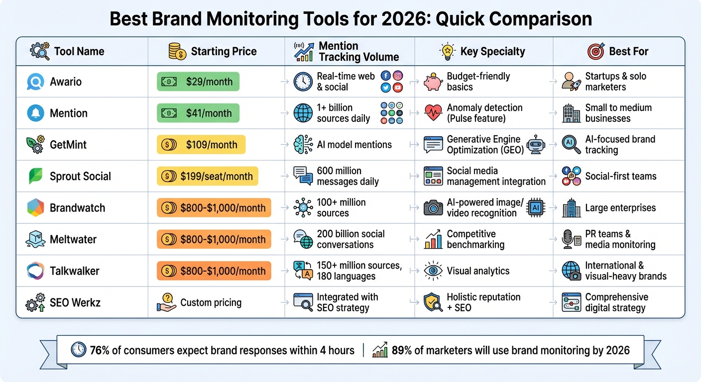
Brand Monitoring Tools 2026: Price and Features Comparison
The world of brand monitoring in 2026 goes far beyond simply keeping tabs on social media and blog mentions. Today’s tools can flag sudden spikes in mentions, track how AI models like ChatGPT and Google Gemini describe your brand, and even identify your logo in images or videos. Here’s a breakdown of some standout tools that can help you manage your brand’s reputation effectively.

SEO Werkz takes a holistic approach, integrating reputation management into a broader digital marketing strategy. Instead of treating it as a standalone service, they combine SEO, content creation, and social media marketing to track mentions, analyze sentiment, and improve your online presence. Their integrated approach helps businesses enhance keyword research, build links, and strengthen their overall digital footprint.
GetMint focuses on Generative Engine Optimization (GEO), monitoring how AI models portray your brand and pinpointing the source URLs feeding those models. Starting at $109/month, it tracks AI-driven mentions, measures your “generative share of voice,” and identifies outdated or inaccurate sources of information. For instance, if ChatGPT references an old, incorrect article about your brand, GetMint helps you locate and address that “zombie source.” This is crucial, as Americans now trust generative AI companies about 29% more than social media platforms.
Joan Burkovic from GetMint highlights this shift:
Social listening is dead. Learn why you need a dedicated AI brand monitoring tool to track hallucinations, sentiment, and share of voice inside ChatGPT and Google.
For teams wanting deeper insights, the $329/month Growth plan offers advanced citation analysis and competitive benchmarking, making it a key tool for proactive reputation management.
Brandwatch excels in social intelligence with AI-powered image and video recognition that identifies your logo in visual content - even when your brand isn’t mentioned by name. It also provides nuanced sentiment analysis, distinguishing between neutral and potentially damaging feedback. With features that summarize thousands of mentions into actionable insights, Brandwatch saves time while offering a G2 rating of 4.4/5. It’s a strong choice for large enterprises needing comprehensive analytics from 150 million sources.
Mention delivers real-time tracking across over one billion sources daily, making it ideal for catching issues before they escalate. Its "Pulse" feature detects anomalies in mention volume, providing early warnings when conversations about your brand spike unexpectedly. Pricing starts at $41/month for the Solo plan and $83/month for the Pro plan, with an enterprise option at $599/month. This is especially crucial since 76% of consumers expect brands to respond within four hours.
Meltwater offers a unified platform for tracking news articles, podcasts, and social media conversations. Its standout feature is competitive benchmarking, using Share of Voice metrics to compare your brand’s presence against competitors and uncover market opportunities. With tools for sentiment analysis and trend tracking, Meltwater helps PR teams monitor narratives and manage media relationships effectively across multiple channels.
Sprout Social combines social media management with brand monitoring, providing a streamlined workflow for both listening and engagement. Starting at $199 per seat per month, it integrates monitoring alerts into its "Smart Inbox", ensuring mentions are routed to the right teams - whether PR, customer support, or SEO. With a G2 rating of 4.4/5, Sprout Social is praised for its ease of use and seamless integration of publishing, engagement, and monitoring features. Higher-tier plans, starting at $399 per seat per month, offer advanced sentiment analysis and competitive benchmarking.
Talkwalker specializes in visual analytics, using AI to detect brand logos in images and videos across 150 million sources. Its ability to identify your product in user-generated content - even when untagged - ensures comprehensive coverage. With support for 180 languages, it’s an excellent choice for international brands. Talkwalker also shines on video-heavy platforms like YouTube, TikTok, and Instagram Reels, making it indispensable for brands with a strong visual presence.
Awario is a budget-friendly option for startups and solo marketers needing solid tracking without enterprise-level costs. It offers real-time monitoring of mentions across the web and social media with advanced filtering to focus on relevant conversations. While it lacks some of the more advanced features like AI-driven monitoring or visual recognition, Awario covers the basics well, including sentiment analysis, real-time alerts, and competitive tracking. It’s a practical choice for teams with straightforward needs at an accessible price point.
Selecting the right brand monitoring tool often comes down to evaluating key features side by side. Below is a breakdown of how each platform performs in terms of starting price, mention tracking capabilities, sentiment analysis, share of voice metrics, and free trial availability.
| Tool | Starting Price | Mention Tracking | Sentiment Analysis | Share of Voice | Free Trial |
|---|---|---|---|---|---|
| SEO Werkz Reputation Management | Custom pricing | Integrated with SEO & content strategy | Yes, with actionable insights | Included in competitive analysis | Contact for demo |
| GetMint | Not specified | Real-time tracking across online sources | AI-driven sentiment tracking | Yes | Contact for demo |
| Brandwatch | Custom (typically $800–$1,000+/month) | 100+ million sources | AI-powered emotion & intent segmentation | Yes | Demo only |
| Mention | $49/month | 1+ billion sources daily | Real-time positive/negative/neutral | Yes | 14 days |
| Meltwater | Custom (typically $800–$1,000+/month) | 200 billion social conversations | Advanced sentiment & trend analysis | Yes, with competitive benchmarking | Demo only |
| Sprout Social | $199 per seat/month | 600 million messages daily | AI-powered sentiment classification | Available in higher tiers | 30 days |
| Talkwalker | Custom (typically $800–$1,000+/month) | 150+ million sources in 187 languages | Advanced visual & text sentiment | Yes | Demo only |
| Awario | $29/month | Real-time web & social monitoring | Basic sentiment analysis | Yes | 7 days |
This table provides a clear snapshot of the tools' core features, helping you identify which one aligns with your brand monitoring priorities.
For instance, Sprout Social stands out with its 30-day trial, offering ample time to explore workflows and test its capabilities. On the other hand, budget-conscious startups might lean toward Awario or Mention, which feature affordable monthly pricing and self-service trials. Enterprise-grade platforms like Brandwatch, Meltwater, and Talkwalker often favor scheduled demos over free trials but deliver in-depth analytics - such as Brandwatch's extensive social data archives dating back to 2010.
If you're managing high-volume brand interactions, Sprout Social processes 600 million messages daily, providing real-time insights into sentiment shifts. Make the most of each tool's trial or demo period to fine-tune keyword filters and minimize irrelevant data.
Start by defining the conversations that are most relevant to your business. For example, a B2B SaaS company focused on GitHub discussions has very different needs compared to a consumer brand monitoring TikTok trends. Pinpoint the platforms that matter most to your industry - whether it's LinkedIn for professional engagement, Reddit for community feedback, or even newer AI platforms like ChatGPT - and use that as your foundation for evaluating tools. Once you've identified the key platforms, consider your budget and pricing constraints.
Pricing varies widely, so it’s important to filter your options based on transparency and flexibility. Some tools offer basic plans starting at $29/month (like Awario), while enterprise solutions can cost over $100,000 annually. For smaller teams and startups, affordable options like Mention ($49/month) might be ideal. On the other hand, larger companies may find value in enterprise plans that include features like access to historical data archives going back over a decade. As Charlotte Schmitt from Octolens puts it:
A tool that delivers thousands of irrelevant mentions from across the web isn't helping, it only adds unnecessary workload.
Take advantage of free trials to test whether a tool effectively filters out irrelevant data. This is especially important since 61% of professionals report struggling with data quality issues. Look for features like AI relevance scoring and Boolean operators (AND, OR, NOT) to ensure the platform can handle your brand's growing complexity over time.
Scalability is another critical factor. Tools with API and Webhook support can integrate seamlessly into your existing workflows. Check if the tool allows for adjustable monitoring speeds - ranging from standard daily updates to "Crisis Mode" alerts every five minutes - for situations that demand immediate attention. Also, evaluate the pricing structure. Per-user pricing can get costly as your team grows, so platforms offering unlimited seats might be more cost-effective for collaborative environments. Additionally, prioritize tools that can push data directly into your existing CRM (like Salesforce or HubSpot) or communication tools (such as Slack or Teams) to streamline your processes as they become more complex.
Finally, align the tool’s features with your specific monitoring goals. If precise tracking is a priority, ensure the tool offers capabilities like LLM visibility tracking to monitor how your brand appears in AI-generated responses (e.g., ChatGPT, Gemini, Perplexity). For industries like fashion, food, or hospitality, AI-powered image recognition is invaluable for identifying your logo in photos and videos. And don’t overlook speed - nearly 75% of consumers expect brands to respond within 24 hours, making real-time alerts a must for maintaining trust and responsiveness.
The digital world of 2026 calls for a fresh take on reputation management. Today, your brand's image isn't just shaped by social media chatter - it’s also influenced by how AI tools like ChatGPT, Gemini, and Perplexity mention your brand when answering customer queries. Katarzyna Dereń from Brand24 highlights this shift:
2026 is going to be a year of brand mentions. Even a little activity on Quora, Reddit, Medium, YouTube or LinkedIn can improve your brand performance in both Google and LLMs.
The numbers back this up. By 2026, 89% of marketers will be utilizing some form of brand monitoring, a jump from 76% just three years prior. This trend underscores the growing importance of staying ahead in how your reputation is tracked and managed.
Whether you're a startup keeping an eye on your first mentions or a large company managing countless conversations, having the right tools can be a game-changer. Modern platforms now offer AI-powered tracking and multimodal monitoring, capturing everything from logos in videos to brand mentions in podcasts, giving you a holistic view of your online presence.
As these tools become more advanced, aligning your strategy with expert solutions is more crucial than ever. SEO Werkz provides tailored reputation management services that not only monitor your brand but also craft strategic responses, turning potential challenges into opportunities to connect with your audience.
In 2026, brand monitoring extends beyond reputation - it’s a key to being discovered. Success will come to those brands that listen, respond swiftly, and show up where it matters most - whether that’s a Reddit discussion, a podcast transcript, or an AI-driven answer.
AI brand monitoring leverages artificial intelligence to keep tabs on how a brand is being talked about across the internet. This includes scanning platforms like social media, news outlets, and review websites. By analyzing these mentions, businesses gain insights into public sentiment, manage their reputation more effectively, and stay aware of their standing in the market. It’s a powerful way to understand how people perceive your brand online.
To pick the best monitoring tool, start by identifying your specific requirements and comparing them to the features each platform provides. Look at essentials like what it monitors (social media, news outlets, review sites), whether it offers real-time alerts, sentiment analysis, and how well it integrates with your existing systems.
Make sure the tool delivers thorough tracking, uses AI for deeper insights, and allows you to create reports tailored to your needs. Pricing is another critical factor - choose a solution that fits your budget while aligning with your brand’s size, industry focus, and overall goals. This way, you can stay on top of your reputation and quickly adapt to emerging trends.
Monitoring your brand goes beyond just tracking social mentions. Keep an eye on brand perception, customer sentiment, online reviews, news articles, forums, podcasts, and even mentions on AI-driven platforms like ChatGPT or Google AI. These insights give you a clearer picture of how people see your brand across different spaces, helping you manage your reputation effectively.
Multi-channel marketing integration is about creating a unified customer experience across digital and offline channels like email, social media, SEO, and paid ads. Why does it matter? Because 86% of shoppers use multiple channels before buying, and campaigns across four or more channels can be 300% more effective. However, challenges like data silos, attribution issues, and shrinking budgets make execution tricky.
Here’s the quick takeaway:
The key is connecting your data, tailoring messages to each channel, and ensuring a smooth customer journey. With the right strategy and tools, multi-channel marketing drives measurable growth.
Multi-Channel Marketing Integration: Key Statistics and Benefits
Multi-channel marketing integration offers impressive results but also comes with its fair share of hurdles. Let’s break it down.
A well-integrated approach can significantly amplify campaign performance - boosting it by 300%. It also helps retain an impressive 89–90% of customers, encourages 1.5× higher spending, and increases revenue by 10–20% when branding remains consistent. The key here? A unified customer experience. Seamless transitions between channels are crucial, especially since 87% of consumers report frustration when they have to repeat their information. This makes having a "single customer view" essential for crafting personalized and effective messaging.
However, integration isn’t without its challenges. 65.7% of marketers struggle with data silos, while 83% find it difficult to consolidate fragmented data into unified user records. On top of that, 80% face issues with attribution metrics. Traditional last-click attribution models only add to the confusion, often failing to account for the early, awareness-building stages of the customer journey.
Adding to the complexity, marketing budgets have taken a hit - shrinking from nearly 9% to just under 8% of revenue. Yet, successful multi-channel marketing requires investments in technology, skilled teams, and seamless coordination across platforms. Tackling these challenges head-on is vital for executing the strategies discussed later in this guide.
"Consistency doesn't mean identical; it means coherent."
Here’s a quick look at how single-channel and multi-channel marketing stack up against each other:
| Feature | Single-Channel Marketing | Multi-Channel Marketing |
|---|---|---|
| Reach | Limited to one platform's audience | Broad reach across various demographics |
| Customer Experience | Simple but often lacks depth | Consistent and reinforced across touchpoints |
| Data Insights | Siloed and limited to one interaction type | Comprehensive view of the customer journey |
| ROI Potential | Lower; relies on a single point of failure | Up to 300% higher than single-channel |
| Customer Retention | Lower loyalty rates | 89–90% retention rate |
| Complexity | Low; easy to manage | High; requires integration and coordination |
| Risk Level | High; vulnerable to algorithm changes or platform decline | Lower; diversified revenue streams provide stability |
| Ideal Use Case | Small businesses with very limited budgets | Businesses aiming for scale and high retention |
Planning a multi-channel strategy isn’t about trying to dominate every platform simultaneously. It’s about carefully selecting the right channels and weaving them together into a connected system. Before launching campaigns, you need a clear roadmap that aligns your channels, messaging, and data. A structured approach ensures that your efforts are effective and cohesive.
Goals like "get more leads" or "increase brand awareness" are too vague for a multi-channel strategy. Instead, focus on SMART goals - Specific, Measurable, Achievable, Relevant, and Time-bound. These provide a clear direction and measurable benchmarks. For instance, instead of saying "improve sales", aim for something like:
"Increase Sales Qualified Leads (SQLs) by 20% in Q4 through coordinated email and social retargeting."
Once your goals are defined, pair them with relevant KPIs that reflect the customer journey stage. For top-of-funnel (TOFU) efforts, track metrics like reach and engagement. For middle (MOFU) and bottom-of-funnel (BOFU) stages, focus on click-through rates (CTR), conversion rates, cost per acquisition (CPA), and return on ad spend (ROAS). Retargeting efforts might track email open rates or assisted conversions.
It’s also worth using an attribution model that goes beyond last-click attribution. This approach highlights the value of channels like social media, which may assist conversions even if they don’t get direct credit. These metrics will guide your decisions in the next steps.
Start by auditing your existing channels. This means identifying strengths, weaknesses, and potential data bottlenecks. Create a technology inventory to list all the tools you’re currently using. Check which systems integrate well and pinpoint areas where data flow is restricted. Many marketers find that data integration is a significant challenge.
Next, dive into historical data to evaluate channel performance. Which platforms drive the most conversions? Where are costs lowest? Which channels assist conversions, even if they don’t earn the last-click credit? This analysis helps you set realistic targets within your SMART framework.
Then, map out the customer journey. Identify every touchpoint where customers interact with your brand, from Awareness (TOFU) to Consideration (MOFU), Decision (BOFU), and even Loyalty. On average, consumers engage with 6–8 marketing channels before making a purchase, and they typically search six times before buying. By understanding these interactions, you can focus on the key moments that heavily influence purchase decisions.
With your goals in place and your audit complete, it’s time to choose the channels that will best connect with your audience. Start by focusing on 2–3 core platforms where your audience is most active, then expand based on ROI.
For example, B2B businesses might prioritize LinkedIn and Google Search, while e-commerce brands targeting younger audiences could lean into TikTok, Meta, and email. Assign each channel a specific role in the customer journey. Use platforms like TikTok, YouTube, and display ads to build awareness at the top of the funnel, while email automation and webinars can nurture leads in the middle. Channels like Google Search and abandoned cart recovery are ideal for closing sales at the bottom.
Keep in mind, your messaging should adapt to each platform’s unique style and audience while maintaining a consistent core narrative. For instance, TikTok might call for short, engaging videos, while LinkedIn works better for detailed case studies. A message map can help you define your core message, identify audience pain points, and tailor content for each channel.
Here’s a real-world example: In 2024, a water filtration company restructured its marketing by shifting its budget from underperforming channels like linear TV and Google Discovery to platforms like TikTok and eRetail. By aligning their efforts, they achieved 8.6% revenue growth and a $1.2M profit boost - all while cutting their media budget by $500,000.
"Multi-channel marketing done right is a coordinated system - where every channel has a defined role, data flows freely across platforms, and strategy evolves based on real performance data."
- Wieldr
With your channels aligned under a unified strategy, you’re ready to move forward with the tools that will bring your campaigns to life.
Building an effective multi-channel strategy starts with a solid technology stack. Without the right tools, you might find yourself overwhelmed - manually transferring data, struggling with attribution, and buried in spreadsheets. The solution? Tools that work together seamlessly, enabling automated data flows and campaigns that practically run themselves.
At the core of this setup are three key layers:
When these layers are connected, your CDP feeds detailed customer profiles into the automation platform, which then powers cross-channel campaigns. Meanwhile, the analytics tools track results and provide insights to refine your strategy. This interconnected system not only improves customer experiences but also boosts your marketing ROI.
The numbers make it clear: integrating multiple channels works. Campaigns using at least four digital channels are 300% more effective than single- or dual-channel efforts. Marketers who use three or more channels see a 494% higher order rate compared to those relying on just one. This kind of setup also lays the groundwork for leveraging AI to streamline and improve campaigns.
For instance, in February 2026, SegmentStream introduced an AI solution that directly integrates with measurement tools to automatically execute and optimize budgets. Sophie Renn from SegmentStream sums it up perfectly:
"If your current stack ends at a dashboard and requires a spreadsheet layer before anything changes, you're running analytics, not intelligence."
The market for multi-channel marketing hubs is expanding rapidly, surpassing $6 billion in 2024 and projected to grow by 17.7% annually through 2034.
Instead of focusing solely on feature-heavy tools, prioritize systems that integrate smoothly. A connected toolset is far more effective than a fragmented one. Start small - implement a simple journey like a welcome series or abandoned cart recovery - before scaling up to more intricate campaigns. Also, establish clear data governance practices before deploying a CDP; otherwise, your "single source of truth" could turn into just another chaotic database.
By choosing tools that work together, you’ll be better equipped to deliver coordinated, data-driven campaigns that align with your overall strategy.
| Tool | Type | Key Features | Ease of Use |
|---|---|---|---|
| MoEngage | Engagement Hub | AI-driven journey orchestration, predictive analytics, real-time personalization | High |
| HubSpot | All-in-One CRM | Centralized dashboard, advanced segmentation, robust native integrations | High |
| Salesforce Marketing Cloud | Enterprise Hub | Einstein AI insights, cross-channel campaign management, deep CRM integration | Moderate |
| SegmentStream | Marketing Intelligence | Autonomous AI, budget execution, incrementality testing | Moderate |
| OneCart | E-commerce Platform | Real-time inventory sync, TikTok Shop/Shopee/Lazada support, AI product descriptions | High |
| ZiftONE | Partner Marketing | Unified PRM and TCMA, co-branded collateral, MDF management | Moderate |
Execution is where multi-channel marketing either shines or stumbles. The key? Precise tracking, seamless timing, and well-connected data systems.
With 86% of shoppers using at least two channels before making a purchase, they expect you to remember their journey every step of the way. And when 87% of consumers feel frustrated by having to repeat themselves across different channels, poor execution doesn’t just confuse your metrics - it risks losing customers altogether.
Here’s how to stay on track.
Tracking is the backbone of any successful campaign. UTM parameters help you identify which channels truly drive results - but only if they’re applied properly.
Start with consistent naming. Use lowercase for everything - "facebook" instead of "Facebook" - because analytics tools treat them as separate sources otherwise, which will fragment your data. Create a shared UTM spreadsheet for your team and external partners. This simple step ensures everyone sticks to the same structure, making campaign analysis down the line far easier.
Avoid tagging internal links on your website. Adding UTM parameters to internal links can overwrite the original traffic source, breaking your session data. UTMs should only be used for external campaigns: paid ads, email newsletters, social media posts, and partner links.
When it comes to attribution, skip the default last-click model, which gives all the credit to the final touchpoint while ignoring earlier interactions. A position-based model works better for most businesses. It assigns 40% of the credit to both the first and last interactions, with the remaining 20% spread across the middle touchpoints. Jen Spencer from Allbound explains it well:
"I'm a big fan of a position-based attribution model where 40% of the credit is assigned to the first and the last interaction... All of the interactions thereafter... should make up 20% of the overall attribution credit."
For more complex campaigns involving multiple channels, consider data-driven attribution (DDA) in GA4. This approach uses machine learning to evaluate how each touchpoint influences conversions, rather than relying on fixed rules.
Once your tracking is solid, the next step is aligning your efforts across channels.
Accurate attribution makes it easier to synchronize campaigns across channels. True coordination goes beyond posting the same message everywhere - it’s about creating connected workflows where actions on one channel trigger responses on another.
Here’s an example: a customer clicks a link in your email, browses three product pages but doesn’t purchase, and then sees a retargeting ad on Instagram the next day featuring the exact products they viewed. That’s coordination. Achieving this requires a unified marketing calendar and automation rules that link your email platform, website behavior tracking, and ad systems.
On average, customers interact with six different channels before making a purchase. Map out these touchpoints and design campaigns that reflect this non-linear journey. For instance, social ads might create awareness, emails could nurture interest, and retargeting ads might close the sale - but all of these efforts must rely on the same customer data.
Use scheduling tools to align the timing of your campaigns. When you launch a promotion, your email should land in inboxes, your social posts should go live, and your paid ads should roll out - all within the same hour. Spreading these actions across several days because different teams manage them separately can dilute the impact.
Just like planning, aligning data across tools is essential for a smooth customer experience. Most marketing platforms don’t communicate with each other naturally, so you’ll need integration tools to sync data between your CRM, ad platforms, email systems, and analytics tools.
Native integrations for platforms like HubSpot, Salesforce, and Google Ads can ensure reliable data sharing. For platforms without built-in integrations, consider using iPaaS (Integration Platform as a Service) tools like Zapier, Tray.io, or Workato. These tools let you connect systems without requiring custom code.
The ultimate goal is a single customer view: one unified record that updates in real time as customers interact across channels. For instance, if someone fills out a form on your website, that data should immediately update in your CRM, trigger a welcome email, and update your ad platform’s audience segments - all automatically.
Take EVEREVE, a retailer with 103 stores, as an example. By unifying its e-commerce and in-store systems with 275 new POS stations in just eight months, the company achieved a 20% year-over-year increase in online conversions and set a record sales day with 36% higher revenue than their previous peak.
Similarly, AG Jeans improved its performance by consolidating legacy integrations into a unified commerce stack. Their conversion rates rose by 1.5 percentage points, and clienteling penetration - where store associates use online data to personalize service - jumped from 15% to 30% of total business.
Perform quarterly audits of your marketing tech stack to spot integration gaps or redundant tools that create data silos. The better connected your systems, the more accurate your tracking and the smoother the customer experience.
An integrated approach to marketing is no longer optional - it's a must for staying competitive. Coordinating campaigns across four or more digital channels can make you 300% more likely to outperform those relying on just one or two channels. This shift is transforming how businesses compete and succeed.
Why go multi-channel? The numbers speak for themselves. Multi-channel strategies can boost purchase rates by 287% compared to single-channel efforts. They help retain nearly 90% of customers and drive revenue growth of 10% to 20% through consistent branding. These results aren't just theoretical - they're proven outcomes.
To make this work, start by setting SMART goals that directly tie to revenue and customer retention. Audit your channels to identify weak spots where customers might drop off. Then, connect your data systems so every platform shares the same customer insights. Focus your efforts on the three to five channels where your audience is most active, and use position-based attribution to figure out which strategies are delivering results. Automate workflows to ensure your actions across platforms are seamless and responsive.
Today's customers expect smooth, coordinated experiences, and the pressure is on. With 87% of retailers agreeing that multi-channel strategies are critical to their success, the real question is no longer if you should integrate, but how fast you can make it happen. The tools are ready, the data proves the impact, and by combining thoughtful planning, smart technology, and precise execution, you can turn these strategies into measurable growth. Don't wait - start now and see the results for yourself.
The fastest way to break down data silos is by setting up a unified, data-driven system that allows information to flow effortlessly between platforms. This means integrating tools like Google Looker Studio or Power BI, automating updates to provide real-time insights, and bringing together critical metrics - like ROAS, CPA, and CLV - into one centralized dashboard. A shared command center with clearly defined KPIs not only boosts team collaboration but also supports smarter, more cohesive decisions across all channels.
The ideal attribution model in GA4 largely depends on your specific goals and the complexity of your customer journey. GA4's default option, Data-Driven Attribution (DDA), uses machine learning to evaluate and distribute credit across various touchpoints based on their influence on conversions.
If your needs are straightforward, simpler models like Last Click or Linear might suffice. However, for multi-channel campaigns, DDA stands out by offering a broader perspective on how different channels contribute to performance.
To narrow down the best 3–5 channels, start by identifying where your audience spends the most time and interacts the most. Look into their preferred platforms - whether it’s social media, email, or search engines - and focus on those. Align your choices with your goals, and review past performance data to pinpoint the channels delivering the highest ROI. By concentrating on fewer, highly relevant platforms, you can allocate resources more effectively and maintain consistent messaging without overspending.


