How to Visualize Marketing KPIs
March 21, 2026Visualizing marketing KPIs can transform raw data into actionable insights. With 230% more data available today than in 2020, marketers need clear dashboards and charts to identify trends, track performance, and make decisions faster. Here’s how to do it:
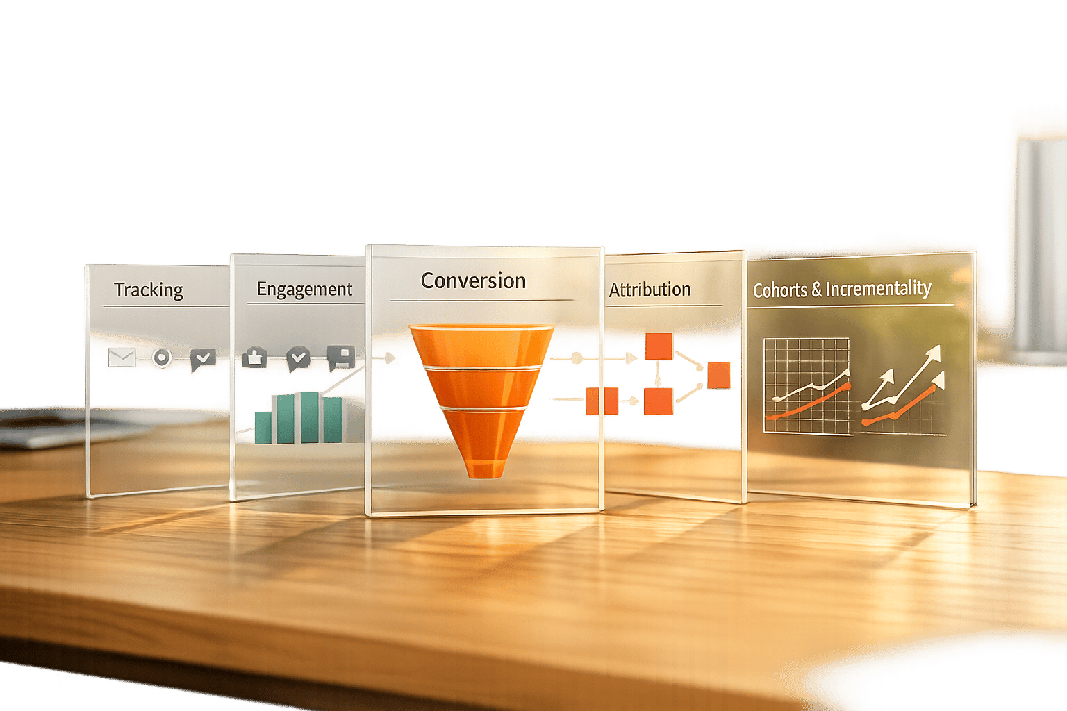
- Identify Key KPIs: Focus on metrics tied to business goals, like revenue, conversion rates, or customer lifetime value (CLV). Limit KPIs to 3–5 per campaign to avoid overload.
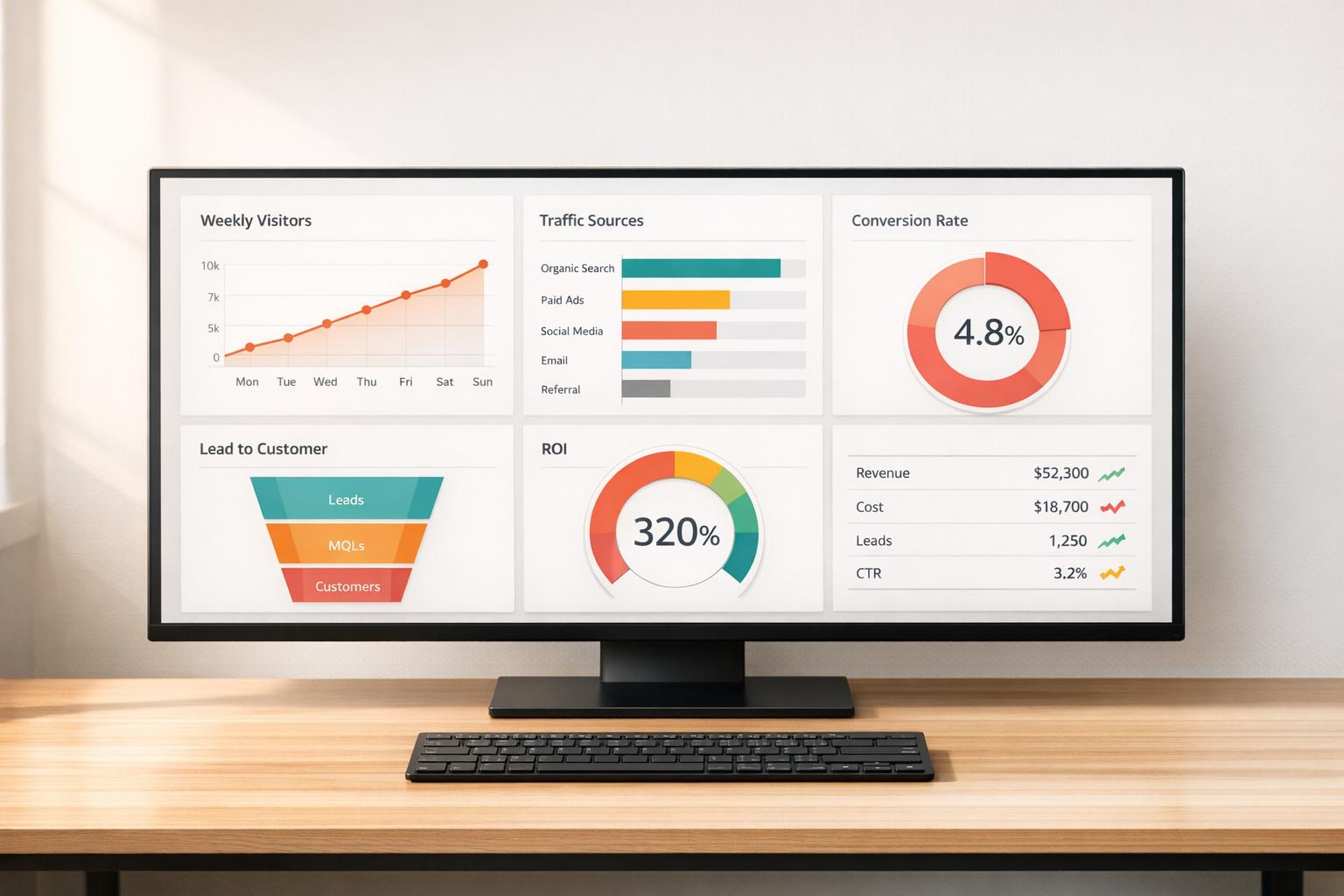
- Choose the Right Charts: Match data to visuals - line charts for trends, bar charts for comparisons, and funnel charts for customer journeys.
- Design Dashboards for Action: Place top metrics in the top-left corner, group related data, and use conditional formatting (e.g., green for success, red for issues).
- Use the Right Tools: Platforms like Google Looker Studio, Power BI, and Tableau can automate data updates and simplify reporting.
Key takeaway: Keep visualizations simple, focused, and actionable to save time and improve decision-making. Whether it’s spotting underperforming campaigns or reallocating budgets, well-designed KPI dashboards can drive better results.
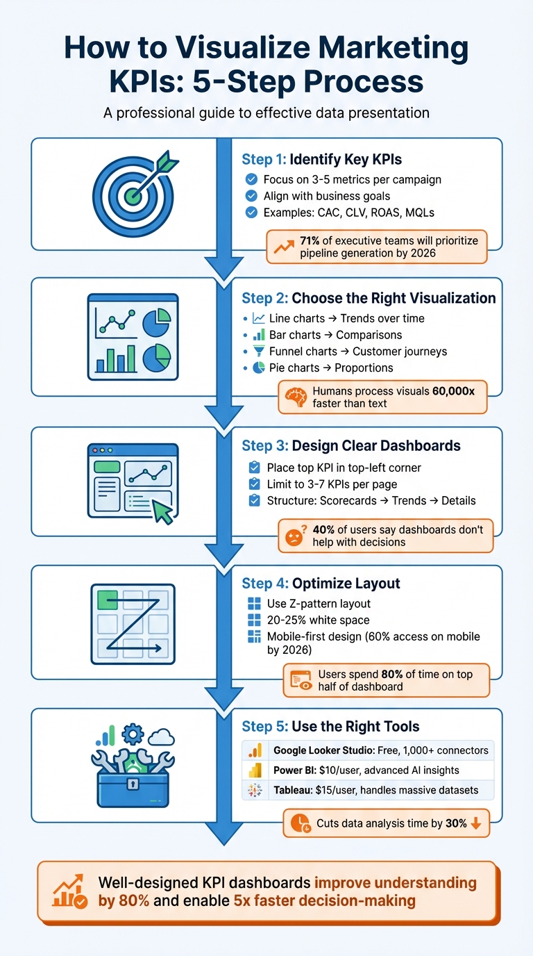
5-Step Process for Visualizing Marketing KPIs
Marketing Dashboard Tutorial: How to Analyze and Track Marketing Performance
sbb-itb-cef5bf6
Step 1: Identify Your Most Important Marketing KPIs
Before diving into dashboards or charts, it’s crucial to pinpoint the metrics that actually drive your business outcomes. One common misstep marketers make is tracking everything instead of focusing on what truly impacts the bottom line.
Align KPIs with Business Goals
Begin by identifying the primary business metric that signifies success for your organization - this could be revenue, profit margin, or customer lifetime value (CLV). Then, link it directly to your marketing efforts. Every KPI you track should prompt a clear action or decision when it changes.
To ensure alignment, match KPIs to the stages of the customer journey:
- Awareness Stage: Monitor organic traffic and brand mentions.
- Consideration Stage: Focus on email open rates and demo requests.
- Sales Stage: Track conversion rates and return on ad spend (ROAS).
- Retention Stage: Measure metrics like CLV and referral rates.
By 2026, 71% of executive teams will prioritize metrics like pipeline generation and revenue influence over traffic or engagement, reflecting a shift toward outcome-driven metrics. Additionally, 83% of executives now expect marketing teams to demonstrate ROI through data-backed dashboards.
"Every metric should answer 'so what?' - if a number doesn't drive decisions, it doesn't belong on the dashboard." - Stephen Few, Dashboard Researcher
Keep your focus narrow - limit KPIs to 3–5 per campaign. Balance lagging indicators (e.g., total monthly sales) with leading indicators (e.g., conversion rates) to get a well-rounded perspective.
Examples of Core Marketing KPIs
The right KPIs depend on your business goals, but some metrics consistently provide actionable insights:
- Customer Acquisition Cost (CAC): This metric reveals how much it costs to acquire a new customer. Calculate it by dividing total marketing and sales expenses by the number of new customers.
- Customer Lifetime Value (CLV): This metric estimates the total revenue a customer generates during their relationship with your business.
- Return on Ad Spend (ROAS): Essential for paid campaigns, this measures the revenue generated for every dollar spent on ads.
- Marketing Qualified Leads (MQLs): For content marketing, tracking MQLs is more insightful than just monitoring page views or time on site.
- Email Open Rate: The average across industries sits at around 42.35%, serving as a benchmark for your email campaigns.
Looking ahead to 2026, AI Visibility is emerging as a critical KPI. It tracks how often your brand appears in AI-generated responses on platforms like ChatGPT or Google AI Overviews compared to competitors. As search evolves toward zero-click results, this metric will help gauge your presence in this changing landscape.
Ultimately, focus on metrics you can directly influence and tie to revenue. For example, 74% of businesses say their top marketing goal is converting leads into customers. This makes the lead-to-customer conversion rate one of the most valuable KPIs to track. Whatever metrics you choose, always provide context - compare them against historical data, industry benchmarks, or specific goals rather than presenting raw numbers alone.
Step 2: Choose the Right Visualization Format
After identifying your core KPIs, the next step is selecting the visual format that conveys their story most effectively. The aim isn’t to create something overly complicated - it’s to make the data’s meaning instantly clear. Since humans process visuals 60,000 times faster than text, choosing the right chart type is crucial for delivering insights at a glance. Let’s dive into how to match your data types with the perfect visualization formats.
Match Visuals to Data Types
Once your KPIs are set, pair each metric with a visual that best represents its nature. For instance:
- Categorical data (like marketing channels or campaign names): Use bar, column, or pie charts for easy comparisons.
- Continuous data (such as revenue trends or traffic volume): Line or area charts work well to show changes over time.
- Hierarchical data (like account structures or product categories): Treemaps are ideal for displaying detailed information in a compact format.
- Sequential processes (like customer journeys or lead funnels): Funnel charts or Sankey diagrams highlight where prospects drop off.
- Multivariate data (comparing three or more variables): Use bubble or radar charts to present complexity without overwhelming your audience.
"The most effective visualization isn't always the most complex – it's the one that makes your data's story immediately clear to your client." - Jay Kang, Swydo
To keep your visuals clean and focused, follow these tips:
- Limit line charts to five lines and restrict pie charts to fewer than six categories that add up to 100%.
- Start bar charts at zero and arrange them by value to emphasize top performers.
- For long category labels, switch to horizontal bar charts to avoid truncation.
Comparison Table of Visualization Types
| Chart Type | Best Use Case | Marketing KPI Example | Advantages |
|---|---|---|---|
| Line Chart | Trends over time | Monthly website traffic | Clearly shows direction and seasonality |
| Bar Chart | Comparing categories | ROAS by channel | Highlights performance differences |
| Pie Chart | Showing proportions | Traffic by source | Visualizes distribution of the whole |
| Heat Map | Highlighting frequency | Seasonal sales trends | Reveals patterns and peak activity periods |
| Funnel Chart | Sequential process stages | Lead-to-sale conversion | Identifies drop-off points in the journey |
| Scatter Plot | Relationship between variables | Ad spend vs. revenue | Exposes correlations and outliers |
For consistency, use the same colors for specific categories (e.g., Paid Search in orange, Organic in blue) to make your visuals easier to interpret. Lastly, avoid 3D effects, as they can distort data relationships and reduce clarity.
Step 3: Design Clear KPI Dashboards
Once you've matched your KPIs with the right visual formats, the next step is creating a dashboard that’s actionable and easy to understand. Here’s the reality: 40% of users say their dashboards don’t help with decision-making, and 34% find them cluttered with irrelevant data. The fix isn’t about adding more data - it’s about designing with purpose. A great dashboard should deliver its core message in under five seconds.
To start, place your most important KPI in the top-left corner, where viewers naturally begin scanning. This "hero metric" should stand out - make it 2–3 times larger than the supporting labels to create a clear visual hierarchy. From there, structure the layout like a funnel: high-level scorecards at the top, trend charts (e.g., line graphs) in the middle, and granular details (like tables) at the bottom. This mirrors how decision-makers process information: big picture first, details later.
"Structure it like a funnel - big picture first, details later." - Jase Rodley, SEO Consultant
Group related metrics together. For example, if you’re showing ad spend over time, place it next to spend by channel for better clarity. Use white space to separate sections and keep things visually clean. Dashboards designed this way help organizations make decisions five times faster than their competitors.
Limit and Prioritize Key Metrics
One common mistake? Trying to cram too much into a single dashboard. Humans can only process 5–7 pieces of information at a time, so keep each dashboard page focused on 3–7 high-impact KPIs. Anything more risks overwhelming your audience, leading to "decision paralysis."
To prioritize, ask yourself: What decision does this number help me make? If the answer isn’t obvious, remove the metric or move it to a drill-down view. For instance, raw impression counts might look impressive, but if they don’t guide budget allocation or creative strategy, they’re just noise.
"If a metric hasn't influenced a decision in 60 days, delete it." - Julia Moreno, Dataslayer
Tailor dashboards to your audience and their specific needs. Executives care about revenue, ROI, and customer acquisition costs. Managers need insights on channel performance and conversion rates. Specialists benefit from granular data like A/B test results and keyword performance. When you design dashboards with the audience in mind, you ensure they see only what’s relevant to their role.
| Dashboard Level | Target Audience | Key Focus Areas |
|---|---|---|
| Executive | CMO / Leadership | Revenue impact, ROI, CAC trends, pipeline |
| Manager | Campaign Managers | Channel performance, spend pacing, CPL, conversions |
| Specialist | Analysts / Coordinators | Ad set data, A/B test results, keyword performance |
Place primary KPIs as single-metric scorecards at the top for maximum impact. Include the current value, a comparison to the previous period (e.g., "+12% vs. last month"), and a clear indicator of whether you’re on track. Avoid confusing jargon - use straightforward titles like Cost per New Customer instead of acronyms like CPA.
Use Conditional Formatting and Trend Indicators
Static numbers don’t inspire action. Conditional formatting adds meaning by highlighting what needs attention. Stick to universal color conventions: green for positive trends, red for issues, and yellow for warning signs. But don’t rely on color alone - about 7% of people are colorblind. Add icons like arrows or checkmarks and shapes to reinforce the message.
Trend indicators are also essential. Show percentage changes (e.g., "↑ 18% vs. last month") or progress toward goals using "Actual vs. Target" comparisons. Progress bars can visually demonstrate how close you are to hitting milestones.
In tables, conditional formatting can flag key insights. For example, highlight campaigns with a ROAS below 1.0 in red and those above 4.0 in green. For keyword rankings, use yellow or orange to mark terms on pages 2–3 (positions 11–30) - these are "striking distance" opportunities that could move to page one with extra effort. Always include a data freshness timestamp so viewers know when the information was last updated.
"One screen, three sections: High-level results, channel performance, actionable recommendations." - Elena Novikova, CEO, Lumus Inc.
Step 4: Optimize Dashboard Layout
A dashboard's layout can make or break its effectiveness. It's not just about presenting data; it's about guiding users to act on it quickly. Research shows users spend 80% of their time focusing on the top half of a dashboard. Yet, despite the potential of dashboards, only 20% are actively used, and a staggering 75% are deemed ineffective by users. The issue isn't the data itself - it's how the information is presented.
With around 60% of users accessing marketing dashboards on mobile devices by 2026, layouts must adapt seamlessly to various screen sizes. Prioritizing a mobile-first design ensures critical KPIs are easy to access, typically stacking them vertically at the top. Here's how to refine your dashboard layout for better decision-making.
Position High-Impact KPIs First
Start with what matters most. Place your top KPI in the top-left corner, where it grabs attention immediately and drives decisions. According to Fitts' Law, placing key elements closer to the user's focal point and making them larger improves efficiency.
A Z-pattern layout works best - organize elements from left to right and top to bottom. Begin with 4–6 high-level KPI scorecards at the top, offering a "5-second story". These KPIs should act as North Star metrics, giving users a quick snapshot of success or failure.
Use a tiered approach to information design:
- Top: High-impact KPIs (e.g., Revenue, ROI)
- Middle: Trend charts and performance over time
- Bottom: Detailed tables and granular data
This structure aligns with how decision-makers process information. In fact, 74% of business leaders prefer concise, actionable metrics over lengthy reports.
| Dashboard Zone | Focus Level | Content Type |
|---|---|---|
| Top-Left | High | Key North Star KPI (e.g., Revenue, ROI) |
| Top-Right | High | Filters and date range controls |
| Middle | Medium | Trend lines and distribution charts |
| Bottom | Low | Detailed tables and supporting data |
Strategic use of white space is essential. By dedicating 20–25% of the layout to white space, you reduce visual fatigue and help users focus. For related metrics, like "spend over time" and "spend by channel", align them horizontally to create logical groupings. Use background colors or borders to visually separate sections and make navigation easier.
"Dashboards aren't novels. Your audience won't read every number. That's why layout matters as much as the data itself." – Coupler.io
Once you've nailed the placement of high-priority KPIs, the next step is to group and filter additional metrics for deeper insights.
Group and Filter Metrics
Organize metrics in a way that aligns with the customer journey: Awareness, Consideration, Conversion, and Retention. For example, group metrics like impressions and reach under "Awareness", while click-through rates and engagement belong under "Consideration."
Position related metrics close together to provide context. For instance, place cost-per-acquisition (CPA) data next to conversion volume. This way, users can quickly assess whether rising CPA correlates with changes in conversions. Use the three-section rule for single-screen views: high-level results at the top, channel performance in the middle, and actionable insights at the bottom.
Interactive filters are critical for maintaining a clean and functional layout. Place date pickers and global filters in the top-right corner, where users naturally expect them. Filters allow users to refine data by dimensions like channel, campaign, region, or device type. Cross-filtering adds another layer of interactivity, updating all visualizations based on a single click (e.g., selecting "Social Media" in a performance chart updates the entire dashboard to show only social data).
For larger datasets, include drill-down functionality. This feature lets users click on a high-level metric to reveal detailed insights without cluttering the main view. To avoid overwhelming users, consider using tabbed layouts to separate categories like Paid Search, Social Media, Email, and Organic. Tabs eliminate the need to scroll endlessly through charts while keeping the dashboard organized.
Keep filters limited to essential dimensions - Date, Channel, Campaign, and Region. Too many filters not only complicate the interface but can also slow down loading times, especially when pulling data from multiple sources. By balancing simplicity with functionality, you can create a dashboard that drives action and keeps users engaged.
Step 5: Use Tools for KPI Visualization
Once your dashboard layout is optimized, the next step is choosing the right visualization tools to simplify your reporting. These tools turn raw data into insights you can act on. Modern platforms automate data updates, connect to various sources, and eliminate the need for manual CSV exports.
When selecting a tool, focus on data connectivity. The best platforms integrate seamlessly with sources like Google Ads, Meta Ads, LinkedIn, and CRM systems. For example, Google Looker Studio supports over 1,000 data sets and connectors, while Power BI and Tableau are designed for handling large datasets with advanced modeling features. Automation is another key feature - tools that refresh dashboards frequently (every 15 minutes to daily) ensure your data stays up-to-date without manual effort.
Interactive features elevate a dashboard from functional to exceptional. Look for slicers that allow filtering by date or channel, drill-down options for detailed exploration, and tooltips for added context. Customization options, like themes and fonts, help align dashboards with your brand, creating polished reports for stakeholders. If you need advanced analytics, tools with AI-driven insights, predictive capabilities, or robust calculation languages like Power BI's DAX can handle complex KPI modeling.
Popular Tools for Marketing KPI Visualization
Google Looker Studio is a great fit for small businesses and marketers within Google's ecosystem. It's free for basic use, with a Pro version costing $9 per user, per project, per month. It offers 21 free native connectors for Google products and over 700 partner-built options. However, it struggles with more than five data sources or complex transformations. For platforms like Facebook Ads, third-party connectors like MetricWiz (around $5 per month) can help bridge gaps.
Microsoft Power BI is ideal for enterprises that rely on Microsoft tools and need advanced analytics. Starting at $10 per user, per month, it uses DAX (Data Analysis Expressions) for sophisticated KPI calculations and predictive analytics. The AppSource marketplace provides custom visuals for niche reporting needs. However, beginners may find the interface challenging and rigid.
Tableau is built for enterprises managing large-scale data. Viewer plans start at $15 per user, per month, with higher-tier licenses for creators and explorers. Its drag-and-drop interface makes it easy to create interactive visuals, but its high licensing costs and need for specialized training can be drawbacks. Google Sheets is still handy for quick data manipulation, though it has a limit of 10 million cells and is harder to maintain for complex filtering.
| Tool | Best For | Main Strength | Main Weakness |
|---|---|---|---|
| Looker Studio | Small businesses & Marketers | Free, user-friendly, integrates with Google | Slows with 5+ data sources or complex blending |
| Power BI | Microsoft-centric enterprises | Advanced AI insights, deep data modeling (DAX) | Steep learning curve, rigid interface |
| Tableau | Large-scale data analysis | Handles massive datasets, interactive visuals | High cost, requires training |
| Google Sheets | Quick, one-off analysis | High control over data and formulas | Hard to manage for complex filtering |
Best Practices for Using Visualization Tools
Once you've selected a tool, these tips will help you get the most out of it.
Plan before you build. Sketch your dashboard layout on paper or a digital tool to ensure a logical flow. Start with high-level KPIs, then add trends and detailed breakdowns. This approach avoids the common mistake of building dashboards around available data instead of actionable insights.
"Design visualizations around decisions, not metrics. Before building a chart or dashboard, ask what action it should trigger." – Manolo Pereira, Reporting Ninja
Keep formatting consistent. Use standardized number formats like $1,000.00, uniform font sizes, and cohesive color schemes across all pages. Replace jargon like CPC or ROAS with clear terms like "Cost per Click" to make data accessible to non-marketing stakeholders.
Avoid overloading with metrics. Limit each dashboard page to about six key metrics or three to four views. Use conditional formatting - green for >90% goal achievement, red for <50% - so users can quickly gauge performance. Always include data source citations and a "last updated" timestamp to build trust with stakeholders.
Make dashboards accessible. Use colorblind-friendly palettes and avoid relying solely on red/green indicators. Add icons like arrows to reinforce visual cues. Automate data flows with marketing intelligence platforms to keep dashboards updated in near-real-time. When blending data from multiple sources, ensure that fields like Date or Campaign Name match exactly to avoid errors.
Conclusion
Clear and actionable KPI visualizations are key to cutting through the overwhelming amount of marketing data today. By following a straightforward five-step process - identifying KPIs, selecting the right visuals, designing dashboards, optimizing layouts, and choosing effective tools - you can see measurable results. For example, using the right visualization can cut data analysis time by 30%, while well-designed charts can improve understanding by up to 80%. These tools help teams move beyond just looking back at past performance ("What happened last month?") to diving deeper into analysis ("Why did it happen, and what steps should we take next?"). This shift not only speeds up decision-making but also enhances campaign performance and ensures alignment across marketing, sales, and finance teams.
"The real secret is not in collecting more data, but in choosing the right metrics and presenting them so well your team can act instantly." – Reportz.io
To harness these benefits, take immediate steps to audit your dashboards. Cut out metrics that don’t directly inform decisions - whether that means pausing campaigns, scaling efforts, or tweaking messaging strategies. Highlight your most impactful KPIs at the top, automate data updates to save time, and design each chart with a clear purpose in mind. Above all, ensure that every chart is easy to interpret at a glance.
Focus on what truly matters. By applying these principles consistently, you’ll drive quicker, smarter decisions and see a measurable return on your marketing efforts.
Ready to take your dashboards to the next level? SEO Werkz specializes in turning complex marketing data into actionable insights. For more tips and strategies, check out our blog at SEO Werkz.
FAQs
How do I pick the 3–5 KPIs that actually matter?
Start by pinpointing the critical questions your team needs to address and aligning your KPIs with those strategic objectives. Prioritize actionable metrics - the ones that directly influence decisions - while steering clear of metrics that look good but offer little value (often called vanity metrics). For better clarity, keep dashboards concise, limiting them to about six key metrics per page. Lastly, select KPIs that matter most to your stakeholders, such as conversion rates or engagement levels. These will help you spot trends and make quicker, smarter decisions.
Which chart should I use for each KPI?
The best chart to use depends on the specific KPI you’re analyzing. Here’s a quick guide:
- Bar/Column Charts: Perfect for comparing categories or tracking performance over time. For example, you can use them to compare sales across different regions or monitor monthly revenue growth.
- Line Graphs: Ideal for showing trends, such as website traffic, user engagement, or conversion rates over a period.
- Pie/Donut Charts: Great for illustrating proportions, like breaking down market share or the percentage of sales from different product categories.
- Gauge/Scorecards: Useful for highlighting performance against specific targets, such as hitting a sales goal or achieving a certain customer satisfaction score.
- Scatter Plots: Best for analyzing relationships between variables, like the connection between ad spend and conversions.
- Waterfall Charts: Effective for visualizing incremental changes, such as how different factors contribute to overall revenue growth.
Each chart type serves a unique purpose, so choosing the right one ensures your data tells the story you want.
How often should my marketing dashboard refresh?
Your marketing dashboard needs to update in real-time - or at least as often as your data changes - to give decision-makers the most up-to-date insights. In a fast-moving world, these timely updates are especially important for remote teams that rely on accurate, current information to make decisions. If real-time updates aren't feasible, daily refreshes should be the goal to keep your data relevant and useful.