
Mobile-First Indexing Strategies for E-Commerce in 2026
March 10, 2026By 2026, your mobile site isn’t just important - it’s everything. Google’s mobile-first indexing means it exclusively uses your mobile website to rank and index your content. If your mobile site is slow, incomplete, or hard to navigate, your rankings and sales will suffer - no matter how good your desktop site is.
Here’s why this matters:
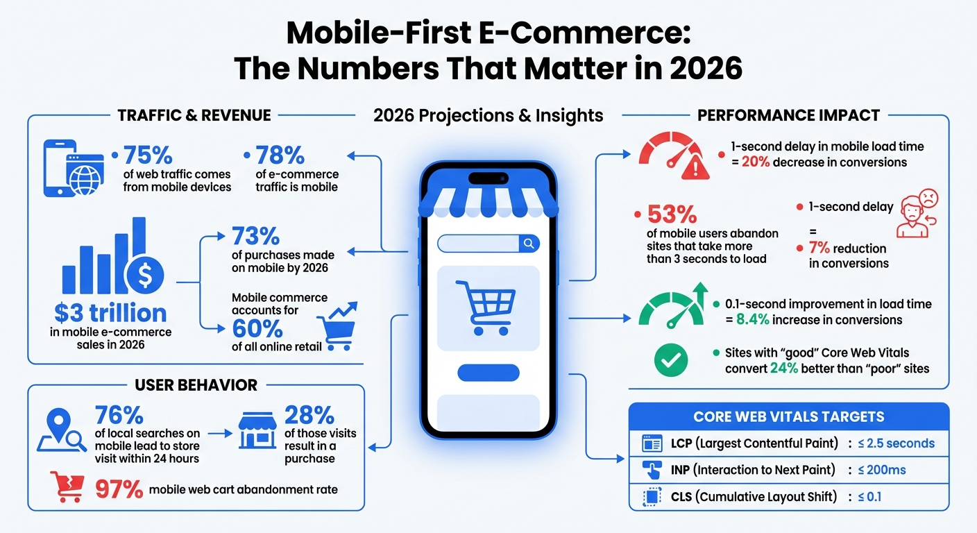
- 75% of web traffic now comes from mobile devices.
- 78% of e-commerce traffic is mobile, driving nearly $3 trillion in sales this year.
- A 1-second delay in mobile load time can cut conversions by 20%, while improving speed by 0.1 seconds can boost them by 8.4%.
To stay competitive, e-commerce businesses must focus on:
- Mobile performance: Optimize speed, Core Web Vitals, and responsiveness.
- Content parity: Ensure mobile and desktop versions display the same information.
- User experience: Simplify navigation, improve checkout, and use mobile-friendly designs.
Mobile-first indexing isn’t just a trend - it’s the new standard. If your mobile site underperforms, you’re losing visibility, traffic, and revenue.
Mobile-First E-Commerce Impact: Traffic, Revenue, and Performance Statistics 2026
Mobile-First Indexing: Core Concepts and 2026 Trends
What is Mobile-First Indexing?
Mobile-first indexing means Google primarily uses the mobile version of your website to crawl, index, and rank content - regardless of the device being used by the searcher. Essentially, Googlebot now operates as a mobile-focused, headless Chromium engine. What this crawler encounters on your mobile site becomes the foundation for your site's indexed content. If any critical information - like product descriptions, customer reviews, or structured data - is missing from your mobile version but present on desktop, Google will act as though it doesn’t exist.
By 2024, Google fully transitioned to mobile-first indexing for all websites. This means the desktop version is no longer a fallback option. Your mobile site isn’t just a secondary version - it’s the only version that matters for search rankings. This shift has especially profound implications for e-commerce, as discussed in the next section.
Why E-Commerce Businesses Need Mobile-First Indexing
For e-commerce, mobile-first indexing directly influences your revenue. Google now evaluates your site entirely based on its mobile performance. If your mobile checkout is clunky, product images load slowly, or key features are hidden to save screen space, those flaws will hurt your rankings - even if your desktop site is flawless. Azra Kassam from Shopify explains it best:
"A flawless desktop site cannot compensate for weak mobile performance" - Azra Kassam, Shopify
The stakes are even higher when you consider user behavior. A whopping 76% of local searches on mobile lead to a store visit within 24 hours, and 28% of those visits result in a purchase. If your mobile site struggles to deliver a seamless experience, you’re not just losing search rankings - you’re losing sales. From page speed to intuitive navigation, every detail of your mobile site determines whether customers can find, trust, and buy from you. As Google’s indexing metrics grow more advanced, optimizing for mobile has become a necessity for staying competitive.
How Mobile-First Indexing Has Changed Since Its Launch
Since its introduction, mobile-first indexing has evolved beyond simply checking if a site is mobile-friendly. By 2026, Google’s evaluation system has become far more sophisticated. It now considers how efficiently your site can be crawled and rendered. This is where the concept of a "Render Budget" comes into play. Pages built with JavaScript-heavy frameworks can take up to 20x longer to crawl compared to static HTML. For example, while a static HTML page might take just 150 milliseconds to index, a JavaScript-intensive page can take over 2,500 milliseconds.
Another major focus is Interaction to Next Paint (INP), a metric that tracks how quickly your site responds to user interactions like taps or clicks. This directly affects user experience and usability. Additionally, there’s the "2MB Cliff" - a soft limit where HTML payloads larger than 2MB risk being truncated, leaving some of your content unindexed.
AI-driven search tools, such as Google’s Search Generative Experience, now prioritize mobile-optimized content when generating snippets and answers. These advancements mean that mobile performance doesn’t just affect rankings - it also impacts how users engage with your site and, ultimately, how much revenue you generate. The bar for mobile optimization continues to rise, and e-commerce businesses must adapt quickly to stay visible and competitive.
sbb-itb-cef5bf6
Maintaining Content Parity Between Mobile and Desktop
What is Content Parity?
In today’s mobile-first world, Google treats mobile content as the primary version of your site. That’s why ensuring your mobile and desktop versions display the same information is critical for maintaining strong search rankings. This concept, known as content parity, means that everything from product descriptions and FAQs to structured data, internal links, and image alt text must be identical across both versions.
Here’s why it matters: Googlebot Smartphone handles 80% to 95% of crawl activity on healthy websites. This makes the mobile version the main source for ranking signals. If important content only appears on the desktop version, it’s likely to be ignored by Google. To avoid this, metadata, schema markup, and internal linking must remain consistent across mobile and desktop versions.
Common Content Parity Mistakes in E-Commerce
E-commerce sites often make the mistake of creating a "Lite Version" for mobile to speed up load times. While this might seem like a smart move, it can hurt rankings since Google indexes only what’s visible on mobile. Features like simplified menus or JavaScript-triggered accordions can hide key internal links or content, making it invisible to Googlebot.
Another issue is Graph Fragmentation, where developers remove Schema.org nodes - like Review or Author - from the mobile version to save space. This disrupts the Knowledge Graph and can weaken your site’s credibility signals (E-E-A-T).
How to Maintain Content Parity
To ensure content parity, use a responsive design with a single URL and unified codebase. If you need to hide content visually on mobile, rely on CSS (e.g., display: none) rather than JavaScript, so the content remains in the initial HTML and is still indexable by Googlebot. For collapsible elements like accordions, opt for semantic HTML5 tags like <details> and <summary> instead of JavaScript-based toggles. These tags are recognized by Google as integral parts of the page content.
"A travel blog regained lost rankings by switching from JavaScript-based itinerary toggles to semantic HTML5 tags." - Search Engine Zine, 2026
Also, double-check that internal links, metadata, and schema markup are consistent across both versions. Tools like Google Search Console’s "Test Live URL" feature can help ensure that nothing - like footer content or FAQs - gets omitted due to rendering issues or truncation.
Keeping mobile and desktop content aligned isn’t just about rankings - it’s also about delivering a seamless experience for users while meeting Google’s expectations for mobile-first indexing.
Improving Mobile Performance for E-Commerce Sites
Why Mobile Site Speed Matters
Mobile site speed isn't just a technical detail - it directly impacts revenue. By 2026, over 70% of e-commerce traffic will come from mobile devices. Even a small delay can cost big. For instance, a 1-second delay in load time can slash conversions by 7%, and 53% of mobile users will leave a site that takes more than 3 seconds to load. On the flip side, improving load times by just 0.1 seconds can increase conversions by as much as 8.4%.
Speed also affects search rankings. With Google’s mobile-first indexing, your mobile site’s performance plays a key role in how you rank. Metrics like Core Web Vitals - Largest Contentful Paint (LCP), Interaction to Next Paint (INP), and Cumulative Layout Shift (CLS) - are official ranking factors. Sites rated as "good" on these metrics convert 24% better than those rated "poor".
Here’s a real-life example: In January 2026, a Miami-based sneaker store optimized its Shopify site by improving its LCP from 5.8 seconds to 1.9 seconds and its INP from 450ms to 120ms. The results? A jump in conversion rates from 1.2% to 3.4% and an extra $180,000 in monthly revenue.
Optimizing Core Web Vitals for Mobile
To improve mobile performance, focus on these three Core Web Vitals:
- LCP: This measures how quickly the main content of a page loads. Aim for 2.5 seconds or less.
- INP: Replacing First Input Delay (FID) in 2024, INP measures how responsive a site is during a user session. Your target is 200ms or less, though only 43% of e-commerce sites currently meet this goal.
- CLS: This metric tracks unexpected layout shifts. Keep it under 0.1 to ensure a stable visual experience.
Here’s a quick reference:
| Metric | Good (Target) | Needs Improvement | Poor |
|---|---|---|---|
| LCP (Largest Contentful Paint) | ≤ 2.5s | 2.5s – 4.0s | > 4.0s |
| INP (Interaction to Next Paint) | ≤ 200ms | 200ms – 500ms | > 500ms |
| CLS (Cumulative Layout Shift) | ≤ 0.1 | 0.1 – 0.25 | > 0.25 |
Companies are already seeing results from optimizing these metrics. For example, Trendyol cut its mobile INP by 50% (from 963ms to 481ms), leading to a 1% increase in click-through rates from product listings to detail pages. Similarly, Vodafone improved its LCP by 31%, which boosted its lead-to-visit rate by 15% and drove an 8% increase in total sales.
Mobile Performance Optimization Techniques
Improving mobile performance often starts with optimizing images. Converting key assets like hero banners and product images to WebP or AVIF formats can reduce file sizes by 25–34% compared to JPEGs. However, avoid lazy-loading critical visuals like hero banners. Use attributes like fetchpriority="high" and add <link rel="preload"> tags to ensure these images load immediately. Also, define explicit width and height attributes to prevent layout shifts.
Another key area is third-party scripts. Remove any unused scripts that haven’t been active in the last 90 days. For essential ones, use the async or defer attributes to stop them from blocking the page’s rendering. Shopify’s Carpe is a great example: by improving its LCP by 52%, the company increased conversions by 5% and grew revenue by 15%.
Finally, upgrade your infrastructure. Using a Content Delivery Network (CDN) with edge caching can reduce latency by 200–800ms. For returning visitors, enabling TLS 1.3 with 0-RTT can save an additional 450–650ms by skipping repeated cryptographic handshakes. For JavaScript-heavy sites, "progressive hydration" is a smart strategy - it prioritizes loading critical elements like navigation menus before less important ones like footers.
Each of these optimizations can make a meaningful difference, both in user experience and your bottom line.
Responsive Design and Mobile User Experience
Responsive Web Design Basics
Responsive design is essential for meeting Google's mobile-first indexing standards. It works by using a single URL and unified HTML codebase that adjusts seamlessly to any screen size. This approach prevents indexing errors and saves crawl budget. A properly configured viewport meta tag (<meta name="viewport" content="width=device-width, initial-scale=1">) ensures your site displays correctly on mobile devices without requiring users to pinch and zoom.
With responsive layouts, relative units allow content to adapt automatically to different screen sizes. Tools like Flexbox and CSS Grid make it easy to reflow content. For instance, a three-column product grid on a desktop can collapse into a single-column layout on a 375px-wide phone screen without needing separate mobile-specific code. Starting in 2024, mobile-first indexing applies to all websites, meaning Google primarily evaluates your mobile version for rankings.
These principles form the backbone of a website that works well across devices, ensuring a smooth mobile experience.
Mobile UX Best Practices for E-Commerce
The details matter when creating a mobile-friendly e-commerce site. Start with touch targets - buttons, links, and form fields should be at least 48×48px with 8px spacing to avoid accidental taps. Place key actions, such as "Add to Cart" or checkout buttons, within thumb-friendly zones for easy access.
For text, use a base font size of at least 16px and a line height between 1.5 and 1.7 to improve readability and avoid unintended zooming on iOS devices. Simplify navigation with a hamburger menu or a bottom tab bar featuring 3–5 main sections for one-handed use. During checkout, opt for a single-column layout, enable guest checkout by default, and offer one-tap payment options like Apple Pay and Google Pay to streamline the process.
Another tip: use HTML5 input types (e.g., type="email", type="tel") to trigger the correct mobile keyboard. This small adjustment can make form completion much faster. A well-optimized mobile UX not only boosts conversions but also supports better rankings under mobile-first indexing.
Mobile Design Mistakes to Avoid
Even with solid design principles, certain missteps can ruin a mobile experience. One major error is desktop-first thinking - designing for large screens and then shrinking the layout for mobile. This often leads to slow, bloated pages that frustrate users, contributing to cart abandonment rates as high as 97%.
Avoid hover-dependent menus or effects, as touchscreens don’t support hover states, making hidden content inaccessible. Similarly, don’t hide critical content like product descriptions or reviews using display: none. If Google can’t see it, it won’t index it. Instead, use HTML5 accordions with <details> and <summary> tags to make content collapsible yet crawlable.
Stay away from intrusive interstitials, like full-screen pop-ups, as Google penalizes these on mobile (exceptions include legal notices like age verification or cookie consent). Be mindful of autoplay videos and unoptimized images as well. Using modern formats like WebP or AVIF and the srcset attribute ensures images are properly sized for various screen widths, improving load speed and user experience.
"If your site isn't responsive, no amount of speed optimization will fix mobile-first indexing issues."
- Greg Bernhardt, SEO Strategist, Shopify
Monitoring and Maintaining Mobile-First Compliance
Tracking Mobile Performance Metrics
Google uses three Core Web Vitals to evaluate your site: Largest Contentful Paint (LCP), Interaction to Next Paint (INP), and Cumulative Layout Shift (CLS). These metrics directly influence how your e-commerce site ranks in search results.
Here’s the key takeaway: real user data matters more than lab results. Google relies on actual user metrics from the Chrome UX Report rather than Lighthouse scores. To capture this data, use the Web Vitals JavaScript library to monitor performance from real mobile visitors. Regularly review Google Search Console’s Core Web Vitals report - weekly checks can help you catch and resolve issues before they impact your rankings.
Keep your Time to First Byte (TTFB) under 800ms by implementing server-side caching and optimizing database queries. Also, monitor your HTML payload size - Google has an approximate soft limit of 2MB for initial HTML. Content beyond this limit, such as product descriptions or footer links, may not be indexed.
Make sure your site performs well on 4G connections, as this is Google’s baseline for mobile indexing. A site that loads quickly on Wi-Fi but lags on 4G will face ranking challenges.
Once you’ve gathered performance data, test across a range of devices to ensure consistent real-world results.
Testing Across Different Devices and Screen Sizes
While Chrome DevTools is great for quick checks, testing on actual devices is essential for accurate performance insights. Focus on real smartphones, especially mid-tier Android devices, as Google uses these as performance benchmarks. Check your analytics to determine the devices your customers use most and prioritize testing on those models.
"Don't just test the iPhone 17. Your customers might be on a Pixel, and everything could look funky there."
- Greg Bernhardt, Shopify SEO Strategist
Use Google Search Console’s URL Inspection tool to see how Google’s Smartphone bot renders your site, including the HTML and screenshots. Test responsive breakpoints (320px–1,920px) to prevent horizontal scrolling issues. Additionally, run the Google Rich Results Test with the mobile user agent selected to confirm that your schema markup displays properly on mobile templates.
Re-test after any changes to your theme, apps, or hosting. Consistent testing ensures your site remains mobile-friendly and ready for Google’s indexing standards.
Keeping Content and Design Updated for Mobile
Building on the principles of content parity, it’s critical to ensure that your mobile design reflects the latest updates to your product offerings and user experience. Every element - text, internal links, schema tags, and image alt attributes - must be identical on both mobile and desktop. If your mobile version hides key content like product reviews or specifications behind a "load more" button requiring JavaScript, that content won’t be indexed by Google.
Stick to responsive design settings and proper viewport configurations, as outlined in the Maintaining Content Parity section, to maintain consistency across devices.
Even if no changes have been made, run weekly performance audits. Use Google Search Console’s Mobile Usability report to identify issues like undersized tap targets (less than 48×48px) or font sizes smaller than 16px. Compress your LCP image to under 100KB for mobile breakpoints and preload it to improve load times. Avoid intrusive interstitials - Google penalizes mobile sites with pop-ups that block main content on page load.
Mobile-First UX Examples That Increase SEO Ranking & Generate More Leads
Conclusion
Google's focus on mobile-first indexing has permanently reshaped how e-commerce sites are evaluated. With mobile devices driving 78% of traffic and 73% of purchases by 2026, ignoring mobile optimization is essentially leaving money on the table. Desktop-only strategies just don’t cut it anymore.
The numbers speak volumes: improving mobile load time by just 0.1 seconds can increase conversions by 8.4%, while a one-second delay can slash them by 20%. Considering mobile commerce is expected to generate $3 trillion in sales this year - accounting for nearly 60% of all online retail - failing to prioritize mobile optimization could cost businesses dearly.
"If your mobile store is underperforming, you are ignoring the majority of your potential revenue." - Elementor
To meet both user expectations and search engine requirements, businesses need to focus on mobile performance. This includes maintaining consistency between mobile and desktop content, optimizing Core Web Vitals for real-world 4G speeds, and eliminating obstacles like cumbersome checkout processes. With mobile web cart abandonment rates averaging 97%, success hinges on more than just speed. Features like thumb-friendly navigation, one-tap payment options, and responsive interfaces are essential.
Mobile-first optimization is not a "set it and forget it" task. Changes like site migrations, theme updates, or hosting adjustments can unexpectedly impact performance. That’s why weekly performance monitoring and quarterly audits are crucial to keeping your site fast, user-friendly, and competitive in the mobile-first landscape. Regular testing and updates ensure your site stays ahead in this ever-evolving digital environment.
FAQs
How do I check what Google indexes on my mobile site?
To check what Google has indexed from your mobile site, head to Google Search Console. There, you can review your indexed pages and coverage reports. Another quick method? Perform a site: search (e.g., site:yourdomain.com) directly on a mobile device or using mobile emulation tools.
Make sure the content on your mobile site matches your desktop version. Why? Because Google primarily uses the mobile version of your site for indexing and ranking. Keeping content consistent across both versions is key for mobile-first indexing.
What’s the fastest way to fix mobile content parity issues?
To address mobile content parity issues effectively, make sure all essential content is included in the initial HTML response. Avoid relying on JavaScript interactions, such as "load more" buttons, since Google might not index content hidden behind them.
Conduct regular parity audits to ensure your mobile and desktop versions are aligned. This includes verifying that metadata and structured data are consistent across both versions.
Additionally, prioritize responsive design and speed optimization. Pay close attention to metrics like Largest Contentful Paint (LCP) to enhance user experience and maintain search engine visibility.
Which mobile Core Web Vitals should I prioritize first?
To optimize Largest Contentful Paint (LCP) for mobile, aim to ensure it loads within 2.5 seconds. This metric is crucial for mobile-first indexing in 2026 because it directly affects both user experience and search rankings.
LCP measures how quickly the largest visible content (like an image, video, or block of text) on a page loads. A slow LCP can frustrate users and lead to higher bounce rates, which can hurt your site’s performance in search results.
To improve LCP, focus on:
- Optimizing Images and Videos: Compress large files, use modern formats like WebP, and implement responsive images for faster loading.
- Prioritizing Critical Resources: Use lazy loading for non-essential assets and preload key elements like hero images or fonts.
- Improving Server Response Times: Utilize a Content Delivery Network (CDN) and minimize server-side delays to speed up delivery.
- Reducing JavaScript and CSS Blockages: Minify files and defer non-critical scripts to prevent delays in rendering.
By addressing these areas, you can significantly boost LCP performance, ensuring your site meets the 2.5-second benchmark for a better mobile experience and stronger search visibility.