
Mobile-First Design: SEO Checklist
February 21, 2026Mobile-first design is no longer optional - it’s mandatory for SEO success. Since Google fully transitioned to mobile-first indexing in July 2024, your mobile site is now the primary version Google evaluates for rankings. If your mobile site falls short - whether in speed, usability, or content - it will hurt your visibility in search results.
Here’s what you need to know:
- Why it matters: Over 63% of global web traffic comes from mobile devices, and 53% of users leave sites that take more than 3 seconds to load. Google now ranks your site based on its mobile version, not desktop.
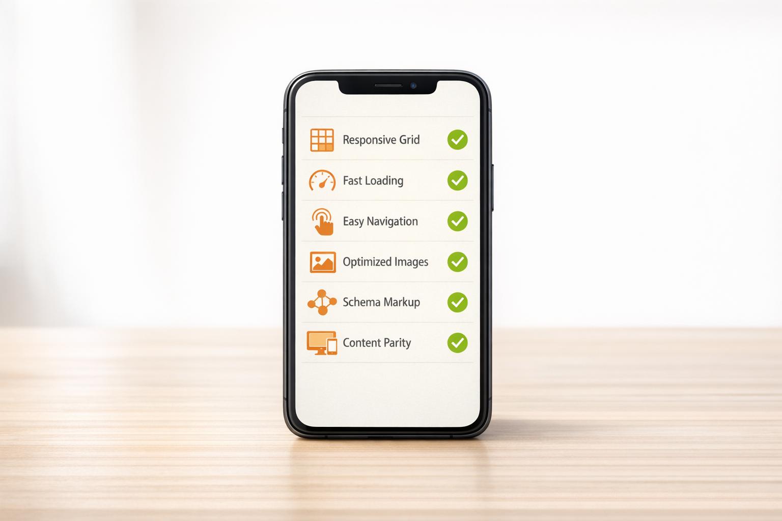
- Key focus areas: Responsive design, fast page speed (Core Web Vitals), touch-friendly navigation, readable content, and consistent structured data between mobile and desktop.
- Actionable steps: Use responsive design (Google’s preferred method), optimize Core Web Vitals like Largest Contentful Paint (LCP), simplify navigation, and ensure all mobile content matches desktop.
This checklist outlines how to meet Google’s mobile-first standards, improve user experience, and boost your rankings. Let’s dive into the details.
Mobile SEO: The Ultimate Guide for Beginners
sbb-itb-cef5bf6
Responsive Design and Technical Setup
Mobile-First Design Approaches: Responsive vs Dynamic vs Separate URLs
Selecting Your Design Approach
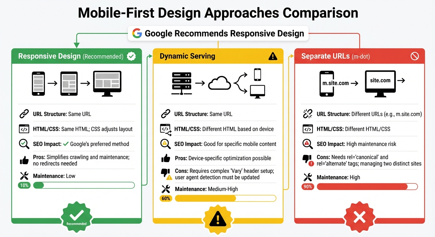
When it comes to mobile-first SEO, responsive design is the go-to recommendation. Google prefers it because it’s straightforward to implement and maintain. With responsive design, a single URL and HTML setup handles everything, eliminating the need for redirects, avoiding duplicate content issues, and simplifying overall management.
Other methods, like dynamic serving and separate mobile URLs (m-dot sites), come with notable challenges. Dynamic serving uses server-side logic to detect user agents, but this can fail if the detection list isn’t consistently updated. Meanwhile, maintaining separate mobile URLs means managing two distinct sites, which requires meticulous use of rel="canonical" and rel="alternate" tags to avoid duplicate content penalties. Both options are resource-heavy and prone to errors.
| Approach | URL Structure | HTML/CSS | SEO Impact |
|---|---|---|---|
| Responsive Design | Same URL | Same HTML; CSS adjusts layout | Recommended. Simplifies crawling and maintenance; no redirects needed. |
| Dynamic Serving | Same URL | Different HTML based on device | Good for specific mobile content but requires complex "Vary" header setup. |
| Separate URLs (m-dot) | Different URLs | Different HTML/CSS | High maintenance; needs rel="canonical" and rel="alternate" tags. |
It’s also crucial to ensure your mobile site mirrors your desktop site in terms of content, structured data, and metadata. With Google’s mobile-first indexing, your mobile site serves as the baseline for rankings. If any content is missing on mobile, it won’t contribute to your search rankings.
Once you’ve chosen your design approach, focus on using precise CSS and HTML techniques to enhance the mobile experience.
CSS and HTML for Mobile Optimization
To create adaptable designs, use fluid grids and percentage-based layouts. Tools like Flexbox and CSS Grid are perfect for crafting layouts that work across multiple devices.
Media queries are essential for customizing layouts based on viewport width. For instance, a breakpoint like @media screen and (max-width: 480px) allows you to adjust typography, spacing, and layout specifically for smaller screens - all without needing separate codebases.
For images and media, set max-width: 100% and height: auto to ensure they scale properly. Additionally, leverage the <picture> element and srcset attributes to serve optimized image resolutions based on the device’s pixel density. This approach prevents mobile users from downloading overly large files unnecessarily.
Lastly, make sure your robots.txt file doesn’t block CSS, JavaScript, or images. Googlebot needs access to these resources to fully render and understand your mobile layout.
Setting Up the Viewport Meta Tag
The viewport meta tag is critical for mobile optimization. Without it, mobile browsers render pages at desktop widths (usually 980px) and then shrink them down, making text nearly unreadable. To fix this, include the following snippet in your HTML <head>:
<meta name="viewport" content="width=device-width, initial-scale=1"> Here’s what each part does:
width=device-width: Matches the screen’s width in device-independent pixels, ensuring content adjusts naturally across devices.initial-scale=1: Maintains a 1:1 relationship between CSS pixels and device-independent pixels, allowing your page to use the full screen width, no matter the orientation.
Avoid disabling zoom by using settings like user-scalable=no or setting a maximum scale. Blocking zoom can make content inaccessible for users with low vision and violates WCAG accessibility guidelines. Accessibility issues can also negatively affect your SEO.
Proper viewport configuration has a measurable impact. It can improve Largest Contentful Paint (LCP) by 15–25% and reduce Cumulative Layout Shift (CLS) by 30–40%. These improvements directly affect your Core Web Vitals, which play a key role in search rankings.
Mobile Performance and Page Speed
Improving Core Web Vitals
Google evaluates mobile performance using three Core Web Vitals metrics, which directly influence search rankings. These metrics include:
- Largest Contentful Paint (LCP): Measures how quickly the main content loads. Aim for 2.5 seconds or faster.
- Interaction to Next Paint (INP): Tracks responsiveness to user input, with a goal of 200 milliseconds or less.
- Cumulative Layout Shift (CLS): Assesses visual stability, with a target score of 0.1 or below.
Speed matters - over 53% of mobile users leave a site if it takes longer than 3 seconds to load. To hit the LCP target, place your largest image directly in the HTML and avoid lazy loading for it.
For INP, split JavaScript tasks that exceed 50 milliseconds. Use tools like the Scheduler API (scheduler.yield()) to let the browser manage critical tasks efficiently. As web.dev puts it:
"By breaking up long tasks, you're giving the browser more opportunities to fit in critical, user-blocking work."
You can identify these long tasks using Chrome DevTools' coverage tool and apply code splitting to shrink your initial bundle size.
To improve CLS, always define width and height attributes for images or use the CSS aspect-ratio property to reserve space, preventing layout shifts. Avoid animating properties like margin, top, or left; instead, use transform: translate(), which is more efficient for the browser's compositor thread.
| Metric | Target (Good) | Poor |
|---|---|---|
| LCP (Largest Contentful Paint) | ≤ 2.5s | > 4.0s |
| INP (Interaction to Next Paint) | ≤ 200ms | > 500ms |
| CLS (Cumulative Layout Shift) | ≤ 0.1 | > 0.25 |
Once these metrics are addressed, focus on optimizing images and media for even faster load times.
Image and Media Optimization
Images make up over 60% of a webpage's total weight, making them a prime target for speed improvements. Switching to modern formats like WebP can reduce file sizes by 25–80% compared to JPEG or PNG, while maintaining quality. For even better compression, explore AVIF format.
To ensure mobile users don't download unnecessarily large images, use the srcset and sizes attributes. These serve images tailored to the device's resolution, such as delivering an 800 x 1,200-pixel image on mobile versus a 1,920 x 1,080-pixel version for desktops.
Enable lazy loading for all images and videos below the fold (excluding critical LCP images) by adding loading="lazy" to your HTML. This prioritizes content visible on the screen while deferring offscreen media until the user scrolls near it.
If you're using animated GIFs, convert them to HTML5 video formats like MP4 or WebM, which can reduce file sizes by up to 90%. Additionally, a Content Delivery Network (CDN) can handle much of the optimization for you, compressing images and delivering them faster via edge servers.
Once you've optimized your media, validate the improvements with performance testing tools.
Testing Mobile Performance
Testing is crucial to maintaining a strong mobile-first SEO strategy. Start with Google PageSpeed Insights, which combines real-world user data from the Chrome User Experience Report with lab-based diagnostics from Lighthouse. This tool provides a performance score and actionable recommendations.
For deeper analysis, use the Chrome DevTools Performance Panel. Its "Live Metrics" feature tracks Core Web Vitals in real time, while detailed trace recordings help identify JavaScript bottlenecks and main-thread blocking. Simulate mobile conditions by throttling the CPU (e.g., 4x slowdown) and network (Fast 4G).
The Core Web Vitals report in Google Search Console is another essential tool. It groups similar URLs, such as product pages, to show how entire sections of your site perform based on real user data from the past 28 days. This allows you to address systemic issues rather than fixing individual pages.
"Use field data for measuring real-world performance, and lab-based tools like Lighthouse for diagnostics of how to improve it." - web.dev
Finally, test on actual devices. Use mid-range smartphones on 3G or 4G networks to detect lag or tap delays that simulations might miss. Run Lighthouse audits in incognito mode to avoid interference from browser extensions or cached data.
Improving mobile performance is just one piece of the puzzle. The next steps will explore user experience and content strategies for a complete mobile-first approach.
User Experience and Navigation
Designing Touch-Friendly Navigation
When designing for touchscreens, make sure tap targets are at least 48x48 CSS pixels with 8–32 pixels of spacing between them. This spacing minimizes accidental taps and makes navigation smoother for users.
Think about the thumb zone - the area on a screen that’s easiest to reach with one thumb. About 75% of users navigate their phones this way, so placing key navigation elements and buttons in the lower two-thirds of the screen is ideal. Apps like Instagram and Spotify use bottom navigation bars to keep essential actions within easy reach.
Feedback matters, too. When users tap a button, they should see an immediate response, like a color change or a subtle animation. This reassures them that their action was registered. For more complex tasks, such as a checkout process, break the steps into separate screens instead of cramming everything onto one page.
| Element | Recommended Size | Purpose |
|---|---|---|
| Tap Targets | 48x48 pixels | Makes tapping easier for fingers |
| Target Spacing | 8–32 pixels | Reduces accidental clicks |
| Close Buttons | 32x32 pixels | Simplifies dismissing pop-ups |
By following these principles, you can create a navigation system that feels natural and easy to use on mobile devices.
Simplifying Mobile Navigation
Keep your mobile menu straightforward - limit top-level items to 4–8 essentials. For secondary options, use a hamburger menu, but make sure to pair the icon with the word "Menu" to improve recognition. A hybrid setup, like a bottom tab bar for the most critical pages alongside a hamburger menu for additional options, strikes a good balance.
Place a search box prominently above the fold. Many users prefer typing queries rather than digging through menus. Also, ensure your mobile navigation reflects the content structure of your desktop site to align with Google’s mobile-first indexing.
To improve usability, use specific HTML5 input types like type="number" for phone numbers. This triggers the appropriate mobile keyboard automatically. Keep form labels short and break longer forms into smaller, manageable steps to avoid overwhelming users.
Avoiding Intrusive Pop-Ups
Google penalizes sites that use intrusive pop-ups, or interstitials, during the transition from search results. These can frustrate users and potentially drop your site by more than 10 positions in mobile search rankings. To avoid this, make sure pop-ups cover no more than 30% of the screen and include a visible close button that’s at least 32x32 pixels.
If you must use a pop-up, delay its appearance by at least 8 seconds or trigger it based on user actions like scrolling or exit intent. Certain interstitials, such as cookie consent or age verification, are acceptable. Chat boxes that provide immediate assistance are also fine, as they add value without disrupting the experience.
"Starting today, pages where content is not easily accessible to a user on the transition from the mobile search results may not rank as high." - Google Webmaster Team
Instead of intrusive pop-ups, consider embedding calls-to-action naturally within your content or placing them at the end of articles. This approach keeps the user experience smooth while still encouraging conversions.
Content Optimization for Mobile
Creating Readable and Scannable Content
Did you know mobile users typically read only 28% of the content on a page? To grab their attention quickly, use the inverted pyramid style - start with the most important information first.
Keep paragraphs short, ideally between 3–5 lines, and stick to simple, concise sentences. Subheadings like H2 and H3 make it easy for readers to jump to the sections they care about.
Highlight crucial details with bulleted lists and bold text, and leave enough white space between text and images. This layout can improve comprehension by up to 20%.
"Mobile optimization is the process of ensuring that visitors who access your site from mobile devices have an experience optimized for the device." - Chima Mmeje, SEO Strategist
For forms, ensure input fields are at least 16px wide to prevent iOS browsers from zooming in unexpectedly. This small tweak can make a big difference in keeping users engaged.
Maintaining Content Parity
With Google's mobile-first indexing, your mobile site is the primary version Google evaluates for rankings. If important content, links, or schema markup are missing on mobile, it could hurt your SEO performance.
"If your mobile version trims out important copy, links, or schema, Googlebot never sees it, and can't rank it." - Tsvetan Velichkov, Director of Technical SEO, Uptick Marketing
To save space without losing vital content, use collapsible sections or accordions. This approach keeps your mobile layout clean while ensuring Google can still access all the information it needs.
Run Google's Rich Results Test to confirm structured data displays correctly on mobile, and use the URL Inspection Tool in Google Search Console to verify that no critical content is hidden via CSS.
Once your content is fully optimized, the next step is to make sure your typography enhances readability across all devices.
Mobile-Friendly Fonts and Typography
Readable typography is just as important as well-optimized content for a smooth mobile experience.
Set your body text to at least 16px - anything smaller forces users to zoom, and 61% of visitors won’t return to a site with hard-to-read fonts. If you want even better clarity, bump it up to 17–18px. Pair this with a line height of 1.4 to 1.6 times the font size to avoid cramped text on small screens.
"Because Google now indexes the mobile version first, body text below 16px severely harms user engagement and SEO: three-quarters of users abandon unreadable pages, bounce rates climb, and rankings sink." - Brent D. Payne, Founder/CEO, Loud Interactive
Ensure strong contrast between text and background with a minimum ratio of 4.5:1 to meet accessibility standards. Use relative units like rem or em so text adjusts properly when users change browser settings. For a more dynamic approach, try CSS clamp() to make fonts scale fluidly: font-size: clamp(16px, 2.5vw, 24px); ensures your text never falls below the readable threshold.
Stick to system fonts or lightweight variable fonts to improve load times. Limit yourself to no more than two custom font files to keep things efficient. For secondary text like captions, go 2px smaller than the body text (around 13–14px) and use a slightly lighter color to maintain a clear visual hierarchy.
Technical SEO for Mobile
Mobile Sitemap and Robots.txt Setup
To help Google index your mobile URLs, submit a dedicated mobile sitemap through Google Search Console. If your site uses separate mobile URLs (like m-dot domains), it's a good idea to keep mobile pages in a separate sitemap from desktop pages. This makes it easier to track indexing progress.
For mobile-specific sitemaps, include the <mobile:mobile/> tag in each URL to signal mobile optimization. Don’t forget to add video and image entries to help Google discover rich media on your site.
Next, check your robots.txt file for any rules that might block mobile-specific URLs or assets. Use the Smartphone tab in Google Search Console's Crawl Errors report to identify any issues affecting mobile crawling.
Once your sitemap and robots.txt are set for mobile, the next step is ensuring your structured data aligns across both mobile and desktop.
Structured Data for Mobile Pages
Structured data should be consistent between your mobile and desktop pages. Since Google moved entirely to mobile-first indexing by July 2024, the mobile version of your site is what gets indexed and ranked. Missing schema markup on your mobile pages can mean losing out on rich search results, even if the desktop version contains it.
"If you use structured data on the desktop versions of your pages, you should have the same structured data on the mobile versions of the pages."
- John Mueller, Search Advocate, Google
The easiest way to implement structured data is with JSON-LD format, which is simpler to manage compared to Microdata or RDFa. Focus on schema types like FAQPage, Product, and VideoObject, which can boost mobile click-through rates by 20–40%. FAQ and HowTo schemas are especially effective on mobile, as they create expandable search results that push competing links further down the screen.
Use Google's Rich Results Test with a smartphone user agent to validate your markup. Compare the source code of your desktop and mobile pages to ensure no schema blocks are missing, as these gaps could impact rankings.
Once your structured data is consistent, turn your attention to securing your site with HTTPS.
HTTPS and Secure Connections
Google uses HTTPS as a ranking signal for mobile. Since mobile-first indexing means Google evaluates your mobile site first, an unsecured mobile site can hurt your rankings. HTTPS is critical for maintaining user security, especially for people browsing on public or unstable cellular networks.
To audit your mobile site’s security, run Google Lighthouse in mobile emulation mode within Chrome DevTools. This tool evaluates security, SEO, and performance specifically for mobile viewports. Additionally, use the Mobile-Friendly Test tool to confirm that Google's smartphone crawler can access and render HTTPS-secured resources like CSS and JavaScript. Make sure your robots.txt file isn’t blocking these critical assets.
With mobile devices accounting for 63% of global web traffic as of early 2026, providing a secure browsing experience is essential for earning and maintaining user trust.
Conclusion and Next Steps
Key Takeaways
Focusing on mobile-first design isn't optional anymore - it's a must. Google now indexes sites based on their mobile versions alone. To keep up, prioritize responsive web design (Google's go-to recommendation), ensure your mobile and desktop content align perfectly, and fine-tune your Core Web Vitals for optimal performance.
Here's why this matters: 63% of global web traffic comes from mobile devices, and users abandon slow-loading sites 53% of the time. To avoid losing visitors (and revenue), adopt modern image formats like WebP or AVIF, enable native lazy loading with loading="lazy", and make sure tap targets are at least 48×48 pixels with 8-pixel spacing. Also, double-check your structured data using Google's Rich Results Test with a mobile user agent - missing schema on mobile could mean forfeiting valuable search enhancements.
These steps highlight the importance of staying ahead, and sometimes, that means bringing in the pros.
Getting Professional Help
When challenges like Core Web Vitals issues, ranking discrepancies between mobile and desktop, or transitioning from m-dot sites to responsive designs arise, expert help can save both time and money. Tackling advanced tasks like implementing Progressive Web Apps, managing server-side rendering for JavaScript-heavy pages, or solving tricky mobile crawl errors often requires specialized tools and experience.
SEO Werkz provides a full suite of mobile optimization services, including technical audits, Core Web Vitals improvements, mobile crawl analysis, and responsive design implementation. Their proprietary tools and methods can uncover device-specific problems that in-house teams might overlook, ensuring your site aligns with mobile-first indexing standards while driving a measurable return on investment.
To stay on top of mobile SEO, establish a quarterly maintenance routine. Use Google Search Console to monitor mobile usability reports, check Core Web Vitals with real-device data, and review content parity after every major update. Remember, mobile SEO isn't a one-and-done task - it’s an ongoing process. Staying proactive ensures you're ready for algorithm changes and shifting user expectations.
FAQs
How can I check if Google is indexing my mobile pages first?
To see if Google is indexing your mobile pages first, head over to Google Search Console. Use the URL Inspection tool by entering your mobile page's URL. This will show whether it's indexed and crawled by Googlebot Smartphone. Another way to verify this is by checking the Settings section. If Googlebot Smartphone is listed as the primary crawler, it means mobile-first indexing is in place.
What should I fix first if my Core Web Vitals fail on mobile?
To improve metrics like LCP (Largest Contentful Paint), CLS (Cumulative Layout Shift), and INP (Interaction to Next Paint), it's essential to tackle specific performance bottlenecks. Here's where to start:
- Optimize images: Compress and properly size images to ensure faster loading times. Consider using modern formats like WebP for better efficiency.
- Reduce render-blocking resources: Minimize or defer CSS and JavaScript files that delay page rendering. Tools like code splitting and lazy loading can help.
- Improve server response times: Use a Content Delivery Network (CDN) and optimize your server settings to reduce delays in delivering content.
Beyond these technical adjustments, focus on user experience improvements:
- Preload hero images: Ensure key visuals load quickly by preloading them, which can significantly enhance LCP.
- Reserve space for dynamic content: Allocate fixed dimensions for elements like ads or images to prevent unexpected layout shifts, addressing CLS issues.
- Break up long tasks: Split heavy JavaScript tasks into smaller chunks to reduce delays in user interactions, improving INP.
By prioritizing these optimizations, you'll be better positioned to meet Google's Core Web Vitals standards, especially for mobile users.
How can I keep mobile content parity without cluttering the page?
To keep your mobile content aligned with its desktop counterpart without overwhelming users, make sure your mobile pages have the same titles, meta tags, content, images, and structured data as the desktop version. Avoid hiding content specifically for mobile users, and cut back on elements that can bog down the experience, such as too many ads or overly large images. Instead, aim for a clean, simple design that prioritizes the most important information, ensuring everything critical remains easy to access and navigate on smaller screens.