Best Practices for Social Media Data Visualization
March 12, 2026Social media data visualization simplifies raw metrics like engagement rates or follower growth into clear visuals - charts, graphs, or maps - making insights easier to understand and act on. It’s essential for tracking performance across platforms, spotting trends, and communicating results effectively to stakeholders. Key takeaways:
- Focus on core metrics: Stick to 4–6 metrics aligned with your goals, like engagement rate, audience growth, or content performance.
- Choose the right visuals: Use line charts for trends, bar charts for comparisons, and pie charts for proportions. Avoid cluttered dashboards.
- Use the right tools: Free options like Google Looker Studio work for small teams, while Tableau or Whatagraph cater to advanced needs.
- Optimize for mobile: Ensure dashboards are easy to read on smaller screens, using clear fonts and minimalistic designs.
How to master data visualization for social media – Flourish webinar
sbb-itb-cef5bf6
Key Social Media Metrics to Track and Visualize
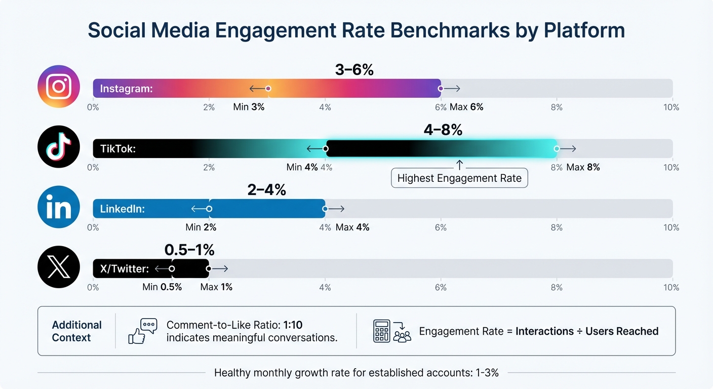
Social Media Engagement Rate Benchmarks by Platform
Stick to monitoring 4–6 core metrics that align with your business goals. Overloading a dashboard with too much data can be just as unhelpful as relying on a cluttered spreadsheet. Focus on how these metrics provide insights into engagement, audience behavior, and content performance to inform better strategies.
Engagement Metrics
Engagement metrics highlight how your audience interacts with your content - likes, comments, shares, and saves all fall under this umbrella. The engagement rate (interactions divided by the number of users reached) is especially useful since it reflects activity from actual viewers, not just followers. Typical benchmarks include:
- Instagram: 3–6%
- TikTok: 4–8%
- LinkedIn: 2–4%
- X/Twitter: 0.5–1%
A comment-to-like ratio of around 1:10 can indicate that your content is sparking meaningful conversations rather than just passive engagement.
"Keeping engagement rate in mind means I constantly assess visuals and copy and ask 'why would anyone care?'"
While engagement is key, knowing your audience adds another layer of insight.
Audience Growth and Demographics
Beyond just counting followers, focus on qualitative data about your audience. For established accounts, a monthly growth rate of 1% to 3% is considered healthy. Understanding demographics - such as age, gender, and location - can help you tailor content more effectively. Tools like geographic heat maps are especially useful for scheduling posts across time zones or tapping into regional trends.
Personalization matters: 60% of people are willing to share their data for a tailored experience, and companies that prioritize personalization can see up to 40% more revenue. These insights allow you to move away from generic messaging and create content that resonates with specific audience segments.
Content Performance Metrics
Content performance metrics help you understand what works and what doesn’t. Comparing reach (unique viewers) with impressions (total views) can reveal whether your content is expanding its audience. A reach-to-impression ratio above 0.7 suggests you're attracting new viewers, while a ratio below 0.5 might indicate your content is primarily cycling through existing followers.
For video content - a dominant format on social media - track metrics like completion rate and average watch time to see where viewers drop off. Live videos, which can generate six times more engagement than regular videos, should also be monitored separately.
Pay attention to saves and bookmarks, as these are high-value engagement signals. Educational posts tend to get more saves, while relatable content often drives shares. Applying the 80/20 rule - where 20% of your content generates 80% of your engagement - can help you refine your content strategy.
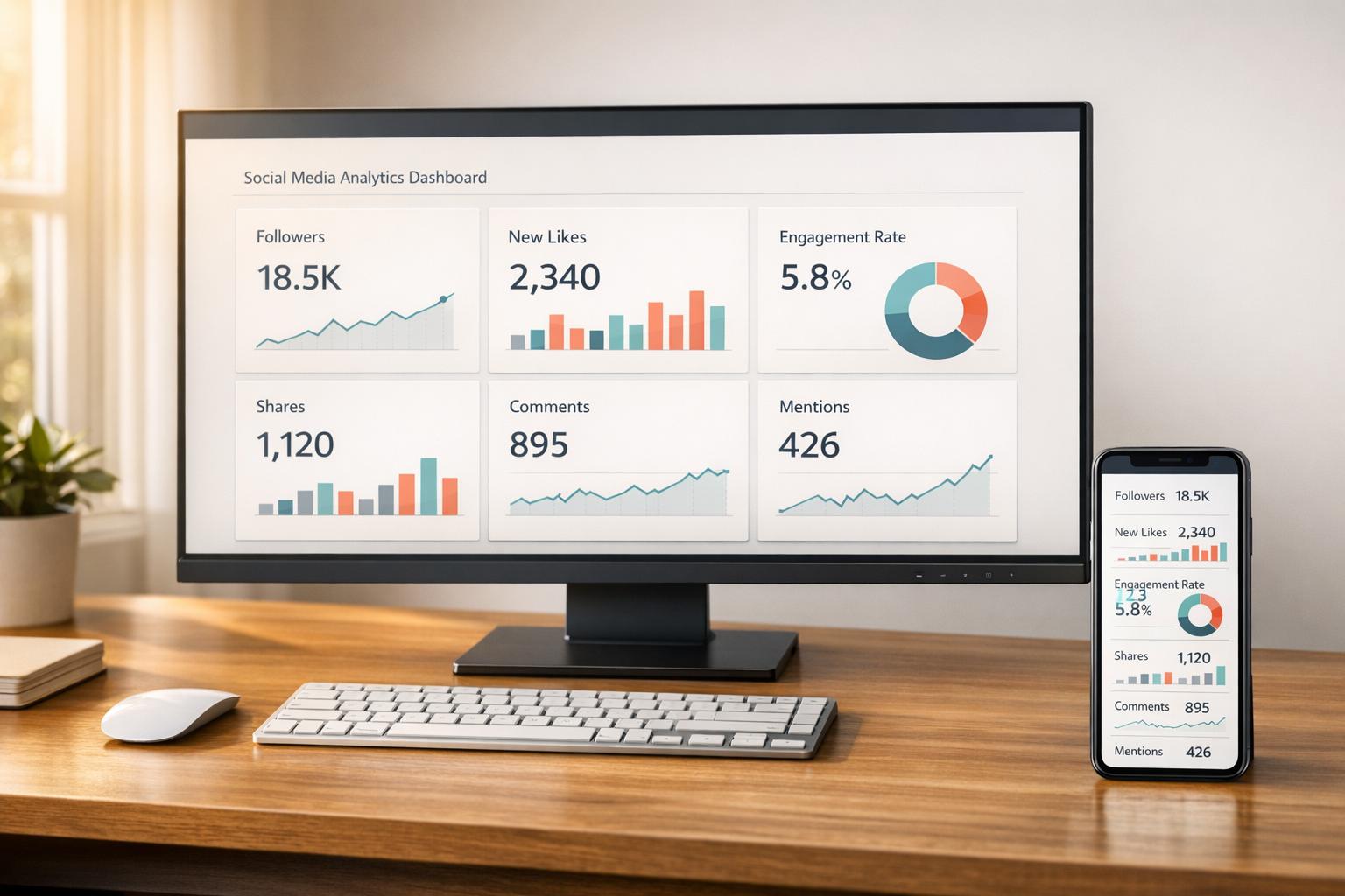
How to Design Effective Social Media Dashboards
Creating a useful social media dashboard means turning raw data into insights that people can act on. The way you design a dashboard depends on who will use it. For instance, C-suite executives need a high-level view of strategic outcomes and ROI, while social media managers need detailed data to track daily performance. Start by identifying the audience and what decisions they need to make.
Selecting the Right Chart Types
Choosing the right chart type is key to making your data clear and actionable. Here’s a quick guide:
- Line charts: Perfect for showing trends over time, like follower growth or engagement patterns.
- Bar charts: Best for comparing numbers, such as performance across platforms or content types.
- Pie or donut charts: Useful for showing proportions, like audience demographics or budget splits. Stick to five or six slices to keep them easy to read.
- Funnel charts: Ideal for tracking processes, such as conversions from clicks to purchases.
- Bullet/KPI charts: Great for tracking progress toward specific goals in real time.
| Metric Category | Recommended Chart Type | Primary Use Case |
|---|---|---|
| Trends | Line Chart | Analyzing follower growth or engagement trends |
| Comparison | Bar/Column Chart | Comparing platform performance |
| Proportion | Donut/Pie Chart | Showing audience demographics |
| Flow/Process | Funnel Chart | Tracking conversion steps |
| Performance | Bullet/KPI Chart | Monitoring progress toward goals |
Avoid using red to represent growth, as it can be misinterpreted negatively. Instead, stick to brand colors or gradients that move from light to dark to highlight trends over time.
Making Dashboards Easy to Read
Dashboards should make key information instantly clear. Since 77% of marketers check their social media dashboards weekly or daily, readability is critical.
"Put your KPIs (Key Performance Indicators) front and center when you load your social media dashboard. You should be able to tell, at a glance, how your social page is performing." - Tristan James, Assisted
Here are some tips for readability:
- Use larger font sizes: 1.5 rem for headers, 1.3 rem for subheaders, and 1.1 rem for labels. This ensures clarity, even on mobile devices.
- Start with black and white for simplicity, then add color to emphasize important data points or trends.
- Use descriptive titles for charts. Instead of just labeling a metric, explain the insight. Research shows that chart titles are the first thing people notice and remember.
- Add date ranges and context markers to clarify the timeframe and any factors influencing the data, such as holidays or algorithm changes.
When to Use Real-Time vs. Historical Data
The type of data you use depends on your goals.
- Real-time data: Essential for active campaigns. It helps social media managers adjust bids, update keywords, or respond to engagement as it happens.
- Historical data: Useful for spotting trends, evaluating long-term progress, and proving ROI to stakeholders.
| Data Type | Primary Use Case | Recommended Chart Types | Target Audience |
|---|---|---|---|
| Real-Time | Campaign adjustments, ad optimizations | Tables, Gauges, Live Feeds | Social Media Managers, Ad Specialists |
| Historical | ROI reporting, trend analysis | Line Charts, Area Charts, Bar Charts | C-Suite, Clients, Marketing Directors |
When using historical data, include notes about external factors - like holidays or platform updates - to explain fluctuations. This context prevents misunderstandings and helps stakeholders see the bigger picture. Automated dashboards can also save time, reducing hours of manual data collection to just about 20 minutes.
Tools for Social Media Data Visualization
The right tool can save you hours of manual work by automating data collection and reporting. In fact, 71% of marketers rely on multiple dashboard tools to track their social media performance efficiently.
Popular Visualization Tools
Databox is a go-to choice for teams aiming to simplify their reporting process. It integrates with more than 130 platforms and features a user-friendly, drag-and-drop interface. With over 4,000 pre-built metrics and options for automated report delivery via Slack or email, it centralizes data without requiring technical know-how.
"The data we're getting from Databox is used in every decision that we make."
- Harry Falowski, Digital Analyst at Conair
Tableau caters to enterprises that need advanced analytics and polished visuals. Its drag-and-drop dashboards and Tableau Prep tool for data cleaning make it ideal for handling complex datasets. However, it does require training and comes at a higher cost - $75 per user per month.
Google Looker Studio is a free tool perfect for teams already using Google Analytics 4 or Google Ads. It syncs data automatically into real-time reports, making it a great option for small businesses or startups looking for professional-grade dashboards without spending extra.
Klipfolio uses "PowerMetrics" to bring together data from various social platforms into a single, easy-to-read display. It’s designed to help teams analyze audience engagement and demographics, cutting down on manual data collection.
Whatagraph is tailored for agencies, offering connections to over 40 data sources and providing white-labeled reports. With 100+ pre-built templates for platforms like LinkedIn Ads and Instagram Business, it’s built for efficiency. For example, in 2026, Maatwerk Online claimed they saved 100 hours monthly by switching to Whatagraph.
"Whatagraph saves time and energy for our marketing specialists. And the hours we're saving is just pure profit."
- Lars Maat, Co-Founder
Each of these tools has its own strengths, so the best choice depends on your team’s needs, technical skills, and budget. Picking the right tool can simplify your data visualization process, ensuring your insights are clear and actionable.
Feature and Pricing Comparison
When selecting a tool, consider factors like team size, budget, and the need for technical expertise. Real-time dashboards are a priority for many marketers - 67% ranked them as a top feature in 2025.
| Tool | Starting Price | Key Strength | Best For |
|---|---|---|---|
| Google Looker Studio | Free | Google ecosystem integration | Small businesses, startups |
| Databox | $72/month | 130+ integrations, automated delivery | Data-driven teams, agencies |
| Tableau | $75/user/month | Advanced analytics, interactive visuals | Enterprise analysts |
| Whatagraph | $199/month | 40+ data sources, white-label reports | Marketing agencies |
| Sprout Social | $199/month | Social listening, sentiment analysis | Mid-market to enterprise brands |
Using pre-built templates can save significant time. Both Databox and Whatagraph offer hundreds of templates for specific platforms, helping you launch professional dashboards quickly. Additionally, automating report delivery via email or Slack - on a daily, weekly, or monthly basis - keeps stakeholders informed without requiring extra effort.
For better accessibility, consider using colorblind-friendly palettes, such as blue-orange combinations, and avoid red-green schemes. About 8% of U.S. users experience color vision deficiencies, so thoughtful design ensures your visualizations are clear to everyone.
Mistakes to Avoid When Visualizing Social Media Data
Creating clear and actionable social media dashboards requires more than just following design principles. Even with advanced tools, certain missteps can make your visualizations less effective. Let’s take a closer look at some common pitfalls and how to avoid them.
Adding Too Many Metrics to Dashboards
Packing a dashboard with too many metrics can overwhelm users and dilute its purpose. Ideally, focus on 3–5 primary metrics to keep things clear and actionable. When dashboards are overloaded with data points, stakeholders may face decision paralysis rather than gaining meaningful insights.
Often, this issue stems from misaligned goals - adding metrics without defining what success looks like for a campaign. For instance, if the goal is lead generation, metrics like impressions or "likes" might take up space without offering valuable insights.
"Decide what metrics you care about in social... Once you dial in what you care about on social, then you can start developing your dashboard."
- Joe Martin, CloudApp
Another common mistake is mixing metrics for different audiences. Executives need high-level summaries, while teams working on execution require more detailed data. Combining both into one view can make the dashboard ineffective for everyone. Instead, create separate dashboards - an executive scorecard for leadership and a tactical dashboard for your social media team.
"Don't try and do too much, or you'll overwhelm yourself. Ask yourself what is most needed in this view... Keep it simple, and you'll be able to view as well as understand the data rather than just look at a whole bunch of numbers."
- Meg Coffey, Coffey & Tea
To make your dashboards more effective, stick to key performance indicators (KPIs) that align directly with your business goals. Eliminate unnecessary elements like gridlines, 3D effects, or redundant labels. Position the most critical KPIs at the top or center of the dashboard and use aggregated views to combine related data points, ensuring clarity and focus.
Choosing the Wrong Chart Types
Using the wrong chart type can lead to confusion and misinterpretation. Since users spend an average of just 1.7 seconds on a Facebook post when browsing on mobile, your visualizations have to communicate insights instantly.
The key is to match your chart type to the data and the story you want to tell. For example, pie charts can be hard to interpret because humans struggle with judging angles. Donut charts, which emphasize the arc length, are often easier to read. Similarly, always start bar and area charts at zero on the y-axis to avoid exaggerating differences. When dealing with long category names, horizontal bar charts work better than vertical ones, as they avoid awkward diagonal or truncated text.
"A chart can either tell a crystal-clear story - or completely confuse your audience."
- Luzmo
For visuals intended for social sharing, stick to simple formats like bar, line, or map charts. Complex visuals, such as Sankey diagrams or chord diagrams, can overwhelm fast-scrolling audiences. This is especially important considering that 40% of software users rate their dashboard experience as a 3 out of 5 or lower, often due to unclear or overly complicated charts.
Ignoring Mobile Optimization
With most social media analytics viewed on mobile devices, resizing a desktop dashboard for smaller screens often leads to cluttered visuals and unreadable text. A proper mobile-friendly design ensures your data remains accessible and easy to interpret.
Mobile optimization involves adjusting the scale, detail, and annotations for smaller screens. This means scaling layouts for smartphones, reducing detail to highlight a single trend or outlier, and simplifying annotations by removing extra gridlines or axis labels. Given that 77% of social media marketers check their dashboards daily or weekly, mobile-friendly designs are crucial for quick, on-the-go insights.
"It's not ok to simply take your chart designed for your big home office monitor and paste it into your social post. Marks, text, axes and all other aspects need to be considered for the smaller form factor."
- Andy Cotgreave, Senior Technical Evangelist, Tableau
Responsive design is essential. Your layout should adapt seamlessly to different screen sizes and orientations. Place key metrics at the top for easy visibility, use minimal text, and ensure the design is clean enough to convey the message in just a few seconds. A good mobile visualization tells a clear story at a glance without requiring users to zoom or scroll.
Conclusion
Key Takeaways
Social media data visualization transforms raw numbers into actionable insights. The core principles are simple: keep visuals clean and easy to understand, prioritize mobile-friendly designs, and customize content for your audience and platform. With users spending just 1.7 seconds on a Facebook post, your visuals need to make an immediate impact.
Choose the right chart for your story - bar charts for comparisons, line graphs for trends - and skip overly complex visuals that might confuse fast-scrolling users. Accessibility is equally important. Around 8% of people in the U.S. have color vision deficiencies, so using colorblind-friendly palettes ensures your visuals are inclusive.
Automation can cut manual tasks by up to 80%, giving you more time to focus on strategic analysis. It's no surprise that 67% of marketers rank real-time dashboards among their top-three must-have features for the future. The tools and strategies outlined here are already becoming industry norms.
These insights provide a foundation for immediate, impactful changes.
Next Steps
To put these takeaways into action, start by auditing your current KPIs - whether that's engagement, audience growth, or conversions - and select a visualization tool that aligns with your team's skills and budget.
Integrate automation by connecting social media APIs to eliminate manual data entry and enable real-time tracking. Use the design tips and metric strategies discussed earlier to refine your dashboards. Regularly review your metrics to ensure they adapt to shifting business priorities.
"The goal isn't perfect measurement - it's better decisions"
FAQs
How do I pick the right KPIs for my dashboard?
To effectively measure success, it’s crucial to select KPIs (Key Performance Indicators) that match your business goals and offer clear, actionable insights. Instead of overwhelming yourself with too many metrics, focus on 4-6 key ones that directly reflect your objectives. For example:
- If your goal is brand awareness, track metrics like reach or impressions.
- For engagement, keep an eye on likes, shares, or comments.
Make sure these KPIs are not only relevant but also measurable over time. Use tools like dashboards to monitor progress consistently. This way, you can identify trends early and adjust your strategy as needed to stay on track.
What’s the best way to show ROI from social media?
To calculate ROI from social media, use this formula: (Revenue Generated - Investment Cost) ÷ Investment Cost, then multiply by 100 to express it as a percentage. Focus on tracking key metrics such as sales, leads, and website traffic that directly result from social media efforts.
Utilizing dashboards with real-time data - like engagement, reach, and conversions - can provide clear insights. Detailed reports on KPIs, such as follower growth and campaign performance, make it easier to showcase ROI and justify your spending to stakeholders.
How can I make dashboards readable on mobile?
When designing dashboards for mobile devices, simplicity is your best friend. Start by using responsive design to ensure charts and tables adjust seamlessly to different screen sizes. Stick to showing only the most important data points to keep things clear and focused.
Make sure to include touch-friendly elements - buttons and interactive features should be large enough and well-placed for easy tapping. For visualizations, go with straightforward chart types like bar or pie charts, which are easier to interpret on smaller screens. These steps help make dashboards more user-friendly and functional for mobile users.